作者:来自 Carly Richmond

为了解释在 Kibana 中构建 Vega 可视化的基础知识,我将使用此 GitHub 存储库中的 2 个示例。具体来说,我将介绍:
- 使用 Elasticsearch 聚合进行数据采购
- 轴和标记
- 事件和信号(例如工具提示和更新中央 Kibana 仪表板过滤器)
我还将分享一些有用的技巧,用于在此过程中调试可视化问题。
关于 Kibana 和 Vega
Kibana 允许你快速构建许多常见的可视化类型,例如柱状图和条形图、热图,甚至指标卡。作为前端工程师,用于构建可视化的低代码工具不仅非常适合原型设计,而且还允许用户潜在地构建自己的基本图表,这样我就可以专注于更复杂的可视化。
Vega 和 Vega-Lite 是用于以 JSON 格式构建可视化和图形的相关语法。两者都可以在 Kibana 中用于构建复杂的可视化以包含在 Kibana 仪表板中。然而,它们的学习曲线很陡峭,很难编写和调试语法中的问题。
为什么选择 Vega?
Vega 和 Vega-Lite 是用于加载和转换数据以构建 JSON 格式的图形和可视化的相关语法。Vega-Lite 是一种更简洁的语法,在渲染之前会转换为 Vega。因此,对于那些刚接触 Vega 的人,我建议首先从 Vega-Lite 开始。
由于 Kibana 提供了许多拖放工具(例如 Lens 和 TSVB)用于在 Elasticsearch 数据之上创建图表,因此应在以下情况下使用 Vega:
- 你需要的可视化类型无法通过其他编辑器获得。关键示例是那些想要创建 Lens 中没有的 Chord 或 Radar 图的人。
- 现有的可视化不支持或缺少你需要的特定功能。
- 创建需要复杂计算或 nested 聚合结构的可视化。
- 你需要根据满足 Kibana Vega 文档中讨论的挑战的数据创建图表。
- 你需要创建的可视化不依赖于表或条件查询。
先决条件
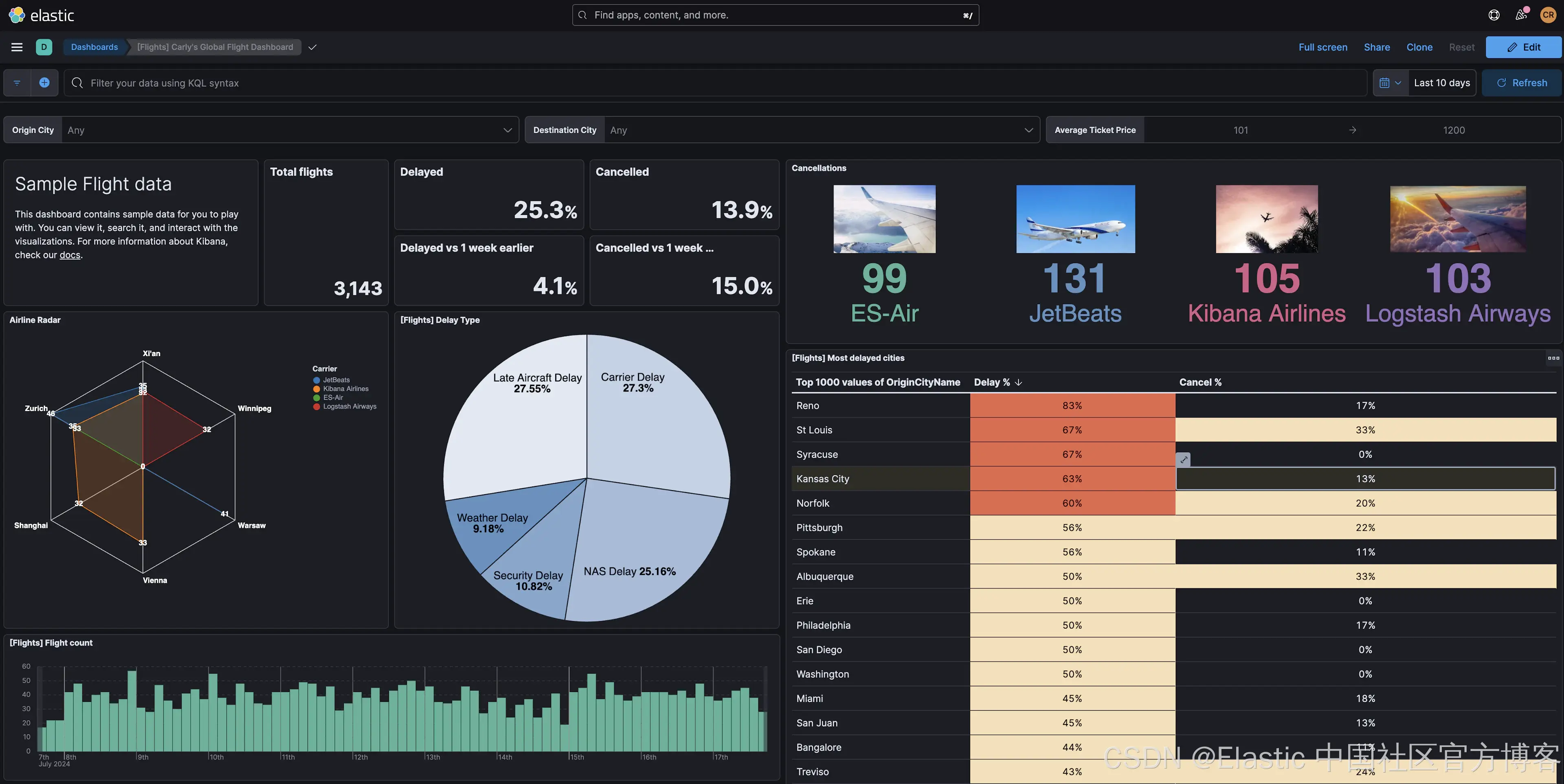
利用 Elastic Cloud 中提供的示例航班数据数据集,我们将构建 2 个新的可视化效果:
- 取消摘要,显示所选时间段内每家航空公司的徽标和取消次数。
- 雷达图,显示每家航空公司飞往主要目的地的航班数量。
在构建这些可视化效果之前,请确保你已完成以下步骤:
- 创建 Elastic Cloud 集群,方法是开始免费试用或使用现有集群。
- 使用文档中的添加示例数据说明添加示例航班数据数据集。
这些示例使用 Kibana v8.14 和 Vega-Lite v5.2.0。这些版本在 Kibana 中默认可用,无需额外安装。
Vega 可视化的基本结构
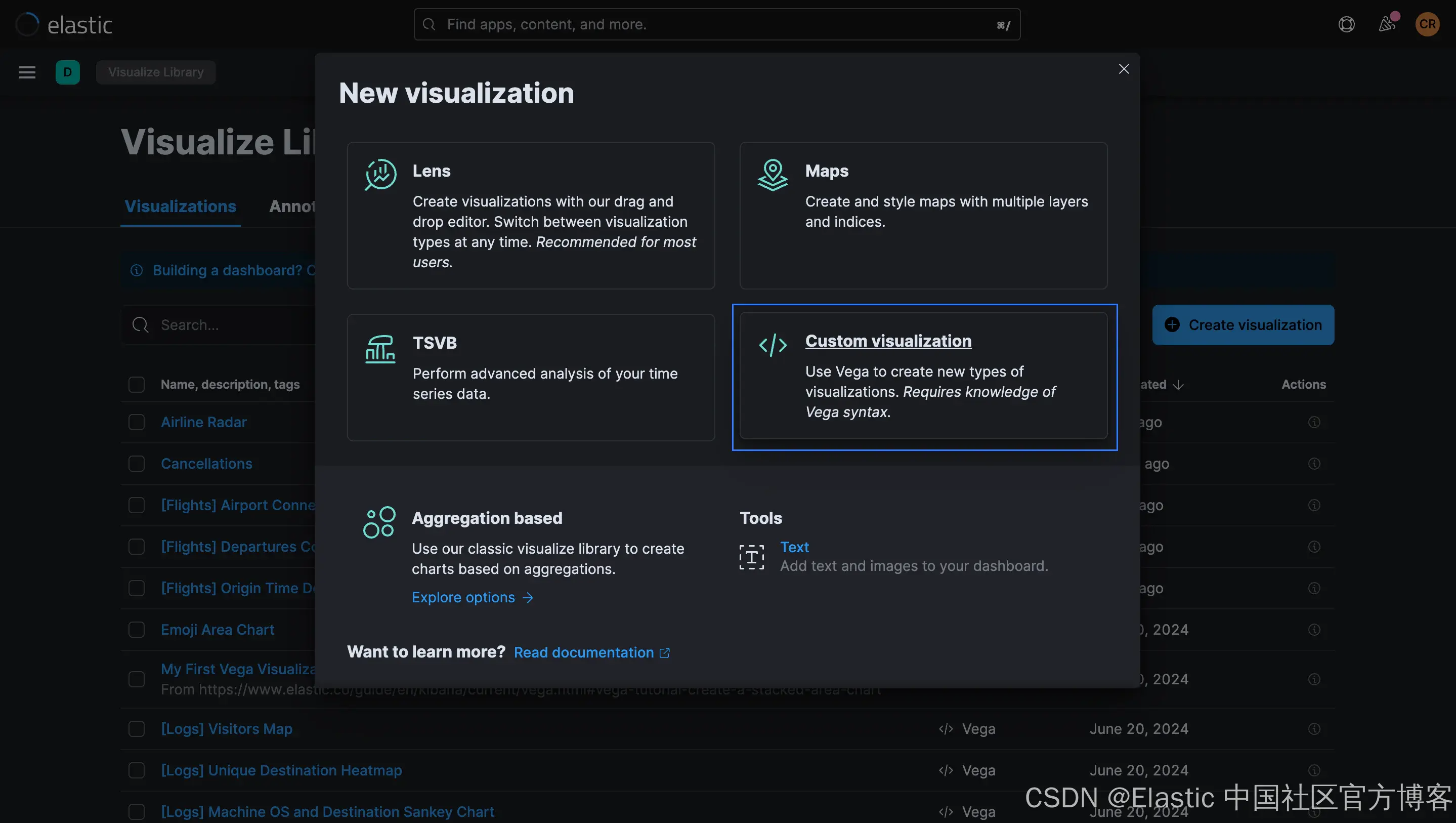
你可以在 Kibana 的各个地方创建 Vega 中的第一个可视化,包括可视化库(Visualize Library )和仪表板(Dashboard)。无论你身在何处,都可以选择自定义可视化(Custom Visualization):
示例 Vega 规范以 HJSON 编写。此 JSON 扩展支持注释、多行字符串和其他有用的语言功能,例如删除引号和逗号以提高可读性。对于你在 Kibana 中编写的任何 Vega 或 Vega-Lite 可视化,你将需要以下元素:
- $schema:用于编写可视化的 Vega 或 Vega-Lite 版本的语言规范。我们的示例使用 Vega-Lite v5.x 的默认模式。
- title 表示可视化标题。或者,另一个可用于描述可视化的元数据字段是 description。
- data:用于从 Elasticsearch 中提取数据以用于图表的 Elasticsearch 查询和相关设置。
- 至少一个来自 mark、marks 或 layer 的属性,用于定义图形元素以显示单个数据点和线系列。
- 包含标记元素渲染所需的视觉属性和相应数据值的编码属性。典型示例包括填充、颜色和文本位置,但类型多种多样。
其他使用的元素将通过后续章节中的示例介绍。
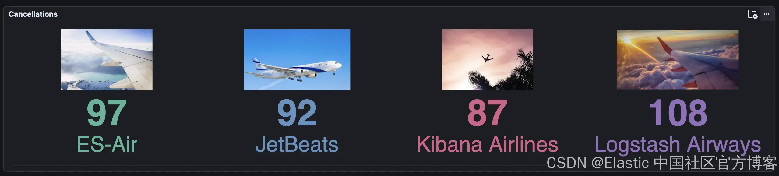
示例 1:带图像的摘要
我们的第一个可视化是一个简单的摘要小部件,使用 Vega-Lite 编写,包含文本和图像数据点:
如果你想直接研究代码,可以在这里找到完整的解决方案。
Schema
我们必须确保 $schema 属性指向 Vega-Lite 正确的模式,以防止出现混淆错误:
$schema: https://vega.github.io/schema/vega-lite/v5.jsonData source
我们的简单信息图将显示所选时间范围内各航空公司的取消次数。在简单的 Elasticsearch Query DSL 中,我们将触发以下请求以获取这些结果:
GET kibana_sample_data_flights/_search
{
  "query": {
    "bool": {
      "must": [
        {
          "range": {
            "timestamp": {
              "gte": "now-7d"
              }
            }
        },
        {
          "match": {
            "Cancelled": "true"
            }
        }
      ]
    }
 },
  "aggs": {
    "carriers": {
      "terms": {
        "field": "Carrier"
        }
      }
    },
  "size": 0
}
在任何 Vega 或 Vega-Lite 可视化中,data 属性定义要可视化的数据源。在 Kibana 中,我们倾向于从 Elasticsearch 索引中提取数据。data.url 可以用作自定义 Kibana 特定对象,而不是 url 值的字符串,该对象被视为上下文感知的 Elasticsearch 查询,它从仪表板元素(例如过滤器栏和日期选择器)提供额外的过滤器上下文。Elasticsearch 查询在 data.url 对象的主体中指定。
如文档中所述,Kibana 在获取要传递给 Vega 渲染器的数据时会解析和考虑几个特殊标记。在此示例中,我们传递了一个使用 %dashboard_context-must_clause% 和 %timefilter% 字符的查询,以在仪表板时间过滤器控件中选择的时间范围内查询 kibana_sample_data_flights 索引中的已取消航班,然后使用terms 聚合聚合结果。
// Define the data source
  data: {
    url: {
      // Which index to search
      index: kibana_sample_data_flights
      // Aggregate data by the time field into time buckets, counting the number of documents in each bucket.
      body: {
        // You cannot use query and the %context% and %timefield% combination in the same data source
        query: {
          bool: {
            must: [
              // See https://www.elastic.co/guide/en/kibana/current/vega.html#vega-queries
              %dashboard_context-must_clause%
              {
                range: {
              // apply timefilter (upper right corner)
              // to the @timestamp variable
                  timestamp: {
                // "%timefilter%" will be replaced with
                // the current values of the time filter
                // (from the upper right corner)
                    %timefilter%: true
                  }
                }
              }
              {
                match: {
                  Cancelled: "true"
                }
              }
            ]
          }
        }
        // Simple bucket aggregation to get document count by carrier
        aggs: {
          carriers: {
            terms: {
              field: Carrier
            }
          }
        }
        // Speed up the response by only including aggregation results
        size: 0
      }
    }

/*
For our graph, we only need the list of bucket values.  Use the format.property to discard everything else.
*/
    format: {
      property: aggregations.carriers.buckets
    }
  }
你可能想知道 format 属性的作用。在 DevTools 控制台中运行我们的初始查询,你将看到感兴趣的结果出现在字段 integration.carriers.buckets 中:
{
"took": 1,
"timed_out": false,
"_shards": {
"total": 1,
"successful": 1,
"skipped": 0,
"failed": 0
},
"hits": {
"total": {
"value": 1331,
"relation": "eq"
},
"max_score": null,
"hits": []
},
"aggregations": {
"carriers": {
"doc_count_error_upper_bound": 0,
"sum_other_doc_count": 0,
"buckets": [
{
"key": "ES-Air",
"doc_count": 351
},
{
"key": "JetBeats",
"doc_count": 338
},
{
"key": "Kibana Airlines",
"doc_count": 328
},
{
"key": "Logstash Airways",
"doc_count": 314
}
]
}
}
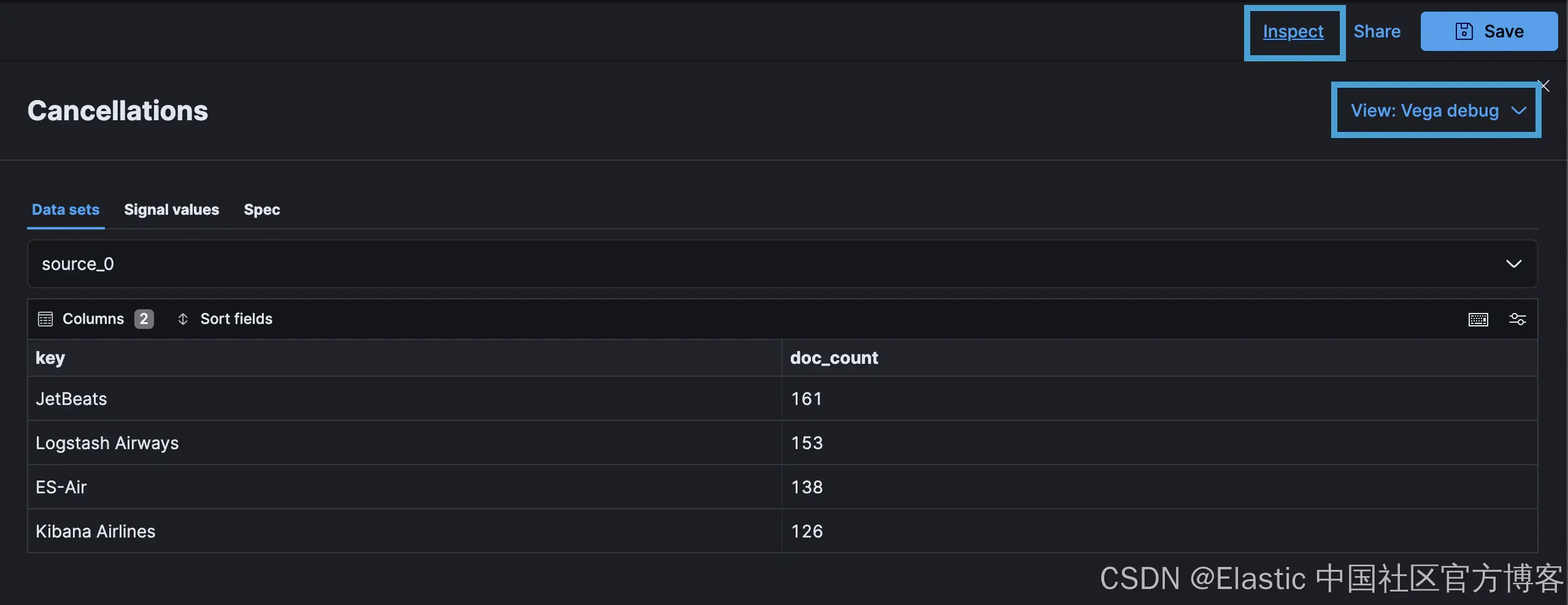
}format 属性会丢弃响应中的其他内容,只留下 source_0 中干净的键值对,这是数据源对象的默认名称。生成的数据在 Inspector 下的 Kibana Vega Debug 选项中可见:
Text Elements
下一步是显示航空公司(由关键字段表示)和使用源数据中的 doc_count 表示的取消次数。简单的 Vega-Lite 可视化使用单个 mark 属性。但是,如果你需要在可视化中使用多个图层,则 layer 属性允许你指定多种 mark 类型,如下所示:
/* "mark" is the graphics element used to show our data.
  Other mark values are: area, bar, circle, line, point, rect, rule, square, text, and tick
  See https://vega.github.io/vega-lite/docs/mark.html
  In this example we have multiple layers instead of a single mark*/
  layer: [
    {
      // Carrier
      mark: {
        type: text
        y: 140
        align: center
        fontSize: 35
      }
      encoding: {
        text: {
          field: key
        }
      }
    }
    // Number of cancellations
    {
      mark: {
        type: text
        y: 90
        align: center
        fontSize: 60
        fontWeight: bold
      }
      encoding: {
        text: {
          field: doc_count
        }
      }
    }
  ]

  /* "encoding" tells the "mark" what data to use and in what way.
  See https://vega.github.io/vega-lite/docs/encoding.html */
  encoding: {
    color: {
      field: key
      type: nominal
      legend: null
    }
  }
上面的例子展示了 2 个 text mark,分别表示承运人和取消次数,后一个 encoding 元素根据数据系列中的 key 属性添加了一个颜色系列。但是,运行上述代码会发现所有元素都重叠了:

注意:如果你的可视化是空白的,请尝试扩大时间范围。
在这种情况下,向编码属性添加不可见的 x 轴可以根据 key 分离值:
  /* "encoding" tells the "mark" what data to use and in what way.
  See https://vega.github.io/vega-lite/docs/encoding.html */
  encoding: {
    x: {
      // The "key" value is the timestamp in milliseconds.  Use it for the x-axis.
      field: key
      type: nominal
      // Hide x-axis
      axis: {
        title: false
        labels: false
      }
    }
    color: {
      field: key
      type: nominal
      legend: null
    }
  }
结果是以下按航空公司以颜色编码的取消次数:

Images
现在为每个载体添加图像元素。Vega-Lite 支持使用 image mark 为每个数据点添加图像。
可以使用 transform 属性进行不同类型的转换,用图像 URL 丰富每个数据点。在这里,我们根据每个记录的 key 属性值(由 dataum 前缀表示)为每个图像添加 URL,并将其存储在新字段 img 中:
// Add new field "img" to add an image url based on the value of field "key"
transform: [
{
calculate: "{'ES-Air': 'https://images.unsplash.com/photo-1483304528321-0674f0040030?q=80&w=320&auto=format&fit=crop', 'JetBeats': 'https://images.unsplash.com/photo-1525396524423-64f7b55f5b33?q=80&w=320&auto=format&fit=crop', 'Kibana Airlines': 'https://images.unsplash.com/photo-1529905270444-b5e32acc3bdd?q=80&w=320&auto=format&fit=crop', 'Logstash Airways': 'https://images.unsplash.com/photo-1551748629-08d916ed6682?q=80&w=320&auto=format&fit=crop'}[datum.key]"
as: img
}
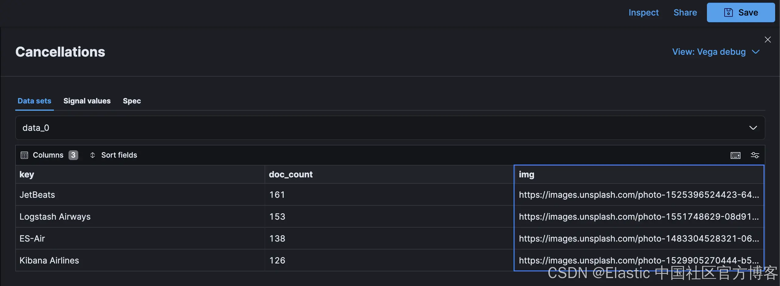
]在 Kibana 检查器中,新的 data_0 字段包含基于定义的映射的图像 URL:
此 URL 可用于添加到图层集合的 image mark:
layer: [
    // Other marks omitted
    // Image
    {
      mark: {
        type: image
        aspect: true
        width: 200
        height: 100
      }
      encoding: {
        url: {
          field: img
        }
      }
    }
 ]
此时,你可能会惊讶地看到以下错误消息而不是图像:
External URLs are not enabled. Add vis_type_vega.enableExternalUrls: true to kibana.yml
默认情况下,Kibana 会阻止外部 URL。将 vis_type_vega.enableExternalUrls: true 的设置添加到你的 kibana.yml 文件(即云配置中 Kibana 实例上的用户设置)后,图像将可见:

自动调整大小
当将此组件添加到仪表板时,考虑到此控件的水平分布,调整大小非常重要。默认情况下,Vega-Lite 不会在每次视图更改时重新计算布局。要配置自动调整和调整大小选项,需要将以下自动调整大小配置添加到顶级规范:
// Setting to auto-fit contents based on panel size
autosize: {
  type: fit
  contains: content
  resize: true
}
使用 fit 尺寸类型时,请注意 Vega-Lite 文档中规定的视图要求。查看 GitHub repo 以获取完整的可视化代码。
示例 2:雷达图
我们的第二个可视化是雷达图或蜘蛛图,它非常适合绘制跨多个类别的一系列值。我们的示例以 Vega 编写,显示了各航空公司飞往每个目的地的航班数量:

此解决方案基于 Vega 文档中的雷达图示例。data source、mark、tooltips 和点击事件代码将在后续章节中讨论。完整代码可在此处获取。
Schema
由于 Kibana 支持 Vega 和 Vega-Lite,我们需要确保 schema 属性指向正确的模式,以防止出现混淆错误。由于我们的示例之前使用了 Vega-Lite 模式,请确保将 schema 设置为适当的 Vega 模式:
$schema: https://vega.github.io/schema/vega/v5.jsonData source
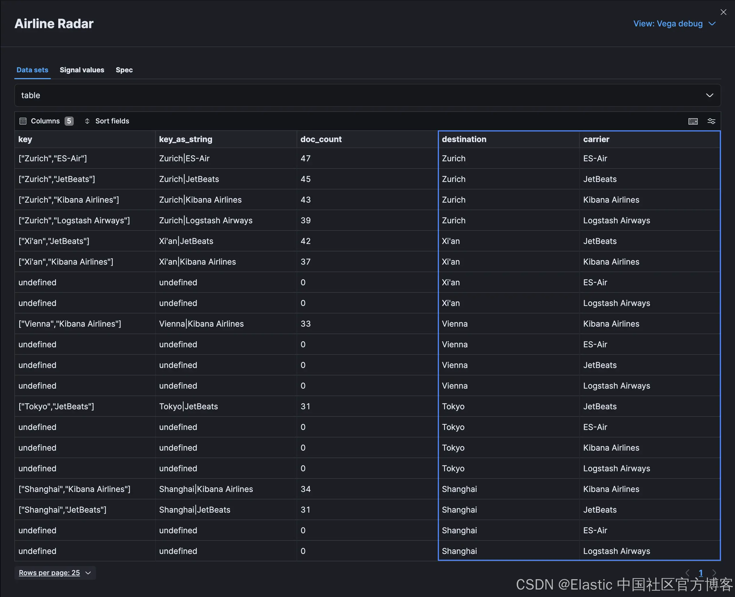
我们的数据源是一个简单的 multi_terms 聚合,用于按目的地和承运商组合获取航班总数:
GET kibana_sample_data_flights/_search
{
  "aggs": {
    "destinations_and_carriers": {
      "multi_terms": {
        "terms": [
          {
            "field": "DestCityName"
          },
          {
            "field": "Carrier"
          }
        ]
      }
    }
  },
  "size": 0
}
聚合在结果对象 aggregations.destinations_and_carrier.buckets 中提供复合键和文档计数,类似于以下内容:
{
  "took": 1,
  "timed_out": false,
  "_shards": {
    "total": 1,
    "successful": 1,
    "skipped": 0,
    "failed": 0
  },
  "hits": {
    "total": {
      "value": 10000,
      "relation": "gte"
    },
    "max_score": null,
    "hits": []
  },
  "aggregations": {
    "destinations_and_carriers": {
      "doc_count_error_upper_bound": 0,
      "sum_other_doc_count": 11532,
      "buckets": [
        {
          "key": ["Zurich", "ES-Air"],
          "key_as_string": "Zurich|ES-Air",
          "doc_count": 174
        },
        {
          "key": ["Zurich", "Kibana Airlines"],
          "key_as_string": "Zurich|Kibana Airlines",
          "doc_count": 173
        },
        {
          "key": ["Zurich", "Logstash Airways"],
          "key_as_string": "Zurich|Logstash Airways",
          "doc_count": 173
        },
        {
          "key": ["Zurich", "JetBeats"],
          "key_as_string": "Zurich|JetBeats",
          "doc_count": 167
        }
      ]
    }
  }
}
数据属性使用自定义 %context% 和 %timefield% 标签接受来自仪表板控件的过滤器上下文和时间戳,Kibana 在传递给 Vega 渲染器之前会替换这些标签:
// Define the data source
data: [
  {
    name: source
    url: {
      %context%: true
      %timefield%: timestamp
      index: kibana_sample_data_flights
      body: {
        aggs: {
          destinations_and_carriers: {
            multi_terms: {
              terms: [
                {
                  field: DestCityName
                }
                {
                  field: Carrier
                }
              ]
            }
          }
        }
        size: 0
      }
    }
    /* For our graph, we only need the list of bucket values.
    Use the format.property to discard everything else. */
    format: {
      property: aggregations.destinations_and_carriers.buckets
    }
  }
]
请注意,我们没有在 Elasticsearch 请求中使用查询来过滤数据。你不能在同一个数据源中使用查询(query)和 %context% 和 %timefield% 组合。如果你需要根据仪表板选择进行过滤以及时间过滤,请按照上面示例 1 中所述传递两者。
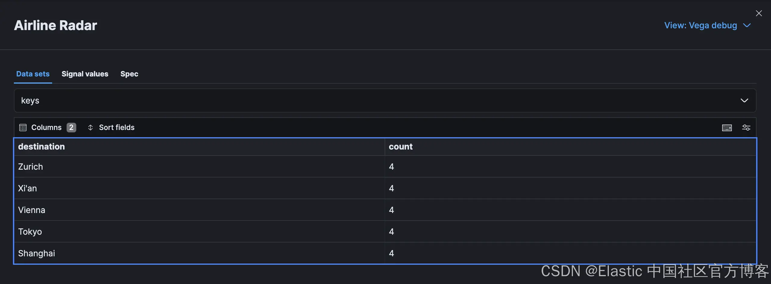
一旦我们从 Elasticsearch 获得结果,我们就可以创建一个扁平化的数据源表,使用公式表达式提取数组元素,使用插补转换(impute transform)对缺失值进行规范化,并使用转换创建一个包含图表外部网络目标的聚合结构 keys。正如你将在下面看到的,我们使用 source 属性来定义 Elasticsearch 聚合源,我们在上一步中恰当地将其命名为 source:
// Define the data source
data: [
    // Elasticsearch data source omitted
    /* Data source where the key array from the multi_terms aggregation is split into two separate fields
    see https://vega.github.io/vega/docs/transforms/formula/ */
    {
      name: table
      source: source
      transform: [
        {
          type: formula
          expr: datum.key[0]
          as: destination
        }
        {
          type: formula
          expr: datum.key[1]
          as: carrier
        }
        /* impute processor performs imputation, which is the statistical process of
        replacing missing data with substituted values */
        {
          type: impute
          groupby: [
            carrier
          ]
          key: destination
          field: doc_count
          method: value
          value: 0
        }
        {
          type: collect
          sort: {
            field: destination
            order: descending
          }
        }
      ]
    }
    /* Data source representing the keys for the outer segment of the radar
    see https://vega.github.io/vega-lite/docs/aggregate.html */
    {
      name: keys
      source: table
      transform: [
        {
          type: aggregate
          groupby: [
            destination
          ]
        }
      ]
    }
]
通过上述转换,我们的附加来源看起来类似于以下内容:
基本图表
要构建一个简单的雷达图,我们需要可用的半径来绘制控件,以及每个元素的比例和标记的定义。
可以使用 signal 根据宽度计算半径。Vega 和 Vega-Lite 中的信号都是动态变量,存储可以驱动交互行为和更新的值。典型示例包括基于鼠标事件或面板宽度的更新。在这里,我们指定一个信号来根据画布宽度计算图表的半径:
/* Dynamic values to drive interactive behavior
see https://vega.github.io/vega/docs/signals/*/
signals: [
  // Chart radius based on width for sizing
  {
    name: radius
    update: width / 3
  }
]
查看所需的可视化效果,你会发现我们需要映射外部径向访问的值以及图表内部的元素。这时 scales 就派上用场了。标记使用这些刻度将视觉元素相对于刻度上的其他元素呈现在正确的位置:
/* Scales to determine positioning and encoding for the radar graph, outside keys and colors
 see https://vega.github.io/vega/docs/scales/ */
 scales: [
  {
    name: angular
    type: point
    range: {
      signal: "[-PI, PI]"
    }
    padding: 0.5
    domain: {
      data: table
      field: destination
    }
  }
  {
    name: radial
    type: linear
    range: {
      signal: "[0, radius]"
    }
    zero: true
    nice: false
    domain: {
      data: table
      field: doc_count
    }
    domainMin: 0
  }
  {
    name: color
    type: ordinal
    domain: {
      data: table
      field: carrier
    }
    range: {
      /* Using the in-build category10 color scheme for each carrier
      see https://vega.github.io/vega/docs/schemes/ for details*/
      scheme: category10
      }
  }
]
通过 scale 属性,我们可以通过linear scale 定义雷达图线上元素的位置,使用 point scale 定义外部目的地的位置范围,以及可视化中间填充的载体段的配色方案。
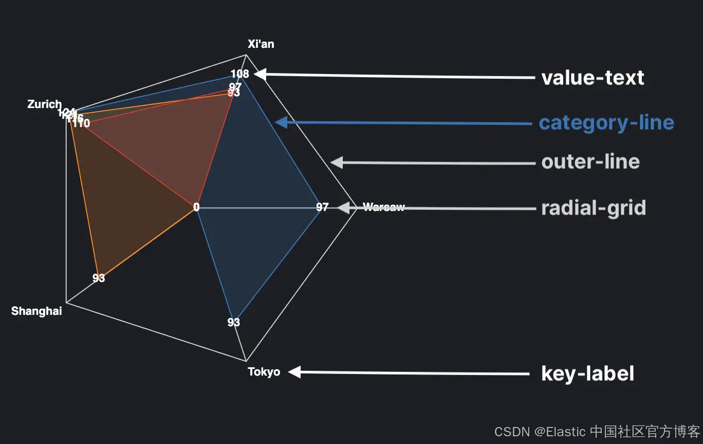
如上图所示,我们的雷达图包含几种不同类型的标记(marks):
- 每家航空公司的阴影多边形由名为 category-line 的线表示。
- 每个目的地的文本标签,恰当地命名为 value-text。
- 从边缘到中心的对角线,称为系列 radial-grid。此系列利用了前面讨论过的 angular scale 以及 rule mark,而不是 line 标记。
- 系列 key-label 描述了在图表外部运行的目的地标签。
- 最后,沿雷达图外部运行的线称为线标记 outer-line。
这些标记的完整代码如下:
// Visualization elements
marks: [
  /* Creating a container mark for the other elements
  see https://vega.github.io/vega/docs/marks/group */
  {
    type: group
    name: categories
    zindex: 1
    from: {
      /* Partition the data for each group by carrier
      see https://vega.github.io/vega/docs/marks/#facet*/
      facet: {
        data: table
        name: facet
        groupby: [
          carrier
        ]
      }
    }
    // Underlying marks
    marks: [
      // Inner colored area segments for each airline
      {
        type: line
        name: category-line
        from: {
          data: facet
        }
        encode: {
          enter: {
            interpolate: {
              value: linear-closed
            }
            x: {
              signal: scale('radial', datum.doc_count) * cos(scale('angular', datum.destination))
            }
            y: {
              signal: scale('radial', datum.doc_count) * sin(scale('angular', datum.destination))
            }
            stroke: {
              scale: color
              field: carrier
            }
            strokeWidth: {
              value: 1
            }
            fill: {
              scale: color
              field: carrier
            }
            fillOpacity: {
              value: 0.2
            }
          }
        }
      }
      // Text labels for the number of flights for each carrier
      {
        type: text
        name: value-text
        from: {
          data: category-line
        }
        encode: {
          enter: {
            x: {
              signal: datum.x
            }
            y: {
              signal: datum.y
            }
            text: {
              signal: datum.datum.doc_count
            }
            align: {
              value: center
            }
            baseline: {
              value: middle
            }
            fill: {
              value: white
            }
            fontWeight: {
              value: bold
            }
          }
        }
      }
    ]
  }
  // Diagonal lines to center of radar chart
  {
    type: rule
    name: radial-grid
    from: {
      data: keys
    }
    zindex: 0
    encode: {
      enter: {
        x: {
          value: 0
        }
        y: {
          value: 0
        }
        x2: {
          signal: radius * cos(scale('angular', datum.destination))
        }
        y2: {
          signal: radius * sin(scale('angular', datum.destination))
        }
        stroke: {
          value: lightgray
        }
        strokeWidth: {
          value: 1
        }
      }
    }
  }
  // Outside destination labels
  {
    type: text
    name: key-label
    from: {
      data: keys
    }
    zindex: 1
    encode: {
      enter: {
        x: {
          signal: (radius + 5) * cos(scale('angular', datum.destination))
        }
        y: {
          signal: (radius + 5) * sin(scale('angular', datum.destination))
        }
        text: {
          field: destination
        }
        align: [
          {
            test: abs(scale('angular', datum.destination)) > PI / 2
            value: right
          }
          {
            value: left
          }
        ]
        baseline: [
          {
            test: scale('angular', datum.destination) > 0
            value: top
          }
          {
            test: scale('angular', datum.destination) == 0
            value: middle
          }
          {
            value: bottom
          }
        ]
        fill: {
          value: white
        }
        fontWeight: {
          value: bold
        }
      }
    }
  }
  // Outside line
  {
    type: line
    name: outer-line
    from: {
      data: radial-grid
    }
    encode: {
      enter: {
        interpolate: {
          value: linear-closed
        }
        x: {
          field: x2
        }
        y: {
          field: y2
        }
        stroke: {
          value: lightgray
        }
        strokeWidth: {
          value: 1
        }
      }
    }
  }
]
此时,将看到一个基本图表。请注意,根据 Kibana 中启用的暗模式或亮模式,某些文本元素可能不可见。目前,无法在 Vega 中获取 Kibana 的选定主题信息(但在问题 #178254 中提出),因此请尽量坚持使用类别配色方案和两种方案中都可见的颜色。
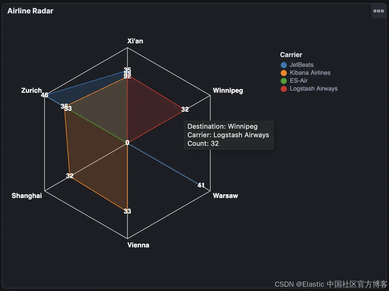
Legend
在此图表中添加图例对于传达哪种颜色代表哪种运营商非常重要。multi_terms 可以在规范的各个范围内定义。在我们的例子中,最简单的方法是将图例定义为顶级属性,并指定 fill 选项以使用我们的 color scale:
/* Carrier legend
see https://vega.github.io/vega/docs/legends/ */
legends: [
  {
    fill: color
    orient: none
    title: Carrier
    encode: {
      legend: {
        update: {
          x: {
            value: 250
          }
          y: {
            value: -150
          }
        }
      }
    }
  }
]
Tooltips
工具提示是另一种实用工具,它使检查繁忙图表中的单个值变得更容易。它们还为单个数据点提供了额外的背景信息。在我们的例子中,它显示了目的地和承运人以及航班数量。与 legends 非常相似,它们可以在我们的规范中的几个不同位置指定。
首先,我们需要使用用户悬停的数据点值来 update 基准对象。你可以使用 mouseover 和 mouseout 事件的更新选项来实现这一点,如下面的代码片段所示:
/* Dynamic values to drive interactive behavior
see https://vega.github.io/vega/docs/signals/*/
signals: [
  // Chart radius based on width for sizing
  {
    name: radius
    update: width / 3
  }
  // Tooltip
  {
    name: tooltip
    value: {}
    on: [
      {
        events: @category-point:mouseover
        update: datum
      }
      {
        events: @category-point:mouseout
        update: "{}"
      }
    ]
  }
]
然后将工具提示的主要配置应用于我们希望在鼠标悬停在特定元素上时触发显示工具提示的标记。在我们的例子中,这是之前定义的名为 value-text 的标记:
// Visualization elements
marks: [
  /* Creating a container mark for the other elements
  see https://vega.github.io/vega/docs/marks/group */
  {
    type: group
    name: categories
    zindex: 1
    from: {
      /* Partition the data for each group by carrier
      see https://vega.github.io/vega/docs/marks/#facet*/
      facet: {
        data: table
        name: facet
        groupby: [
          carrier
        ]
      }
    }
    // Underlying marks
    marks: [
      // Text labels for the number of flights for each carrier
      {
        type: text
        name: value-text
        from: {
          data: category-line
        }
        encode: {
          enter: {
            x: {
              signal: datum.x
            }
            y: {
              signal: datum.y
            }
            // Tooltip configuration (tied to mouse-event signals above)
            tooltip: {
              signal: "{'Destination': datum.datum.destination, 'Carrier': datum.datum.carrier, 'Count': datum.datum.doc_count}"
            }
            text: {
              signal: datum.datum.doc_count
            }
            align: {
              value: center
            }
            baseline: {
              value: middle
            }
            fill: {
              value: white
            }
            fontWeight: {
              value: bold
            }
          }
        }
      }
      // Other underlying marks omitted
    ]
  }
]
请注意,数据点存储在构成数据点上下文的通用 datum 元素下的单独 datum 对象中。这就是我们在路径中出现两次的原因。
最后,我们得到了我们正在寻找的完整图表!
更新全局仪表板状态
将这些可视化效果添加到我们的航班仪表板后,你会注意到,单击 Lens 和 TSVB 创建的控件上的数据点会更新全局仪表板过滤器,但我们的 Vega 和 Vega-Lite 控件不会:
默认情况下,点击事件不会传递到仪表板过滤器,需要使用其他 signals 添加。Kibana 提供了一组扩展函数来触发数据更新并更改仪表板查询和日期时间过滤器。
例如,要将选定的承运人添加到全局仪表板过滤器,请将点击事件处理程序添加到 value-text 标记,以使用 kibanaAddFilter 函数为航空公司添加值:
/* Dynamic values to drive interactive behavior
see https://vega.github.io/vega/docs/signals/*/
signals: [
  // Other signals omitted
  // Update dashboard filters on click event
  {
    name: point_click
    on: [
      {
        events: {
          source: scope
          type: click
          markname: value-text
        }
        update:
        '''
          kibanaAddFilter({
          "match_phrase": {
            "Carrier": datum.datum.carrier
            }
          }, "kibana_sample_data_flights", "selected-carrier")
        '''
      }
    ]
  }
]
结果是,当我们单击雷达图元素时,所有适用的图表都会过滤其结果以显示所选的承运人:
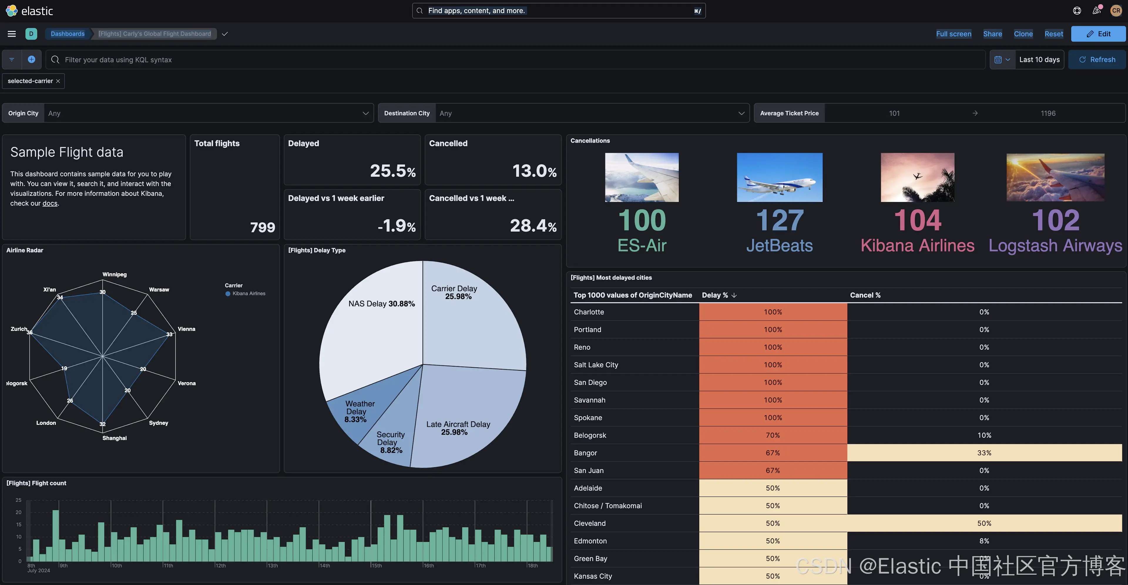
在此示例中,用户只能选择一家航空公司。但如果需要特别处理过滤器事件的更新或删除,则可以使用 kibanaremoveFilter 和 kibanaRemoveAllFilters 函数删除所有过滤器。
如需查看此可视化的最终版本,请查看 GitHub 存储库。
调试技巧
即使拥有最好的复制粘贴技能,每个开发人员在尝试将这些示例以及核心 Vega 和 Vega-Lite 示例调整到他们的数据集时都会遇到错误。因此,熟悉常见错误和检查工具至关重要。
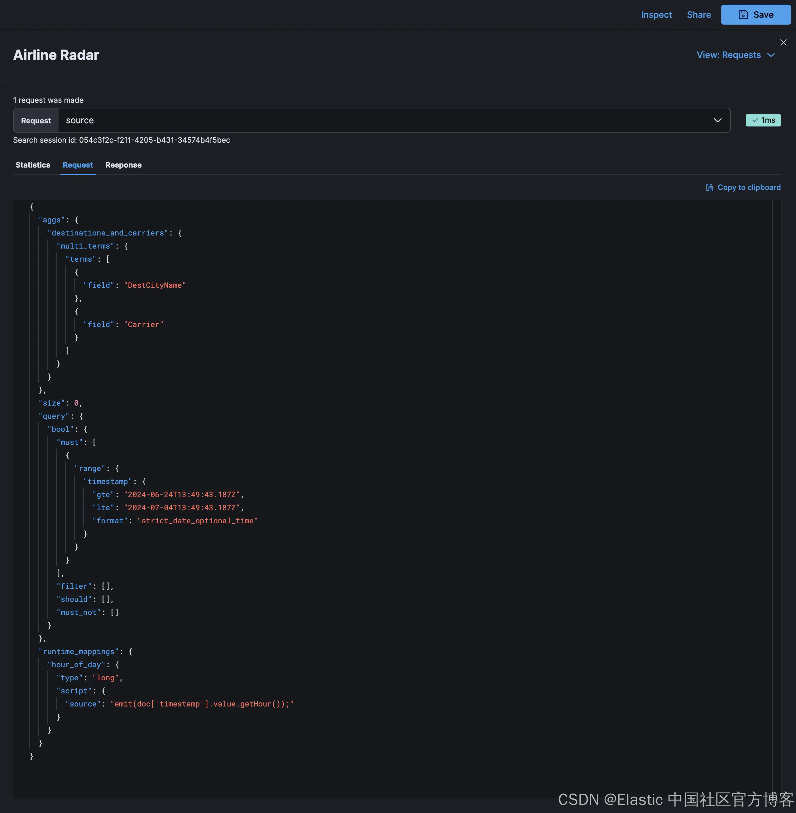
Kibana 提供了检查器,我们已经在本博客的各个部分看到过它的使用,它允许你查看 Elasticsearch 请求和响应结构,以及可视化中的数据值和信号:
对于更熟悉浏览器开发工具的人来说,VEGA_DEBUG 对象是通过控制台中的 Kibana Vega 插件公开的:
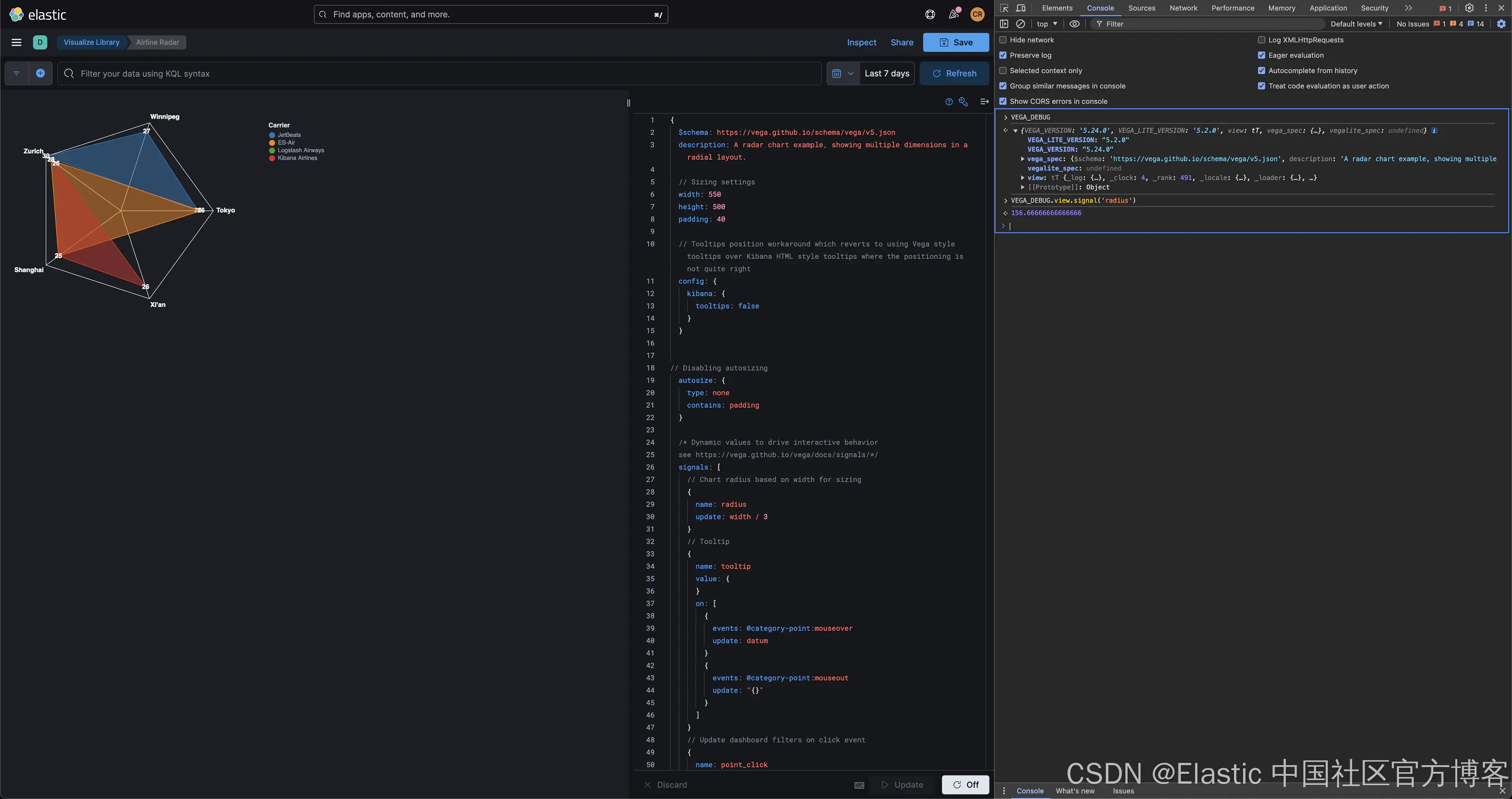
正如你在 Chrome DevTools 的上述屏幕截图中看到的,Vega 调试指南中介绍的调试表达式可通过 VEGA_DEBUG 访问。例如,使用 view.signal(signal_name) 检查雷达图中半径信号的值可以通过 VEGA_DEBUG.view.signal('radius') 实现。
在研究这篇文章的过程中,我注意到了你在开发过程中可能遇到的特定错误:
- 无法将未定义或 null 转换为对象,这在某些语言中相当于 NullPointerException。对于嵌套对象,请检查完整路径是否可用,尤其是在 data 对象中将 format 属性与 Elasticsearch 查询一起使用时。相关警告是无法读取未定义的属性
- Infinite extent for field "field": Infinity, -Infinity:这是开发人员遇到的常见警告,与指定字段的值集有关。使用检查器检查值和数据类型。
- 警告 URL 被丢弃,因为它与 "text"不兼容,这是使用与特定标记不兼容或应在其他地方指定的属性的示例。对于这些问题,请检查语言规范。
社区论坛中已经提出了一些常见问题和错误。请搜索以查看你的问题是否已得到解答。或者,提出社区可以尝试提供帮助的新问题。
结论
虽然 Lens 和 TSVB 控件提供了多种用于展示数据的图表类型,但 Vega 和 Vega-Lite 是构建 Kibana 中高级可视化的推荐方法。在本文中,示例涵盖了可视化数据和更新视图以响应用户操作(例如点击)的基本技术。
在构建你自己的 Vega 可视化时,请尝试在 Kibana 中包含这些示例或来自 Vega 和 Vega Lite 示例页面的其他示例,并调整查询以使用你的数据。在社区论坛中与我们分享你的问题和可视化。
祝你可视化愉快!
原文:Kibana and Vega: Building advanced visualizations --- Search Labs