一、项目
数据可视化学习
二、库依赖
matplotlib,pygal,
三、生成数据
1.绘制简单的折线图
python
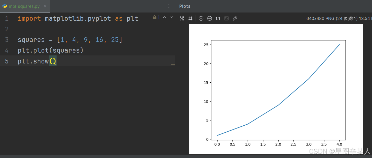
import matplotlib.pyplot as plt

squares = [1, 4, 9, 16, 25]
plt.plot(squares)
plt.show()
模块pyplot包含很多用于生成图表的函数。
(1)修改标签文字和线条粗细
python
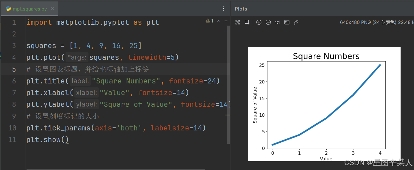
import matplotlib.pyplot as plt

squares = [1, 4, 9, 16, 25]
plt.plot(squares, linewidth=5)
# 设置图表标题,并给坐标轴加上标签
plt.title("Square Numbers", fontsize=24)
plt.xlabel("Value", fontsize=14)
plt.ylabel("Square of Value", fontsize=14)
# 设置刻度标记的大小
plt.tick_params(axis='both', labelsize=14)
plt.show()
参数linewidth决定了plot()绘制的线条的粗细。函数title()给图表指定标题。在上述代码中,出现了多次的参数fontsize指定了图表中文字的大小。
函数xlabel()和ylabel()让你能够为每条轴设置标题;而函数tick_params()设置刻度的样式,其中指定的实参将影响x轴和y轴上的刻度(axis='both'),并将刻度标记的字号设置为14。
(2)校正图形
当你向plot()提供一系列数字时,它假设第一个数据点对应的 x 坐标值为0,但我们的第一个点对应的 x 值为1。为改变这种默认行为,我们可以给plot()同时提供输入值和输出值
python
import matplotlib.pyplot as plt

input_values = [1, 2, 3, 4, 5]
squares = [1, 4, 9, 16, 25]
plt.plot(input_values, squares, linewidth=5)
# 设置图表标题,并给坐标轴加上标签
plt.title("Square Numbers", fontsize=24)
plt.xlabel("Value", fontsize=14)
plt.ylabel("Square of Value", fontsize=14)
# 设置刻度标记的大小
plt.tick_params(axis='both', labelsize=14)
plt.show()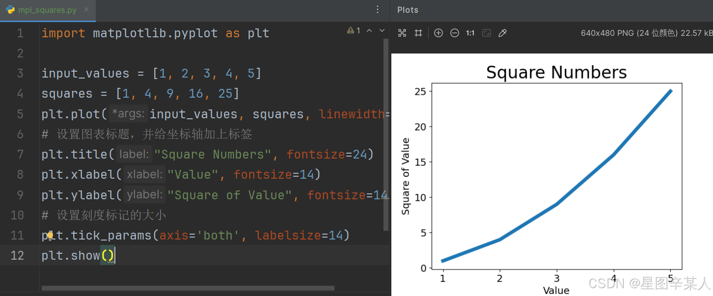
(3)使用scatter()绘制散点图并设置其样式
有时候,需要绘制散点图并设置各个数据点的样式。要绘制单个点,可使用函数scatter(),并向它传递一对 x 和 y 坐标,它将在指定位置绘制一个点
python
import matplotlib.pyplot as plt

plt.scatter(2, 4)
plt.show()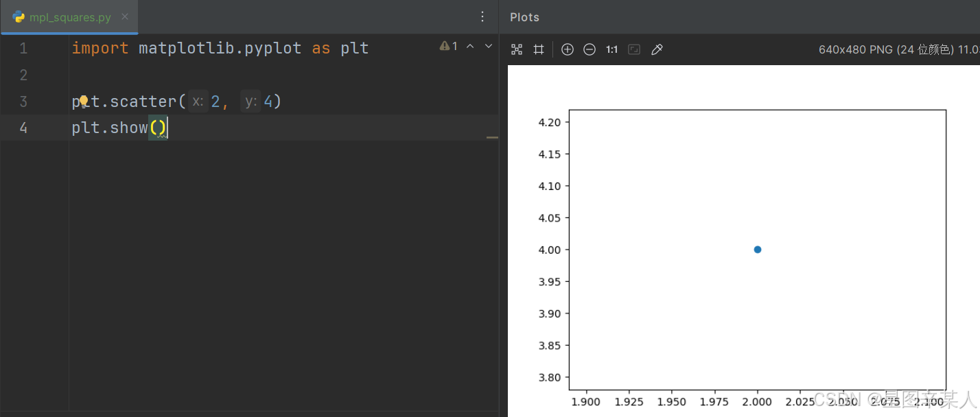
下面来设置输出的样式,使其更有趣:添加标题,给轴加上标签,并确保所有文本都大到能够看清
python
import matplotlib.pyplot as plt

plt.scatter(2, 4, s=200)
# 设置图表标题并给坐标轴加上标签
plt.title("Square Numbers", fontsize=24)
plt.xlabel("Value", fontsize=14)
plt.ylabel("Square of Value", fontsize=14)
# 设置刻度标记的大小
plt.tick_params(axis='both', which='major', labelsize=14)
plt.show()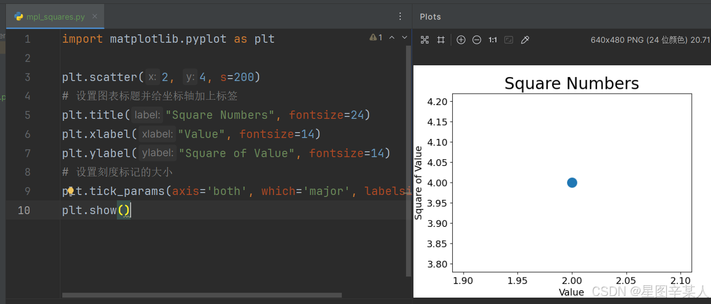
(4)使用scatter()绘制一系列点
要绘制一系列的点,可向scatter()传递两个分别包含x值和y值的列表
python
import matplotlib.pyplot as plt

x_values = [1, 2, 3, 4, 5]
y_values = [1, 4, 9, 16, 25]
plt.scatter(x_values, y_values, s=100)
# 设置图表标题并给坐标轴加上标签
plt.title("Square Numbers", fontsize=24)
plt.xlabel("Value", fontsize=14)
plt.ylabel("Square of Value", fontsize=14)
# 设置刻度标记的大小
plt.tick_params(axis='both', which='major', labelsize=14)
plt.show()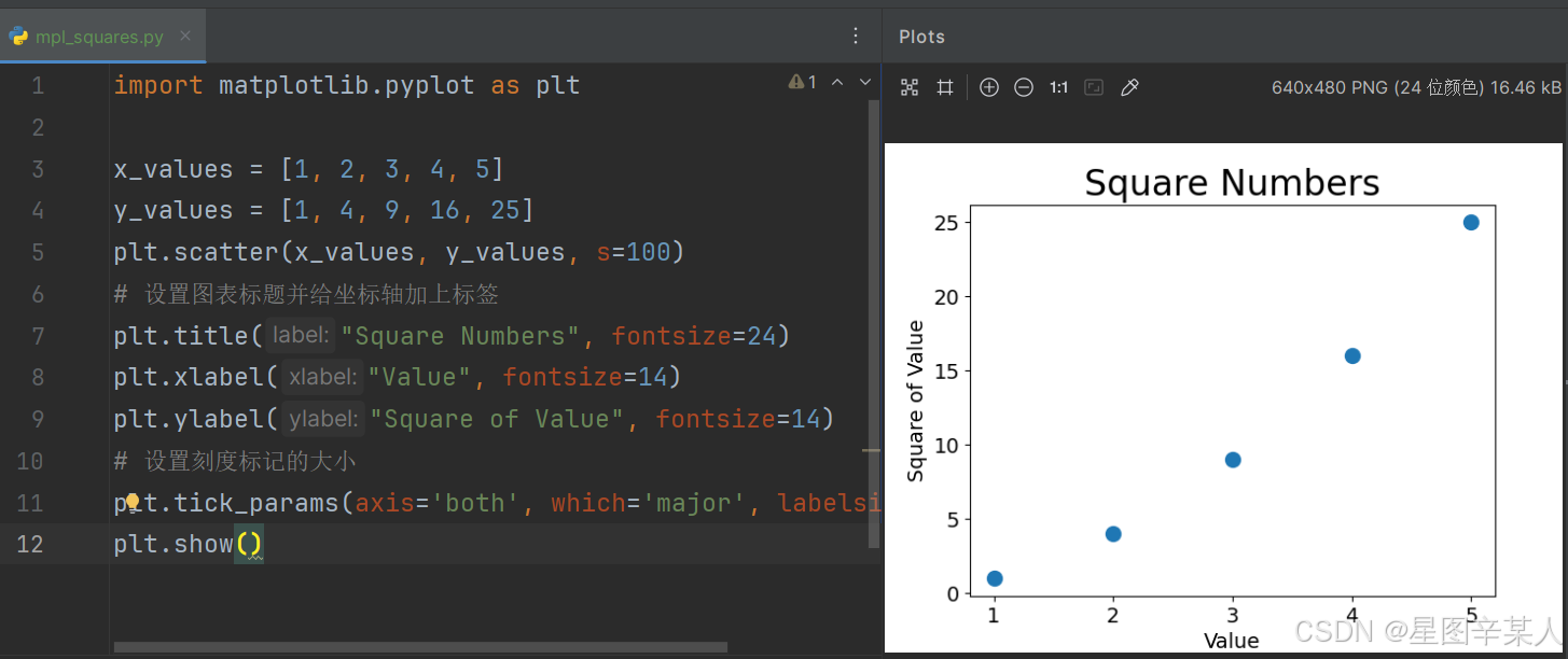
(5)自动计算数据
可以不必手工计算包含点坐标的列表,而让Python循环来替我们完成这种计算
python
import matplotlib.pyplot as plt

x_values = list(range(1, 1001))
y_values = [x**2 for x in x_values]
plt.scatter(x_values, y_values, s=40)
# 设置图表标题并给坐标轴加上标签
plt.title("Square Numbers", fontsize=24)
plt.xlabel("Value", fontsize=14)
plt.ylabel("Square of Value", fontsize=14)
# 设置刻度标记的大小
plt.tick_params(axis='both', which='major', labelsize=14)
# 设置每个坐标轴的取值范围
plt.axis([0, 1100, 0, 1100000])
plt.show()
函数axis()要求提供四个值:x 和 y 坐标轴的最小值和最大值。
(6)删除数据点的轮廓
matplotlib允许你给散点图中的各个点指定颜色。默认为蓝色点无轮廓,要修改数据点的轮廓,可在调用scatter()时传递实参edgecolor。
python
import matplotlib.pyplot as plt

x_values = list(range(1, 1001))
y_values = [x**2 for x in x_values]
plt.scatter(x_values, y_values, edgecolor='red', s=40)
# 设置图表标题并给坐标轴加上标签
plt.title("Square Numbers", fontsize=24)
plt.xlabel("Value", fontsize=14)
plt.ylabel("Square of Value", fontsize=14)
# 设置刻度标记的大小
plt.tick_params(axis='both', which='major', labelsize=14)
# 设置每个坐标轴的取值范围
plt.axis([0, 1100, 0, 1100000])
plt.show()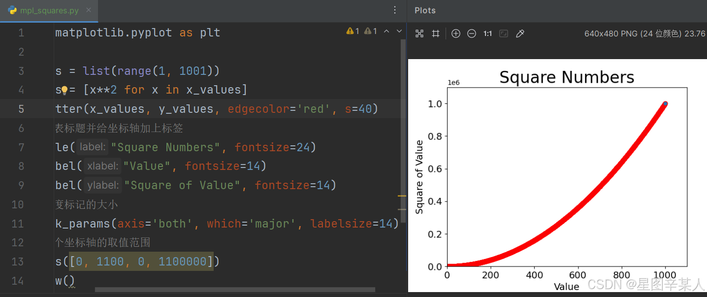
(7)自定义颜色
要修改数据点的颜色,可向scatter()传递参数c,并将其设置为要使用的颜色的名称
python
plt.scatter(x_values, y_values, c='red', edgecolor='none', s=40)你还可以使用RGB颜色模式自定义颜色。要指定自定义颜色,可传递参数c,并将其设置为一个元组,其中包含三个0~1之间的小数值,它们分别表示红色、绿色和蓝色分量。
python
import matplotlib.pyplot as plt

x_values = list(range(1, 1001))
y_values = [x**2 for x in x_values]
plt.scatter(x_values, y_values, c=(0, 0, 0.8), edgecolor='none',
s=40)
# 设置图表标题并给坐标轴加上标签
plt.title("Square Numbers", fontsize=24)
plt.xlabel("Value", fontsize=14)
plt.ylabel("Square of Value", fontsize=14)
# 设置刻度标记的大小
plt.tick_params(axis='both', which='major', labelsize=14)
# 设置每个坐标轴的取值范围
plt.axis([0, 1100, 0, 1100000])
plt.show()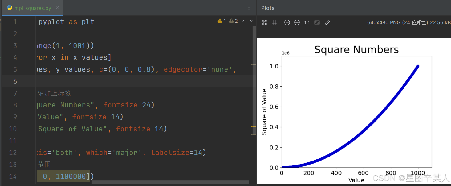
值越接近0,指定的颜色越深,值越接近1,指定的颜色越浅
(8)使用颜色映射
颜色映射(colormap)是一系列颜色,它们从起始颜色渐变到结束颜色。在可视化中,颜色映射用于突出数据的规律。模块pyplot内置了一组颜色映射。要使用这些颜色映射,你需要告诉pyplot该如何设置数据集中每个点的颜色。
python
import matplotlib.pyplot as plt

x_values = list(range(1, 1001))
y_values = [x**2 for x in x_values]
plt.scatter(x_values, y_values, c=y_values, cmap=plt.cm.Blues,
edgecolor='none', s=40)
# 设置图表标题并给坐标轴加上标签
plt.title("Square Numbers", fontsize=24)
plt.xlabel("Value", fontsize=14)
plt.ylabel("Square of Value", fontsize=14)
# 设置刻度标记的大小
plt.tick_params(axis='both', which='major', labelsize=14)
# 设置每个坐标轴的取值范围
plt.axis([0, 1100, 0, 1100000])
plt.show()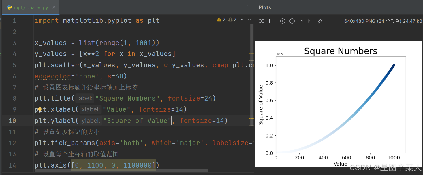
我们将参数c设置成了一个 y 值列表,并使用参数cmap告诉pyplot使用哪个颜色映射。这些代码将 y 值较小的点显示为浅蓝色,并将 y值较大的点显示为深蓝色。
(9)自动保存图表
要让程序自动将图表保存到文件中,可将对plt.show()的调用替换为对plt.savefig()的调用
python
plt.savefig('squares_plot.png', bbox_inches='tight')第一个实参指定要以什么样的文件名保存图表,第二个实参指定将图表多余的空白区域裁剪掉。如果要保留图表周围多余的空白区域,可省略这个实参。
2.随机漫步
随机漫步是这样行走得到的路径:每次行走都完全是随机的,没有明确的方向,结果是由一系列随机决策决定的。
(1)创建RandomWalk()类
为模拟随机漫步,我们将创建一个名为RandomWalk的类,它随机地选择前进方向。这个类需要三个属性,其中一个是存储随机漫步次数的变量,其他两个是列表,分别存储随机漫步经过的每个点的 x 和 y坐标。
RandomWalk类只包含两个方法:init()和fill_walk(),其中后者计算随机漫步经过的所有点。下面先来看看__init__()
python
from random import choice

class RandomWalk():
    """一个生成随机漫步数据的类"""
    def __init__(self, num_points=5000):
        """初始化随机漫步的属性"""
        self.num_points = num_points
        # 所有随机漫步都始于(0, 0)
        self.x_values = [0]
        self.y_values = [0]
为做出随机决策,我们将所有可能的选择都存储在一个列表中,并在每次做决策时都使用choice()来决定使用哪种选择。接下来,我们将随机漫步包含的默认点数设置为5000,这大到足以生成有趣的模式,同时又足够小,可确保能够快速地模拟随机漫步。然后,我们创建了两个用于存储x和y值的列表,并让每次漫步都从点(0, 0)出发。
(2)选择方向
我们将使用fill_walk()来生成漫步包含的点,并决定每次漫步的方向
python
    def fill_walk(self):
        """计算随机漫步包含的所有点"""
        # 不断漫步,直到列表达到指定的长度
        while len(self.x_values) < self.num_points:
            # 决定前进方向以及沿这个方向前进的距离
            x_direction = choice([1, -1])
            x_distance = choice([0, 1, 2, 3, 4])
            x_step = x_direction * x_distance
            y_direction = choice([1, -1])
            y_distance = choice([0, 1, 2, 3, 4])
            y_step = y_direction * y_distance
            # 拒绝原地踏步
            if x_step == 0 and y_step == 0:
                continue
            # 计算下一个点的x和y值
            next_x = self.x_values[-1] + x_step
            next_y = self.y_values[-1] + y_step
            self.x_values.append(next_x)
            self.y_values.append(next_y)
(3)绘制随机漫步图
python
from matplotlib import pyplot as plt
from radomwalk import RandomWalk

# 创建一个RandomWalk实例,并将其包含的点都绘制出来
rw = RandomWalk()
rw.fill_walk()
plt.scatter(rw.x_values, rw.y_values)
plt.show()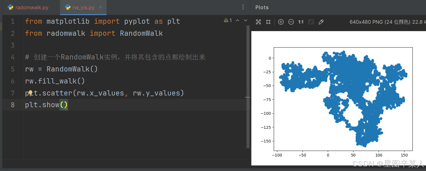
(4)模拟多次随机漫步
python
from matplotlib import pyplot as plt
from radomwalk import RandomWalk

while True:
    rw = RandomWalk()
    rw.fill_walk()
    plt.scatter(rw.x_values, rw.y_values)
    plt.show()
    label=input("Make another photo(y/n):")
    if label=='n':
        break;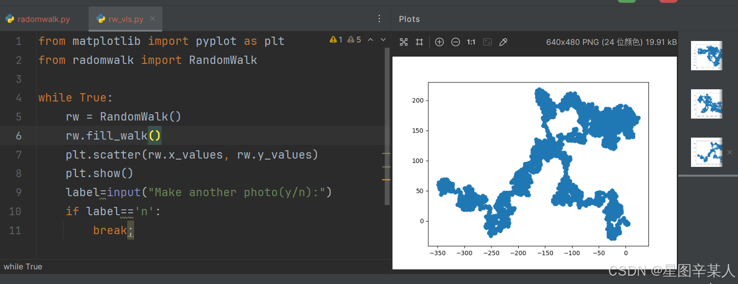
(5)给点着色
我们将使用颜色映射来指出漫步中各点的先后顺序,为根据漫步中各点的先后顺序进行着色,我们传递参数c,并将其设置为一个列表,其中包含各点的先后顺序。由于这些点是按顺序绘制的,因此给参数c指定的列表只需包含数字1~5000。
python
from matplotlib import pyplot as plt
from radomwalk import RandomWalk

while True:
    rw = RandomWalk()
    rw.fill_walk()
    point_num=list(range(rw.num_points))
    plt.scatter(rw.x_values, rw.y_values, c=point_num,cmap=plt.cm.Blues,s=15)
    plt.show()
    label=input("Make another photo(y/n):")
    if label=='n':
        break;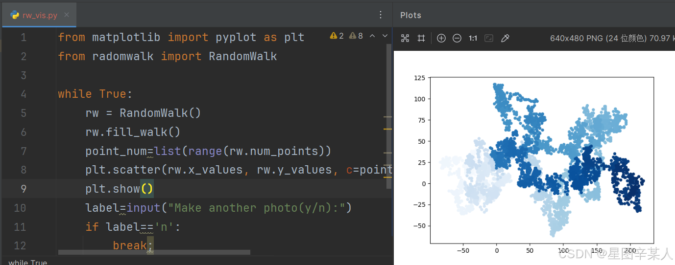
(6)重新绘制起点和终点
除了给随机漫步的各个点着色,以指出它们的先后顺序外,如果还能呈现随机漫步的起点和终点就更好了。为此,可在绘制随机漫步图后重新绘制起点和终点。我们让起点和终点变得更大,并显示为不同的颜色,以突出它们。
python
from matplotlib import pyplot as plt
from radomwalk import RandomWalk

while True:
    rw = RandomWalk()
    rw.fill_walk()
    point_num=list(range(rw.num_points))
    plt.scatter(rw.x_values, rw.y_values, c=point_num,
                cmap=plt.cm.Blues,
                edgecolor='none', s=15)
    # 突出起点和终点
    plt.scatter(0, 0, c='green', edgecolors='none', s=100)
    plt.scatter(rw.x_values[-1], rw.y_values[-1], c='red',
                edgecolors='none',
                s=100)
    plt.show()
    label=input("Make another photo(y/n):")
    if label=='n':
        break;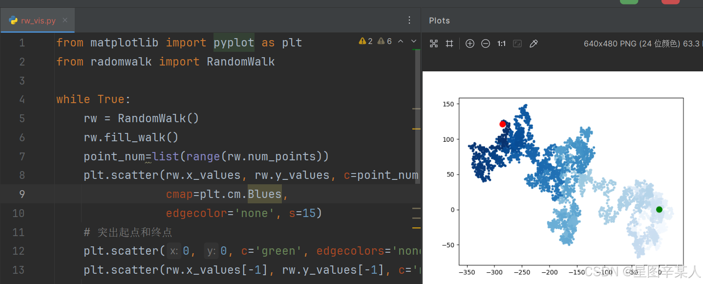
(7)隐藏坐标轴
为修改坐标轴,使用了函数plt.axes()来将每条坐标轴的可见性都设置为False。
python
from matplotlib import pyplot as plt
from radomwalk import RandomWalk

while True:
    rw = RandomWalk()
    rw.fill_walk()
    point_num=list(range(rw.num_points))
    # 隐藏坐标轴
    ax=plt.axes()
    ax.get_xaxis().set_visible(False)
    ax.get_yaxis().set_visible(False)
    plt.scatter(rw.x_values, rw.y_values, c=point_num,
                cmap=plt.cm.Blues,
                edgecolor='none', s=15)
    # 突出起点和终点
    plt.scatter(0, 0, c='green', edgecolors='none', s=100)
    plt.scatter(rw.x_values[-1], rw.y_values[-1], c='red',
                edgecolors='none',
                s=100)

    plt.show()
    label=input("Make another photo(y/n):")
    if label=='n':
        break;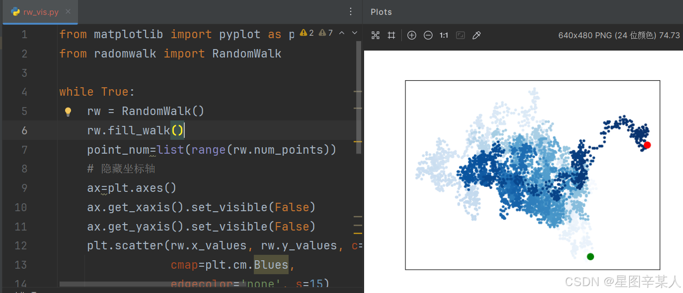
(8)调整尺寸以适合屏幕
python
from matplotlib import pyplot as plt
from radomwalk import RandomWalk

while True:
    rw = RandomWalk()
    rw.fill_walk()
    point_num=list(range(rw.num_points))
    # 设置绘图窗口的尺寸
    plt.figure(figsize=(10, 6))
    # 隐藏坐标轴
    ax = plt.axes()
    ax.get_xaxis().set_visible(False)
    ax.get_yaxis().set_visible(False)
    plt.scatter(rw.x_values, rw.y_values, c=point_num,
                cmap=plt.cm.Blues,
                edgecolor='none', s=15)
    # 突出起点和终点
    plt.scatter(0, 0, c='green', edgecolors='none', s=100)
    plt.scatter(rw.x_values[-1], rw.y_values[-1], c='red',
                edgecolors='none',
                s=100)

    plt.show()
    label=input("Make another photo(y/n):")
    if label=='n':
        break;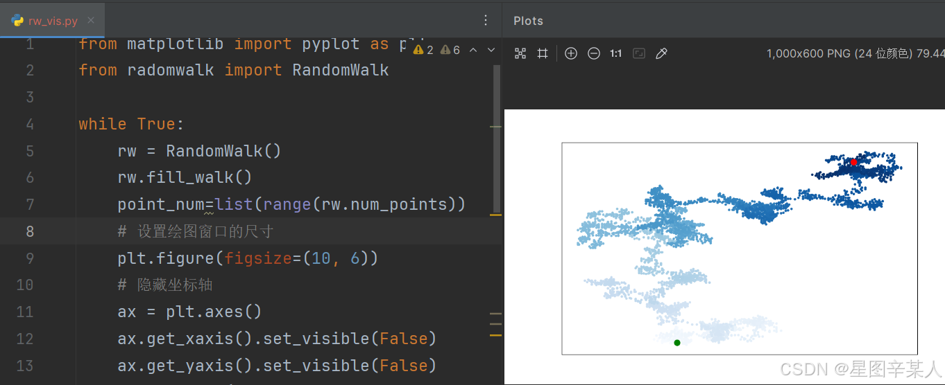
函数figure()用于指定图表的宽度、高度、分辨率和背景色。你需要给形参figsize指定一个元组,向matplotlib指出绘图窗口的尺寸,单位为英寸。
Python假定屏幕分辨率为80像素/英寸,如果上述代码指定的图表尺寸不合适,可根据需要调整其中的数字。如果你知道自己的系统的分辨率,可使用形参dpi向figure()传递该分辨率,以有效地利用可用的屏幕空间
python
plt.figure(dpi=128, figsize=(10, 6))3.使用Pygal模拟掷骰子
我们将使用Python可视化包Pygal来生成可缩放的矢量图形文件。对于需要在尺寸不同的屏幕上显示的图表,这很有用,因为它们将自动缩放,以适合观看者的屏幕。
(1)创建Die类
python
from random import randint

class Die():
    """表示一个骰子的类"""
    def __init__(self, num_sides=6):
        """骰子默认为6面"""
        self.num_sides = num_sides
    def roll(self):
        """"返回一个位于1和骰子面数之间的随机值"""
        return randint(1, self.num_sides)
(2)掷骰子
python
from die import Die
# 创建一个D6
die = Die()
# 掷几次骰子,并将结果存储在一个列表中
results = []
for roll_num in range(100):
    result = die.roll()
    results.append(result)
print(results)
(3)分析结果
为分析掷一个D6骰子的结果,我们计算每个点数出现的次数
python
from die import Die
# 创建一个D6
die = Die()
# 掷几次骰子,并将结果存储在一个列表中
results = []
for roll_num in range(100):
    result = die.roll()
    results.append(result)
# 分析结果
frequencies = []
for value in range(1, die.num_sides+1):
    frequency = results.count(value)
    frequencies.append(frequency)
print(frequencies)
(4)绘制直方图
有了频率列表后,我们就可以绘制一个表示结果的直方图。
python
from die import Die
import pygal

# 创建一个D6
die = Die()
# 掷几次骰子,并将结果存储在一个列表中
results = []
for roll_num in range(1000):
    result = die.roll()
    results.append(result)
# 分析结果
frequencies = []
for value in range(1, die.num_sides+1):
    frequency = results.count(value)
    frequencies.append(frequency)

# 对结果进行可视化
hist = pygal.Bar()
hist.title = "Results of rolling one D6 1000 times."
hist.x_labels = ['1', '2', '3', '4', '5', '6']
hist.x_title = "Result"
hist.y_title = "Frequency of Result"
hist.add('D6', frequencies)
hist.render_to_file('die_visual.svg')
为创建条形图,我们创建了一个pygal.Bar()实例,并将其存储在hist中。接下来,我们设置hist的属性title,将掷D6骰子的可能结果用作 x 轴的标签,并给每个轴都添加了标题。我们使用add()将一系列值添加到图表中(向它传递要给添加的值指定的标签,还有一个列表,其中包含将出现在图表中的值)。最后,我们将这个图表渲染为一个SVG文件,这种文件的扩展名为.svg。
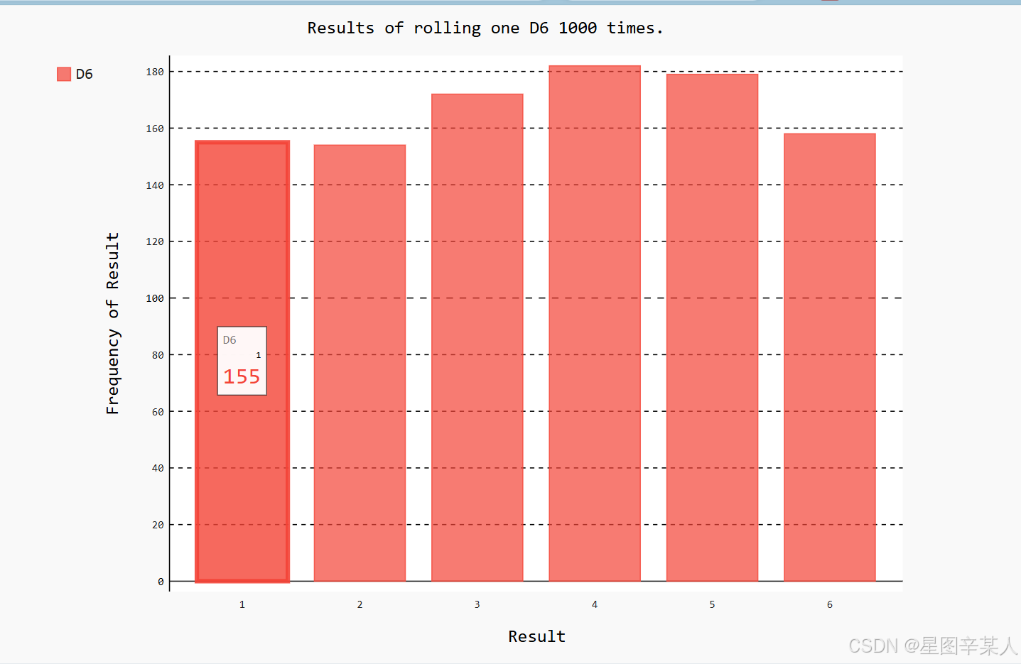
Pygal让这个图表具有交互性:如果你将鼠标指向该图表中的任何条形,将看到与之相关联的数据。
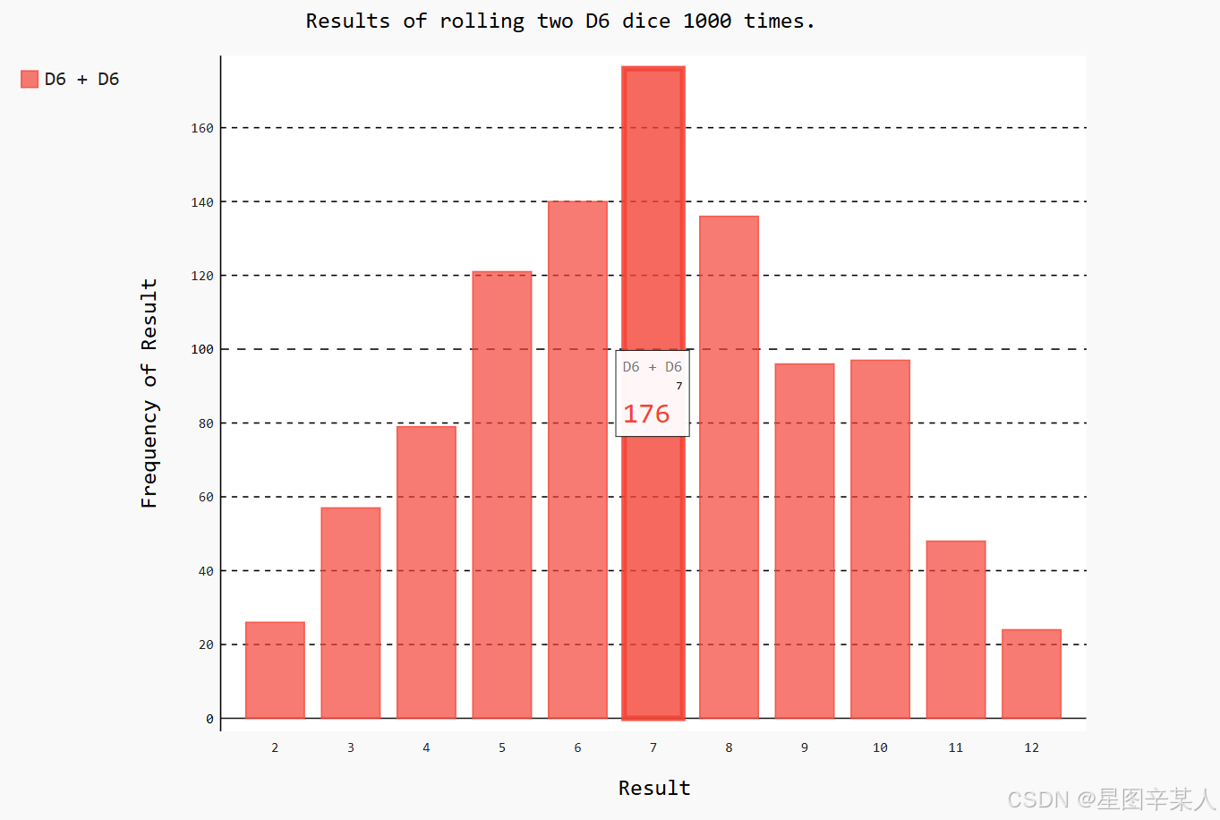
(5)同时掷两个骰子
python
import pygal
from die import Die
# 创建两个D6骰子
die_1 = Die()
die_2 = Die()
# 掷骰子多次,并将结果存储到一个列表中
results = []
for roll_num in range(1000):
    result = die_1.roll() + die_2.roll()
    results.append(result)
# 分析结果
frequencies = []
max_result = die_1.num_sides + die_2.num_sides
for value in range(2, max_result+1):
    frequency = results.count(value)
    frequencies.append(frequency)
# 可视化结果
hist = pygal.Bar()
hist.title = "Results of rolling two D6 dice 1000 times."
hist.x_labels = ['2', '3', '4', '5', '6', '7', '8', '9', '10','11', '12']
hist.x_title = "Result"
hist.y_title = "Frequency of Result"
hist.add('D6 + D6', frequencies)
hist.render_to_file('dice_visual.svg')
创建两个Die实例后,我们掷骰子多次,并计算每次的总点数。
四、下载数据
1.CSV文件格式
要在文本文件中存储数据,最简单的方式是将数据作为一系列以逗号分隔的值(CSV)写入文件。这样的文件称为CSV文件。
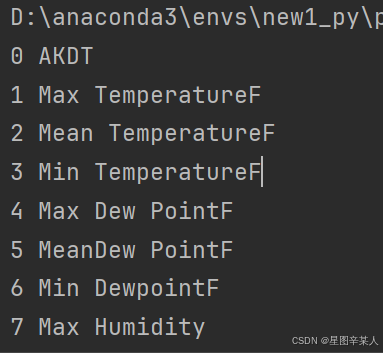
(1)分析CSV文件头
csv模块包含在Python标准库中,可用于分析CSV文件中的数据行,让我们能够快速提取感兴趣的值。
python
import csv

filename = 'sitka_weather_07-2014.csv'
with open(filename) as f:
    reader = csv.reader(f)
    header_row = next(reader)
    print(header_row)
导入模块csv后,我们将要使用的文件的名称存储在filename中。接下来,我们打开这个文件,并将结果文件对象存储在f中。然后,我们调用csv.reader(),并将前面存储的文件对象作为实参传递给它,从而创建一个与该文件相关联的阅读器(reader)对象。模块csv包含函数next(),调用它并将阅读器对象传递给它时,它将返回文件中的下一行。
(2)打印文件头及其位置
为让文件头数据更容易理解,将列表中的每个文件头及其位置打印出来
python
import csv

filename = 'sitka_weather_07-2014.csv'
with open(filename) as f:
    reader = csv.reader(f)
    header_row = next(reader)
    for index, column_header in enumerate(header_row):
        print(index, column_header)
我们对列表调用了enumerate()来获取每个元素的索引及其值。
(3)提取并读取数据
python
import csv

filename = 'sitka_weather_07-2014.csv'
with open(filename) as f:
    reader = csv.reader(f)
    header_row = next(reader)
    highs = []
    for row in reader:
        highs.append(row[1])
    print(highs)
我们创建了一个名为highs的空列表,再遍历文件中余下的各行。阅读器对象从其停留的地方继续往下读取CSV文件,每次都自动返回当前所处位置的下一行。由于我们已经读取了文件头行,这个循环将从第二行开始------从这行开始包含的是实际数据。
(4)绘制气温图表
python
import csv
from matplotlib import pyplot as plt

filename = 'sitka_weather_07-2014.csv'
with open(filename) as f:
    reader = csv.reader(f)
    header_row = next(reader)
    highs = []
    for row in reader:
        highs.append(int(row[1]))
    print(highs)
# 根据数据绘制图形
fig = plt.figure(dpi=128, figsize=(10, 6))
plt.plot(highs, c='red')
# 设置图形的格式
plt.title("Daily high temperatures, July 2014", fontsize=24)
plt.xlabel('', fontsize=16)
plt.ylabel("Temperature (F)", fontsize=16)
plt.tick_params(axis='both', which='major', labelsize=16)
plt.show()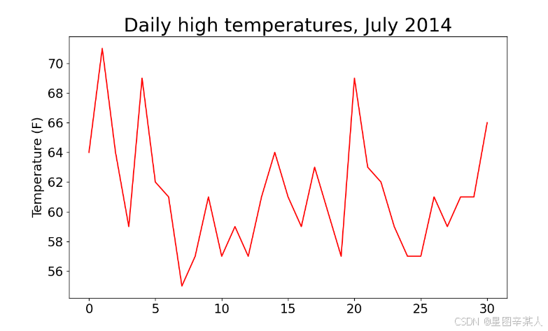
(5)模块datetime
读取日期数据时,获得的是一个字符串,因为我们需要想办法将字符串'2014-7-1'转换为一个表示相应日期的对象。
为创建一个表示2014年7月1日的对象,可使用模块datetime中的方法strptime()。
python
>>> from datetime import datetime
>>> first_date = datetime.strptime('2014-7-1', '%Y-%m-%d')
>>> print(first_date)
2014-07-01 00:00:00
我们首先导入了模块datetime中的datetime类,然后调用方法strptime(),并将包含所需日期的字符串作为第一个实参。第二个实参告诉Python如何设置日期的格式。
|----|---------------------|
| 实参 | 含义 |
| %A | 星期名,如Monday |
| %B | 月份名,如May |
| %m | 用数字表示的月份(01~12) |
| %d | 用数字表示月份中的一天(01~31) |
| %Y | 四位的年份,如2015 |
| %y | 两位的年份,如15 |
| %H | 24小时制的小时数(00~23) |
| %I | 12小时制的小时数(01~12) |
| %p | am或pm |
| %M | 分钟数(00~59) |
| %S | 秒数(00~59) |
(6)在图表中添加日期
python
import csv
from datetime import datetime
from matplotlib import pyplot as plt

# 从文件中获取日期和最高气温
filename = 'sitka_weather_07-2014.csv'
with open(filename) as f:
    reader = csv.reader(f)
    header_row = next(reader)
    dates, highs = [], []
    for row in reader:
        current_date = datetime.strptime(row[0], "%Y-%m-%d")
        dates.append(current_date)
        highs.append(int(row[1]))
# 根据数据绘制图形
fig = plt.figure(dpi=128, figsize=(10, 6))
plt.plot(dates, highs, c='red')
# 设置图形的格式
plt.title("Daily high temperatures, July 2014", fontsize=24)
plt.xlabel('', fontsize=16)
fig.autofmt_xdate()
plt.ylabel("Temperature (F)", fontsize=16)
plt.tick_params(axis='both', which='major', labelsize=16)
plt.show()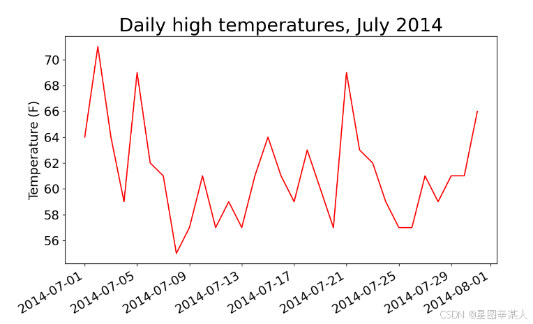
我们调用了fig.autofmt_xdate()来绘制斜的日期标签,以免它们彼此重叠。
(7)再绘制一个数据系列
python
import csv
from datetime import datetime
from matplotlib import pyplot as plt

# 从文件中获取日期和最高气温
filename = 'sitka_weather_2014.csv'
with open(filename) as f:
    reader = csv.reader(f)
    header_row = next(reader)
    dates, highs,lows = [], [],[]
    for row in reader:
        current_date = datetime.strptime(row[0], "%Y-%m-%d")
        dates.append(current_date)
        highs.append(int(row[1]))
        lows.append(int(row[3]))
# 根据数据绘制图形
fig = plt.figure(dpi=128, figsize=(10, 6))
plt.plot(dates, highs, c='red')
plt.plot(dates, lows, c='blue')
# 设置图形的格式
plt.title("Daily high and low temperatures - 2014", fontsize=24)
plt.xlabel('', fontsize=16)
fig.autofmt_xdate()
plt.ylabel("Temperature (F)", fontsize=16)
plt.tick_params(axis='both', which='major', labelsize=16)
plt.show()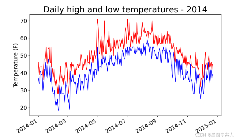
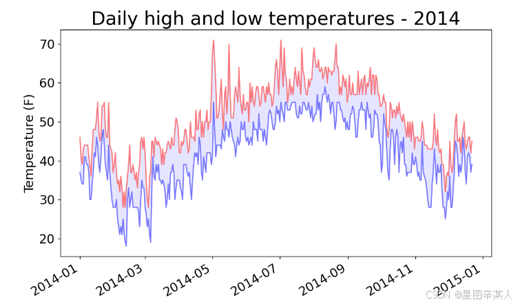
(8)给图表区域着色
我们将使用方法fill_between(),它接受一个 x 值系列和两个 y 值系列,并填充两个 y 值系列之间的空间
python
import csv
from datetime import datetime
from matplotlib import pyplot as plt

# 从文件中获取日期和最高气温
filename = 'sitka_weather_2014.csv'
with open(filename) as f:
    reader = csv.reader(f)
    header_row = next(reader)
    dates, highs,lows = [], [],[]
    for row in reader:
        current_date = datetime.strptime(row[0], "%Y-%m-%d")
        dates.append(current_date)
        highs.append(int(row[1]))
        lows.append(int(row[3]))
# 根据数据绘制图形
fig = plt.figure(dpi=128, figsize=(10, 6))
plt.plot(dates, highs, c='red',alpha=0.5)
plt.plot(dates, lows, c='blue',alpha=0.5)
plt.fill_between(dates, highs, lows, facecolor='blue', alpha=0.1)
# 设置图形的格式
plt.title("Daily high and low temperatures - 2014", fontsize=24)
plt.xlabel('', fontsize=12)
fig.autofmt_xdate()
plt.ylabel("Temperature (F)", fontsize=16)
plt.tick_params(axis='both', which='major', labelsize=16)
plt.show()
实参alpha指定颜色的透明度。Alpha值为0表示完全透明,1(默认设置)表示完全不透明。
(9)错误检查
将文件death_valley_2014.csv复制到本章程序所在的文件夹,再修改highs_lows.py,使其生成死亡谷的气温图
python
import csv
from datetime import datetime
from matplotlib import pyplot as plt

# 从文件中获取日期和最高气温
filename = 'death_valley_2014.csv'
with open(filename) as f:
    reader = csv.reader(f)
    header_row = next(reader)
    dates, highs,lows = [], [],[]
    for row in reader:
        current_date = datetime.strptime(row[0], "%Y-%m-%d")
        dates.append(current_date)
        highs.append(int(row[1]))
        lows.append(int(row[3]))
# 根据数据绘制图形
fig = plt.figure(dpi=128, figsize=(10, 6))
plt.plot(dates, highs, c='red',alpha=0.5)
plt.plot(dates, lows, c='blue',alpha=0.5)
plt.fill_between(dates, highs, lows, facecolor='blue', alpha=0.1)
# 设置图形的格式
plt.title("Daily high and low temperatures - 2014", fontsize=24)
plt.xlabel('', fontsize=12)
fig.autofmt_xdate()
plt.ylabel("Temperature (F)", fontsize=16)
plt.tick_params(axis='both', which='major', labelsize=16)
plt.show()
会报错
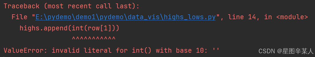
该traceback指出,Python无法处理其中一天的最高气温,因为它无法将空字符串(' ')转换为整数。为解决这种问题,我们在从CSV文件中读取值时执行错误检查代码,对分析数据集时可能出现的异常进行处理。
python
import csv
from datetime import datetime
from matplotlib import pyplot as plt

# 从文件中获取日期和最高气温
filename = 'death_valley_2014.csv'
with open(filename) as f:
    reader = csv.reader(f)
    header_row = next(reader)
    dates, highs,lows = [], [],[]
    for row in reader:
        try:
            current_date = datetime.strptime(row[0], "%Y-%m-%d")
            high=int(row[1])
            low=int(row[3])
        except ValueError:
            print(current_date,'missing data')
        else:
            dates.append(current_date)
            highs.append(high)
            lows.append(low)
# 根据数据绘制图形
fig = plt.figure(dpi=128, figsize=(10, 6))
plt.plot(dates, highs, c='red',alpha=0.5)
plt.plot(dates, lows, c='blue',alpha=0.5)
plt.fill_between(dates, highs, lows, facecolor='blue', alpha=0.1)
# 设置图形的格式
title = "Daily high and low temperatures - 2014\nDeath Valley, CA"
plt.title(title, fontsize=20)
plt.xlabel('', fontsize=12)
fig.autofmt_xdate()
plt.ylabel("Temperature (F)", fontsize=16)
plt.tick_params(axis='both', which='major', labelsize=16)
plt.show()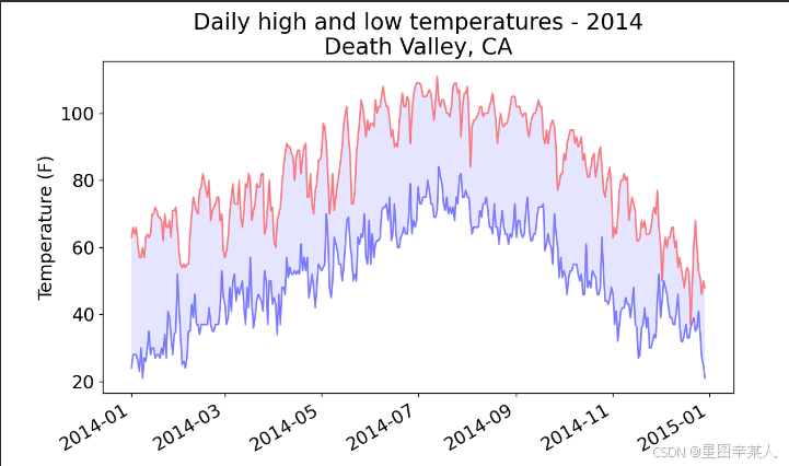
2.制作交易收盘价走势图:JSON 格式
(1)下载收盘价数据
收盘价数据文件位于https://raw.githubusercontent.com/muxuezi/btc/master/btc_close_2017.json。
[
{
"date": "2017-01-01",
"month": "01",
"week": "52",
"weekday": "Sunday",
"close": "6928.6492"
},
--snip--
{
"date": "2017-12-12",
"month": "12",
"week": "50",
"weekday": "Tuesday",
"close": "113732.6745"
}
]
这个文件实际上就是一个很长的Python列表,其中每个元素都是一个包含五个键的字典:统计日期、月份、周数、周几以及收盘价。由于2017年1月1日是周日,作为2017年的第一周实在太短,因此将其计入2016年的第52周。于是2017年的第一周是从2017年1月2日(周一)开始的。
也可以使用函数urlopen来下载数据
python
from urllib.request import urlopen
import json

json_url ='https://raw.githubusercontent.com/muxuezi/btc/master/btc_close_2017.json'
response = urlopen(json_url)
# 读取数据
req = response.read()
# 将数据写入文件
with open('btc_close_2017_urllib.json','wb') as f:
    f.write(req)
# 加载json格式
file_urllib = json.loads(req)
print(file_urllib)
我们的btc_close_2017.json文件放在GitHub网站上,urlopen(json_url)是将json_url网址传入urlopen函数。这行代码执行后, Python就会向GitHub的服务器发送请求。GitHub的服务器响应请求后把btc_close_2017.json文件发送给Python,之后用response.read()就可以读取文件数据。这时,可以将文件数据保存到文件夹中。最后,我们用函数json.load()将文件内容转换成Python能够处理的格式,与前面直接下载的文件内容一致。
函数urlopen的代码稍微复杂一些,第三方模块requests封装了许多常用的方法,让数据下载和读取方式变得非常简单
python
import requests

json_url ='https://raw.githubusercontent.com/muxuezi/btc/master/btc_close_2017.json'
req = requests.get(json_url)
# 将数据写入文件
with open('btc_close_2017_request.json','w') as f:
 f.write(req.text)
file_requests = req.json()
requests通过get方法向GitHub服务器发送请求。GitHub服务器响应请求后,返回的结果存储在req变量中。req.text属性可以直接读取文件数据,返回格式是字符串。另外,直接用req.json()就可以将btc_close_2017.json文件的数据转换成Python列表file_requests。
(2)提取相关的数据
python
import json

file_name='btc_close_2017.json'
with open(file_name,'r') as f:
    data=json.load(f)
    print(type(data))
for data_row in data:
    print(type(data_row))
    date=data_row['date']
    month=data_row['month']
    week=data_row['week']
    weekday=data_row['weekday']
    close=data_row['close']
    print("{} is month {} week {}, {}, the close price is {}RMB".format(date, month, week, weekday, close))
首先导入模块json,然后将数据存储在data中。我们遍历了data中的每个元素。每个元素都是一个字典,包含五个键-值对,dict就用来存储字典中的每个键-值对。之后就可以取出所有键的值。
(3)将字符串转换为数字值
为了能在后面的内容中对交易数据进行计算,需要先将表示周数和收盘价的字符串转换为数值。
python
import json

file_name='btc_close_2017.json'
with open(file_name,'r') as f:
    data=json.load(f)
    print(type(data))
for data_row in data:
    date=data_row['date']
    month=int(data_row['month'])
    week=int(data_row['week'])
    weekday=data_row['weekday']
    close=int(float(data_row['close']))
    print("{} is month {} week {}, {}, the close price is {}RMB".format(date, month, week, weekday, close))
(4)绘制收盘价折线图
绘制折线图之前,需要获取x 轴与y 轴数据,因此我们创建了几个列表来存储数据。
python
import json

file_name='btc_close_2017.json'
with open(file_name,'r') as f:
    data=json.load(f)
dates=[]
months=[]
weeks=[]
weekdays=[]
close=[]
for data_row in data:
    dates.append(data_row['date'])
    months.append(int(data_row['month']))
    weeks.append(int(data_row['week']))
    weekdays.append(data_row['weekday'])
    close.append(int(float(data_row['close'])))
有了x 轴与y 轴的数据,就可以绘制折线图了。由于数据点比较多,x轴要显示346个日期,在有限的屏幕上会显得十分拥挤。因此我们需要利用Pygal的配置参数,对图形进行适当的调整。
python
import json
import pygal

file_name='btc_close_2017.json'
with open(file_name,'r') as f:
    data=json.load(f)
dates=[]
months=[]
weeks=[]
weekdays=[]
close=[]
for data_row in data:
    dates.append(data_row['date'])
    months.append(int(data_row['month']))
    weeks.append(int(data_row['week']))
    weekdays.append(data_row['weekday'])
    close.append(int(float(data_row['close'])))
line_chart = pygal.Line(x_label_rotation=20,show_minor_x_labels=False)
line_chart.title = '收盘价(¥)'
line_chart.x_labels = dates
N = 20 # x轴坐标每隔20天显示一次
line_chart.x_labels_major = dates[::N]
line_chart.add('收盘价', close)
line_chart.render_to_file('收盘价折线图(¥).svg')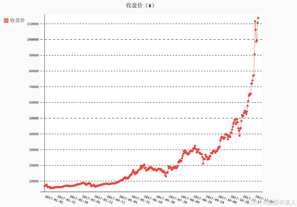
首先导入模块pygal,然后在创建Line实例时,分别设置了x_label_rotation与show_minor_x_ labels作为初始化参数。x_label_rotation=20让x 轴上的日期标签顺时针旋转20°,show_minor_x_labels=False则告诉图形不用显示所有的x轴标签。设置了图形的标题和x 轴标签之后,我们配置x_labels_major属性,让x 轴坐标每隔20天显示一次。
(5)时间序列特征初探
进行时间序列分析总是期望发现趋势(trend)、周期性(seasonality)和噪声(noise),从而能够描述事实、预测未来、做出决策。从收盘价的折线图可以看出,2017年的总体趋势是非线性
的,而且增长幅度不断增大,似乎呈指数分布。但是,我们还发现,在每个季度末(3月、6月和9月)似乎有一些相似的波动。尽管这些波动被增长的趋势掩盖了,不过其中也许有周期性。为了验证周期性的假设,需要首先将非线性的趋势消除。对数变换(log transformation)是常用的处理方法之一。让我们用Python标准库的数学模块math来解决这个问题。math里有许多常用的数学函数,这里用以10为底的对数函数math.log10计算收盘价,日期仍然保持不变。这种方式称为半对数(semi-logarithmic)变换。
python
import json
import pygal
import math

file_name='btc_close_2017.json'
with open(file_name,'r') as f:
    data=json.load(f)
dates=[]
months=[]
weeks=[]
weekdays=[]
close=[]
for data_row in data:
    dates.append(data_row['date'])
    months.append(int(data_row['month']))
    weeks.append(int(data_row['week']))
    weekdays.append(data_row['weekday'])
    close.append(int(float(data_row['close'])))
line_chart = pygal.Line(x_label_rotation=20,show_minor_x_labels=False)
line_chart.title = '收盘价对数变换(¥)'
line_chart.x_labels = dates
N = 20 # x轴坐标每隔20天显示一次
line_chart.x_labels_major = dates[::N]
close_log = [math.log10(_) for _ in close]
line_chart.add('log收盘价', close_log)
line_chart.render_to_file('收盘价对数变换折线图(¥).svg')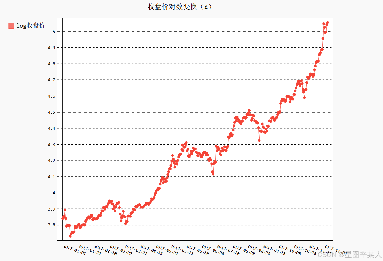
现在,用对数变换剔除非线性趋势之后,整体上涨的趋势更接近线性增长。从图中可以清晰地看出,收盘价在每个季度末似乎有显著的周期性------3月、6月和9月都出现了剧烈的波动。
(6)收盘价均值
下面再利用btc_close_2017.json文件中的数据,绘制2017年前11个月的日均值、前49周(2017-01-02~2017-12-10)的日均值,以及每周中各天(Monday~Sunday)的日均值。虽然这些日均值的数值不同,但都是一段时间的均值,计算方法是一样的。
由于需要将数据按月份、周数、周几分组,再计算每组的均值,因此我们导入Python标准库中模块itertools的函数groupby。然后将x 轴与y 轴的数据合并、排序,再用函数groupby分组。分组之后,求出每组的均值,存储到xy_map变量中。最后,将xy_map中存储的x 轴与y 轴数据分离,就可以像之前那样用Pygal画图了。下面我们画出收盘价月日均值。由于2017年12月的数据并不完整,我们只取2017年1月到11月的数据。通过dates查找2017-12-01的索引位置,确定周数和收盘价的取数范围。
python
import json
import pygal
import math
from itertools import groupby

def draw_line(x_data, y_data, title, y_legend):
    xy_map = []
    for x, y in groupby(sorted(zip(x_data, y_data)), key=lambda _:_[0]):
        y_list = [v for _, v in y]
        xy_map.append([x, sum(y_list) / len(y_list)])
    x_unique, y_mean = [*zip(*xy_map)]
    line_chart = pygal.Line()
    line_chart.title = title
    line_chart.x_labels = x_unique
    line_chart.add(y_legend, y_mean)
    line_chart.render_to_file(title+'.svg')
    return line_chart

file_name='btc_close_2017.json'
with open(file_name,'r') as f:
    data=json.load(f)
dates=[]
months=[]
weeks=[]
weekdays=[]
close=[]
for data_row in data:
    dates.append(data_row['date'])
    months.append(int(data_row['month']))
    weeks.append(int(data_row['week']))
    weekdays.append(data_row['weekday'])
    close.append(int(float(data_row['close'])))
idx_month = dates.index('2017-12-01')
line_chart_month = draw_line(months[:idx_month],close[:idx_month], '收盘价月日均值(¥)','月日均值')
line_chart_month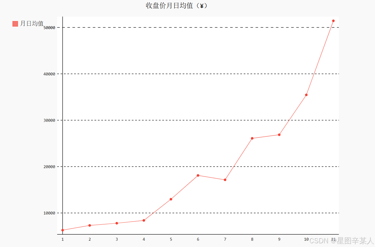
下面再来绘制前49周(2017-01-02~2017-12-10)的日均值。2017年1月1日是周日,归属为2016年第52周,因此2017年的第一周从2017年1月2日开始,取数时需要将第一天去掉。另外,2017年第49周周日是2017年12月10日,因此我们通过dates查找2017-12-11的索引位置,确定周数和收盘价的取数范围。
python
import json
import pygal
import math
from itertools import groupby

def draw_line(x_data, y_data, title, y_legend):
    xy_map = []
    for x, y in groupby(sorted(zip(x_data, y_data)), key=lambda _:_[0]):
        y_list = [v for _, v in y]
        xy_map.append([x, sum(y_list) / len(y_list)])
    x_unique, y_mean = [*zip(*xy_map)]
    line_chart = pygal.Line()
    line_chart.title = title
    line_chart.x_labels = x_unique
    line_chart.add(y_legend, y_mean)
    line_chart.render_to_file(title+'.svg')
    return line_chart

file_name='btc_close_2017.json'
with open(file_name,'r') as f:
    data=json.load(f)
dates=[]
months=[]
weeks=[]
weekdays=[]
close=[]
for data_row in data:
    dates.append(data_row['date'])
    months.append(int(data_row['month']))
    weeks.append(int(data_row['week']))
    weekdays.append(data_row['weekday'])
    close.append(int(float(data_row['close'])))
idx_week = dates.index('2017-12-11')
line_chart_week = draw_line(weeks[1:idx_week], close[1:idx_week],'收盘价周日均值(¥)', '周日均值')
line_chart_week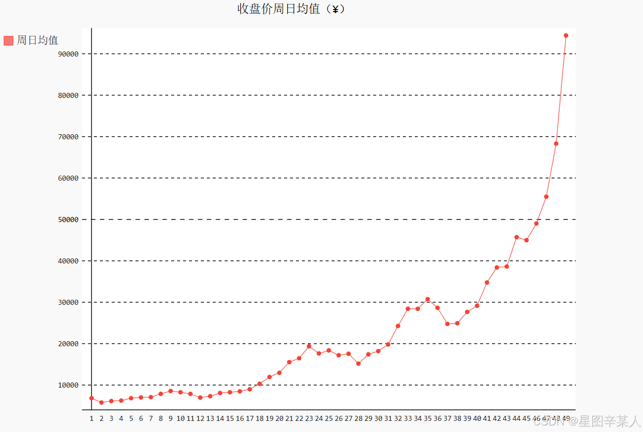
最后,绘制每周中各天的均值。为了使用完整的时间段,还像前面那样取前49周(2017-01-02~2017-12-10)的数据,同样通过dates查找2017-12-11的索引位置,确定周数和收盘价的取数范围。但是,由于这里的周几是字符串,按周一到周日的顺序排列,而不是单词首字母的顺序,绘图时x 轴标签的顺序会有问题。另外,原来的周几都是英文单词,还可以将其调整为中文。因此,需要对前面的程序做一些特殊处理。
python
import json
import pygal
import math
from itertools import groupby

def draw_line(x_data, y_data, title, y_legend):
    xy_map = []
    for x, y in groupby(sorted(zip(x_data, y_data)), key=lambda _:_[0]):
        y_list = [v for _, v in y]
        xy_map.append([x, sum(y_list) / len(y_list)])
    x_unique, y_mean = [*zip(*xy_map)]
    line_chart = pygal.Line()
    line_chart.title = title
    line_chart.x_labels = x_unique
    line_chart.add(y_legend, y_mean)
    line_chart.render_to_file(title+'.svg')
    return line_chart

file_name='btc_close_2017.json'
with open(file_name,'r') as f:
    data=json.load(f)
dates=[]
months=[]
weeks=[]
weekdays=[]
close=[]
for data_row in data:
    dates.append(data_row['date'])
    months.append(int(data_row['month']))
    weeks.append(int(data_row['week']))
    weekdays.append(data_row['weekday'])
    close.append(int(float(data_row['close'])))
idx_week = dates.index('2017-12-11')
wd = ['Monday', 'Tuesday', 'Wednesday', 'Thursday', 'Friday','Saturday','Sunday']
weekdays_int = [wd.index(w) + 1 for w in weekdays[1:idx_week]]
line_chart_weekday = draw_line(weekdays_int, close[1:idx_week],'收盘价星期均值(¥)','星期均值')
line_chart_weekday.x_labels = ['周一','周二','周三','周四','周五','周六','周日']
line_chart_weekday.render_to_file('收盘价星期均值(¥).svg')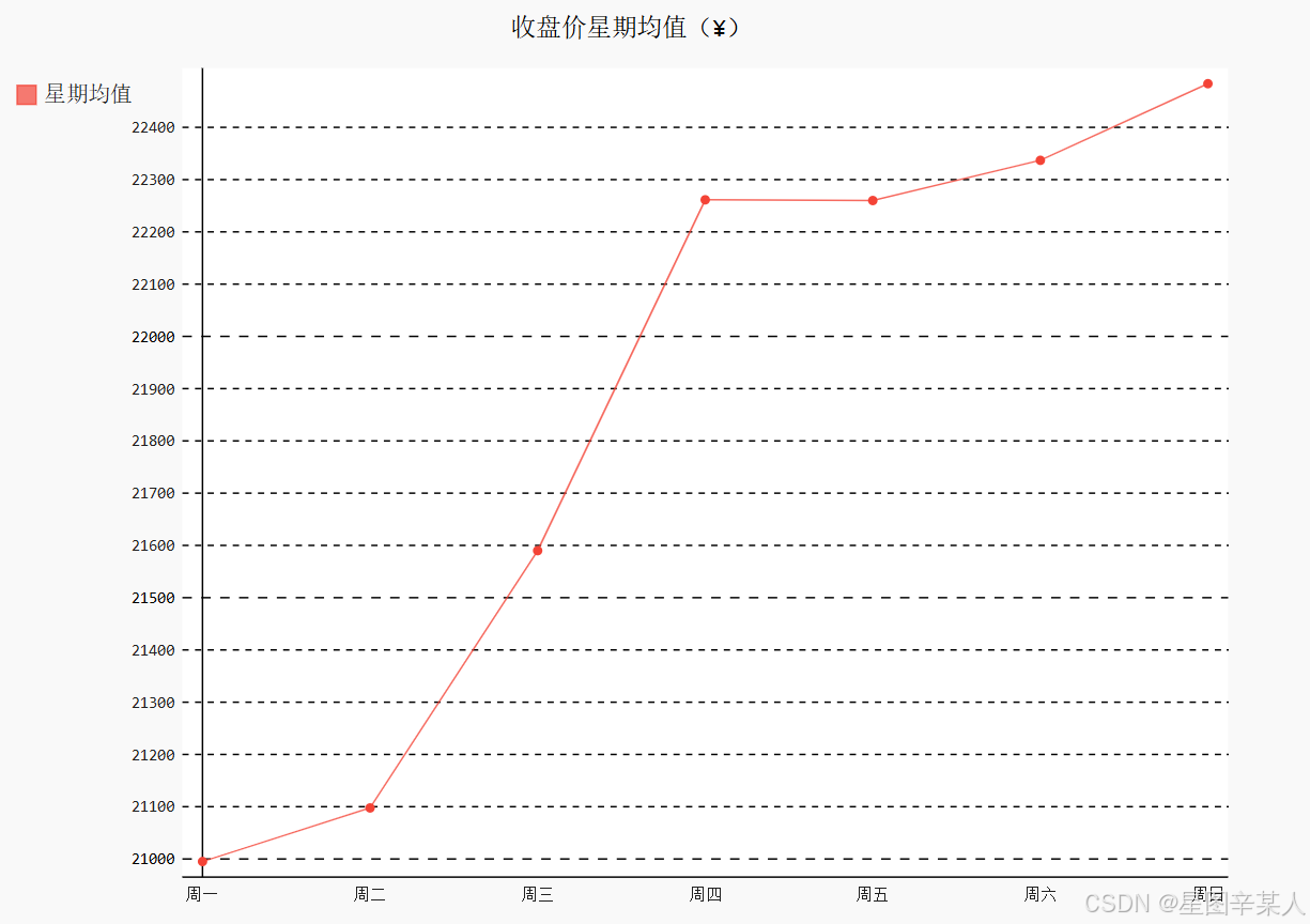
首先,我们列出一周七天的英文单词,然后将weekdays的内容替换成1~7的整数。这样函数draw_line在处理数据时按周几的顺序排列,就会将周一放在列表的第一位,周日放在列表的第七位。图形生成之后,再将图形的x轴标签替换为中文。
(7)收盘价数据仪表盘
如果能够将之前的图片整合在一起,就可以很方便地进行长期管理、监测和分析。另外,新的图表也可以十分方便地加入进来,这样就形成了一个数据仪表盘(dashboard)。
python
with open('收盘价Dashboard.html', 'w', encoding='utf8') as html_file:
    html_file.write('<html><head><title>收盘价Dashboard</title><meta charset="utf-8"></head><body>\n')
    for svg in ['收盘价折线图(¥).svg', '收盘价对数变换折线图(¥).svg', '收盘价月日均值(¥).svg','收盘价周日均值(¥).svg', '收盘价星期均值(¥).svg']:
        html_file.write(' <object type="image/svg+xml" data="{0}" height=500></object>\n'.format(svg))
        html_file.write('</body></html>')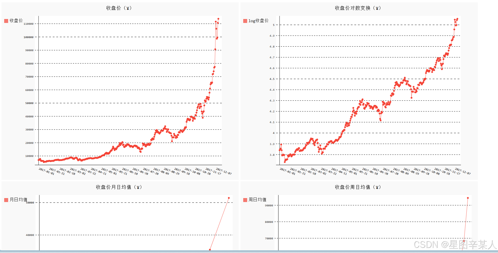
和常见网络应用的数据仪表盘一样,我们的数据仪表盘也是一个完整的网页(HTML文件)。首先,需要创建一个名为收盘价Dashboard.html的网页文件,然后将每幅图都添加到页面中。这里设置SVG图形的默认高度为500像素,由于SVG是矢量图,可以任意缩放且不失真,因此可以通过放大或缩小网页来调整视觉效果。
五、使用API
1.使用Web API
Web API是网站的一部分,用于与使用非常具体的URL请求特定信息的程序交互。这种请求称为API调用。请求的数据将以易于处理的格式(如JSON或CSV)返回。
我们将使用GitHub的API来请求有关该网站中Python项目的信息,然后使用Pygal生成交互式可视化,以呈现这些项目的受欢迎程度。
(1)使用API调用请求数据
GitHub的API让你能够通过API调用来请求各种信息。https://api.github.com/search/repositories?
q=language:python&sort=stars,这个调用返回GitHub当前托管了多少个Python项目,还有有关最受欢迎的Python仓库的信息。
第一部分(https://api.github.com/)将请求发送到GitHub网站中响应API调用的部分;接下来的一部分(search/repositories)让API搜索GitHub上的所有仓库。
repositories后面的问号指出我们要传递一个实参。q表示查询,而等号让我们能够开始指定查询(q=)。通过使用language:python,我们指出只想获取主要语言为Python的仓库的信息。最后一部分(&sort=stars)指定将项目按其获得的星级进行排序。
python
{
    "total_count": 14898979,
    "incomplete_results": true,
    "items": [
        {
            "id": 54346799,
            "node_id": "MDEwOlJlcG9zaXRvcnk1NDM0Njc5OQ==",
            "name": "public-apis",
            "full_name": "public-apis/public-apis",
            "private": false,
GitHub总共有14898979个Python项目。"incomplete_results"的值为true,据此我们知道请求是
不完整的。倘若GitHub无法全面处理该API,它返回的这个值将为true。接下来的列表中显示了返回的"items",其中包含GitHub上最受欢迎的Python项目的详细信息。
(2)处理API响应
python
import requests

url = 'https://api.github.com/search/repositories?q=language:python&sort=stars'
r=requests.get(url)
print("Status Code:",r.status_code)

dic=r.json()
print(dic.keys())
我们导入了模块requests,我们存储API调用的URL,然后使用requests来执行调用。我们调用get()并将URL传递给它,再将响应对象存储在变量r中。响应对象包含一个名为status_code的属性,它让我们知道请求是否成功了(状态码200表示请求成功)。这个API返回JSON格式的信息,因此我们使用方法json()将这些信息转换为一个Python字典。
(3)处理响应字典
python
import requests

url = 'https://api.github.com/search/repositories?q=language:python&sort=stars'
r=requests.get(url)
print("Status Code:", r.status_code)

dic=r.json()
print("Total repositories:", dic['total_count'])

repo_dicts=dic['items']
print("Repositories returned:", len(repo_dicts))

repo_dict = repo_dicts[0]
print("\nKeys:", len(repo_dict))
for key in sorted(repo_dict.keys()):
    print(key)
与'items'相关联的值是一个列表,其中包含很多字典,而每个字典都包含有关一个Python仓库的信息。我们将这个字典列表存储在repo_dicts中。
接下来研究第一个仓库
python
import requests

url = 'https://api.github.com/search/repositories?q=language:python&sort=stars'
r=requests.get(url)
print("Status Code:", r.status_code)

dic=r.json()
print("Total repositories:", dic['total_count'])

repo_dicts=dic['items']
print("Repositories returned:", len(repo_dicts))
#研究第一个仓库
repo_dict = repo_dicts[0]
print("\nSelected information from the first repository:")
print("Name:", repo_dict['name'])
print("owner:", repo_dict['owner']['login'])
print("stargazers:", repo_dict['stargazers_count'])
print("repository:",repo_dict['html_url'])
print("created_at:", repo_dict['created_at'])
print("updated_at:", repo_dict['updated_at'])
print("Description:", repo_dict['description'])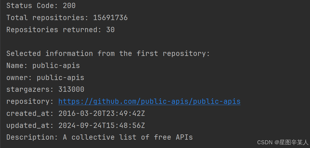
(4)概述最受欢迎的仓库
python
import requests

url = 'https://api.github.com/search/repositories?q=language:python&sort=stars'
r=requests.get(url)
print("Status Code:", r.status_code)

dic=r.json()
print("Total repositories:", dic['total_count'])

repo_dicts=dic['items']
print("Repositories returned:", len(repo_dicts))

print("\nSelected information from the first repository:")
for repo in repo_dicts:
    print("\nName:", repo['name'])
    print("Owner:", repo['owner']['login'])
    print("Stars:", repo['stargazers_count'])
    print("Repository URL:", repo['html_url'])
    print("Description:", repo['description'])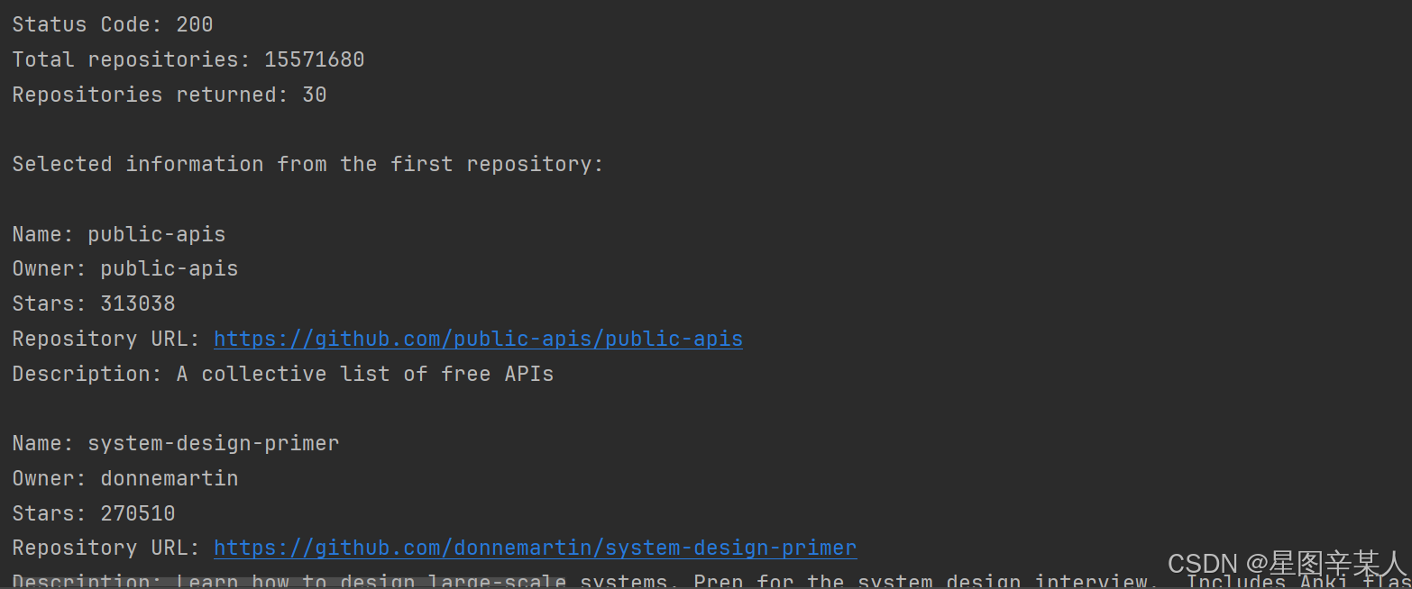
(5)监视API的速率限制
大多数API都存在速率限制,即你在特定时间内可执行的请求数存在限制。要获悉你是否接近了GitHub的限制,请在浏览器中输入https://api.github.com/rate_limit。
python
{
    "resources": {
        "core": {
            "limit": 60,
            "remaining": 56,
            "reset": 1727230456,
            "used": 4,
            "resource": "core"
        },
        "graphql": {
            "limit": 0,
            "remaining": 0,
            "reset": 1727232054,
            "used": 0,
            "resource": "graphql"
        },
        "integration_manifest": {
            "limit": 5000,
            "remaining": 5000,
            "reset": 1727232054,
            "used": 0,
            "resource": "integration_manifest"
        },
        "search": {
            "limit": 10,
            "remaining": 10,
            "reset": 1727228514,
            "used": 0,
            "resource": "search"
        }
    },
    "rate": {
        "limit": 60,
        "remaining": 56,
        "reset": 1727230456,
        "used": 4,
        "resource": "core"
    }
}
我们关心的信息是search API的速率限制。极限为每分钟10个请求,而在当前这一分钟内,我们还可执行10个请求。reset值指的是配额将重置的Unix时间或新纪元时间(1970年1月1日午夜后多少秒)。用完配额后,你将收到一条简单的响应,由此知道已到达API极限。到达极限后,你必须等待配额重置。
2.使用Pygal可视化仓库
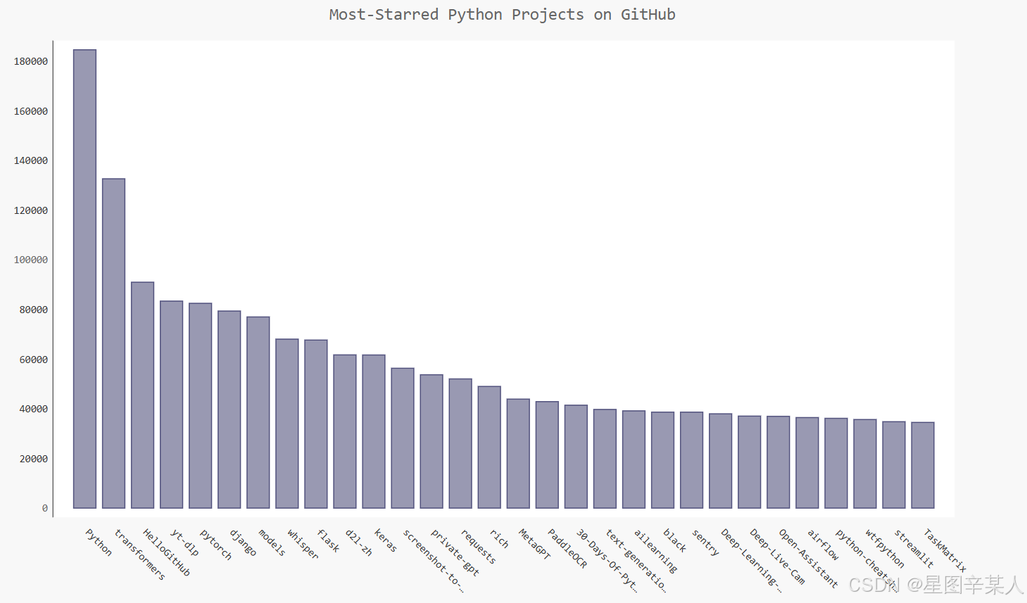
我们将创建一个交互式条形图:条形的高度表示项目获得了多少颗星。单击条形将带你进入项目在GitHub上的主页。
python
import requests
import pygal
from pygal.style import LightColorizedStyle as LCS,LightenStyle as LS
# 执行API调用并存储响应
url = 'https://api.github.com/search/repositories?q=language:python&sort=stars'
r=requests.get(url)
print("Status Code:", r.status_code)
# 将API响应存储在一个变量中
dic=r.json()
print("Total repositories:", dic['total_count'])
# 研究有关仓库的信息
repo_dicts=dic['items']
names,stars=[],[]
for repo in repo_dicts:
    names.append(repo['name'])
    stars.append(repo['stargazers_count'])

my_style=LS("#333366",base_style=LCS)
chart=pygal.Bar(style=my_style,x_label_rotation=45,show_legend=False)
chart.title = 'Most-Starred Python Projects on GitHub'
chart.x_labels=names
chart.add('',stars)
chart.render_to_file('python_repos.svg')
我们使用LightenStyle类定义了一种样式,并将其基色设置为深蓝色。我们还传递了实参base_style,以使用LightColorizedStyle类。然后,我们使用Bar()创建一个简单的条形图,并向它传递了my_style。我们还传递了另外两个样式实参:让标签绕x轴旋转45度,并隐藏了图例。
(1)改进Pygal图表
我们将进行多个方面的定制,因此先来稍微调整代码的结构,创建一个配置对象,在其中包含要传递给Bar()的所有定制.
python
import requests
import pygal
from pygal.style import LightColorizedStyle as LCS,LightenStyle as LS
# 执行API调用并存储响应
url = 'https://api.github.com/search/repositories?q=language:python&sort=stars'
r=requests.get(url)
print("Status Code:", r.status_code)
# 将API响应存储在一个变量中
dic=r.json()
print("Total repositories:", dic['total_count'])
# 研究有关仓库的信息
repo_dicts=dic['items']
names,stars=[],[]
for repo in repo_dicts:
    names.append(repo['name'])
    stars.append(repo['stargazers_count'])

my_style=LS("#333366",base_style=LCS)
my_config=pygal.Config()
my_config.x_label_rotation=45
my_config.show_legend=False
my_config.title_font_size=24
my_config.label_font_size=14
my_config.major_label_font_size=18
my_config.truncate_label=15
my_config.show_y_guides=False
my_config.width=1000
chart=pygal.Bar(my_config,style=my_style)
chart.title = 'Most-Starred Python Projects on GitHub'
chart.x_labels=names
chart.add('',stars)
chart.render_to_file('python_repos.svg')
我们创建了一个Pygal类Config的实例,并将其命名为my_config。通过修改my_config的属性,可定制图表的外观。我们设置了两个属性------x_label_rotation和show_legend,它们原来是在创建Bar实例时以关键字实参的方式传递的。我们设置了图表标题、副标签和主标签的字体大小。我们使用truncate_label将较长的项目名缩短为15个字符。接下来,我们将show_y_guides设置为False,以隐藏图表中的水平线。最后,设置了自定义宽度,让图表更充分地利用浏览器中的可用空间。
(2)添加自定义工具提示
在Pygal中,将鼠标指向条形将显示它表示的信息,这通常称为工具提示。在这个示例中,当前显示的是项目获得了多少个星。下面来创建一个自定义工具提示,以同时显示项目的描述。
python
import pygal
from pygal.style import LightenStyle as LS,LightColorizedStyle as LCS

my_style = LS('#333366',base_style=LCS)
chart=pygal.Bar(style=my_style,x_label_rotation=45,show_legend=False)
chart.title = 'Python Projects'
chart.x_labels = ['httpie', 'django', 'flask']
plot_dicts = [
{'value': 16101, 'label': 'Description of httpie.'},
{'value': 15028, 'label': 'Description of django.'},
{'value': 14798, 'label': 'Description of flask.'},
]
chart.add('', plot_dicts)
chart.render_to_file('bar_descriptions.svg')
我们定义了一个名为plot_dicts的列表,其中包含三个字典,分别针对项目HTTPie、Django和Flask。每个字典都包含两个键:'value'和'label'。Pygal根据与键'value'相关联的数字来
确定条形的高度,并使用与'label'相关联的字符串给条形创建工具提示。方法add()接受一个字符串和一个列表。这里调用add()时,我们传入了一个由表示条形的字典组成的列表(plot_dicts)。
(3)根据数据绘图
python
import requests
import pygal
from pygal.style import LightColorizedStyle as LCS,LightenStyle as LS
# 执行API调用并存储响应
url = 'https://api.github.com/search/repositories?q=language:python&sort=stars'
r=requests.get(url)
print("Status Code:", r.status_code)
# 将API响应存储在一个变量中
dic=r.json()
print("Total repositories:", dic['total_count'])
# 研究有关仓库的信息
repo_dics=dic['items']
print("Number of repositories:", len(repo_dics))
names,plot_dics=[],[]
for repo in repo_dics:
    names.append(repo['name'])
    plot_dic={'value':repo['stargazers_count'],'label':repo['description']}
    plot_dics.append(plot_dic)
my_style=LS("#333366",base_style=LCS)
my_config=pygal.Config()
my_config.x_label_rotation=45
my_config.show_legend=False
my_config.title_font_size=24
my_config.label_font_size=14
my_config.major_label_font_size=18
my_config.truncate_label=15
my_config.show_y_guides=False
my_config.width=1000
chart=pygal.Bar(my_config,style=my_style)
chart.title = 'Most-Starred Python Projects on GitHub'
chart.x_labels=names
chart.add('',plot_dics)
chart.render_to_file('python_repos.svg')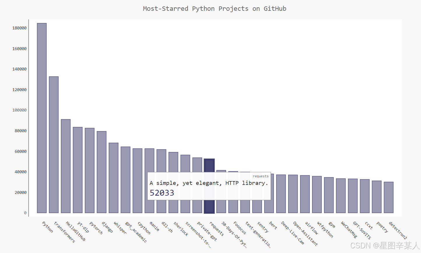
(4)在图表中添加可单击的链接
Pygal还允许你将图表中的每个条形用作网站的链接。为此,只需添加一行代码,在为每个项目创建的字典中,添加一个键为'xlink'的键---值对。
python
import requests
import pygal
from pygal.style import LightColorizedStyle as LCS,LightenStyle as LS
# 执行API调用并存储响应
url = 'https://api.github.com/search/repositories?q=language:python&sort=stars'
r=requests.get(url)
print("Status Code:", r.status_code)
# 将API响应存储在一个变量中
dic=r.json()
print("Total repositories:", dic['total_count'])
# 研究有关仓库的信息
repo_dics=dic['items']
print("Number of repositories:", len(repo_dics))
names,plot_dics=[],[]
for repo in repo_dics:
    names.append(repo['name'])
    plot_dic={'value':repo['stargazers_count'],
              'label':repo['description'],
              'xlink':repo['html_url']}
    plot_dics.append(plot_dic)
my_style=LS("#333366",base_style=LCS)
my_config=pygal.Config()
my_config.x_label_rotation=45
my_config.show_legend=False
my_config.title_font_size=24
my_config.label_font_size=14
my_config.major_label_font_size=18
my_config.truncate_label=15
my_config.show_y_guides=False
my_config.width=1000
chart=pygal.Bar(my_config,style=my_style)
chart.title = 'Most-Starred Python Projects on GitHub'
chart.x_labels=names
chart.add('',plot_dics)
chart.render_to_file('python_repos.svg')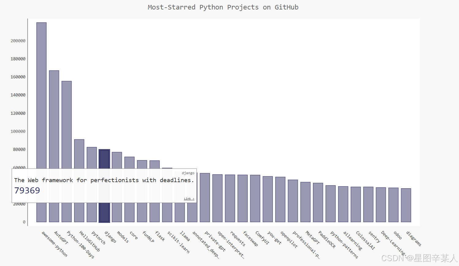
Pygal根据与键'xlink'相关联的URL将每个条形都转换为活跃的链接。单击图表中的任何条形时,都将在浏览器中打开一个新的标签页,并在其中显示相应项目的GitHub页面。
3.Hacker News API
Hacker News网站,用户分享编程和技术方面的文章,并就这些文章展开积极的讨论。Hacker News的API让你能够访问有关该网站所有文章和评论的信息,且不要求你通过注册获得密钥。
我们随便调用一篇文章hacker-news.firebaseio.com/v0/item/41657986.json,响应是一个字典
python
{
    "by": "jkatz05",
    "descendants": 119,
    "id": 41657986,
    "kids": [
        41658517,
        41661613,
        41659060,
        41658988,
        41662705,
        41658824,
        41659428,
        41661214,
        41660697,
        41662115,
        41659044,
        41659790,
        41665752,
        41662688,
        41658804,
        41659104,
        41662742,
        41661314,
        41660248,
        41663448,
        41659016,
        41659644,
        41659132,
        41658033,
        41658030,
        41659636
    ],
    "score": 579,
    "time": 1727356224,
    "title": "PostgreSQL 17",
    "type": "story",
    "url": "https://www.postgresql.org/about/news/postgresql-17-released-2936/"
}
下面来执行一个API调用,返回Hacker News上当前热门文章的ID,再查看每篇排名靠前的文章
python
import requests
from operator import itemgetter

url="https://hacker-news.firebaseio.com/v0/topstories.json"
res=requests.get(url)
print("Status Code:",res.status_code)
data=res.json()
dicts=[]
for row in data[:10]:
    url="https://hacker-news.firebaseio.com/v0/item/"+str(row)+".json"
    res_row=requests.get(url)
    print(res_row.status_code)
    response_dict=res_row.json()
    submission_dict={
        "title":response_dict["title"],
        "link":'http://news.ycombinator.com/item?id='+str(row),
        "comments":response_dict.get("descendants",0)
    }
    dicts.append(submission_dict)

dicts=sorted(dicts,key=itemgetter('comments'),reverse=True)
for dict in dicts:
    print("\nTitle:",dict["title"])
    print("Link:",dict["link"])
    print("Comments:",dict["comments"])
如果文章还没有评论,响应字典中将没有键'descendants'。不确定某个键是否包含在字典中时,可使用方法dict.get(),它在指定的键存在时返回与之相关联的值,并在指定的键不存在时返回你指定的值(这里是0)。
五、源码地址
11xy11/pydemo1 (github.com)或Python编程:从入门到实践 (ituring.com.cn)