Matplotlib数据可视化
Matplotlib 是一个用于创建静态、动态和交互式可视化的Python库。它能够生成图表、直方图、功率谱、条形图、错误图、散点图等,并且可以嵌入到应用程序中,如使用 Tkinter、wxPython 或 PyQt 等 GUI 工具包构建的应用程序。Matplotlib 的灵活性和强大功能使其成为 Python 社区中最受欢迎的数据可视化工具之一。
主要特点
- 广泛的输出格式支持:可以将图形保存为多种文件格式,包括 PNG、PDF、SVG、EPS 和 JPEG。
- 跨平台兼容性:可以在 Windows、macOS 和 Linux 上运行。
- 易于使用的面向对象 API:提供了一个直观的接口来创建复杂的图形。
- 丰富的样式和颜色选项:允许自定义线条样式、标记符号、颜色映射等。
- 与 NumPy 和 Pandas 集成良好:可以直接处理这些库中的数据结构,简化了数据准备过程。
- 多种后端支持:可以选择不同的渲染后端,适用于各种应用场景(如 Web 开发、桌面应用)。
- 动画支持:可以通过 matplotlib.animation 模块制作动画效果。
- 交互式功能:结合 Jupyter Notebook 使用时,可以实现交互式的探索性数据分析。
第六部分 常用视图
第一节 折线图
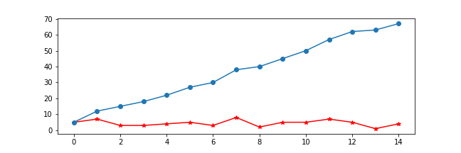
python
import numpy as np
import matplotlib.pyplot as plt
x = np.random.randint(0,10,size = 15)
# 一图多线
plt.figure(figsize=(9,6))
plt.plot(x,marker = '*',color = 'r')
plt.plot(x.cumsum(),marker = 'o')
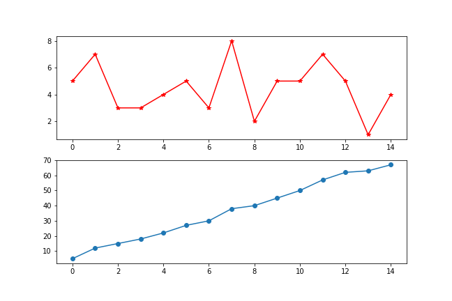
# 多图布局
fig,axs = plt.subplots(2,1)
fig.set_figwidth(9)
fig.set_figheight(6)
axs[0].plot(x,marker = '*',color = 'red')
axs[1].plot(x.cumsum(),marker = 'o')第二节 柱状图
堆叠柱状图
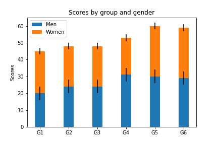
python
import numpy as np
import matplotlib.pyplot as plt
labels = ['G1', 'G2', 'G3', 'G4', 'G5','G6'] # 级别
men_means = np.random.randint(20,35,size = 6)
women_means = np.random.randint(20,35,size = 6)
men_std = np.random.randint(1,7,size = 6)
women_std = np.random.randint(1,7,size = 6)
width = 0.35
plt.bar(labels, # 横坐标
        men_means, # 柱高
        width, # 线宽
        yerr=4, # 误差条
        label='Men')#标签
plt.bar(labels, women_means, width, yerr=2, bottom=men_means,
       label='Women')
plt.ylabel('Scores')
plt.title('Scores by group and gender')
plt.legend()
分组带标签柱状图
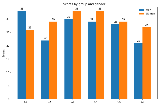
python
import matplotlib
import matplotlib.pyplot as plt
import numpy as np

labels = ['G1', 'G2', 'G3', 'G4', 'G5','G6'] # 级别
men_means = np.random.randint(20,35,size = 6)
women_means = np.random.randint(20,35,size = 6)
x = np.arange(len(men_means))
plt.figure(figsize=(9,6))
width = 0.5
rects1 = plt.bar(x - width/2, men_means, width) # 返回绘图区域对象
rects2 = plt.bar(x + width/2, women_means, width)

# 设置标签标题,图例
plt.ylabel('Scores')
plt.title('Scores by group and gender')
plt.xticks(x,labels)
plt.legend(['Men','Women'])

# 添加注释
def set_label(rects):
    for rect in rects:
        height = rect.get_height() # 获取高度
        plt.text(x = rect.get_x() + rect.get_width()/2, # 水平坐标
                 y = height + 0.5, # 竖直坐标
                 s = height, # 文本
                 ha = 'center') # 水平居中

set_label(rects1)
set_label(rects2)
plt.tight_layout() # 设置紧凑布局
plt.savefig('./分组带标签柱状图.png')
第三节 极坐标图
极坐标线形图
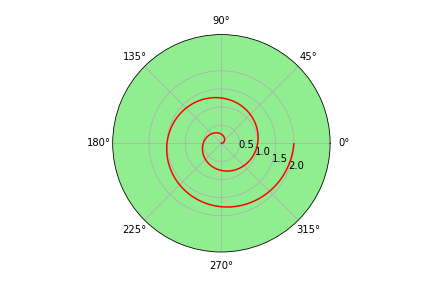
python
import numpy as np
import matplotlib.pyplot as plt

r = np.arange(0, 4*np.pi, 0.01) # 弧度值
y = np.linspace(0,2,len(r)) # 目标值

ax = plt.subplot(111,projection = 'polar',facecolor = 'lightgreen') # 定义极坐标
ax.plot(r, y,color = 'red')
ax.set_rmax(3) # 设置半径最大值
ax.set_rticks([0.5, 1, 1.5, 2])  # 设置半径刻度
ax.set_rlabel_position(-22.5)  # 设置半径刻度位置
ax.grid(True) # 网格线

ax.set_title("A line plot on a polar axis", va='center',ha = 'center',pad = 30)
极坐标柱状图
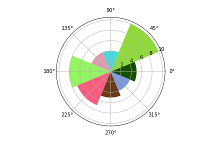
python
import numpy as np
import matplotlib.pyplot as plt
N = 8 # 分成8份
theta = np.linspace(0.0, 2 * np.pi, N, endpoint=False)
radii = np.random.randint(3,15,size = N)
width = np.pi / 4
colors = np.random.rand(8,3) # 随机生成颜色
ax = plt.subplot(111, projection='polar') # polar表示极坐标
ax.bar(theta, radii, width=width, bottom=0.0,color = colors)
第四节 直方图
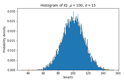
python
import numpy as np
import matplotlib.pyplot as plt

mu = 100 # 平均值
sigma = 15 # 标准差
x = np.random.normal(loc = mu,scale = 15,size = 10000)
fig, ax = plt.subplots()

n, bins, patches = ax.hist(x, 200, density=True) # 直方图

# 概率密度函数
y = ((1 / (np.sqrt(2 * np.pi) * sigma)) *
     np.exp(-0.5 * (1 / sigma * (bins - mu))**2))
plt.plot(bins, y, '--')
plt.xlabel('Smarts')
plt.ylabel('Probability density')
plt.title(r'Histogram of IQ: $\mu=100$, $\sigma=15$')

# 紧凑布局
fig.tight_layout()
plt.savefig('./直方图.png')
第五节 箱形图
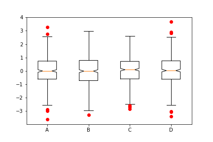
python
import numpy as np
import matplotlib.pyplot as plt
data=np.random.normal(size=(500,4))
lables = ['A','B','C','D']
# 用Matplotlib画箱线图
plt.boxplot(data,1,'gD',labels=lables) # 红色的圆点是异常值
第六节 散点图
散点图的英文叫做 scatter plot,它将两个变量的值显示在二维坐标中,非常适合展示两个变量之间的关系
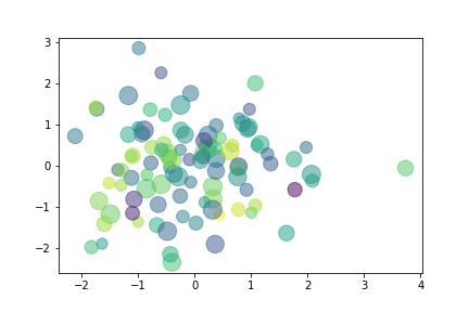
python
import numpy as np
import matplotlib.pyplot as plt
data = np.random.randn(100,2)
s = np.random.randint(100,300,size = 100)
color = np.random.randn(100)

plt.scatter(data[:,0], # 横坐标
            data[:,1], # 纵坐标
            s = s, # 尺寸
            c = color, # 颜色
            alpha = 0.5) # 透明度
第六节 饼图
一般饼图
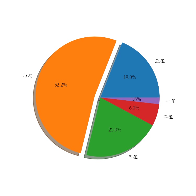
python
import numpy as np
import matplotlib.pyplot as plt
# 解决中文字体乱码的问题
matplotlib.rcParams['font.sans-serif']='Kaiti SC'

labels =["五星","四星","三星","二星","一星"] # 标签
percent = [95,261,105,30,9] # 某市星级酒店数量

# 设置图片大小和分辨率
fig=plt.figure(figsize=(5,5), dpi=150)
# 偏移中心量,突出某一部分
explode = (0, 0.1, 0, 0, 0)
# 绘制饼图:autopct显示百分比,这里保留一位小数;shadow控制是否显示阴影
plt.pie(x = percent, # 数据
        explode=explode, # 偏移中心量
        labels=labels,  # 显示标签
        autopct='%0.1f%%', # 显示百分比
        shadow=True) # 阴影,3D效果
plt.savefig("./饼图.jpg")
嵌套饼图
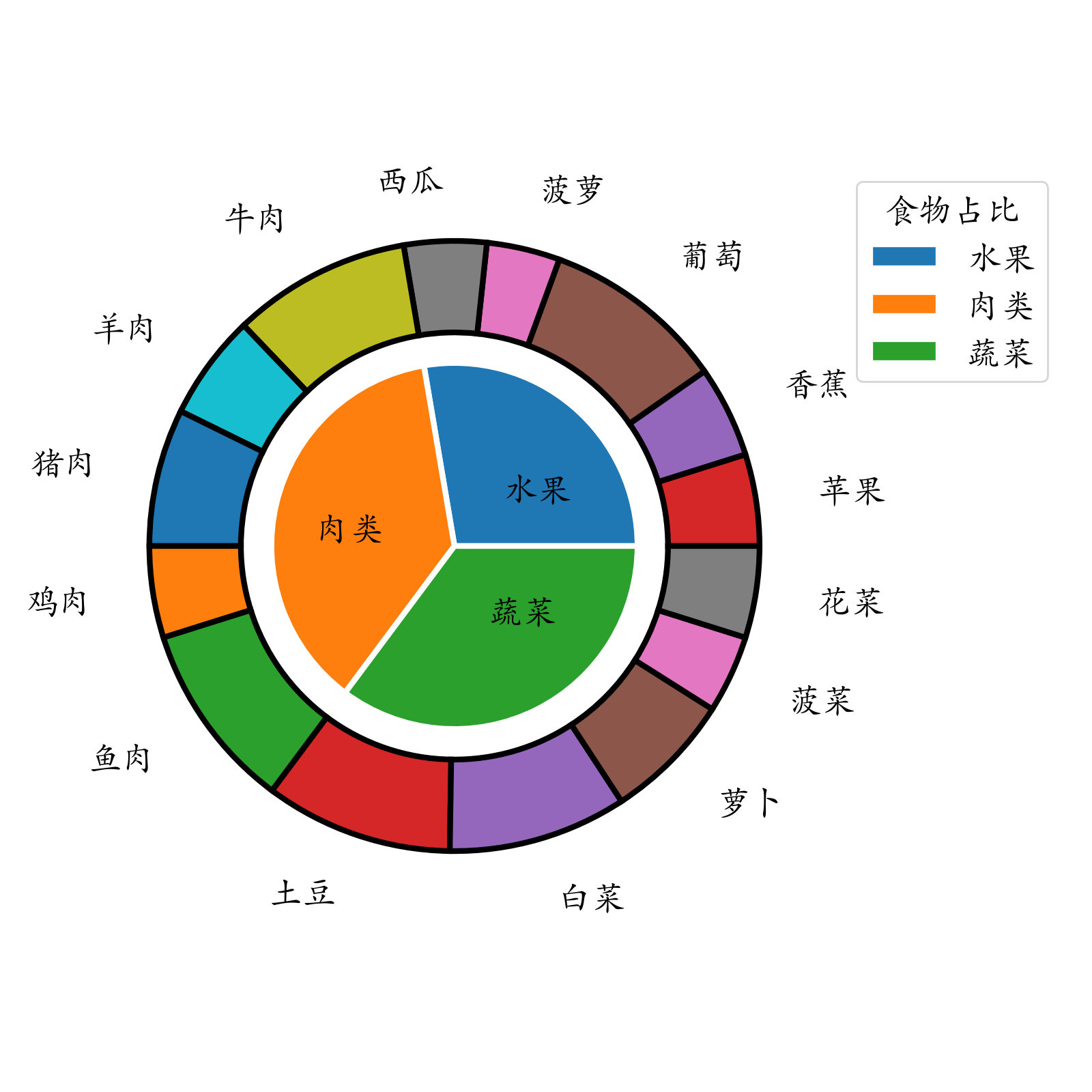
python
import pandas as pd
import matplotlib.pyplot as plt
food = pd.read_excel('./food.xlsx')
# 分组聚合,内圈数据
inner = food.groupby(by = 'type')['花费'].sum()
outer = food['花费'] # 外圈数据
plt.rcParams['font.family'] = 'Kaiti SC'
plt.rcParams['font.size'] = 18
fig=plt.figure(figsize=(8,8))
# 绘制内部饼图
plt.pie(x = inner, # 数据
        radius=0.6, # 饼图半径
        wedgeprops=dict(linewidth=3,width=0.6,edgecolor='w'),# 饼图格式:间隔线宽、饼图宽度、边界颜色
        labels = inner.index, # 显示标签
        labeldistance=0.4) # 标签位置
# 绘制外部饼图
plt.pie(x = outer,
        radius=1, # 半径
        wedgeprops=dict(linewidth=3,width=0.3,edgecolor='k'),# 饼图格式:间隔线宽、饼图宽度、边界颜色
        labels = food['食材'], # 显示标签
        labeldistance=1.2) # 标签位置

# 设置图例标题,bbox_to_anchor = (x, y, width, height)控制图例显示位置
plt.legend(inner.index,bbox_to_anchor = (0.9,0.6,0.4,0.4),title = '食物占比')
plt.tight_layout()
plt.savefig('./嵌套饼图.png',dpi = 200)
甜甜圈(自学)
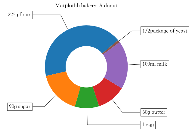
python
import numpy as np
import matplotlib.pyplot as plt

plt.figure(figsize=(6,6))
# 甜甜圈原料
recipe = ["225g flour",
          "90g sugar",
          "1 egg",
          "60g butter",
          "100ml milk",
          "1/2package of yeast"]
# 原料比例
data = [225, 90, 50, 60, 100, 5]
wedges, texts = plt.pie(data,startangle=40)
bbox_props = dict(boxstyle="square,pad=0.3", fc="w", ec="k", lw=0.72)
kw = dict(arrowprops=dict(arrowstyle="-"),
          bbox=bbox_props,va="center")

for i, p in enumerate(wedges):
    ang = (p.theta2 - p.theta1)/2. + p.theta1 # 角度计算
    # 角度转弧度----->弧度转坐标
    y = np.sin(np.deg2rad(ang))
    x = np.cos(np.deg2rad(ang))
    ha = {-1: "right", 1: "left"}[int(np.sign(x))] # 水平对齐方式
    connectionstyle = "angle,angleA=0,angleB={}".format(ang) # 箭头连接样式
    kw["arrowprops"].update({"connectionstyle": connectionstyle}) # 更新箭头连接方式
    plt.annotate(recipe[i], xy=(x, y), xytext=(1.35*np.sign(x), 1.4*y),
                 ha=ha,**kw,fontsize = 18,weight = 'bold')
plt.title("Matplotlib bakery: A donut",fontsize = 18,pad = 25)
plt.tight_layout()
第七节 热力图
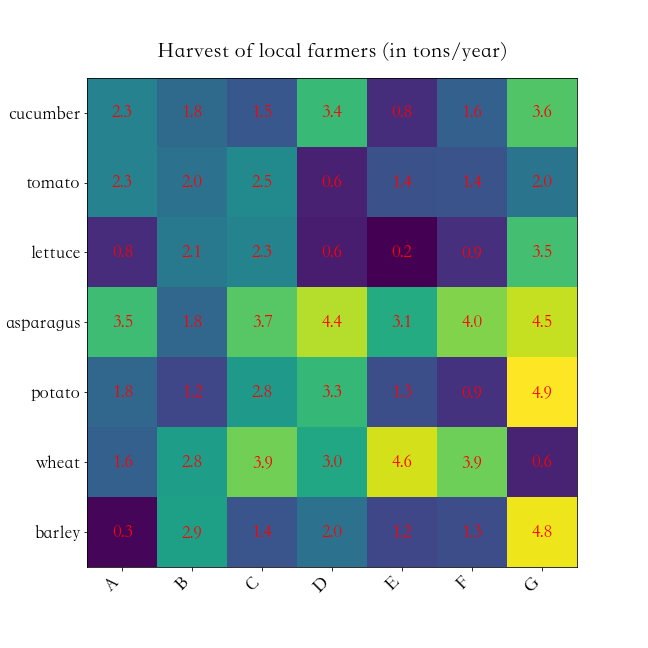
python
import numpy as np
import matplotlib
import matplotlib.pyplot as plt

vegetables = ["cucumber", "tomato", "lettuce", "asparagus","potato", "wheat", "barley"]
farmers = list('ABCDEFG')

harvest = np.random.rand(7,7)*5 # 农民丰收数据

plt.rcParams['font.size'] = 18
plt.rcParams['font.weight'] = 'heavy'
plt.figure(figsize=(9,9))
im = plt.imshow(harvest)

plt.xticks(np.arange(len(farmers)),farmers,rotation = 45,ha = 'right')
plt.yticks(np.arange(len(vegetables)),vegetables)

# 绘制文本
for i in range(len(vegetables)):
    for j in range(len(farmers)):
        text = plt.text(j, i, round(harvest[i, j],1),
                       ha="center", va="center", color='r')
plt.title("Harvest of local farmers (in tons/year)",pad = 20)
fig.tight_layout()
plt.savefig('./热力图.png')
第八节 面积图
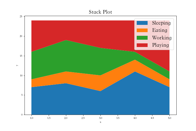
python
import matplotlib.pyplot as plt
plt.figure(figsize=(9,6))
days = [1,2,3,4,5]
sleeping =[7,8,6,11,7]
eating = [2,3,4,3,2]
working =[7,8,7,2,2]
playing = [8,5,7,8,13]
plt.stackplot(days,sleeping,eating,working,playing)
plt.xlabel('x')
plt.ylabel('y')
plt.title('Stack Plot',fontsize = 18)
plt.legend(['Sleeping','Eating','Working','Playing'],fontsize = 18)
第九节 蜘蛛图
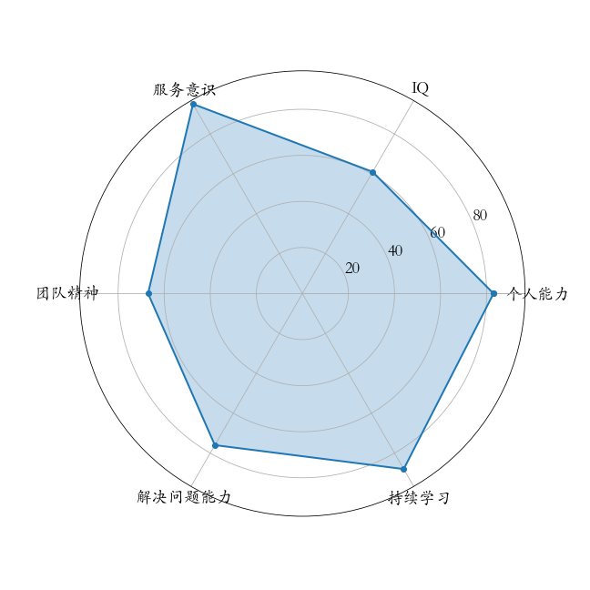
python
import numpy as np
import matplotlib.pyplot as plt
plt.rcParams['font.family'] = 'Kaiti SC'
labels=np.array(["个人能力","IQ","服务意识","团队精神","解决问题能力","持续学习"])
stats=[83, 61, 95, 67, 76, 88]
# 画图数据准备,角度、状态值
angles=np.linspace(0, 2*np.pi, len(labels), endpoint=False)
stats=np.concatenate((stats,[stats[0]]))
angles=np.concatenate((angles,[angles[0]]))
# 用Matplotlib画蜘蛛图
fig = plt.figure(figsize=(9,9))
ax = fig.add_subplot(111, polar=True)
ax.plot(angles, stats, 'o-', linewidth=2) # 连线
ax.fill(angles, stats, alpha=0.25) # 填充
# 设置角度
ax.set_thetagrids(angles*180/np.pi,#角度值
                  labels,
                  fontsize = 18)
ax.set_rgrids([20,40,60,80],fontsize = 18)
第七部分 3D图形
第一节 三维折线图散点图
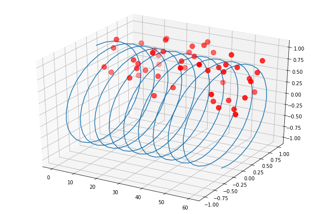
python
import numpy as np
import matplotlib.pyplot as plt
from mpl_toolkits.mplot3d.axes3d import Axes3D # 3D引擎

x = np.linspace(0,60,300)
y = np.sin(x)
z = np.cos(x)

fig = plt.figure(figsize=(9,6)) # 二维图形
ax3 = Axes3D(fig) # 二维变成了三维
ax3.plot(x,y,z) # 3维折线图
# 3维散点图
ax3.scatter(np.random.rand(50)*60,np.random.rand(50),np.random.rand(50),
            color = 'red',s = 100)
第二节 三维柱状图
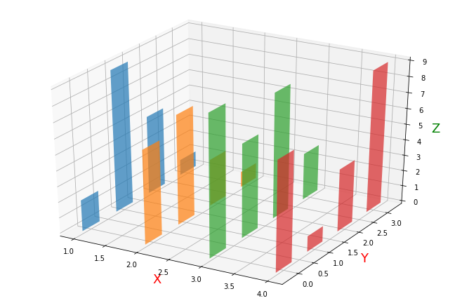
python
import numpy as np
import matplotlib.pyplot as plt
from mpl_toolkits.mplot3d.axes3d import Axes3D # 3D引擎
month = np.arange(1,5)
# 每个月 4周 每周都会产生数据
# 三个维度:月、周、销量
fig = plt.figure(figsize=(9,6))
ax3 = Axes3D(fig)

for m in month:
    ax3.bar(np.arange(4),
            np.random.randint(1,10,size = 4),
            zs = m ,
            zdir = 'x',# 在哪个方向上,一排排排列
            alpha = 0.7,# alpha 透明度
            width = 0.5)
ax3.set_xlabel('X',fontsize = 18,color = 'red')
ax3.set_ylabel('Y',fontsize = 18,color = 'red')
ax3.set_zlabel('Z',fontsize = 18,color = 'green')
第八部分 实战-数据分析师招聘数据分析
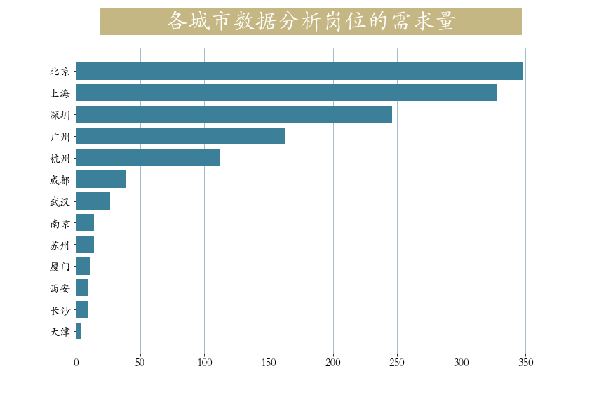
第一节 各城市对数据分析岗位的需求量
两种常用颜色:浅蓝色: #3c7f99,淡黄色:#c5b783
python
plt.figure(figsize=(12,9))
cities = job['city'].value_counts() # 统计城市工作数量
plt.barh(y = cities.index[::-1],
        width = cities.values[::-1],
        color = '#3c7f99')
plt.box(False) # 不显示边框
plt.title(label='           各城市数据分析岗位的需求量           ',
          fontsize=32, weight='bold', color='white',
          backgroundcolor='#c5b783',pad = 30 )
plt.tick_params(labelsize = 16)
plt.grid(axis = 'x',linewidth = 0.5,color = '#3c7f99')
第二节 不同领域对数据分析岗的需求量
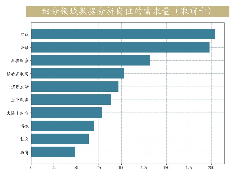
python
# 获取需求量前10多的领域
industry_index = job["industryField"].value_counts()[:10].index
industry =job.loc[job["industryField"].isin(industry_index),"industryField"]
plt.figure(figsize=(12,9))
plt.barh(y = industry_index[::-1],
         width=pd.Series.value_counts(industry.values).values[::-1],
         color = '#3c7f99')
plt.title(label='      细分领域数据分析岗位的需求量(取前十)     ',
          fontsize=32, weight='bold', color='white',
          backgroundcolor='#c5b783',ha = 'center',pad = 30)
plt.tick_params(labelsize=16)
plt.grid(lw = 0.5,color = '#3c7f99',ls = '--')
第三节 各城市薪资状况
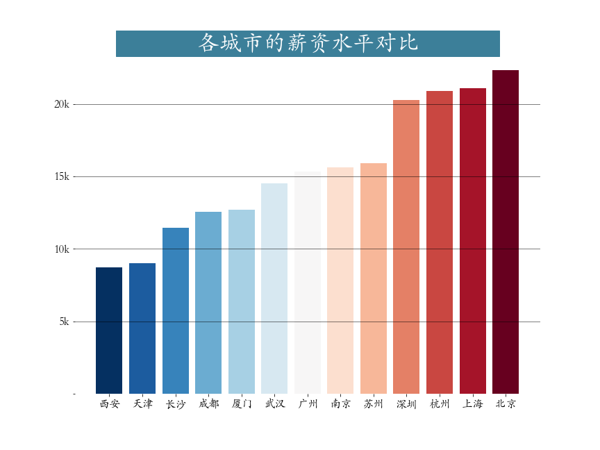
python
plt.figure(figsize=(12,9))
city_salary = job.groupby("city")["salary"].mean().sort_values() # 分组聚合运算
plt.bar(x = city_salary.index,height = city_salary.values,
       color = plt.cm.RdBu_r(np.linspace(0,1,len(city_salary))))
plt.title(label='              各城市的薪资水平对比              ',
         fontsize=32, weight='bold', color='white', backgroundcolor='#3c7f99')
plt.tick_params(labelsize=16)
plt.grid(axis = 'y',linewidth = 0.5,color = 'black')
plt.yticks(ticks = np.arange(0,25,step = 5,),labels = ['','5k','10k','15k','20k'])
plt.box(False) # 去掉边框
plt.savefig('./各城市薪资状况.png')
第四节 工作经验与薪水关系
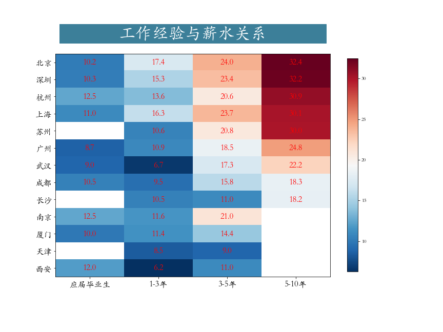
python
work_salary = job.pivot_table(index="city",columns="workYear",values="salary") # 透视表
work_salary = work_salary[["应届毕业生","1-3年","3-5年","5-10年"]]\
              .sort_values(by = '5-10年',ascending = False) # 筛选一部分工作经验
data = work_salary.values
data = np.repeat(data,4,axis = 1) # 重复4次,目的画图,美观,图片宽度拉大
plt.figure(figsize=(12,9))
plt.imshow(data,cmap='RdBu_r')
plt.yticks(np.arange(13),work_salary.index)
plt.xticks(np.array([1.5,5.5,9.5,13.5]),work_salary.columns)
# 绘制文本
h,w = data.shape
for x in range(w):
    for y in range(h):
        if (x%4 == 0) and (~np.isnan(data[y,x])):
            text = plt.text(x + 1.5, y, round(data[y,x],1),
                           ha="center", va="center", color='r',fontsize = 16)
plt.colorbar(shrink = 0.85)
plt.tick_params(labelsize = 16)
plt.savefig('./工作经验与薪水关系.png')
第五节 学历要求
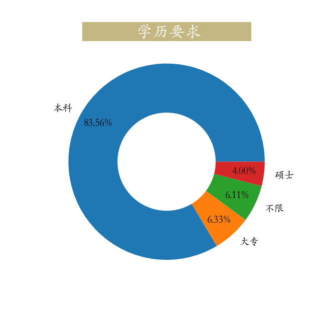
python
education = job["education"].value_counts(normalize=True)
plt.figure(figsize=(9,9))
_ = plt.pie(education,labels=education.index,autopct='%0.2f%%',
            wedgeprops=dict(linewidth=3,width = 0.5),pctdistance=0.8,
            textprops = dict(fontsize = 20))
_ = plt.title(label='             学历要求            ',
          fontsize=32, weight='bold',
          color='white', backgroundcolor='#c5b783')
plt.savefig('./学历要求.png')
第六节 技能要求
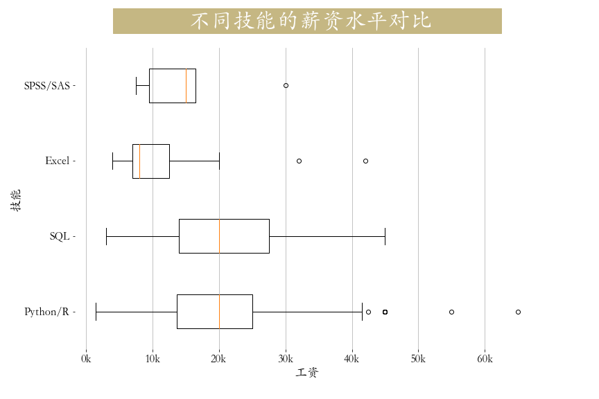
python
def get_level(x):
    if x["Python/R"] == 1:
        x["skill"] = "Python/R"
    elif x["SQL"] == 1:
        x["skill"] = "SQL"
    elif x["Excel"] == 1:
        x["skill"] = "Excel"
    elif x['SPSS/SAS'] == 1:
        x['skill'] = 'SPSS/SAS'
    else:
        x["skill"] = "其他"
    return x
job = job.apply(get_level,axis=1) # 数据转换

# 获取主要技能
x = job.loc[job.skill!='其他'][['salary','skill']]
cond1 = x['skill'] == 'Python/R'
cond2 = x['skill'] =='SQL'
cond3 = x['skill'] == 'Excel'
cond4 = x['skill'] == 'SPSS/SAS'

plt.figure(figsize=(12,8))
plt.title(label='             不同技能的薪资水平对比            ',
          fontsize=32, weight='bold', color='white',
          backgroundcolor='#c5b783',pad = 30)
plt.boxplot(x = [job.loc[job.skill!='其他']['salary'][cond1],
                job.loc[job.skill!='其他']['salary'][cond2],
                job.loc[job.skill!='其他']['salary'][cond3],
                job.loc[job.skill!='其他']['salary'][cond4]],
           vert = False,labels = ["Python/R","SQL","Excel",'SPSS/SAS'])
plt.tick_params(axis="both",labelsize=16)
plt.grid(axis = 'x',linewidth = 0.75)
plt.xticks(np.arange(0,61,10), [str(i)+"k" for i in range(0,61,10)])
plt.box(False)
plt.xlabel('工资', fontsize=18)
plt.ylabel('技能', fontsize=18)
plt.savefig('./技能要求.png')
第七节 大公司对技能要求
colors = '#ff0000', '#ffa500', '#c5b783', '#3c7f99', '#0000cd'
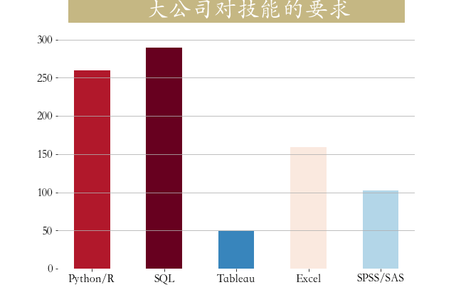
python
skill_count = job[job['companySize'] == '2000人以上'][['Python','SQL','Tableau','Excel','SPSS/SAS']].sum()
plt.figure(figsize=(9,6))
plt.bar(np.arange(5),skill_count,
        tick_label = ['Python/R','SQL','Tableau','Excel','SPSS/SAS'],
        width = 0.5,
        color = plt.cm.RdBu_r(skill_count/skill_count.max()))
_ = plt.title(label='             大公司对技能的要求         ',
          fontsize=32, weight='bold', color='white',
          backgroundcolor='#c5b783',pad = 30)
plt.tick_params(labelsize=16,)
plt.grid(axis = 'y')
plt.box(False)
plt.savefig('./大公司技能要求.png')
第八节 不同规模的公司在招人要求上的差异
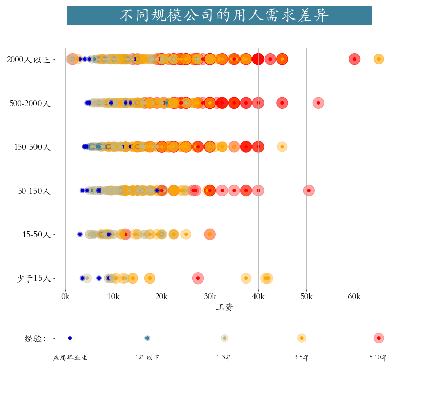
python
from matplotlib import gridspec
workYear_map = {
    "5-10年": 5,
    "3-5年": 4,
    "1-3年": 3,
    "1年以下": 2,
    "应届毕业生": 1}
color_map = {
    5:"#ff0000",
    4:"#ffa500",
    3:"#c5b783",
    2:"#3c7f99",
    1:"#0000cd"}
cond = job.workYear.isin(workYear_map)
job = job[cond]
job['workYear'] = job.workYear.map(workYear_map)
# 根据companySize进行排序,人数从多到少
job['companySize'] = job['companySize'].astype('category')
list_custom = ['2000人以上', '500-2000人','150-500人','50-150人','15-50人','少于15人']
job['companySize'].cat.reorder_categories(list_custom, inplace=True)
job.sort_values(by = 'companySize',inplace = True,ascending = False)

plt.figure(figsize=(12,11))
gs = gridspec.GridSpec(10,1)
plt.subplot(gs[:8])
plt.suptitle(t='            不同规模公司的用人需求差异          ',
         fontsize=32,
         weight='bold', color='white', backgroundcolor='#3c7f99')
plt.scatter(job.salary,job.companySize,
            c = job.workYear.map(color_map),
            s = (job.workYear*100),alpha = 0.35)
plt.scatter(job.salary,job.companySize,
            c = job.workYear.map(color_map))
plt.grid(axis = 'x')
plt.xticks(np.arange(0,161,10), [str(i)+"k" for i in range(0,161,10)])
plt.xlabel('工资', fontsize=18)
plt.box(False)
plt.tick_params(labelsize = 18)

# 绘制底部标记
plt.subplot(gs[9:])
x = np.arange(5)[::-1]
y = np.zeros(len(x))
s = x*100
plt.scatter(x,y,s=s,c=color_map.values(),alpha=0.3)
plt.scatter(x,y,c=color_map.values())
plt.box(False)
plt.xticks(ticks=x,labels=list(workYear_map.keys()),fontsize=14)
plt.yticks(np.arange(1),labels=['  经验:'],fontsize=18)
plt.savefig('./不同规模公司招聘薪资工作经验差异.png')
Seaborn介绍
Seaborn是基于matplotlib的图形可视化python包。它提供了一种高度交互式界面,便于用户能够做出各种有吸引力的统计图表。
Seaborn是在matplotlib的基础上进行了更高级的API封装,从而使得作图更加容易,在大多数情况下使用seaborn能做出很具有吸引力的图,而使用matplotlib就能制作具有更多特色的图。应该把Seaborn视为matplotlib的补充,而不是替代物。
安装
pip install seaborn -i https://pypi.tuna.tsinghua.edu.cn/simple
快速上手
样式设置
Python
import seaborn as sns
sns.set(style = 'darkgrid',context = 'talk',font = 'STKaiti')
stlyle设置,修改主题风格,属性如下:
| style | 效果 |
|---|---|
| darkgrid | 黑色网格(默认) |
| whitegrid | 白色网格 |
| dark | 黑色背景 |
| white | 白色背景 |
| ticks | 四周有刻度线的白背景 |
context设置,修改大小,属性如下:
| context | 效果 |
|---|---|
| paper | 越来越大越来越粗 |
| notebook(默认) | 越来越大越来越粗 |
| talk | 越来越大越来越粗 |
| poster | 越来越大越来越粗 |
线形图
Python
import seaborn as sns
import matplotlib.pyplot as plt
import pandas as pd
import numpy as np
sns.set(style = 'dark',context = 'poster',font = 'STKaiti') # 设置样式
plt.figure(figsize=(9,6))

x = np.linspace(0,2*np.pi,20)
y = np.sin(x)

sns.lineplot(x = x,y = y,color = 'green',ls = '--')
sns.lineplot(x = x,y = np.cos(x),color = 'red',ls = '-.')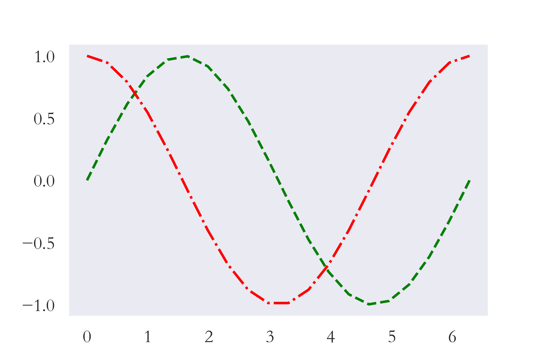
各种图形绘制
调色板
参数palette(调色板),用于调整颜色,系统默认提供了六种选择:deep, muted, bright, pastel, dark, colorblind
参数palette调色板,可以有更多的颜色选择,Matplotlib为我们提供了多大178种,这足够绘图用,可以通过代码**print(plt.colormaps())**查看选择
| 178种 |
|---|
| Accent |
| Accent_r |
| Blues |
| Blues_r |
| ...... |
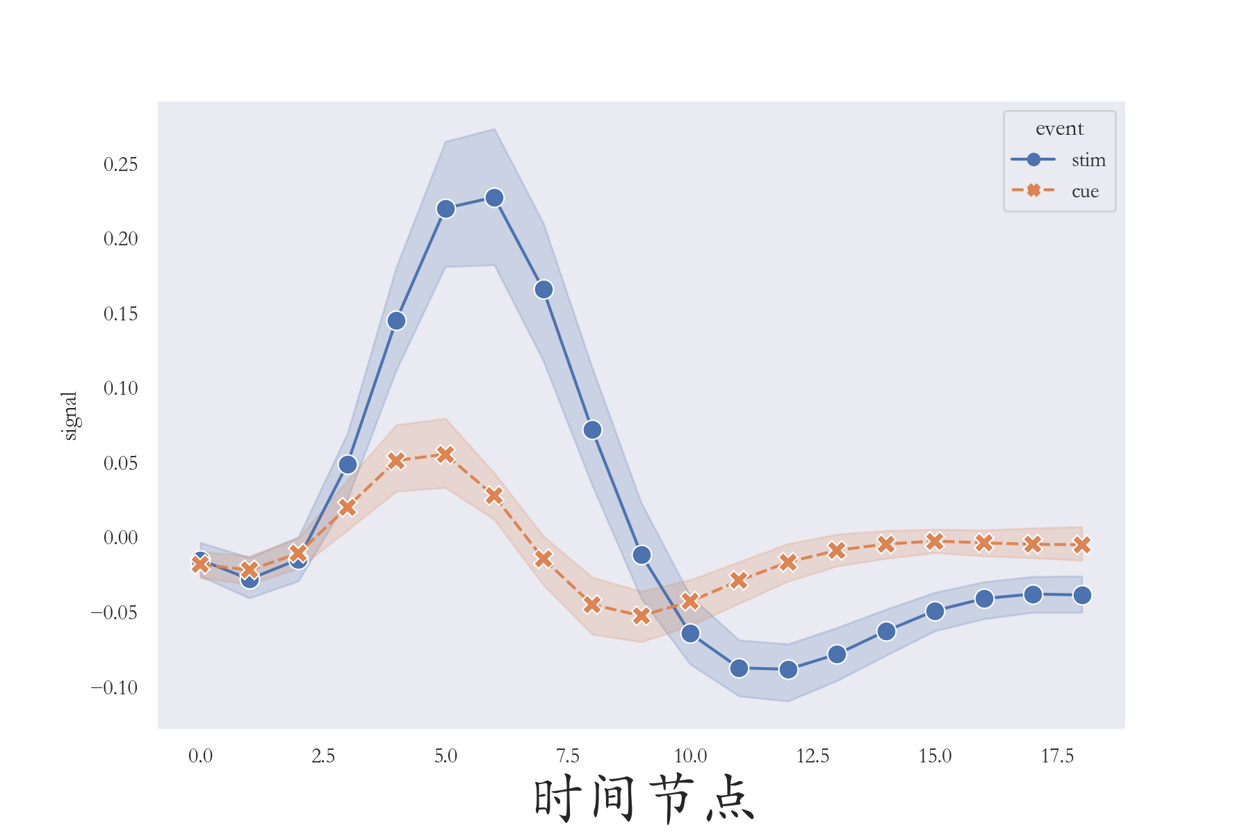
线形图
Python
import seaborn as sns
import matplotlib.pyplot as plt
import pandas as pd
sns.set(style = 'dark',context = 'notebook',font = 'STKaiti') # 设置样式
plt.figure(figsize=(9,6))
fmri = pd.read_csv('./fmri.csv') # fmri这一核磁共振数据

ax = sns.lineplot(x = 'timepoint',y = 'signal',
                  hue = 'event',style = 'event' ,
                  data= fmri,
                  palette='deep',
                  markers=True,
                  markersize = 10)

plt.xlabel('时间节点',fontsize = 30)
plt.savefig('./线形图.png',dpi = 200)lineplot()函数作用是绘制线型图 。参数x、y,表示横纵 坐标;参数hue,表示根据属性分类 绘制两条线 ("event"属性分两类"stim"、"cue");参数style,表示根据属性分类设置样式 ,实线和虚线;参数data,表示数据 ;参数marker、markersize,分别表示画图标记点 以及尺寸大小!
散点图
Python
import matplotlib.pyplot as plt
import seaborn as sns
data = pd.read_csv('./tips.csv') # 小费
plt.figure(figsize=(9,6))
sns.set(style = 'darkgrid',context = 'talk')
# 散点图
fig = sns.scatterplot(x = 'total_bill', y = 'tip',
                      hue = 'time', data = data,
                      palette = 'autumn', s = 100)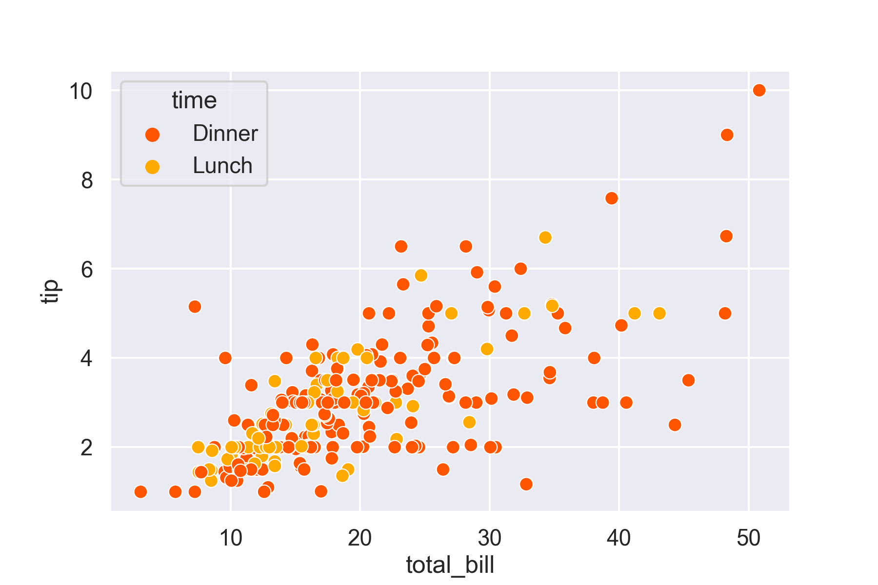
柱状图
Python
import seaborn as sns
import matplotlib.pyplot as plt
plt.figure(figsize = (9,6))
sns.set(style = 'whitegrid')
tips = pd.read_csv('./tips.csv') # 小费
ax = sns.barplot(x = "day", y = "total_bill",
                 data = tips,hue = 'sex',
                 palette = 'colorblind',
                 capsize = 0.2)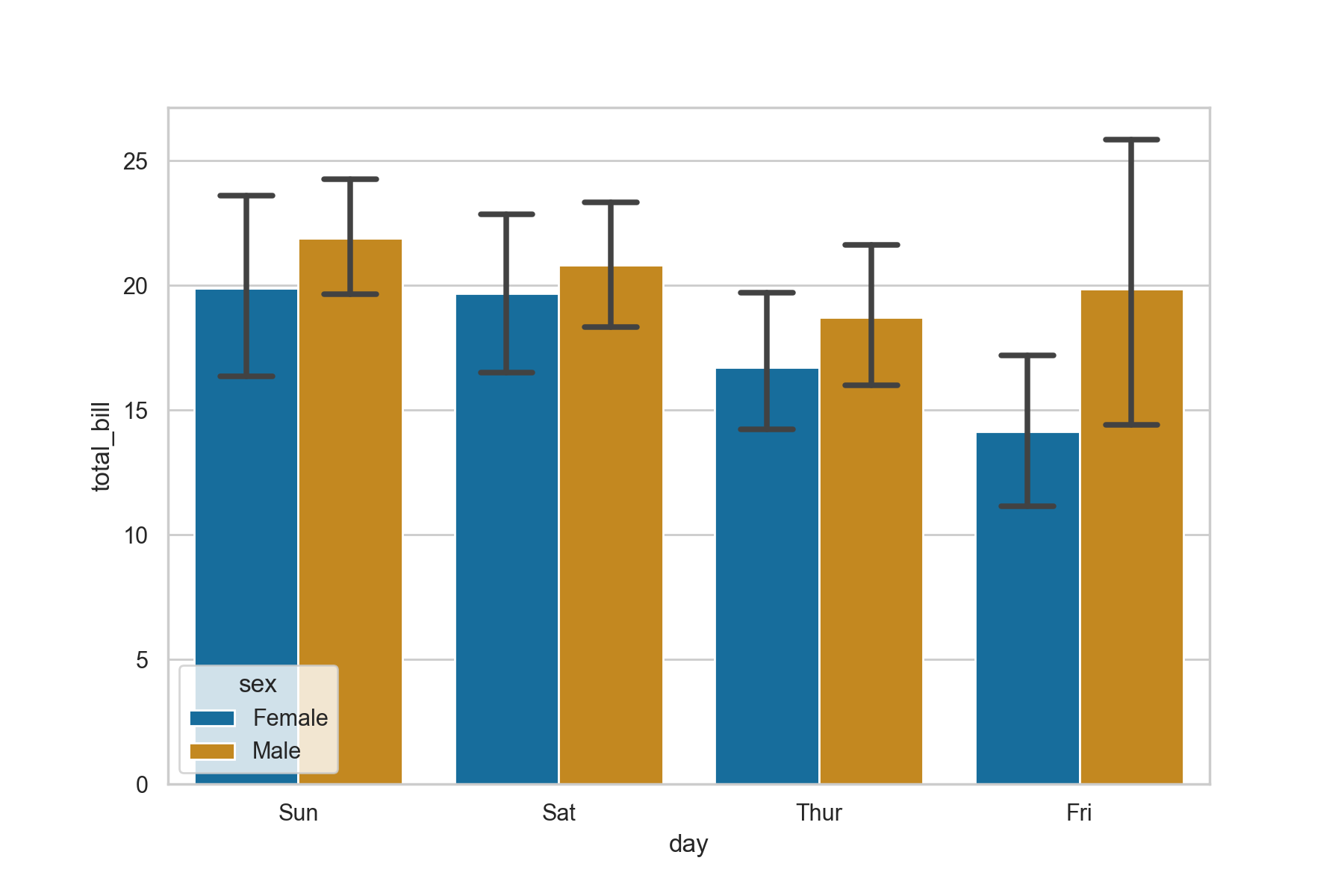
箱式图
Python
import seaborn as sns
import matplotlib.pyplot as plt
import pandas as pd
sns.set(style = 'ticks')
tips = pd.read_csv('./tips.csv')
ax = sns.boxplot(x="day", y="total_bill", data=tips,palette='colorblind')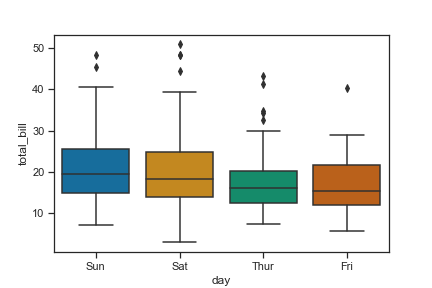
直方图
Python
import seaborn as sns
import numpy as np
import matplotlib.pyplot as plt
sns.set(style = 'dark')
x = np.random.randn(5000)
sns.histplot(x,kde = True)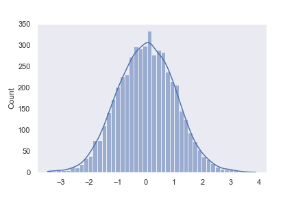
Python
import seaborn as sns
import numpy as np
import matplotlib.pyplot as plt
import pandas as pd
sns.set(style = 'darkgrid')
tips = pd.read_csv('./tips.csv')
sns.histplot(x = 'total_bill', data = tips, kde = True)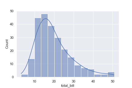
分类散点图
Python
import seaborn as sns
import matplotlib.pyplot as plt
import pandas as pd
sns.set(style = 'darkgrid')
exercise = pd.read_csv('./exercise.csv')
sns.catplot(x="time", y="pulse", hue="kind", data=exercise)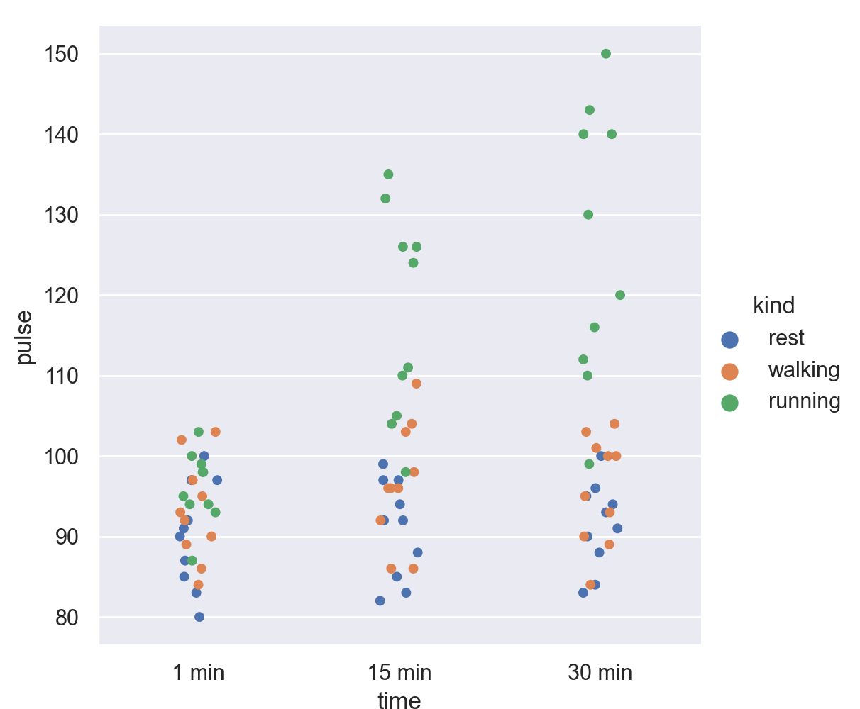
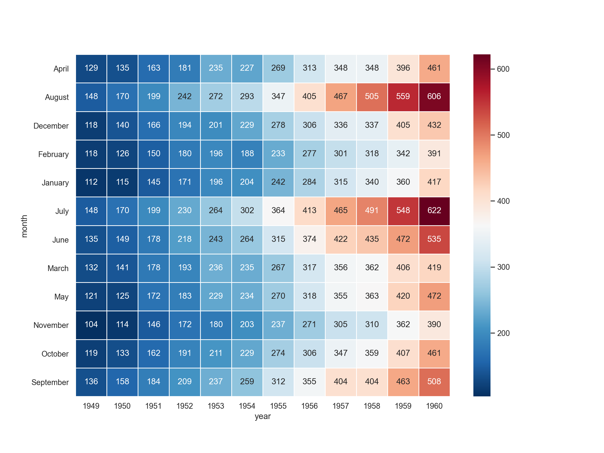
热力图
Python
import matplotlib.pyplot as plt
import seaborn as sns
plt.figure(figsize=(12,9))
flights = pd.read_csv('./flights.csv')

flights = flights.pivot("month", "year", "passengers")
sns.heatmap(flights, annot=True,fmt = 'd',cmap = 'RdBu_r',
            linewidths=0.5)