1、概 述
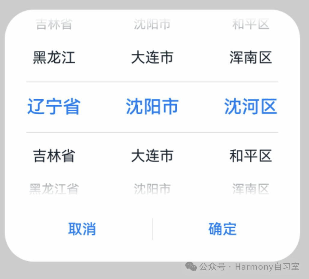
ArkUI提供了一个文本选择器(showTextPickerDialog),可以方便的实现文本级联选择,例如:省->市->区,示意如下:
下面针对文本选择器做简单介绍。
2、接口介绍
定义文本滑动选择器弹窗并弹出,接口定义如下:
showTextPickerDialog(options: TextPickerDialogOptions): void其中TextPickerDialogOptions,主要用于配置文本滑动选择器弹窗的参数。字段配置如下:
|-------------------------|-------------------------------------------------------------------------------------------------------------|---------------------------------------------------------------------------------------------------------------------------------------------------------------------------------------------------------------------------------------------|
| 名称 | 类型 | 说明 |
| range | string\[\] | string\[\] \[\] | Resource |TextPickerRangeContent\[\] | TextCascadePickerRangeContent\[\] | 选择器的数据选择列表。不可设置为空数组,若设置为空数组,则不显示;若动态变化为空数组,则保持当前正常值显示。 说明:单列数据选择器使用string\[\],Resource,TextPickerRangeContent\[\]类型。多列数据选择器使用string\[\]\[\]类型。多列联动数据选择器使用TextCascadePickerRangeContent\[\]类型。Resource类型只支持strarray.json。range的类型及列数不可以动态修改。 |
| selected | number | number\[\] | 设置默认选中项在数组中的索引值。默认值:0 说明:单列数据选择器使用number类型。多列、多列联动数据选择器使用number\[\]类型。从API version 10开始,该参数支持双向绑定变量。 |
| value | string \| string\[\] | 设置默认选中项的值,优先级低于selected。默认值:第一个元素值 说明:只有显示文本列表时该值有效。显示图片或图片加文本的列表时,该值无效。单列数据选择器使用string类型。多列、多列联动数据选择器使用string\[\]类型。从API version 10开始,该参数支持双向绑定变量。 |
| defaultPickerItemHeight | number | string | 设置选择器中选项的高度。默认值:选中项56vp,非选中项36vp。设置该参数后,选中项与非选中项的高度均为所设置的值。 |
| disappearTextStyle | PickerTextStyle | 设置所有选项中最上和最下两个选项的文本颜色、字号、字体粗细。默认值:{color: '#ff182431',font: {size: '14fp',weight: FontWeight.Regular}} |
| textStyle | PickerTextStyle | 设置所有选项中除了最上、最下及选中项以外的文本颜色、字号、字体粗细。默认值:{color: '#ff182431',font: {size: '16fp',weight: FontWeight.Regular}} |
| selectedTextStyle | PickerTextStyle | 设置选中项的文本颜色、字号、字体粗细。默认值:{color: '#ff007dff',font: {size: '20vp',weight: FontWeight.Medium}} |
| acceptButtonStyle | PickerDialogButtonStyle | 设置确认按钮显示样式、样式和重要程度、角色、背景色、圆角、文本颜色、字号、字体粗细、字体样式、字体列表、按钮是否默认响应Enter键。说明:acceptButtonStyle与cancelButtonStyle中最多只能有一个primary字段配置为true,二者primary字段均配置为true时均不生效。 |
| cancelButtonStyle | PickerDialogButtonStyle | 设置取消按钮显示样式、样式和重要程度、角色、背景色、圆角、文本颜色、字号、字体粗细、字体样式、字体列表、按钮是否默认响应Enter键。 说明:acceptButtonStyle与cancelButtonStyle中最多只能有一个primary字段配置为true,二者primary字段均配置为true时均不生效。 |
| canLoop | boolean | 设置是否可循环滚动,true:可循环,false:不可循环,默认值:true。 |
| alignment | DialogAlignment | 弹窗在竖直方向上的对齐方式。默认值:DialogAlignment.Default |
| offset | Offset | 弹窗相对alignment所在位置的偏移量。默认值:{ dx: 0 , dy: 0 } |
| maskRect | Rectangle | 弹窗遮蔽层区域,在遮蔽层区域内的事件不透传,在遮蔽层区域外的事件透传。默认值:{ x: 0, y: 0, width: '100%', height: '100%' } |
| onAccept | (value: TextPickerResult) => void | 点击弹窗中的"确定"按钮时触发该回调。 |
| onCancel | () => void | 点击弹窗中的"取消"按钮时触发该回调。 |
| onChange | (value: TextPickerResult) => void | 滑动弹窗中的选择器使当前选中项改变时触发该回调。 |
| backgroundColor | ResourceColor | 弹窗背板颜色。默认值:Color.Transparent说明:当设置了backgroundColor为非透明色时,backgroundBlurStyle需要设置为BlurStyle.NONE,否则颜色显示将不符合预期效果。 |
| backgroundBlurStyle | BlurStyle | 弹窗背板模糊材质。默认值:BlurStyle.COMPONENT_ULTRA_THICK 说明:设置为BlurStyle.NONE即可关闭背景虚化。当设置了backgroundBlurStyle为非NONE值时,则不要设置backgroundColor,否则颜色显示将不符合预期效果。 |
| onDidAppear | () => void | 弹窗弹出时的事件回调。 说明:1.正常时序依次为:onWillAppear>>onDidAppear>>(onAccept/onCancel/onChange)>>onWillDisappear>>onDidDisappear。2.在onDidAppear内设置改变弹窗显示效果的回调事件,二次弹出生效。3.快速点击弹出,消失弹窗时,存在onWillDisappear在onDidAppear前生效。4. 当弹窗入场动效未完成时关闭弹窗,该回调不会触发。 |
| onDidDisappear | () => void | 弹窗消失时的事件回调。 说明:1.正常时序依次为:onWillAppear>>onDidAppear>>(onAccept/onCancel/onChange)>>onWillDisappear>>onDidDisappear。 |
| onWillAppear | () => void | 弹窗显示动效前的事件回调。 说明:1.正常时序依次为:onWillAppear>>onDidAppear>>(onAccept/onCancel/onChange)>>onWillDisappear>>onDidDisappear。2.在onWillAppear内设置改变弹窗显示效果的回调事件,二次弹出生效。 |
| onWillDisappear | () => void | 弹窗退出动效前的事件回调。 说明:1.正常时序依次为:onWillAppear>>onDidAppear>>(onAccept/onCancel/onChange)>>onWillDisappear>>onDidDisappear。2.快速点击弹出,消失弹窗时,存在onWillDisappear在onDidAppear前生效。 |
| shadow | ShadowOptions | ShadowStyle | 设置弹窗背板的阴影。当设备为2in1时, 默认场景下获焦阴影值为: ShadowStyle.OUTER_FLOATING_MD, 失焦为: ShadowStyle.OUTER_FLOATING_SM |
3、案 例
本案例通过设置range的参数类型为TextCascadePickerRangeContent\[\]类型实现3列文本选择器弹窗。
TextCascadePickerRangeContent是一个内置数据结构类型,定义如下:
declare interface TextCascadePickerRangeContent { text: string | Resource; children?: TextCascadePickerRangeContent[];}当按下确定按钮时,弹窗会通过onAccept返回目前所选中文本和索引值。如需弹窗再次弹出时显示选中的是上一次确定的文本,就要在回调中重新给select进行赋值。效果如下:
代码如下,直接复制粘贴到项目中可以运行(请注意22、32行的选择返回数据结构的定义):
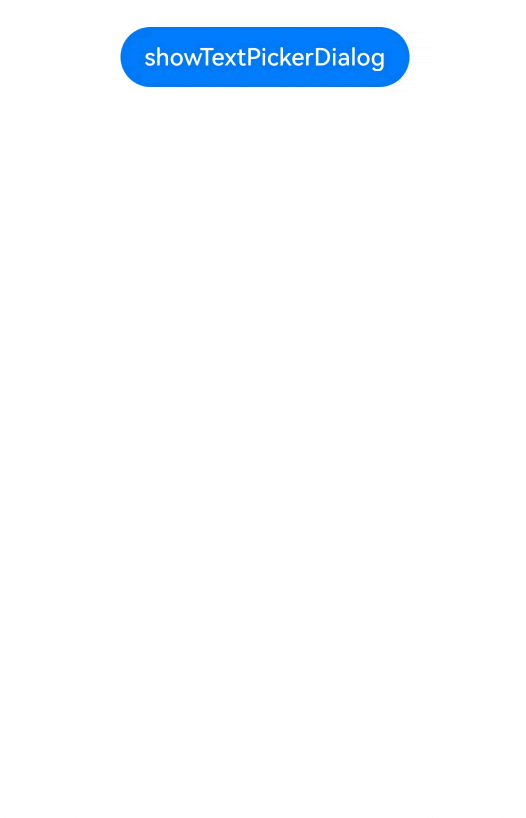
@Entry@Componentstruct TextPickerDialogExample { private data: TextCascadePickerRangeContent[] = [ { text: '辽宁省', children: [{ text: '沈阳市', children: [{ text: '沈河区' }, { text: '和平区' }, { text: '浑南区' }] }, { text: '大连市', children: [{ text: '中山区' }, { text: '金州区' }, { text: '长海县' }] }] }, { text: '吉林省', children: [{ text: '长春市', children: [{ text: '南关区' }, { text: '宽城区' }, { text: '朝阳区' }] }, { text: '四平市', children: [{ text: '铁西区' }, { text: '铁东区' }, { text: '梨树县' }] }] }, { text: '黑龙江省', children: [{ text: '哈尔滨市', children: [{ text: '道里区' }, { text: '道外区' }, { text: '南岗区' }] }, { text: '牡丹江市', children: [{ text: '东安区' }, { text: '西安区' }, { text: '爱民区' }] }] } ] // 由于数据是3列,因此,这里的select是一个数组,表示每一列对应的选择序号 private select : number[] = [0,0,0]; build() { Column() { Button('showTextPickerDialog') .margin(30) .onClick(() => { this.getUIContext().showTextPickerDialog({ range: this.data, selected: this.select, onAccept: (value: TextPickerResult) => { this.select = value.index as number[] } }) }) }.width('100%').margin({ top: 5 }) }}