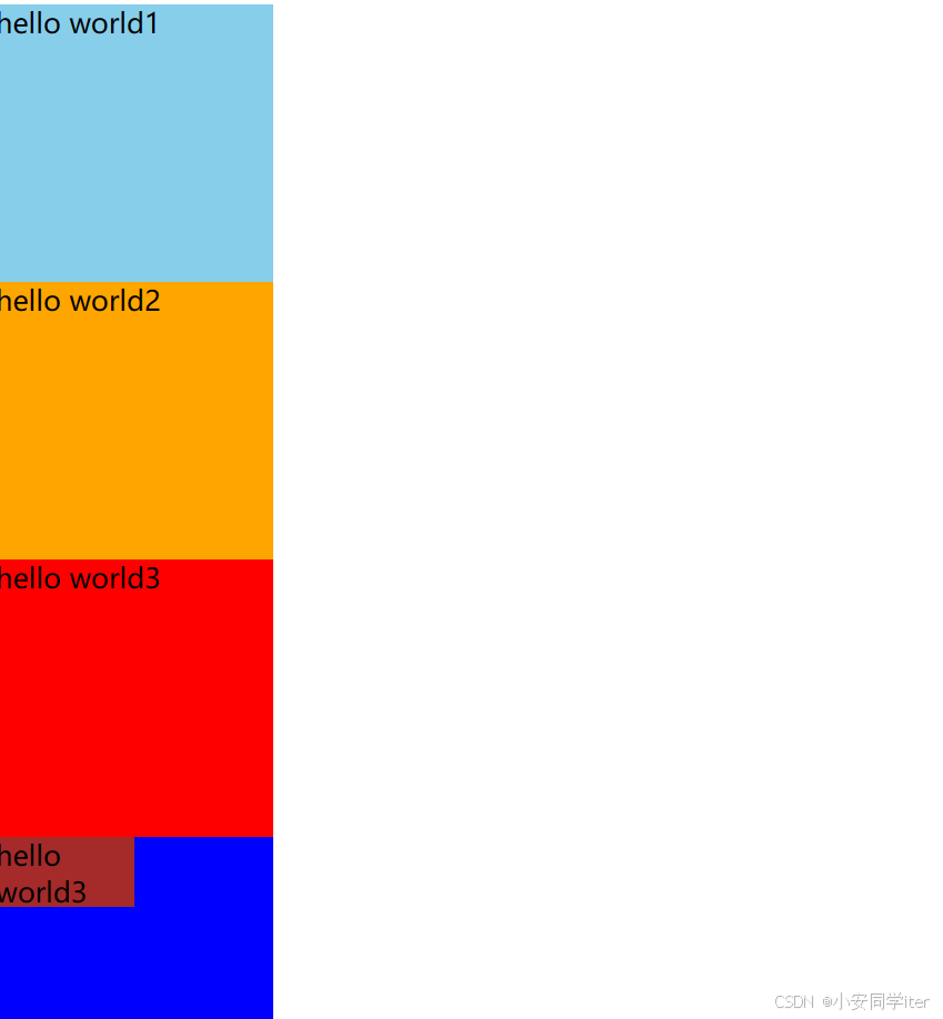
一 长度单位
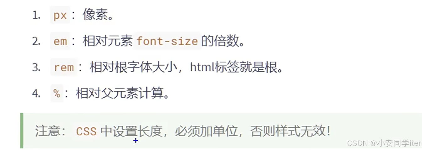
代码实现:
html
<!DOCTYPE html>
<html lang="zh-CN">
<head>
<meta charset="UTF-8">
<meta name="viewport" content="width=device-width, initial-scale=1.0">
<title>Document</title>
<style>
/* 根元素 */
html {
font-size: 20px;
}
/* 第一种长度单位px */
#ax1 {
width: 200px;
height: 200px;
font-size: 20px;
background-color: skyblue;
}
/* 第二种长度单位:em(相对于当前元素的font-size 的倍数) */
/* 没有指定则会向上寻找 */
#ax2 {
width: 10em;
height: 10em;
font-size: 20px;
background-color: orange;
}
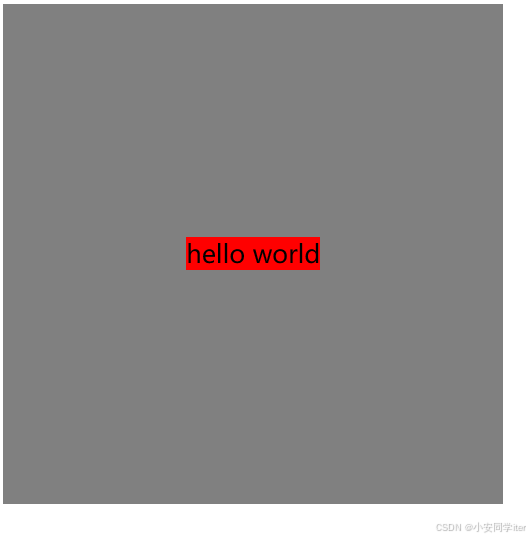
/* 第三种长度单位:相当于根元素 */
#ax3 {
width: 10rem;
height: 10rem;
font-size: 20px;
background-color: red;
}
/* 第四种长度单位:相对其父元素的百分比尺寸 */
#ax4 {
width: 200px;
height: 200px;
font-size: 20px;
background-color: blue;
}
.inside {
width: 50%;
height: 25%;
font-size: 20px;
background-color: brown;
}
</style>
</head>
<body>
<div id="ax1">hello world1</div>
<div id="ax2">hello world2</div>
<div id="ax3">hello world3</div>
<div id="ax4">
<div class="inside">hello world3</div>
</div>
</body>
</html>图形化展示:
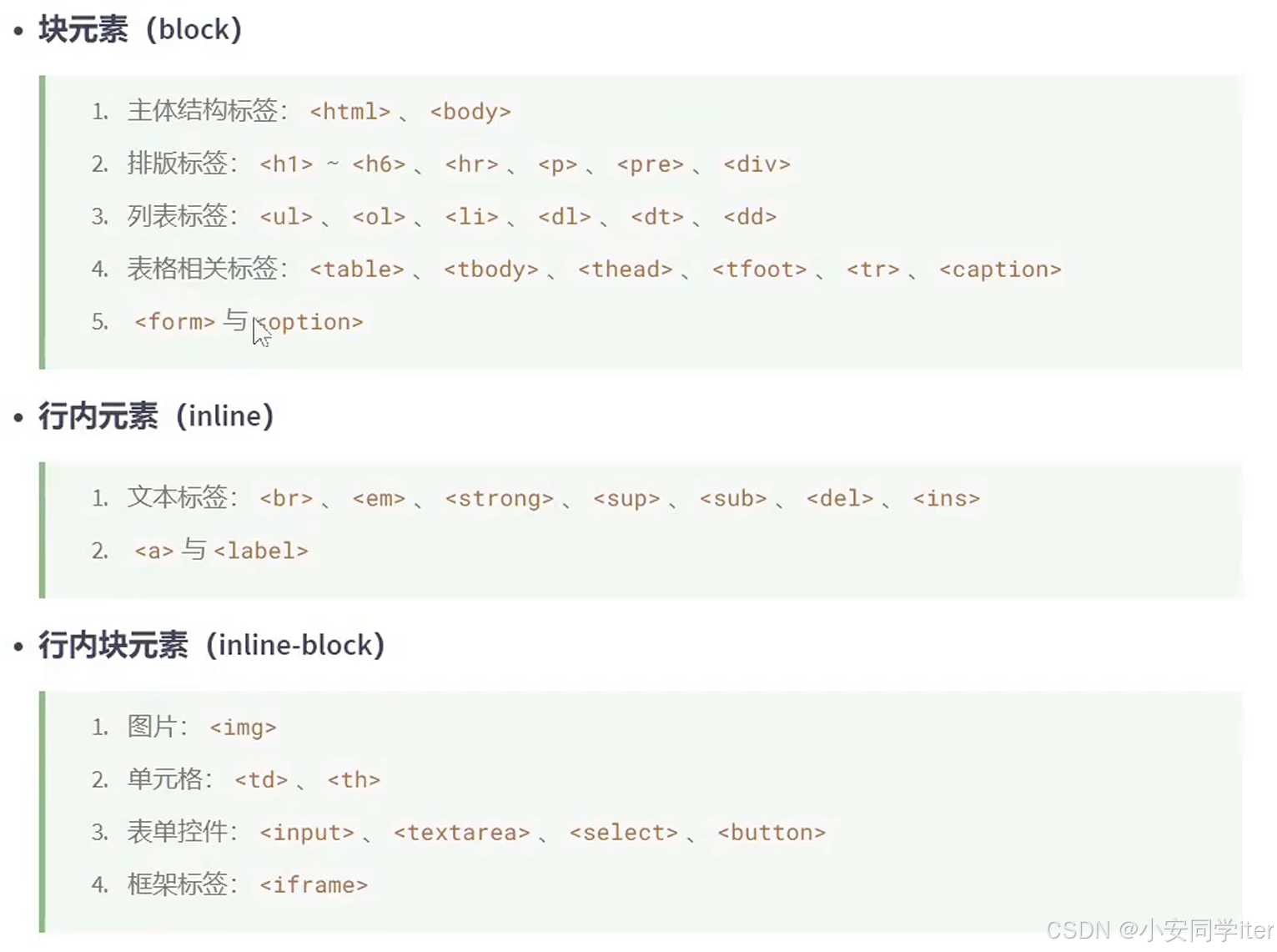
二 元素显示模式
1 三种显示模式
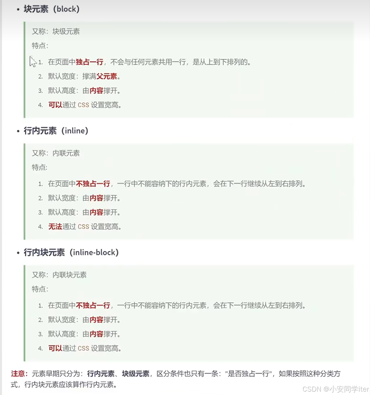
总结:
2 修改元素的显示模式
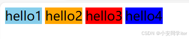
代码实现:
html
<!DOCTYPE html>
<html lang="zh-CN">

<head>
    <meta charset="UTF-8">
    <meta name="viewport" content="width=device-width, initial-scale=1.0">
    <title>Document</title>
    <style>
        div {
            width: 200px;
            height: 200px;
            font-size: 20px;
            /* inline是行内元素 block是块元素 inline-block行内块元素 none是隐藏*/
            display: inline;
        }

        #ax1 {
            background-color: skyblue;
        }

        #ax2 {
            background-color: orange;
        }

        #ax3 {
            background-color: red;
        }

        #ax4 {
            background-color: blue;
        }
    </style>
</head>

<body>
    <div id="ax1">hello1</div>
    <div id="ax2">hello2</div>
    <div id="ax3">hello3</div>
    <div id="ax4">hello4</div>
</body>

</html>
图形化展示:
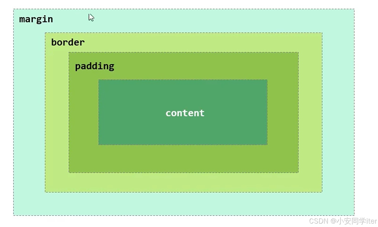
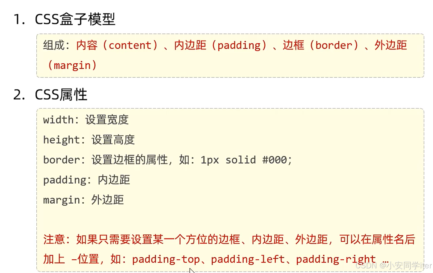
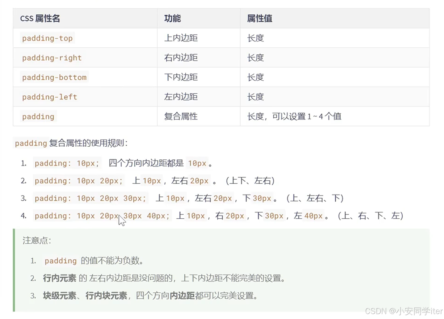
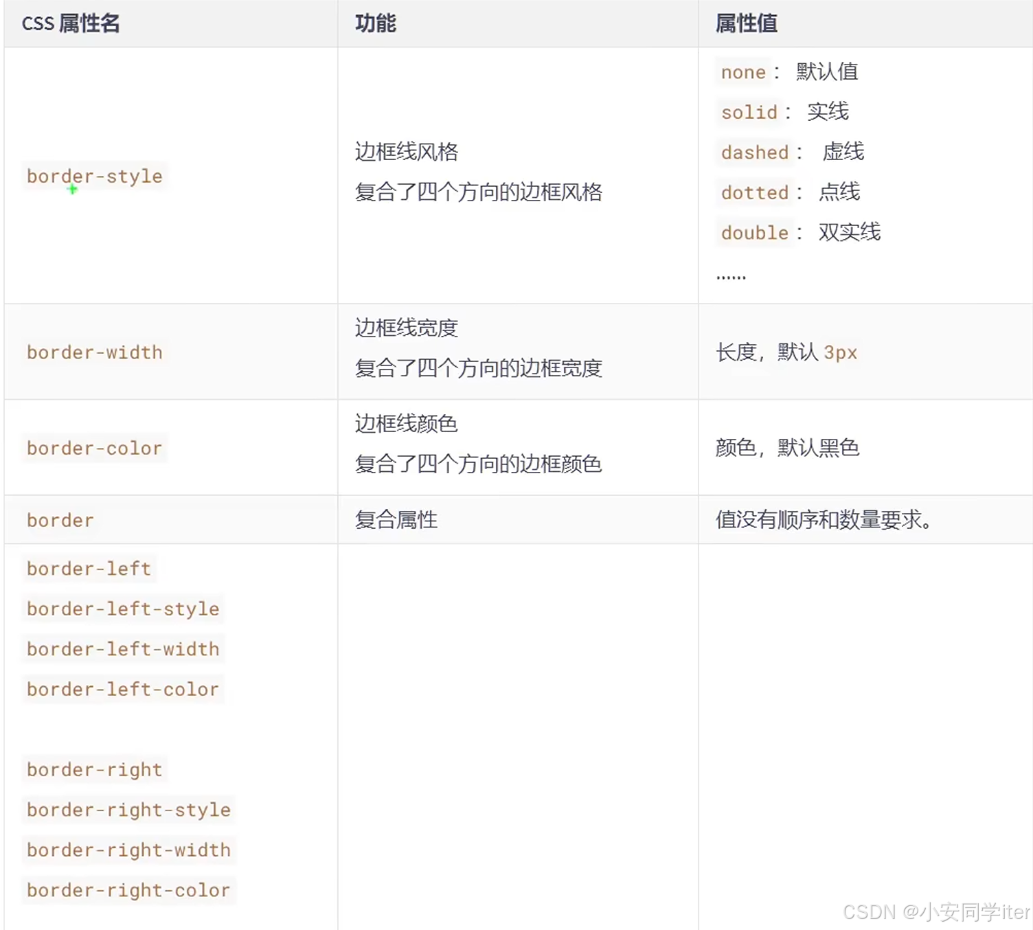
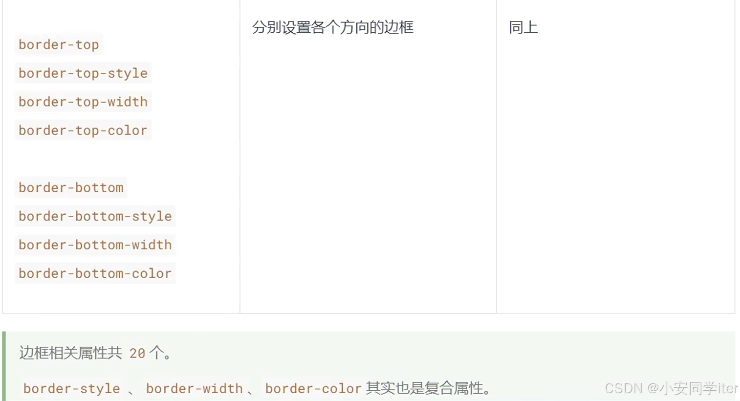
三 盒子模型的组成部分
盒子模型组成:内容区域(content),内边距区域(padding),边框区域(border),外边距区域(margin)
代码实现:
html
<!DOCTYPE html>
<html lang="zh-CN">

<head>
    <meta charset="UTF-8">
    <meta name="viewport" content="width=device-width, initial-scale=1.0">
    <title>Document</title>
    <style>
        div {
            /* 内容区的宽 */
            width: 400px;
            /* 内容区的高 */
            height: 400px;
            /* 内边距 */
            padding: 20px;
            /* 边框 */
            border: 10px solid black;
            /* 外边距 */
            margin: 50px;

            font-size: 20px;
            background-color: gray;
        }
    </style>
</head>

<body>
    <div>内容区</div>
</body>

</html>
图形化展示:
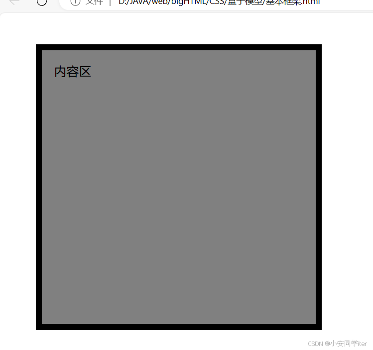
1 内容(content)
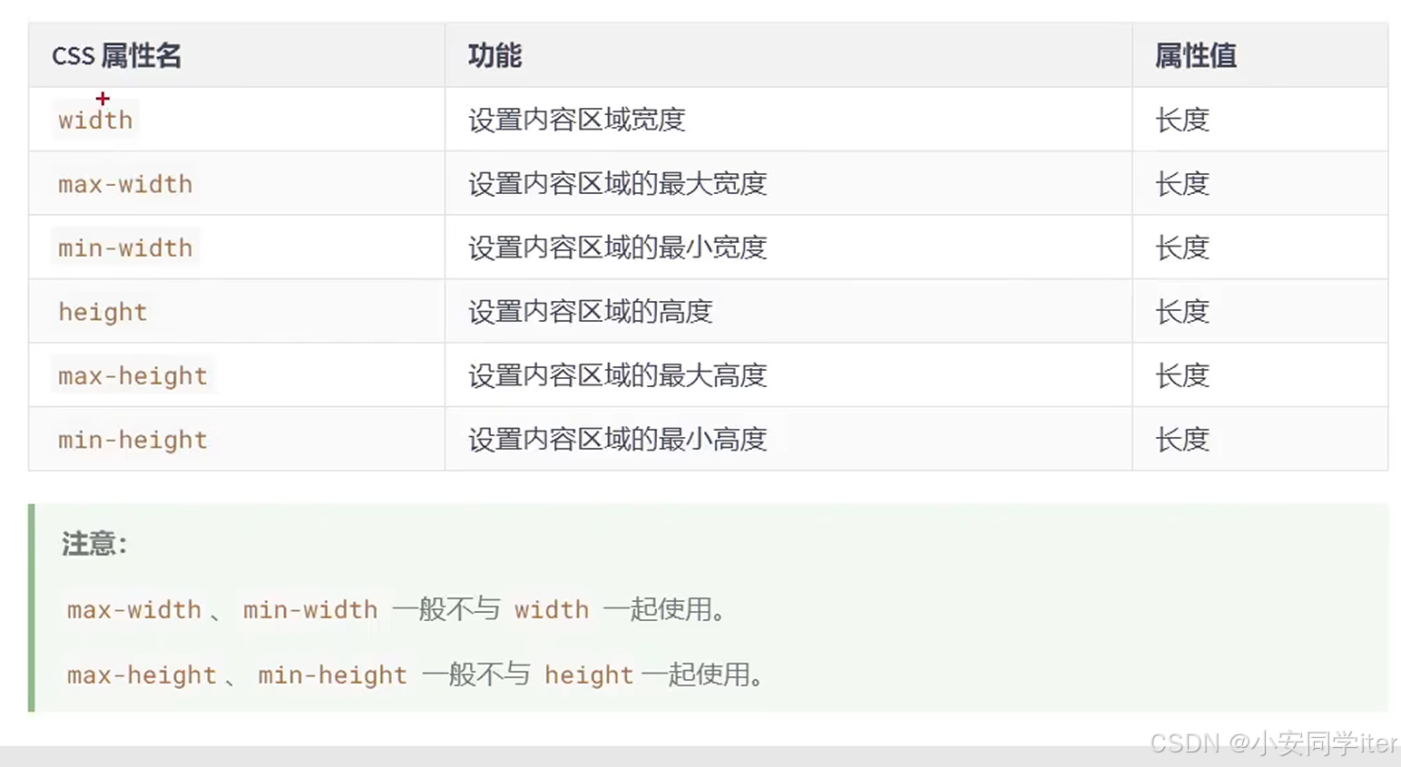
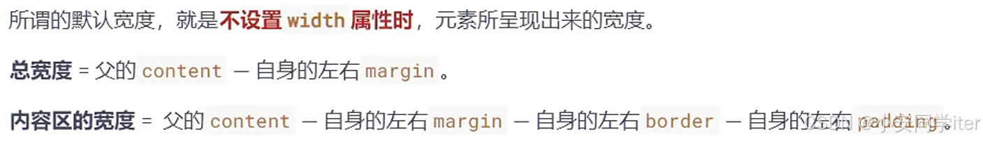
2 默认宽度
3 盒子的内边距(padding)
4 盒子的边框(border)
5 盒子的外间距(margin)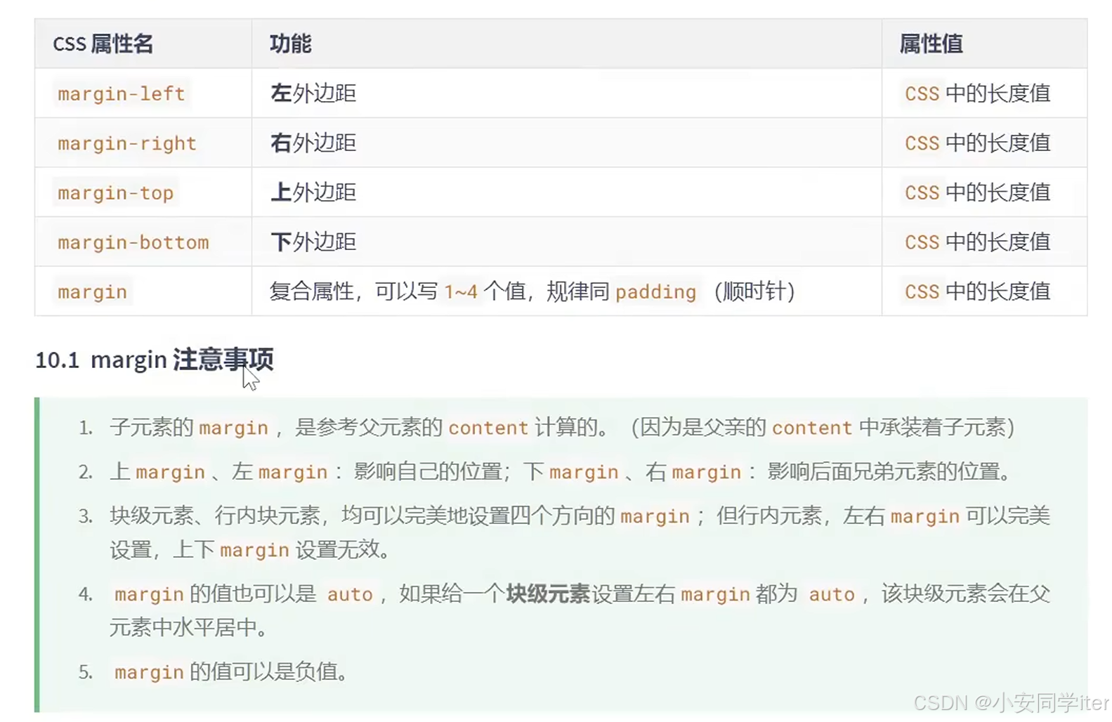
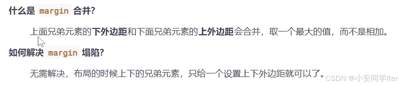
1 margin塌陷问题
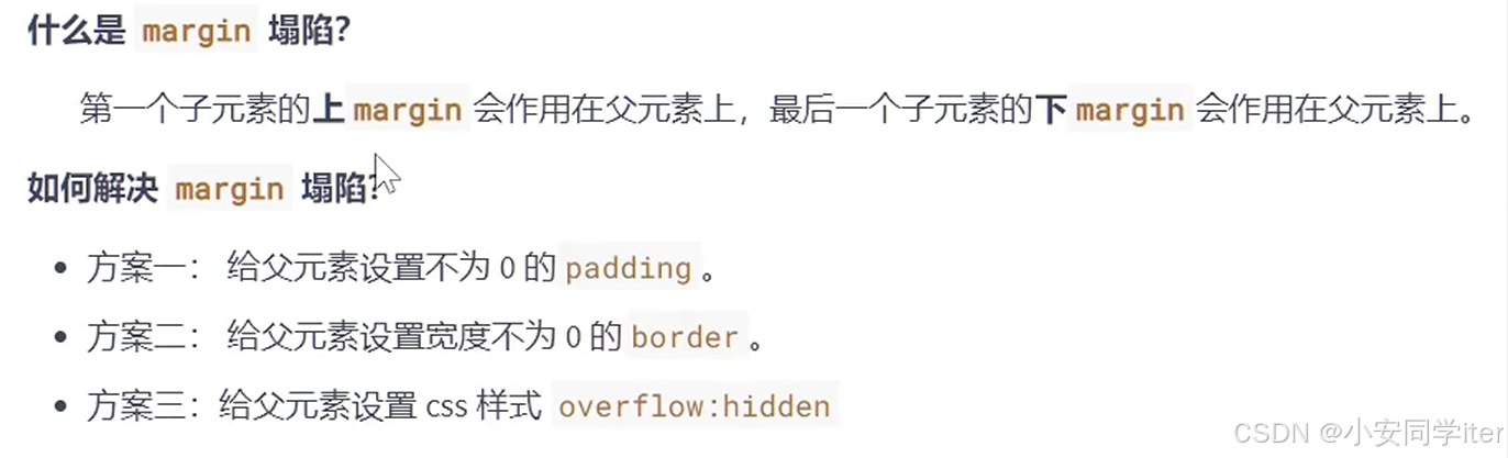
2 margin合并问题-公摊面积
四 问题解决
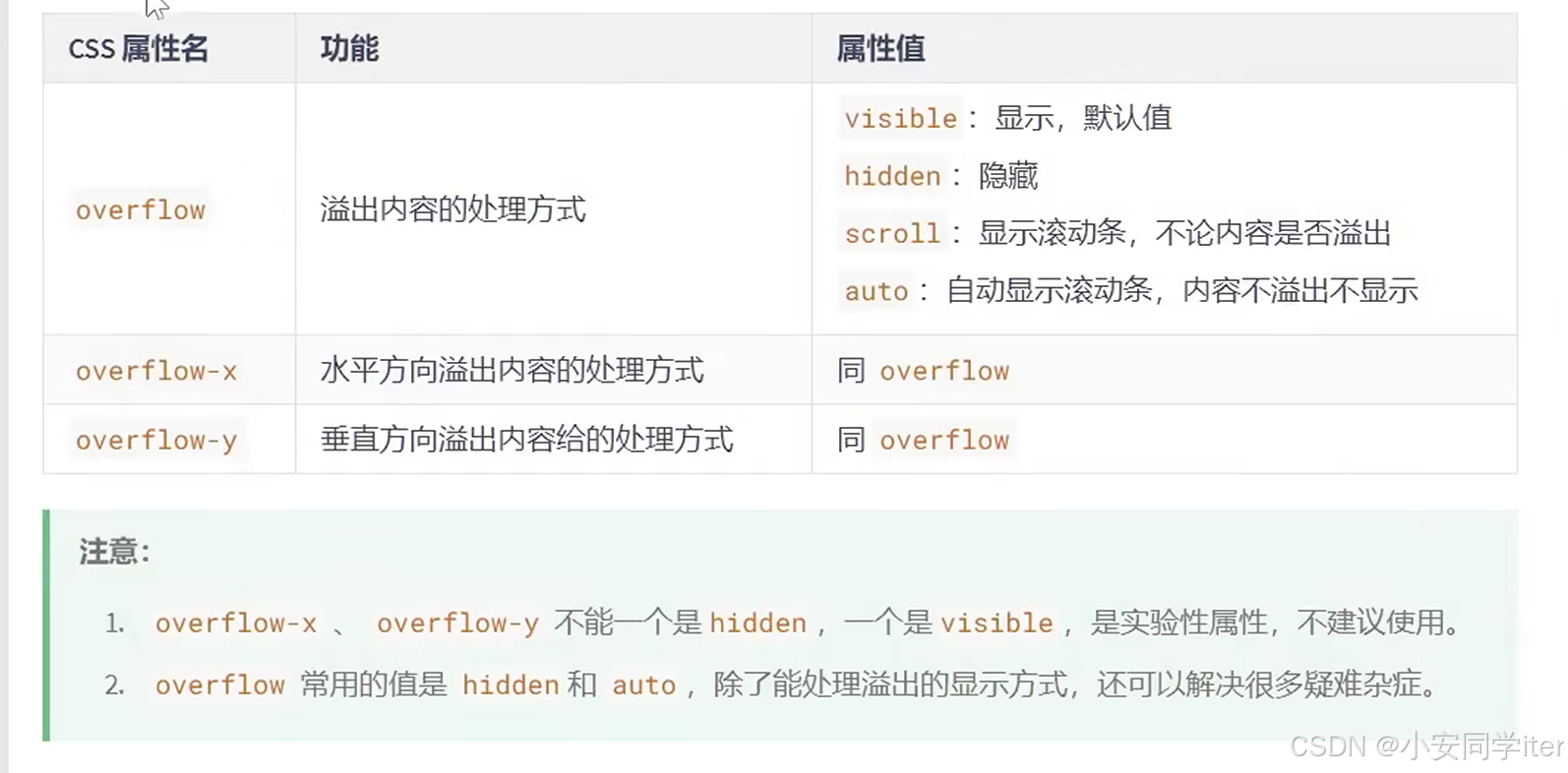
1 处理内容溢出问题
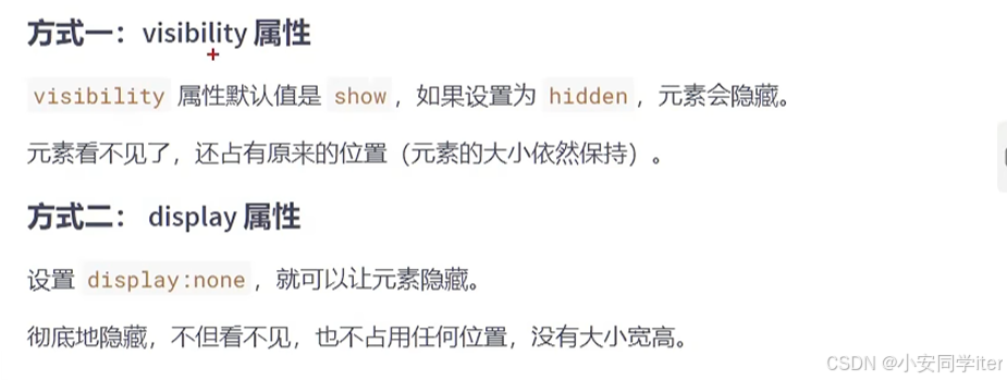
2 隐藏元素的两种方式
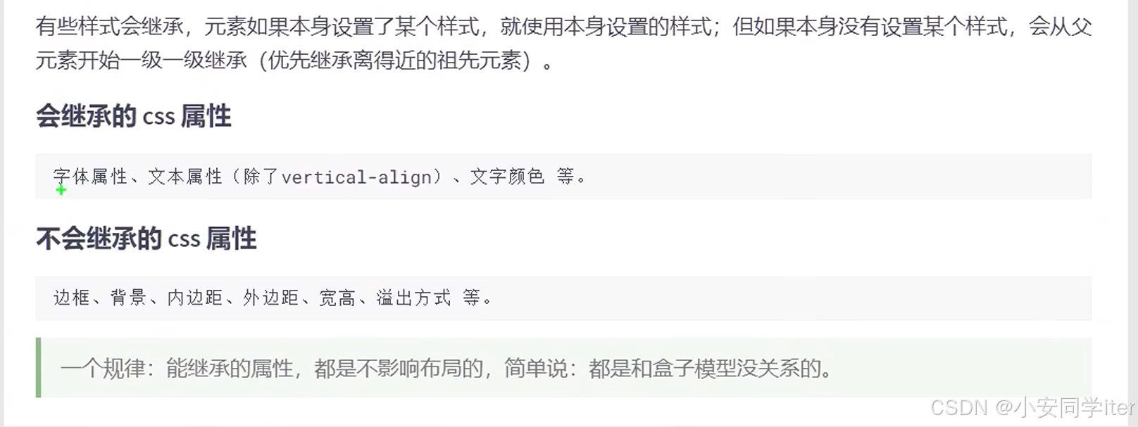
3 样式的继承
背景颜色的默认为透明--transparent
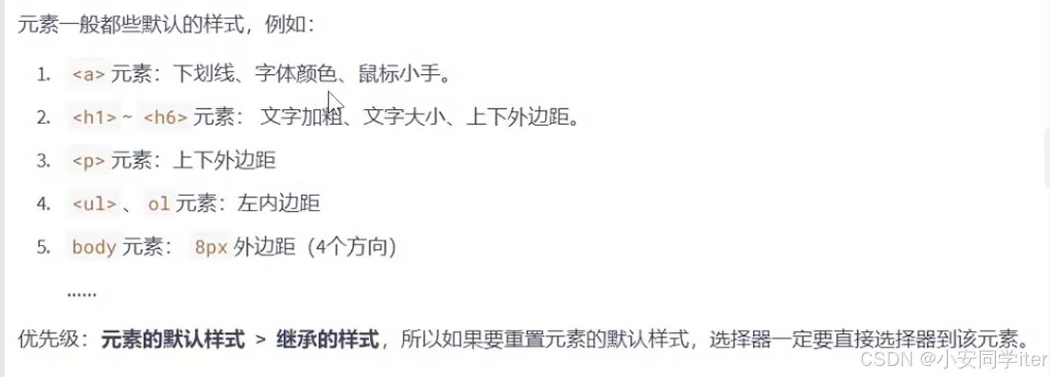
4 元素的默认样式
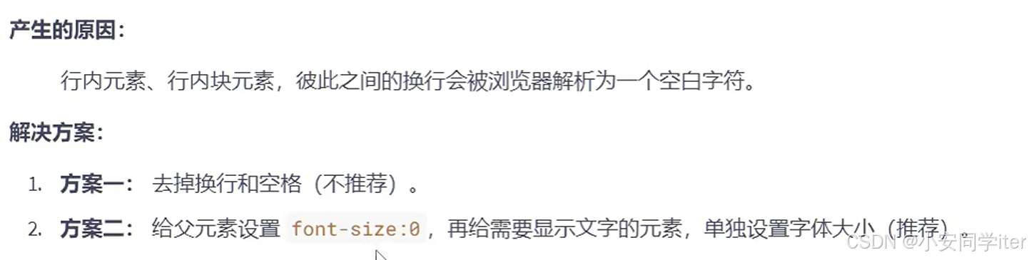
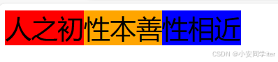
5 处理元素之间的空白问题
代码实现:
html
<!DOCTYPE html>
<html lang="zh-CN">

<head>
    <meta charset="UTF-8">
    <meta name="viewport" content="width=device-width, initial-scale=1.0">
    <title>Document</title>
    <style>
        /* 回车这个空格被认定为opx 不占据空间 */
        div {
            font-size: 0px;
        }

        span {
            font-size: 30px;
        }

        .ax1 {
            background-color: red;
        }

        .ax2 {
            background-color: orange;
        }

        .ax3 {
            background-color: blue;
        }
    </style>


</head>

<body>
    <div>
        <span class="ax1">人之初</span>
        <span class="ax2">性本善</span>
        <span class="ax3">性相近</span>
    </div>
</body>

</html>
图形化展示:
6 行内块元素的幽灵空白问题
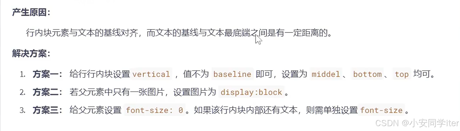
图形化展示
五 布局技巧
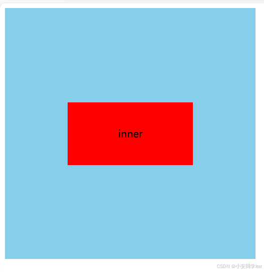
1 居中布局(块元素)
代码实现:
html
<!DOCTYPE html>
<html lang="zh-CN">

<head>
    <meta charset="UTF-8">
    <meta name="viewport" content="width=device-width, initial-scale=1.0">
    <title>Document</title>
    <style>
        .outer {
            width: 400px;
            height: 400px;
            background-color: skyblue;
            overflow: hidden;
        }

        .inner {
            width: 200px;
            height: 100px;
            margin: 0 auto;
            margin-top: 150px;
            background-color: red;
            text-align: center;
            line-height: 100px;
        }
    </style>


</head>

<body>
    <div class="outer">
        <div class="inner">
            inner
        </div>
    </div>
</body>

</html>
图形化展示:
2 居中显示(行内元素)
代码实现:
html
<!DOCTYPE html>
<html lang="zh-CN">

<head>
    <meta charset="UTF-8">
    <meta name="viewport" content="width=device-width, initial-scale=1.0">
    <title>Document</title>
    <style>
        /* 行内元素可以当成文字处理 */
        .ax1 {
            width: 400px;
            height: 400px;
            background-color: gray;
            text-align: center;
            line-height: 400px;
        }
        .ax2 {
            background-color: red;
            font-size: 20px;
        }
    </style>
</head>

<body>

    <div class="ax1">
        <span class="ax2">hello world</span>
    </div>

</body>

</html>
图形化展示:
六 浮动
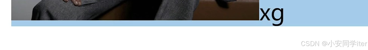
1 元素浮动
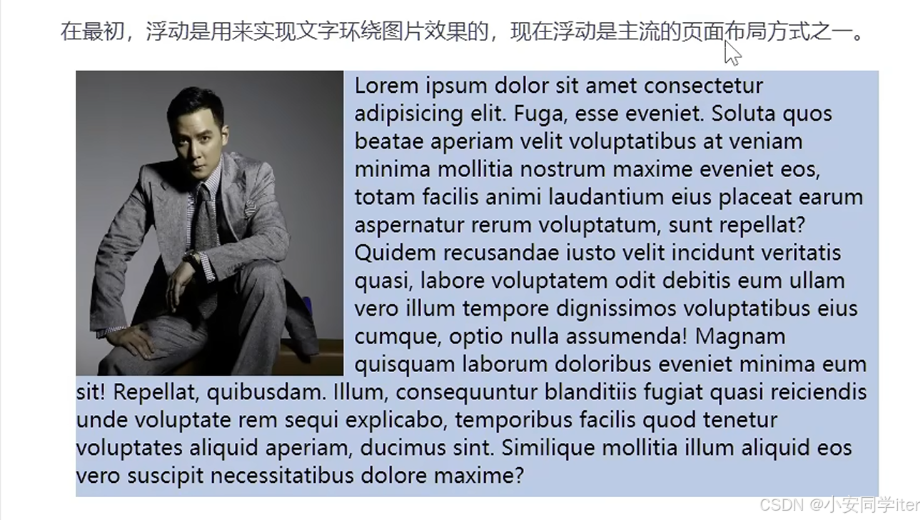
代码实现:
html
<!DOCTYPE html>
<html lang="zh-CN">

<head>
    <meta charset="UTF-8">
    <meta name="viewport" content="width=device-width, initial-scale=1.0">
    <title>Document</title>
    <style>
        div {
            width: 800px;
            height: 600px;
            background-color: skyblue;
        }

        img {
            width: 300px;
            float: left;
            margin-right: 1em;
        }
    </style>
</head>

<body>
    <div>
        <img src="../../HTML/QQ图片20240919174729.jpg" alt="">
        Lorem ipsum dolor sit, amet consectetur adipisicing elit. Excepturi earum repudiandae reprehenderit corporis
        architecto modi possimus quia aut! Est tempore quaerat, esse odio deleniti, debitis doloribus eos exercitationem
        ipsam omnis temporibus dignissimos nostrum nobis iste, distinctio perferendis repudiandae! Exercitationem qui
        modi pariatur ipsam blanditiis, consectetur fugiat officia sapiente aperiam consequatur doloribus, corporis
        illo? Rem libero officia totam est, ad accusantium nihil commodi a nam alias qui earum doloremque corrupti sequi
        labore doloribus accusamus voluptatem aliquid odit repellat minus laudantium. Qui quis libero doloremque nam id
        dignissimos voluptatibus commodi, natus recusandae vero unde quas. Consequatur deserunt omnis dolorem minus
        veniam aperiam nisi officiis perferendis eligendi. Eaque exercitationem tempora reprehenderit? Quae earum facere
        autem, alias maxime, impedit voluptas officia doloremque voluptate nostrum, accusantium natus quis quidem
        accusamus! Nesciunt autem, dolorem reprehenderit iusto accusamus maiores eius sed quaerat veniam! Molestias
        beatae quaerat voluptates, tenetur, ipsum saepe atque rerum dicta dolorem error at aperiam, eaque incidunt?
        Totam culpa dolorem eaque delectus aperiam sit repudiandae laudantium distinctio fugit in dolor voluptas quaerat
        laborum fugiat deleniti architecto, optio, blanditiis doloribus laboriosam. Dolor, ex? Possimus, fugiat
        delectus, fuga quaerat deleniti voluptate necessitatibus enim repellat temporibus iusto quibusdam excepturi
        ratione culpa ea accusantium quae voluptas cum quod dicta.
    </div>
</body>

</html>
图形化实现
2 元素浮动的特点
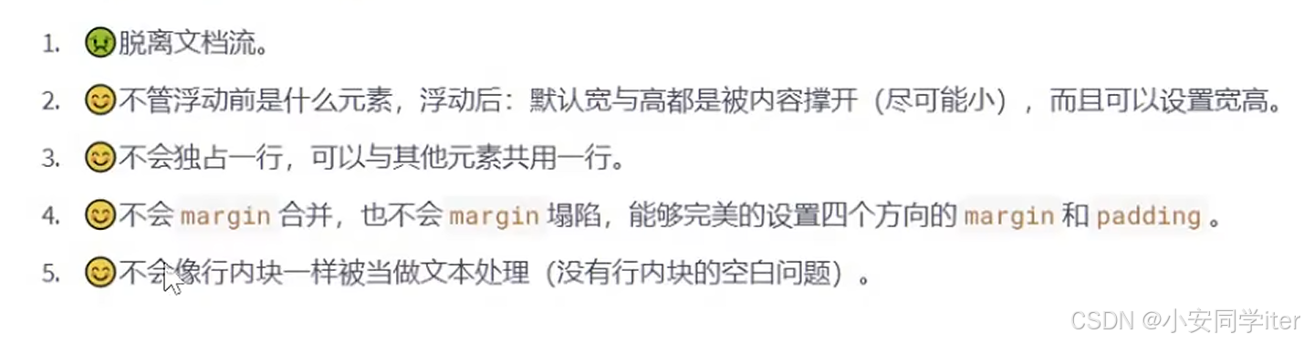
内容解释:
-
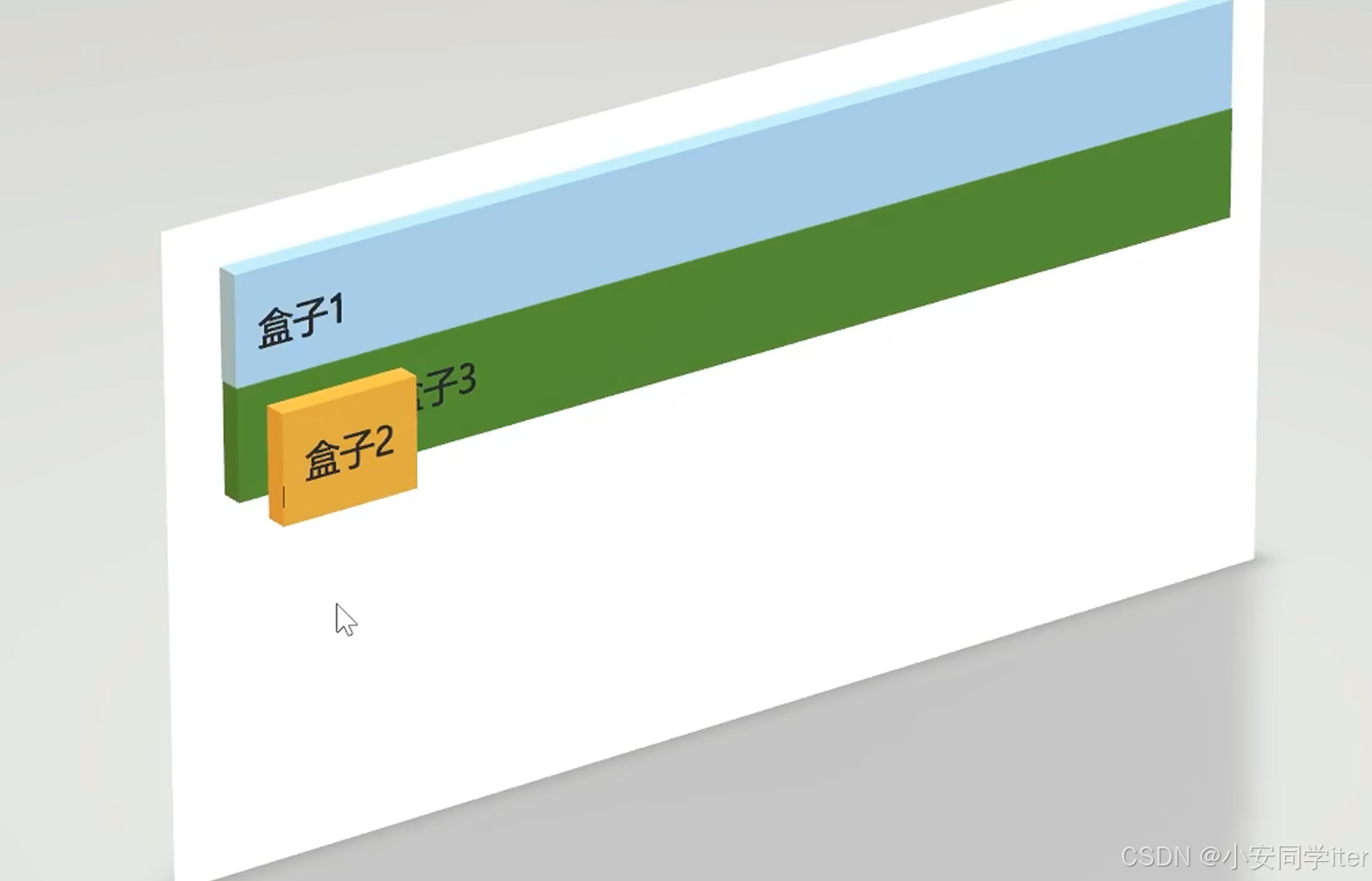
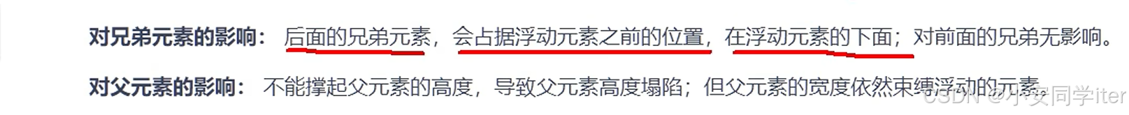
脱离文档流:
- 浮动元素会从正常的文档流中移除,并尽可能地向左或向右移动(取决于
float属性的值是left还是right)。这意味着浮动元素不会影响其后的非浮动元素的位置。
- 浮动元素会从正常的文档流中移除,并尽可能地向左或向右移动(取决于
-
不管浮动前是什么元素,浮动后:默认宽与高都是被内容撑开(尽可能小),而且可以设置宽高:
- 浮动元素的宽度和高度默认情况下是由其内容决定的,即内容多少就占用多大的空间。但是,你可以通过CSS手动设置浮动元素的宽度和高度。
-
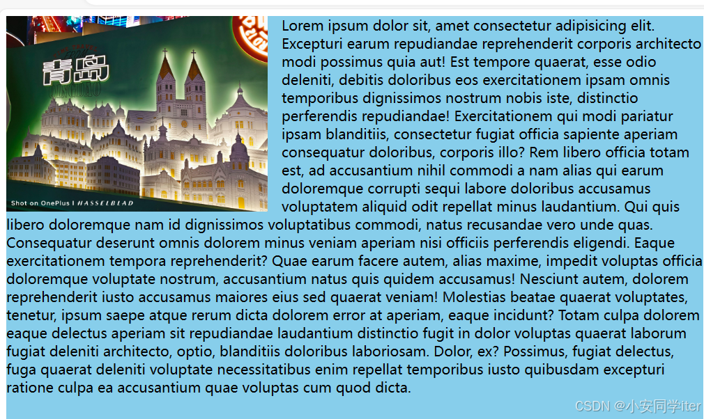
不会独占一行,可以与其他元素共用一行:
- 浮动元素不会自动占据一整行的空间,而是尽可能地和其他浮动元素共享一行。如果空间不足,则浮动元素会换到下一行。
-
不会margin合并,也不会margin塌陷,能够完美的设置四个方向的margin和padding:
- 浮动元素的外边距(
margin)不会与其他元素的外边距发生合并现象,也不会出现所谓的"margin塌陷"问题。这意味着你可以精确地控制浮动元素四周的间距。
- 浮动元素的外边距(
-
不会像行内块一样被当做文本处理(没有行内块的空白问题):
- 浮动元素不会像行内元素那样受到空白字符的影响。行内元素之间的空白会被浏览器解析为一个空格,而浮动元素则不会受此影响,因此不会出现因空白字符导致的额外间隙问题。
代码实现:
html
<!DOCTYPE html>
<html lang="zh-CN">
<head>
<meta charset="UTF-8">
<meta name="viewport" content="width=device-width, initial-scale=1.0">
<title>Document</title>
<style>
.outer {
background-color: skyblue;
width: 800px;
height: 400px;
}
.box {
font-size: 20px;
}
.box1 {
background-color: skyblue;
}
.box2 {
background-color: yellow;
float: left;
}
.box3 {
background-color: green;
}
</style>
</head>
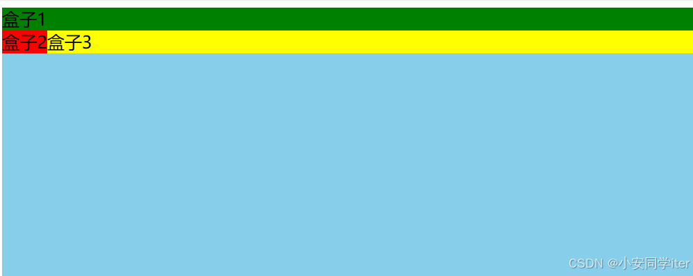
<body>
<div class="outer">
<div class="box box1">盒子1</div>
<div class="box box2">盒子2</div>
<div class="box box3">盒子3</div>
</div>
</body>
</html>图形化展示:
3 元素浮动的影响
137集