示例效果和代码 直接可以用
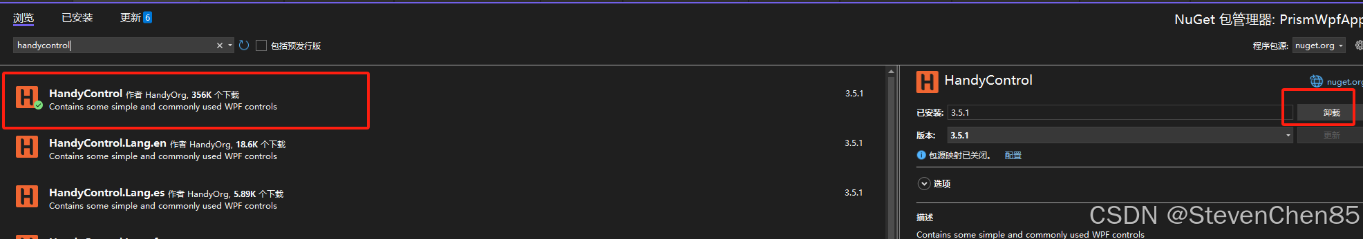
1.安装 , 输入 HandyControl
2.<!--配置HandyControl-->
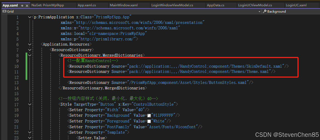
<!--配置HandyControl-->
<ResourceDictionary Source="pack://application:,,,/HandyControl;component/Themes/SkinDefault.xaml"/>
<ResourceDictionary Source="pack://application:,,,/HandyControl;component/Themes/Theme.xaml"/>

<Application.Resources>
    <ResourceDictionary>
        <ResourceDictionary.MergedDictionaries>
            <!--配置HandyControl-->
            <ResourceDictionary Source="pack://application:,,,/HandyControl;component/Themes/SkinDefault.xaml"/>
            <ResourceDictionary Source="pack://application:,,,/HandyControl;component/Themes/Theme.xaml"/>
        </ResourceDictionary.MergedDictionaries>
    </ResourceDictionary>
</Application.Resources>
3.使用示例
<Window x:Class="PrismWpfApp.Views.MainWindow"
xmlns="http://schemas.microsoft.com/winfx/2006/xaml/presentation"
xmlns:x="http://schemas.microsoft.com/winfx/2006/xaml"
xmlns:d="http://schemas.microsoft.com/expression/blend/2008"
xmlns:mc="http://schemas.openxmlformats.org/markup-compatibility/2006"
xmlns:local="clr-namespace:PrismWpfApp"
xmlns:prism="http://prismlibrary.com/"
prism:ViewModelLocator.AutoWireViewModel="True"
mc:Ignorable="d"
Title="{Binding Title}" Height="450" Width="800">
<Grid>
<!--<TextBlock Text="{Binding Title}"/>-->
<Grid.RowDefinitions>
<RowDefinition Height="30"></RowDefinition>
<RowDefinition ></RowDefinition>
</Grid.RowDefinitions>
<StackPanel Grid.Row="0" Orientation="Horizontal">
<Button Content="区域A" Width="80" Height="30" Command="{Binding ShowContentCommand}" CommandParameter="UserControlA" ></Button>
<Button Content="区域B" Width="80" Height="30" Command="{Binding ShowContentCommand}" CommandParameter="UserControlB" ></Button>
<Button Content="区域C" Width="80" Height="30" Command="{Binding ShowContentCommand}" CommandParameter="UserControlC" ></Button>
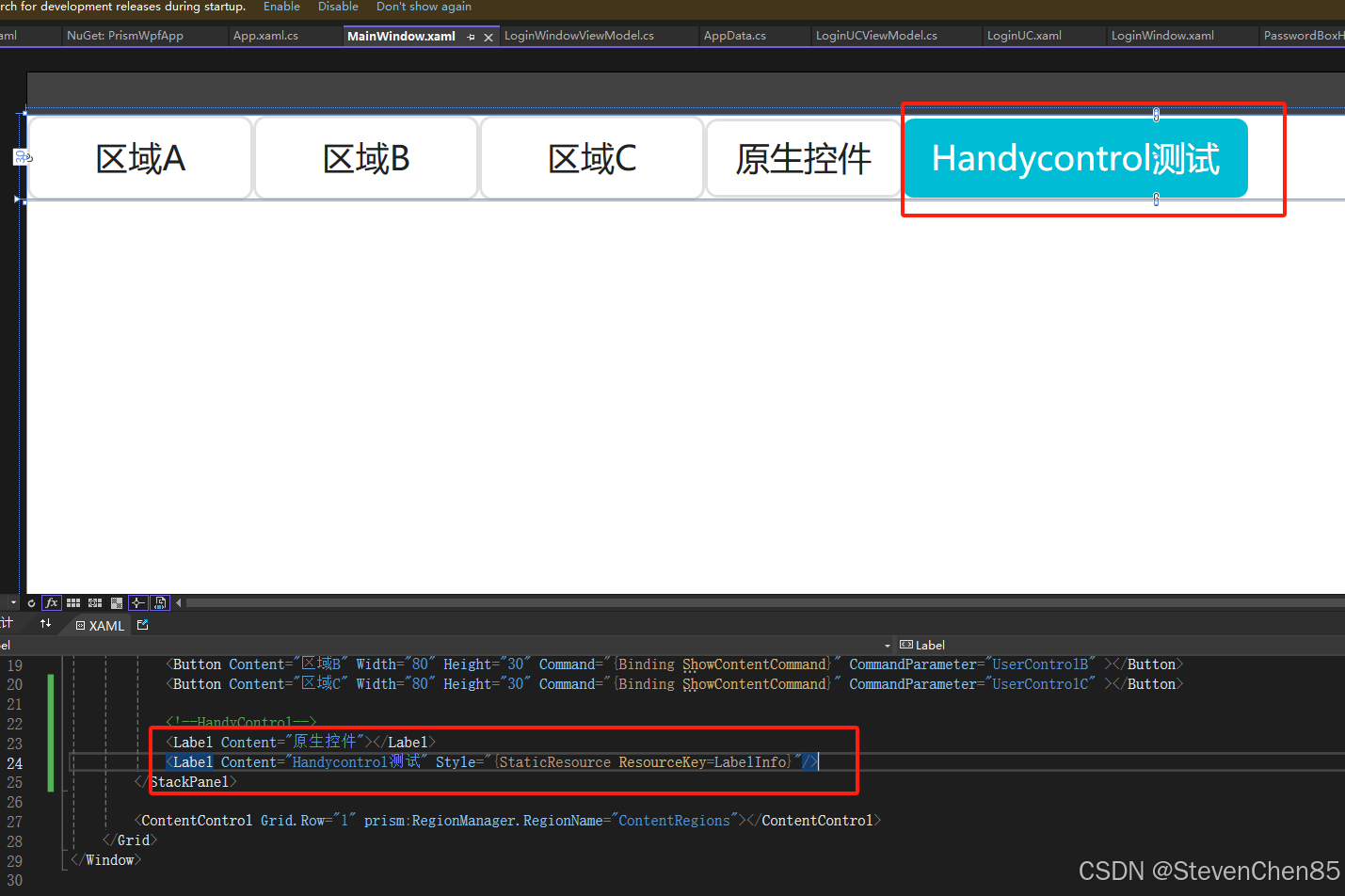
<!--HandyControl-->
<Label Content="原生控件"></Label>
<Label Content="Handycontrol测试" Style="{StaticResource ResourceKey=LabelInfo}"/>
</StackPanel>
<ContentControl Grid.Row="1" prism:RegionManager.RegionName="ContentRegions"></ContentControl>
</Grid>
</Window>