2025ArkTS基础UI(一)------Column、Row、Text组件
前言
臭宝们,今天我们来学习ArkTS基础UI组件的使用,其中包括:
Column、Row、Text组件。
知识点
Colum、Row组件用于布局,Text、Image、Button组件用于展示。
Column组件
Column组件用于垂直布局,其子元素从上到下依次排列,常作为布局的根组件。
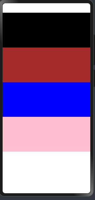
示例代码(一)
@Extend(Column) function  Columnd(){
  .width('100%')
  .height('20%')
}
@Entry
@Component
struct Index {


  build() {
    Column() {
      Column()
        .backgroundColor(Color.Black)
        .Columnd()
      Column()
        .Columnd()
        .backgroundColor(Color.Brown)
      Column()
        .Columnd()
        .backgroundColor(Color.Blue)
      Column()
        .Columnd()
        .backgroundColor(Color.Pink)

    }
    .height('100%')
    .width('100%')
  }
}
效果图(一)
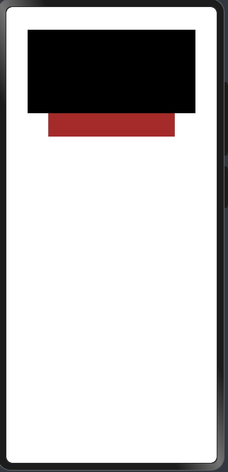
示例代码(二)
@Entry
@Component
struct Index {

  build() {
    Column() {
      Column()
        .backgroundColor(Color.Black)
        .width('80%')
        .height('20%')
      Column()
        .width('60%')
        .height('40')
        .backgroundColor(Color.Brown)
    }
    .height('100%')
    .width('100%')
  }
}
效果图(二)
Column属性
| 属性名 | 类型 | 说明 |
|---|---|---|
| width | string | number | 设置组件的宽度,可以是百分比或具体数值。例如:'100%' 或 '200px'。 |
| height | string | number | 设置组件的高度,可以是百分比或具体数值。例如:'50%' 或 '300px'。 |
| backgroundColor | Color | 设置背景颜色。例如:backgroundColor(Color.Red)。 |
Row组件
Row组件用于水平布局,其子元素从左到右依次排列。
示例代码(一)
@Extend(Column) function  Columnd(){
  .width('20%')
  .height('100%')
}
@Entry
@Component
struct Index {


  build() {
    Row() {
      Column()
        .backgroundColor(Color.Black)
        .Columnd()
      Column()
        .Columnd()
        .backgroundColor(Color.Brown)
      Column()
        .Columnd()
        .backgroundColor(Color.Blue)
      Column()
        .Columnd()
        .backgroundColor(Color.Pink)

    }
    .height('100%')
    .width('100%')
  }
}
效果图(一)

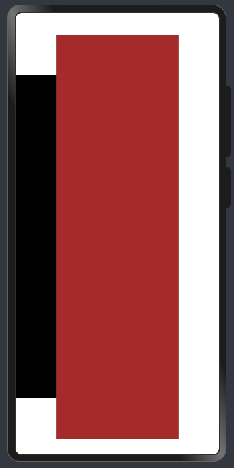
示例代码(二)
@Entry
@Component
struct Index {


  build() {
    Row() {
      Column()
        .backgroundColor(Color.Black)
        .width('20%')
        .height('80%')
      Column()
        .width('60%')
        .height('100%')
        .backgroundColor(Color.Brown)
    }
    .height('100%')
    .width('100%')
  }
效果图(二)
Row属性
| 属性名 | 类型 | 说明 |
|---|---|---|
| width | string | number | 设置组件的宽度,可以是百分比或具体数值。例如:'100%' 或 '200px'。 |
| height | string | number | 设置组件的高度,可以是百分比或具体数值。例如:'50%' 或 '300px'。 |
| backgroundColor | Color | 设置背景颜色。例如:backgroundColor(Color.Red)。 |
Text组件
text组件用于展示文本内容。
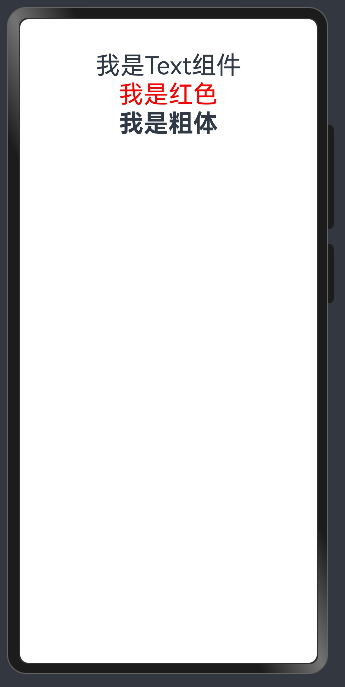
示例代码
@Entry
@Component
struct Index {


  build() {
    Column() {
      Text('我是Text组件')
        .fontSize(30)
      Text('我是红色')
        .fontSize(30)
        .fontColor(Color.Red)
      Text('我是粗体')
        .fontSize(30)
        .fontWeight(FontWeight.Bold)
    }
    .height('100%')
    .width('100%')
  }
}
效果图
Text属性
| 属性名 | 类型 | 说明 |
|---|---|---|
| fontSize | number | 设置字体大小。例如:fontSize(24),单位为像素(px)。 |
| fontColor | Color | 设置字体颜色。例如:fontColor(Color.Blue)。 |
| fontWeight | FontWeight | 设置字体粗细。例如:fontWeight(FontWeight.Bold)。 |
最后,希望臭宝们能够熟练掌握这些基础组件的使用,以便在开发中灵活运用。