文章目录
-
- 一、RadioButton简介
- 二、RadioButton的基本用法
-
- [1. 创建基本的RadioButton](#1. 创建基本的RadioButton)
- [2. 分组管理](#2. 分组管理)
- [3. 设置默认选中](#3. 设置默认选中)
- 三、RadioButton的重要属性和事件
-
- [1. 关键属性](#1. 关键属性)
- [2. 主要事件](#2. 主要事件)
- [3. 事件处理流程](#3. 事件处理流程)
- [4. 监听选中状态变化](#4. 监听选中状态变化)
- 四、数据绑定与RadioButton
-
- [1. 基本数据绑定](#1. 基本数据绑定)
- [2. 数据绑定流程](#2. 数据绑定流程)
- [3. 使用枚举绑定](#3. 使用枚举绑定)
- 五、自定义RadioButton样式
-
- [1. 基本样式设置](#1. 基本样式设置)
- [2. 自定义模板](#2. 自定义模板)
- [3. 创建图像按钮](#3. 创建图像按钮)
- 六、常见应用场景及示例
-
- [1. 应用场景流程图](#1. 应用场景流程图)
- [2. 选项卡式界面](#2. 选项卡式界面)
- [3. 问卷调查表单](#3. 问卷调查表单)
- [4. 与其他控件组合使用](#4. 与其他控件组合使用)
- 七、MVVM模式中的RadioButton
- 八、性能优化和最佳实践
-
- [1. 性能考虑](#1. 性能考虑)
- [2. 可访问性](#2. 可访问性)
- [3. 常见问题及解决方案](#3. 常见问题及解决方案)
- 九、总结
- 十、相关资源
可以根据Github拉取示例程序运行
GitHub程序演示地址(点击直达)也可以在本文资源中下载
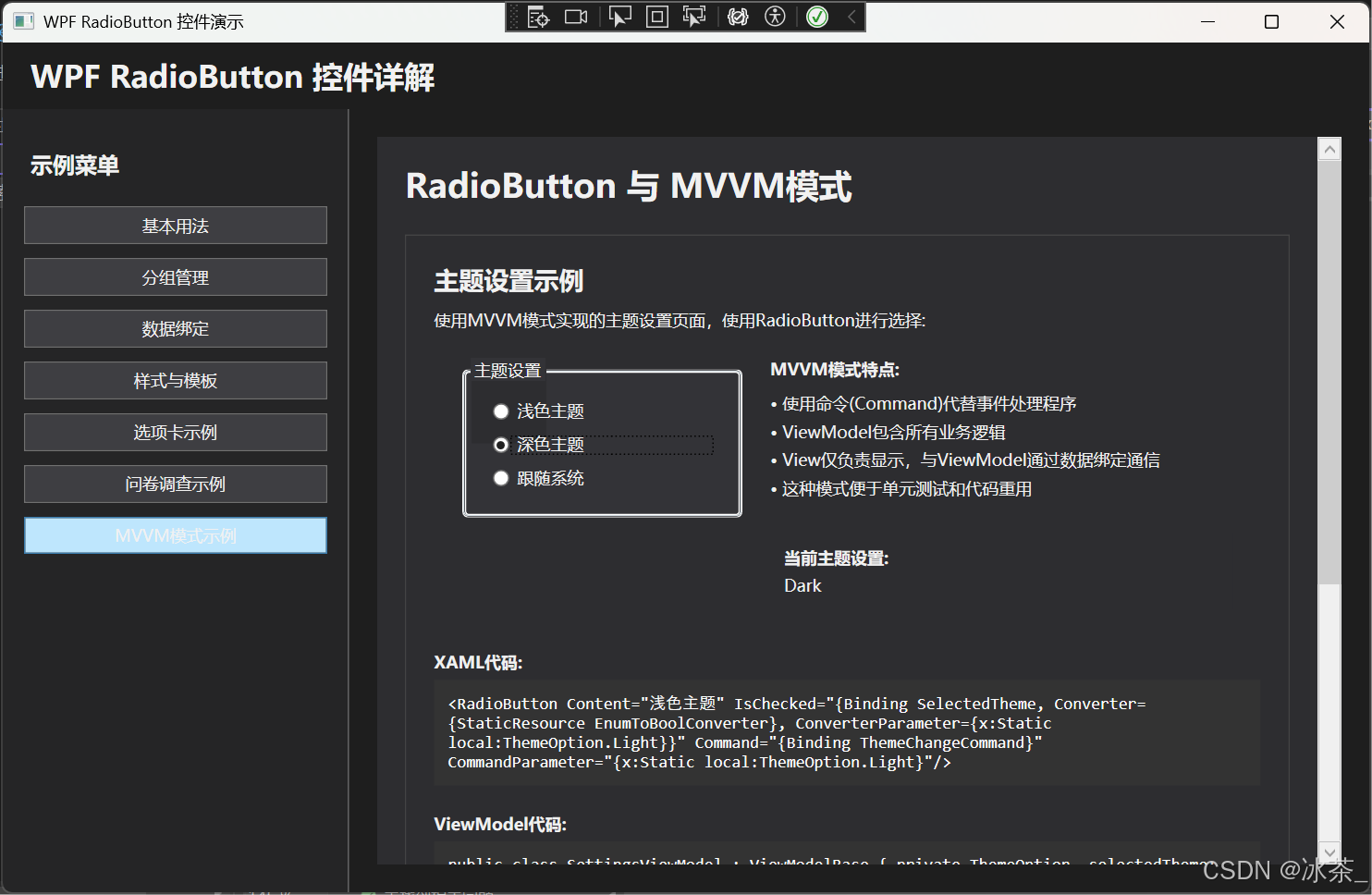
一、RadioButton简介
RadioButton(单选按钮)是WPF中常用的UI控件之一,用于在一组选项中选择唯一的一个选项。与CheckBox不同,同一组内的RadioButton具有互斥性,即同一时间只能有一个按钮被选中。RadioButton主要应用于需要用户从预定义的多个选项中选择一个的场景。
RadioButton控件继承自ToggleButton类,从而获得了可切换状态的特性。但与ToggleButton不同,它实现了组内互斥的行为,确保同一组内只有一个RadioButton可以被选中。
Object DependencyObject Visual UIElement FrameworkElement Control ContentControl ButtonBase ToggleButton RadioButton
IsChecked: bool
GroupName: string
IsThreeState: bool
二、RadioButton的基本用法
1. 创建基本的RadioButton
以下是创建基本RadioButton的XAML代码:
xaml
<RadioButton Content="选项1" Margin="5"/>
<RadioButton Content="选项2" Margin="5"/>
<RadioButton Content="选项3" Margin="5"/>
若要在代码中创建RadioButton:
csharp
// 创建RadioButton控件
RadioButton radioButton = new RadioButton();
radioButton.Content = "选项1";
radioButton.Margin = new Thickness(5);
2. 分组管理
RadioButton的核心特性是通过GroupName属性进行分组。同一个GroupName的RadioButton只能有一个处于选中状态:
xml
<StackPanel>
    <!-- 第一组 -->
    <RadioButton GroupName="Group1" Content="选项1" Margin="5"/>
    <RadioButton GroupName="Group1" Content="选项2" Margin="5"/>
    <RadioButton GroupName="Group1" Content="选项3" Margin="5"/>

    <!-- 第二组 -->
    <RadioButton GroupName="Group2" Content="选择A" Margin="5"/>
    <RadioButton GroupName="Group2" Content="选择B" Margin="5"/>
</StackPanel>
如果不设置GroupName,RadioButton的分组将基于其逻辑父级元素进行。例如,放在同一个StackPanel中的RadioButton(不指定GroupName)将自动成为一个组。
3. 设置默认选中
通过IsChecked属性设置RadioButton的默认选中状态:
xml
<RadioButton GroupName="Group1" Content="选项1" IsChecked="True" Margin="5"/>
<RadioButton GroupName="Group1" Content="选项2" Margin="5"/>
<RadioButton GroupName="Group1" Content="选项3" Margin="5"/>
三、RadioButton的重要属性和事件
1. 关键属性
RadioButton GroupName
指定RadioButton所属的组名
默认值: 空字符串 IsChecked
获取或设置RadioButton的选中状态
默认值: false IsThreeState
指定是否启用三态模式
默认值: false Content
设置RadioButton的显示内容
默认值: null
2. 主要事件
RadioButton Checked
RadioButton被选中时触发 Unchecked
RadioButton从选中状态变为未选中状态时触发 Indeterminate
当IsThreeState为true时,
RadioButton进入不确定状态时触发 Click
单击RadioButton时触发
3. 事件处理流程
User RadioButton OtherRadioButtons Application 点击 检查当前状态 取消选中同组其他按钮 触发Checked事件 触发Unchecked事件 alt 当前未选中 当前已选中 始终触发Click事件 User RadioButton OtherRadioButtons Application
4. 监听选中状态变化
csharp
public MainWindow()
{
    InitializeComponent();

    // 方法1:单独处理Checked事件
    myRadioButton.Checked += (sender, e) =>
    {
        // 处理选中事件
        MessageBox.Show("RadioButton被选中");
    };

    // 方法2:使用Click事件统一处理状态变化
    myRadioButton.Click += (sender, e) =>
    {
        RadioButton rb = sender as RadioButton;
        if (rb.IsChecked == true)
        {
            // 处理选中状态
        }
    };
}
四、数据绑定与RadioButton
1. 基本数据绑定
将RadioButton的IsChecked属性绑定到视图模型中的布尔属性:
xml
<RadioButton Content="男" IsChecked="{Binding IsMale}"/>
<RadioButton Content="女" IsChecked="{Binding IsFemale}"/>
csharp
public class PersonViewModel : INotifyPropertyChanged
{
    private bool _isMale;

    public bool IsMale
    {
        get { return _isMale; }
        set
        {
            _isMale = value;
            OnPropertyChanged(nameof(IsMale));
            // 更新互斥属性
            if (value) IsFemale = false;
        }
    }

    private bool _isFemale;

    public bool IsFemale
    {
        get { return _isFemale; }
        set
        {
            _isFemale = value;
            OnPropertyChanged(nameof(IsFemale));
            // 更新互斥属性
            if (value) IsMale = false;
        }
    }

    // INotifyPropertyChanged 实现
    public event PropertyChangedEventHandler PropertyChanged;

    protected void OnPropertyChanged(string propertyName)
    {
        PropertyChanged?.Invoke(this, new PropertyChangedEventArgs(propertyName));
    }
}
2. 数据绑定流程
绑定 用户交互 触发事件 更新 影响 ViewModel中的属性 RadioButton.IsChecked UI状态改变 PropertyChanged通知 其他UI元素或逻辑
3. 使用枚举绑定
更常见和推荐的做法是使用枚举进行绑定:
csharp
// 枚举定义
public enum Gender
{
    Male,
    Female
}

// 视图模型
public class PersonViewModel : INotifyPropertyChanged
{
    private Gender _gender;

    public Gender Gender
    {
        get { return _gender; }
        set
        {
            _gender = value;
            OnPropertyChanged(nameof(Gender));
        }
    }

    // INotifyPropertyChanged 实现
    public event PropertyChangedEventHandler PropertyChanged;

    protected void OnPropertyChanged(string propertyName)
    {
        PropertyChanged?.Invoke(this, new PropertyChangedEventArgs(propertyName));
    }
}
xml
<RadioButton Content="男"
             IsChecked="{Binding Gender, Converter={StaticResource EnumToBoolConverter}, ConverterParameter={x:Static local:Gender.Male}}"/>
<RadioButton Content="女"
             IsChecked="{Binding Gender, Converter={StaticResource EnumToBoolConverter}, ConverterParameter={x:Static local:Gender.Female}}"/>
枚举到布尔值的转换器:
csharp
public class EnumToBoolConverter : IValueConverter
{
    public object Convert(object value, Type targetType, object parameter, CultureInfo culture)
    {
        // 检查值和参数
        if (value == null || parameter == null) return false;

        // 获取枚举值
        string enumValue = value.ToString();
        string targetValue = parameter.ToString();

        // 比较并返回结果
        return enumValue.Equals(targetValue);
    }

    public object ConvertBack(object value, Type targetType, object parameter, CultureInfo culture)
    {
        // 如果选中,则返回对应的枚举值
        if (value is bool && (bool)value)
        {
            if (parameter != null)
            {
                return Enum.Parse(targetType, parameter.ToString());
            }
        }

        // 默认返回
        return Binding.DoNothing;
    }
}
五、自定义RadioButton样式
1. 基本样式设置
xml
<RadioButton Content="自定义样式" Margin="5">
    <RadioButton.Style>
        <Style TargetType="RadioButton">
            <Setter Property="Foreground" Value="Navy"/>
            <Setter Property="FontWeight" Value="Bold"/>
            <Setter Property="Padding" Value="5"/>
            <Style.Triggers>
                <Trigger Property="IsChecked" Value="True">
                    <Setter Property="Foreground" Value="Red"/>
                </Trigger>
                <Trigger Property="IsMouseOver" Value="True">
                    <Setter Property="Foreground" Value="Green"/>
                </Trigger>
            </Style.Triggers>
        </Style>
    </RadioButton.Style>
</RadioButton>
2. 自定义模板
通过修改ControlTemplate可以完全改变RadioButton的外观:
xml
<RadioButton Content="自定义模板" Margin="10">
    <RadioButton.Template>
        <ControlTemplate TargetType="RadioButton">
            <Border x:Name="border"
                    BorderBrush="Gray"
                    BorderThickness="1"
                    CornerRadius="8"
                    Background="LightGray"
                    Padding="5">
                <Grid>
                    <Grid.ColumnDefinitions>
                        <ColumnDefinition Width="Auto"/>
                        <ColumnDefinition Width="*"/>
                    </Grid.ColumnDefinitions>

                    <!-- 自定义单选按钮外观 -->
                    <Grid Width="16" Height="16" Margin="0,0,5,0" VerticalAlignment="Center">
                        <Ellipse x:Name="outerEllipse"
                                 Fill="White"
                                 Stroke="DarkGray"
                                 StrokeThickness="1"/>
                        <Ellipse x:Name="innerEllipse"
                                 Width="8" Height="8"
                                 Fill="Blue"
                                 Visibility="Collapsed"/>
                    </Grid>

                    <!-- 内容 -->
                    <ContentPresenter Grid.Column="1"
                                     VerticalAlignment="Center"
                                     HorizontalAlignment="Left"/>
                </Grid>
            </Border>

            <!-- 视觉状态管理 -->
            <ControlTemplate.Triggers>
                <Trigger Property="IsChecked" Value="True">
                    <Setter TargetName="innerEllipse" Property="Visibility" Value="Visible"/>
                    <Setter TargetName="outerEllipse" Property="Stroke" Value="Blue"/>
                </Trigger>
                <Trigger Property="IsMouseOver" Value="True">
                    <Setter TargetName="border" Property="Background" Value="#FFE8E8E8"/>
                </Trigger>
                <Trigger Property="IsPressed" Value="True">
                    <Setter TargetName="border" Property="Background" Value="#FFDDDDDD"/>
                </Trigger>
                <Trigger Property="IsEnabled" Value="False">
                    <Setter TargetName="border" Property="Opacity" Value="0.5"/>
                    <Setter TargetName="outerEllipse" Property="Stroke" Value="#FFAAAAAA"/>
                    <Setter TargetName="innerEllipse" Property="Fill" Value="#FFAAAAAA"/>
                </Trigger>
            </ControlTemplate.Triggers>
        </ControlTemplate>
    </RadioButton.Template>
</RadioButton>
3. 创建图像按钮
xml
<RadioButton GroupName="ImageButtons" Margin="5">
    <RadioButton.Template>
        <ControlTemplate TargetType="RadioButton">
            <Border x:Name="border"
                    BorderThickness="2"
                    BorderBrush="Transparent"
                    CornerRadius="4">
                <Grid>
                    <Image Source="/Assets/icon.png" Width="32" Height="32"/>
                    <Border x:Name="selectionIndicator"
                           Background="#3000BFFF"
                           Opacity="0"
                           CornerRadius="4"/>
                </Grid>
            </Border>
            <ControlTemplate.Triggers>
                <Trigger Property="IsChecked" Value="True">
                    <Setter TargetName="border" Property="BorderBrush" Value="#FF00BFFF"/>
                    <Setter TargetName="selectionIndicator" Property="Opacity" Value="1"/>
                </Trigger>
                <Trigger Property="IsMouseOver" Value="True">
                    <Setter TargetName="selectionIndicator" Property="Opacity" Value="0.5"/>
                </Trigger>
            </ControlTemplate.Triggers>
        </ControlTemplate>
    </RadioButton.Template>
</RadioButton>
六、常见应用场景及示例
1. 应用场景流程图
是 否 是 否 用户进入界面 是否有预设选项? 设置默认RadioButton选中 所有RadioButton保持未选中 用户选择其他选项 触发选中事件 执行相应业务逻辑 需要切换界面? 加载新界面 更新当前界面状态
2. 选项卡式界面
xml
<Grid>
    <Grid.RowDefinitions>
        <RowDefinition Height="Auto"/>
        <RowDefinition Height="*"/>
    </Grid.RowDefinitions>

    <!-- 选项卡栏 -->
    <StackPanel Orientation="Horizontal" Background="#F0F0F0">
        <RadioButton x:Name="tabHome" Content="首页" IsChecked="True"
                    Style="{StaticResource TabRadioButtonStyle}"/>
        <RadioButton x:Name="tabSettings" Content="设置"
                    Style="{StaticResource TabRadioButtonStyle}"/>
        <RadioButton x:Name="tabHelp" Content="帮助"
                    Style="{StaticResource TabRadioButtonStyle}"/>
    </StackPanel>

    <!-- 内容区域 -->
    <Grid Grid.Row="1">
        <ContentControl>
            <ContentControl.Style>
                <Style TargetType="ContentControl">
                    <Style.Triggers>
                        <DataTrigger Binding="{Binding IsChecked, ElementName=tabHome}" Value="True">
                            <Setter Property="Content" Value="{StaticResource HomeContent}"/>
                        </DataTrigger>
                        <DataTrigger Binding="{Binding IsChecked, ElementName=tabSettings}" Value="True">
                            <Setter Property="Content" Value="{StaticResource SettingsContent}"/>
                        </DataTrigger>
                        <DataTrigger Binding="{Binding IsChecked, ElementName=tabHelp}" Value="True">
                            <Setter Property="Content" Value="{StaticResource HelpContent}"/>
                        </DataTrigger>
                    </Style.Triggers>
                </Style>
            </ContentControl.Style>
        </ContentControl>
    </Grid>
</Grid>
选项卡按钮样式:
xml
<Style x:Key="TabRadioButtonStyle" TargetType="RadioButton">
    <Setter Property="Template">
        <Setter.Value>
            <ControlTemplate TargetType="RadioButton">
                <Border x:Name="border"
                        BorderThickness="0,0,0,3"
                        BorderBrush="Transparent"
                        Padding="15,10">
                    <ContentPresenter HorizontalAlignment="Center" VerticalAlignment="Center"/>
                </Border>
                <ControlTemplate.Triggers>
                    <Trigger Property="IsChecked" Value="True">
                        <Setter TargetName="border" Property="BorderBrush" Value="#FF0078D7"/>
                        <Setter TargetName="border" Property="Background" Value="White"/>
                    </Trigger>
                    <Trigger Property="IsMouseOver" Value="True">
                        <Setter TargetName="border" Property="Background" Value="#FFEEEEEE"/>
                    </Trigger>
                </ControlTemplate.Triggers>
            </ControlTemplate>
        </Setter.Value>
    </Setter>
</Style>
3. 问卷调查表单
xml
<StackPanel>
    <TextBlock Text="您最喜欢哪种编程语言?" FontWeight="Bold" Margin="0,20,0,10"/>

    <RadioButton x:Name="rbCSharp" Content="C#" GroupName="ProgrammingLanguage" Margin="5"/>
    <RadioButton x:Name="rbJava" Content="Java" GroupName="ProgrammingLanguage" Margin="5"/>
    <RadioButton x:Name="rbPython" Content="Python" GroupName="ProgrammingLanguage" Margin="5"/>
    <RadioButton x:Name="rbCpp" Content="C++" GroupName="ProgrammingLanguage" Margin="5"/>
    <RadioButton x:Name="rbOther" Content="其他" GroupName="ProgrammingLanguage" Margin="5"/>

    <!-- 条件显示文本框 -->
    <TextBox Margin="25,5,5,5"
             Visibility="{Binding IsChecked, ElementName=rbOther, Converter={StaticResource BooleanToVisibilityConverter}}"
             Placeholder="请指定其他语言"/>
</StackPanel>
4. 与其他控件组合使用
RadioButton与TextBlock组合:
xml
<RadioButton GroupName="Options" Margin="5">
    <StackPanel Orientation="Vertical">
        <TextBlock Text="标准配送" FontWeight="Bold"/>
        <TextBlock Text="3-5个工作日送达" Foreground="Gray" FontSize="11"/>
    </StackPanel>
</RadioButton>

<RadioButton GroupName="Options" Margin="5">
    <StackPanel Orientation="Vertical">
        <TextBlock Text="加急配送" FontWeight="Bold"/>
        <TextBlock Text="1-2个工作日送达(额外收费)" Foreground="Gray" FontSize="11"/>
    </StackPanel>
</RadioButton>
七、MVVM模式中的RadioButton
在MVVM模式中,RadioButton通常绑定到ViewModel中的属性:
csharp
public class SettingsViewModel : INotifyPropertyChanged
{
    // 定义主题选项枚举
    public enum ThemeOption
    {
        Light,
        Dark,
        System
    }

    private ThemeOption _selectedTheme;

    public ThemeOption SelectedTheme
    {
        get { return _selectedTheme; }
        set
        {
            if (_selectedTheme != value)
            {
                _selectedTheme = value;
                OnPropertyChanged(nameof(SelectedTheme));
                // 应用主题变更
                ApplyThemeChange(value);
            }
        }
    }

    private void ApplyThemeChange(ThemeOption theme)
    {
        // 实现主题变更逻辑
    }

    // 实现INotifyPropertyChanged
    public event PropertyChangedEventHandler PropertyChanged;

    protected void OnPropertyChanged(string propertyName)
    {
        PropertyChanged?.Invoke(this, new PropertyChangedEventArgs(propertyName));
    }
}
XAML中使用命令绑定:
xml
<StackPanel>
    <TextBlock Text="主题设置" FontWeight="Bold" Margin="0,0,0,10"/>

    <RadioButton Content="浅色主题"
                 IsChecked="{Binding SelectedTheme, Converter={StaticResource EnumToBoolConverter}, ConverterParameter={x:Static local:SettingsViewModel+ThemeOption.Light}}"
                 Command="{Binding ThemeChangeCommand}"
                 CommandParameter="{x:Static local:SettingsViewModel+ThemeOption.Light}"/>

    <RadioButton Content="深色主题"
                 IsChecked="{Binding SelectedTheme, Converter={StaticResource EnumToBoolConverter}, ConverterParameter={x:Static local:SettingsViewModel+ThemeOption.Dark}}"
                 Command="{Binding ThemeChangeCommand}"
                 CommandParameter="{x:Static local:SettingsViewModel+ThemeOption.Dark}"/>

    <RadioButton Content="跟随系统"
                 IsChecked="{Binding SelectedTheme, Converter={StaticResource EnumToBoolConverter}, ConverterParameter={x:Static local:SettingsViewModel+ThemeOption.System}}"
                 Command="{Binding ThemeChangeCommand}"
                 CommandParameter="{x:Static local:SettingsViewModel+ThemeOption.System}"/>
</StackPanel>
八、性能优化和最佳实践
1. 性能考虑
- 避免过多的触发器:在自定义样式中,尽量减少触发器的数量和复杂性。
- 共享资源:将样式和模板定义为资源,以便在多个RadioButton之间共享。
- 适当使用虚拟化:在包含大量RadioButton的容器(如ItemsControl)中,启用虚拟化以提高性能。
2. 可访问性
为了提高应用程序的可访问性,确保:
- 为RadioButton提供有意义的Content内容
- 使用合适的颜色对比度
- 考虑键盘导航支持
3. 常见问题及解决方案
自定义样式导致功能丢失 数据绑定不更新UI RadioButton无法正确分组 确保包含所有必要的视觉状态和触发器 自定义ControlTemplate缺少必要的视觉状态管理 使用VSM管理状态 模板定义不完整 确保正确实现INotifyPropertyChanged接口 ViewModel未实现INotifyPropertyChanged 检查转换器逻辑,添加调试信息 转换器存在问题 检查GroupName的拼写是否一致 GroupName属性设置不一致 确保RadioButton位于相同的逻辑树中 RadioButton位于不同的命名空间 问题 可能原因 解决方案
九、总结
RadioButton作为WPF中重要的用户输入控件,具有以下特点:
- 互斥性:同一组内的RadioButton具有互斥性,用户只能选择其中一个。
- 灵活性:通过GroupName属性可以轻松创建多个分组。
- 可自定义:通过样式和模板可以完全改变其外观。
- 数据绑定:可以与MVVM模式无缝配合,支持多种绑定方式。
在实际应用中,RadioButton多用于有限选项的单选场景,如性别选择、问卷调查、配置设置等。通过合理的设计和样式定制,可以极大地提升用户体验。