今天给大家带来一个超酷的前端特效------黑洞光标!让你的鼠标变成一个会吞噬光粒子的迷你黑洞,点击时还会喷射出绿色能量粒子!🌠
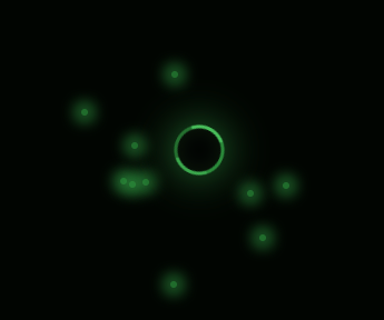
🚀 效果预览
想象一下:你的鼠标变成一个旋转的黑洞,周围环绕着绿色的吸积盘,当你在页面上移动时,它就像宇宙中的神秘天体一样吸引着周围的光粒子... 点击屏幕时,还会像超新星爆发一样喷射出能量粒子!✨
🌟 特效亮点
-
旋转的吸积盘 💫
黑洞周围有发光的绿色吸积盘,不停旋转模拟真实黑洞效果
-
悬停放大效果 🔍
当鼠标悬停在元素上时,黑洞会微微膨胀,仿佛在"吞噬"那个元素
-
点击粒子爆发 ✨
点击屏幕时会喷射出10个绿色光粒子,像能量爆发一样
-
流畅的动画 🎬
所有效果都使用CSS动画和requestAnimationFrame实现,60fps丝滑流畅
🛠️ 技术实现
1. 黑洞本体设计
css
.black-hole-cursor {
    background: radial-gradient(
        circle at center,
        #000 0%,
        #000 60%,
        #227030 80%,
        #32a144 100%
    );
    box-shadow:
        0 0 15px rgba(50, 161, 68, 0.5),
        inset 0 0 10px rgba(50, 161, 68, 0.1);
}
使用径向渐变创造黑洞的层次感,从纯黑到主题绿色渐变🌿
2. 吸积盘动画
css
@keyframes rotate {
    0% { transform: rotate(0deg); }
    100% { transform: rotate(360deg); }
}
简单的旋转动画,让黑洞看起来更真实🌀
3. 粒子喷射系统
javascript
document.addEventListener('click', function(e) {
    // 创建5个光粒子
    for (let i = 0; i < 5; i++) {
        const photon = document.createElement('div');
        // 设置粒子初始位置和样式...
        document.body.appendChild(photon);

        // 粒子动画逻辑
        const animate = () => {
            // 更新粒子位置和透明度...
            requestAnimationFrame(animate);
        };
        animate();
    }
});
点击时动态创建粒子元素,并使用requestAnimationFrame实现流畅动画✨
🎨 设计思路
-
颜色选择 🟢
使用#32a144作为主色调,从深绿到浅绿的渐变模拟能量衰减
-
物理模拟 🌍
- 黑洞悬停时放大模拟引力增强
- 粒子喷射后逐渐消失模拟能量耗散
-
性能优化 ⚡
- 使用transform和opacity实现高性能动画
- 粒子消失后及时移除DOM节点
🚀 完整源码
html
<!DOCTYPE html>
<html lang="zh-CN">

<head>
    <meta charset="UTF-8">
    <meta name="viewport" content="width=device-width, initial-scale=1.0">
    <title>黑洞光标效果</title>
    <style>
        body {
            margin: 0;
            padding: 0;
            box-sizing: border-box;
            height: 100vh;
            background-color: #000;
            cursor: none;
            overflow-x: hidden;
        }

        /* 黑洞光标 */
       .black-hole-cursor {
            position: fixed;
            width: 20px;
            height: 20px;
            border-radius: 50%;
            background: radial-gradient(
                    circle at center,
                    #000 0%,
                    #000 60%,
                    #227030 80%,
                    #32a144 100%
            );
            pointer-events: none;
            transform: translate(-50%, -50%);
            z-index: 9999;
            transition:
                width 0.3s ease,
                height 0.3s ease;
            box-shadow:
                0 0 15px rgba(50, 161, 68, 0.5),
                inset 0 0 10px rgba(50, 161, 68, 0.1);
        }

        /* 黑洞吸积盘 */
       .accretion-disk {
            position: absolute;
            width: 100%;
            height: 100%;
            border-radius: 50%;
            border: 2px solid transparent;
            border-top-color: #32a144;
            border-right-color: #46c75b;
            border-bottom-color: #288036;
            border-left-color: #56e36c;
            animation: rotate 3s linear infinite;
            opacity: 0.8;
        }

        @keyframes rotate {
            0% {
                transform: rotate(0deg);
            }

            100% {
                transform: rotate(360deg);
            }
        }

        /* 不同状态的黑洞样式 */
       .black-hole-hover {
            width: 30px;
            height: 30px;
            box-shadow:
                0 0 25px rgba(50, 161, 68, 0.8),
                inset 0 0 15px rgba(50, 161, 68, 0.2);
        }

       .black-hole-active {
            width: 25px;
            height: 25px;
            box-shadow:
                0 0 20px rgba(50, 161, 68, 0.8),
                inset 0 0 10px rgba(50, 161, 68, 0.3);
        }

        /* 光粒子 */
       .light-particle {
            position: fixed;
            width: 4px;
            height: 4px;
            border-radius: 50%;
            background-color: #32a144;
            pointer-events: none;
            z-index: 9998;
            opacity: 1;
            transform: translate(-50%, -50%);
            transition: all 0.5s ease-out;
        }
    </style>
</head>

<body>
    <!-- 黑洞光标 -->
    <div class="black-hole-cursor" id="cursor">
        <div class="accretion-disk"></div>
    </div>

    <script>
        document.addEventListener('DOMContentLoaded', function () {
            const cursor = document.getElementById('cursor');
            let mouseX = window.innerWidth / 2;
            let mouseY = window.innerHeight / 2;

            // 鼠标移动时更新黑洞位置
            document.addEventListener('mousemove', function (e) {
                mouseX = e.clientX;
                mouseY = e.clientY;
                cursor.style.left = `${mouseX}px`;
                cursor.style.top = `${mouseY}px`;
            });

            const hoverables = document.querySelectorAll('*');
            // 为可交互元素添加事件
            hoverables.forEach(item => {
                item.addEventListener('mouseenter', function () {
                    cursor.classList.add('black-hole-hover');
                });

                item.addEventListener('mouseleave', function () {
                    cursor.classList.remove('black-hole-hover');
                });

                item.addEventListener('mousedown', function () {
                    cursor.classList.add('black-hole-active');
                });

                item.addEventListener('mouseup', function () {
                    cursor.classList.remove('black-hole-active');
                });
            });

            // 鼠标点击事件,创建少量光子
            document.addEventListener('click', function (e) {
                const clickX = e.clientX;
                const clickY = e.clientY;
                const photonCount = 10; // 点击出现的光子数量

                for (let i = 0; i < photonCount; i++) {
                    const photon = document.createElement('div');
                    photon.classList.add('light-particle');
                    photon.style.left = `${clickX}px`;
                    photon.style.top = `${clickY}px`;
                    document.body.appendChild(photon);

                    const angle = Math.random() * Math.PI * 2;
                    const speed = 2 + Math.random() * 3;
                    let x = clickX;
                    let y = clickY;
                    let opacity = 1;

                    const animate = () => {
                        x += Math.cos(angle) * speed;
                        y += Math.sin(angle) * speed;
                        opacity -= 0.02;

                        photon.style.left = `${x}px`;
                        photon.style.top = `${y}px`;
                        photon.style.opacity = opacity;

                        if (opacity > 0) {
                            requestAnimationFrame(animate);
                        } else {
                            photon.remove();
                        }
                    };

                    animate();
                }
            });
        });
    </script>
</body>

</html>
💡 创意扩展
想让这个特效更酷?试试这些idea:
-
增加音效 🔊
点击时添加"嗖嗖"的粒子音效
-
粒子追踪 🎯
让光粒子不是直线飞出,而是螺旋飞向黑洞
-
重力影响 🌌
让页面上的元素微微向光标方向倾斜,模拟引力效果
-
星空背景 🌠
添加闪烁的星星作为背景,增强宇宙感
🌈 结语
这个黑洞光标特效非常适合用于:
- 科幻主题网站 🚀
- 个人博客 🎮
- 创意作品集 🎨