目录
[1. 折线图](#1. 折线图)
[2. 柱状图](#2. 柱状图)
[3. 条形图](#3. 条形图)
[4. 饼图](#4. 饼图)
[5. 爆炸式饼图](#5. 爆炸式饼图)
[6. 环型图](#6. 环型图)
[7. 散点图](#7. 散点图)
[8. 散点图 + 回归线](#8. 散点图 + 回归线)
[9. 箱线图](#9. 箱线图)
[10. 多图表绘制](#10. 多图表绘制)
[三、项目实战: 房地产市场洞察与价值评估](#三、项目实战: 房地产市场洞察与价值评估)
[总结不易 ~ 本章节对我有很大的收获,希望对你也是!!!!](#总结不易 ~ 本章节对我有很大的收获,希望对你也是!!!!)
一、数据可视化
1. 折线图
python
# 绘制折线图
import matplotlib.pyplot as plt
from PIL.ImageColor import colormap
from matplotlib import rcParams # 字体
rcParams['font.sans-serif'] = ['SimHei']

# 创建一个图表 设置大小
plt.figure(figsize=(10, 5))

month = ['1月', '2月', '3月', '4月']
sales = [100, 150, 80, 130]
# 绘制折线图
plt.plot(month, sales,
         label='产品A',
         color='orange',
         linewidth = 2,
         linestyle = '--',
         marker = 'o',
         )
# 添加标题
plt.title('2025年销售趋势', color='red', fontsize=20)
# 添加坐标轴的标签
plt.xlabel('月份', fontsize=20)
plt.ylabel('销售额(万元)', fontsize=10)
# 添加图例 设置在左上
plt.legend(loc='upper left') # 这里的配置首先就是要在绘制图表中 设置label=''

# 添加网格线
plt.grid(True, alpha=0.1, color='blue') # alpha 是透明度
plt.grid(axis='x') # 只设置横轴

# 设置刻度大小
plt.xticks(rotation=0, fontsize=10) # rotation 字体旋转角度
plt.yticks(rotation=0, fontsize=10) # rotation 字体旋转角度

# 设置y轴的范围
plt.ylim(0, 160)

# 在每个数据点上显示数值
# zip 就相当于打包(month, sales)
for x, y in zip(month, sales): # x, y 分别对应的坐标 , 显示y的数据 str(y)
    plt.text(x, y, str(y), ha='center', va='bottom', fontsize=10)

# 显示图表
plt.show()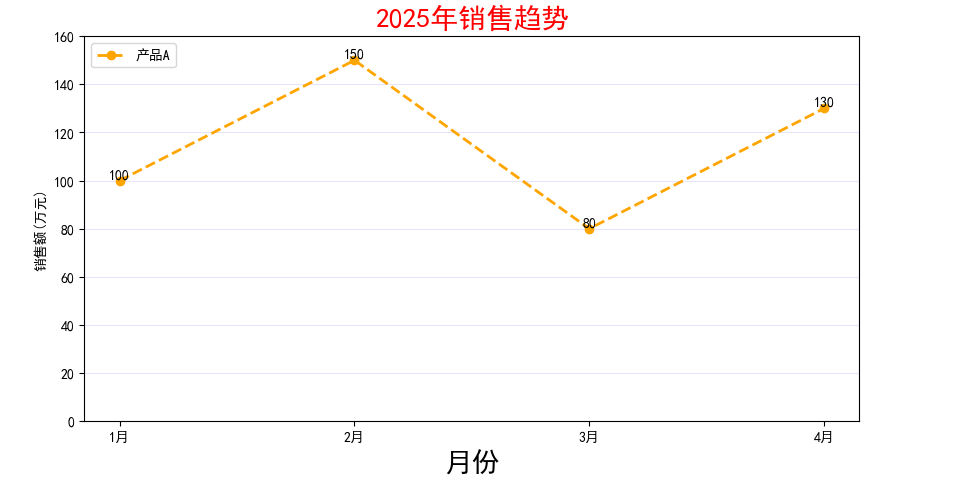
2. 柱状图
python
# 绘制柱状图
import matplotlib.pyplot as plt
from PIL.ImageColor import colormap
from matplotlib import rcParams # 字体
rcParams['font.sans-serif'] = ['SimHei']
# 创建一个图表 设置大小
plt.figure(figsize=(10, 5))

# 要绘图的数据
subjects = ['语文', '数学', '英语', '科学']
scores = [85, 92, 78, 88]

# 绘制柱状图 对应(x, y)
plt.bar(subjects, scores, label='小红', color='orange', width=0.6)

# 添加标题
plt.title('2025年成绩分布', color='red', fontsize=20)
# 添加坐标轴
plt.xlabel('科目', fontsize=10)
plt.ylabel('分数', fontsize=10)
# 添加图例
plt.legend(loc='upper left')

# 添加网格线
plt.grid(True,axis='y', alpha=0.1, color='blue', linestyle='--')

# 设置刻度字体大小
plt.xticks(rotation=0, fontsize=12)
plt.yticks(rotation=0, fontsize=12)

# 设置y轴的范围
plt.ylim(0, 100)

# 在每个数据点上的数值显示
for x, y in zip(subjects, scores):
    plt.text(x, y+1, str(y), ha='center', va='bottom', fontsize=10)

# 自动优化排版
plt.tight_layout()

# 显示图表
plt.show()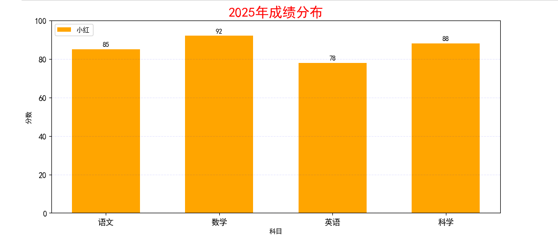
3. 条形图
python
# 绘制条形图
import matplotlib.pyplot as plt
from PIL.ImageColor import colormap
from matplotlib import rcParams # 字体
rcParams['font.sans-serif'] = ['SimHei']
# 创建一个图表 设置大小
plt.figure(figsize=(10, 5))
# 要绘图的数据
countries = ['United States', 'China', 'Japan', 'Germany', 'India']
gdp = [85, 92, 4, 12, 32]
# 绘制条形图
plt.barh(countries, gdp)
plt.show()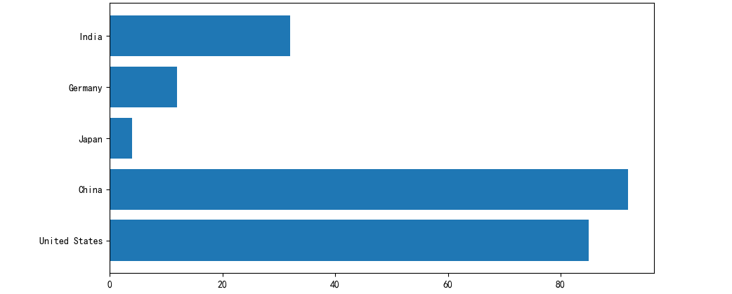
4. 饼图
python
# 绘制饼图
import matplotlib.pyplot as plt
from PIL.ImageColor import colormap
from matplotlib import rcParams # 字体
rcParams['font.sans-serif'] = ['SimHei']
# 创建一个图表 设置大小
plt.figure(figsize=(10, 5))

# 要绘制的数据
things = ['学习', '娱乐', '运动', '睡觉', '其他']
times = [6, 4, 1, 8, 5]
colors = ['#66b3ff', '#99ff99', '#ffcc99', '#ff9999', '#ff4499'] # 配色

# 绘制饼图
plt.pie(times, labels=things,
        autopct='%1.1f%%',
        startangle=90, # 调整初始画图的角度
        colors = colors
        )


# 添加标题
plt.title('一天的时间分布', color='red', fontsize=20)


plt.show()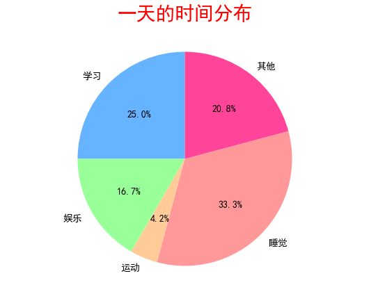
5. 爆炸式饼图
python
# 绘制爆炸式饼图
import matplotlib.pyplot as plt
from PIL.ImageColor import colormap
from matplotlib import rcParams # 字体
rcParams['font.sans-serif'] = ['SimHei']
# 创建一个图表 设置大小
plt.figure(figsize=(10, 5))

# 要绘制的数据
things = ['学习', '娱乐', '运动', '睡觉', '其他']
times = [6, 4, 1, 8, 5]
colors = ['#66b3ff', '#99ff99', '#ffcc99', '#ff9999', '#ff4499'] # 配色


# 爆炸式 饼图设置
explode = [0.1, 0, 0, 0, 0] # 设置突出块


# 绘制饼图
plt.pie(times, labels=things,
        autopct='%1.1f%%',
        startangle=90, # 调整初始画图的角度
        colors = colors,
        explode = explode,
        shadow = True # 添加阴影
        )


# 添加标题
plt.title('一天的时间分布', color='red', fontsize=20)


plt.show()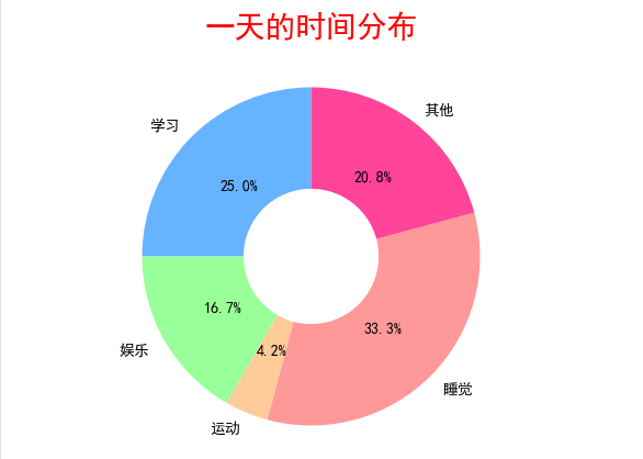
6. 环型图
python
# 绘制环形图
import matplotlib.pyplot as plt
from PIL.ImageColor import colormap
from matplotlib import rcParams # 字体
rcParams['font.sans-serif'] = ['SimHei']
# 创建一个图表 设置大小
plt.figure(figsize=(10, 5))

# 要绘制的数据
things = ['学习', '娱乐', '运动', '睡觉', '其他']
times = [6, 4, 1, 8, 5]
colors = ['#66b3ff', '#99ff99', '#ffcc99', '#ff9999', '#ff4499'] # 配色

# 绘制饼图
plt.pie(times, labels=things,
        autopct='%1.1f%%',
        startangle=90, # 调整初始画图的角度
        colors = colors,

        # 环形设置
        wedgeprops={'width': 0.6},
        )


# 添加标题
plt.title('一天的时间分布', color='red', fontsize=20)


plt.show()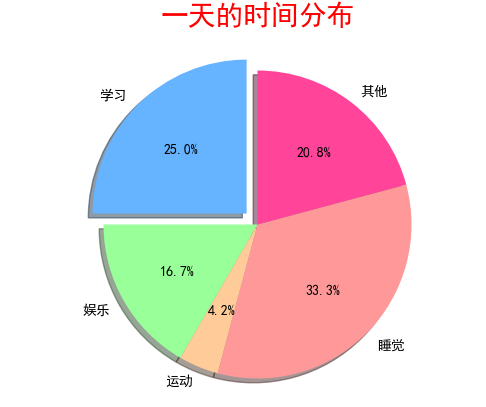
7. 散点图
python
# 绘制散点图
import matplotlib.pyplot as plt
from PIL.ImageColor import colormap
from matplotlib import rcParams # 字体
rcParams['font.sans-serif'] = ['SimHei']
# 创建一个图表 设置大小
plt.figure(figsize=(10, 5))

# 要绘图的数据
scores = [50, 55, 60, 65, 70, 75, 80]
hours = [1, 2, 3, 4, 5, 6, 7]

# 绘制散点图
plt.scatter(hours, scores)

# 显示图标
plt.show()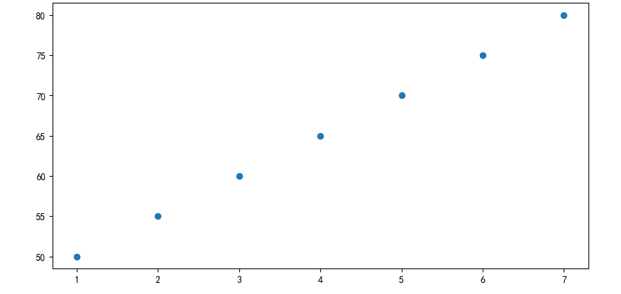
8. 散点图 + 回归线
python
# 绘制散点图
import matplotlib.pyplot as plt
import random
from PIL.ImageColor import colormap
from matplotlib import rcParams # 字体
rcParams['font.sans-serif'] = ['SimHei']
# 创建一个图表 设置大小
plt.figure(figsize=(10, 5))

# 要绘图的数据
x = []
y = []
for i in range(1000):
    tmp = random.uniform(0, 10)
    x.append(tmp)
    y.append(2 * tmp + random.gauss(0, 2))

# 绘制散点图
plt.scatter(x, y,
            color='orange',
            alpha=0.5,
            s=20, # 设置圆点的大小
            )

# 画回归线
plt.plot([0, 10], [0, 20], color='red')

# 显示图标
plt.show()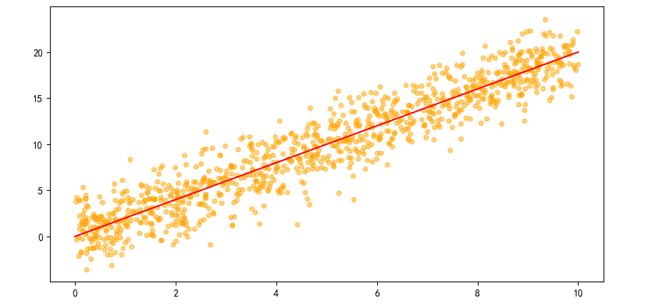
9. 箱线图
python
# 箱线图
import matplotlib.pyplot as plt

# 模拟3门课的成绩
data = {
    '语文': [82, 85, 88, 70, 90, 76, 84, 83, 95],
    '数学': [75, 80, 79, 93, 88, 82, 87, 89, 92],
    '英语': [70, 72, 68, 65, 78, 80, 85, 90, 95]
}

plt.figure(figsize=(8, 6))
plt.boxplot(data.values(), tick_labels=data.keys())
plt.title("各科成绩分布(箱线图)")
plt.ylabel("分数")
plt.grid(True, axis='y', linestyle='--', alpha=0.5)
plt.show()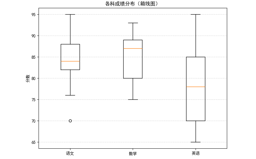
- 折线图:趋势随时间变化
- 条形图 / 柱状图:类别之间对比
- 饼图:整体组成比例
- 散点图:两变量相关性
- 箱线图:数据分布、异常
10. 多图表绘制
python
# 多个图的绘制方法
import matplotlib.pyplot as plt
# 要绘制图的数据
month = ['1', '2', '3', '4']
sales = [100, 150, 80, 130]

# ubplot 生成一个子图 x行y列 index
f1 = plt.subplot(2, 2, 1)
f1.plot(month, sales)

f2 = plt.subplot(2, 2, 2)
f2.bar(month, sales)

f2 = plt.subplot(2, 2, 3)
f2.scatter(month, sales)

f2 = plt.subplot(2, 2, 4)
f2.barh(month, sales)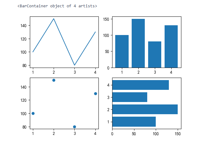
二、综合案例
温度分析
python
# 分析案例 温度分析
#  1. 导入库
import pandas as pd
import matplotlib.pyplot as plt
from matplotlib import rcParams # 字体
rcParams['font.sans-serif'] = ['SimHei']

# 2. 导入数据
df = pd.read_csv('data/weather.csv')
df.head()

# 控制气温的趋势变化图
df['date'] = pd.to_datetime(df['date'])
df = df[df['date'].dt.year == 2015]
plt.figure(figsize=(10, 10))
plt.plot(df['date'], df['temp_max'], label='最高气温')
plt.plot(df['date'], df['temp_min'], label='最高气温')
plt.xlabel('日期')
plt.ylabel('气温')
plt.legend()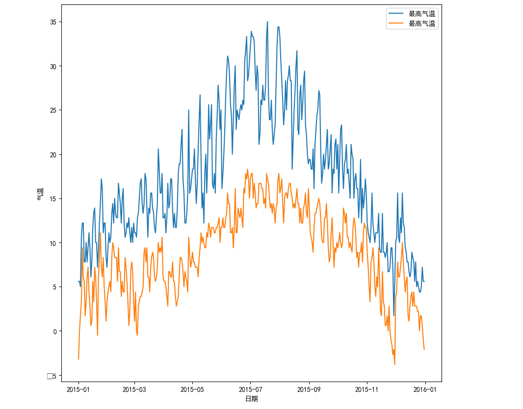
python
df['temp_mean'] = (df['temp_max'] + df['temp_min']) / 2
plt.figure(figsize = (15, 10))
plt.plot(df['date'], df['temp_mean'], label='平均气温')
plt.xlabel('日期')
plt.ylabel('气温')
plt.legend()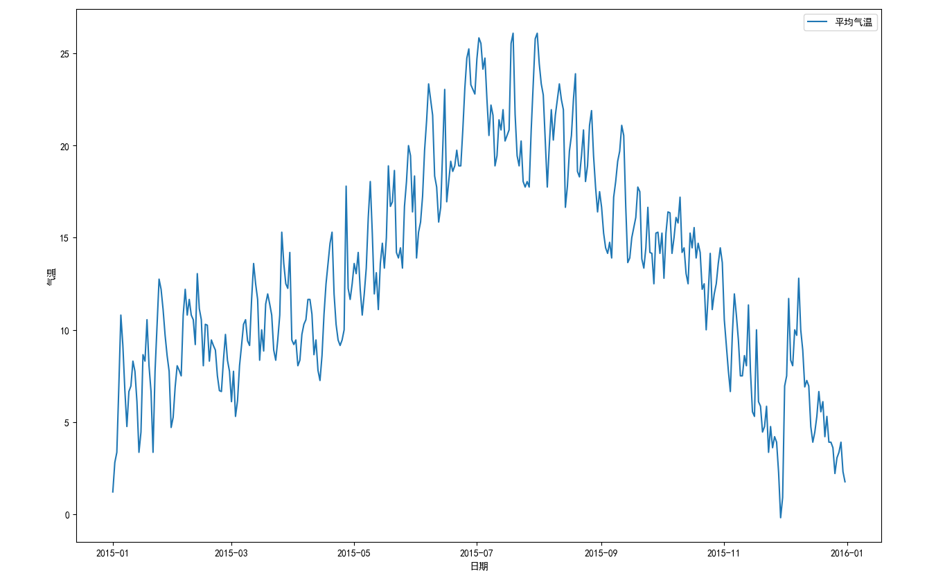
python
# 绘制降水量的直方图
plt.hist(df['precipitation'], bins=5)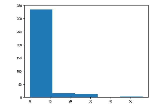
三、项目实战: 房地产市场洞察与价值评估
python
# 1. 导入库
import numpy as np
import matplotlib.pyplot as plt
import pandas as pd
import seaborn as sns
from matplotlib import rcParams
rcParams['font.sans-serif'] = ('SimHei')
# 2. 导入数据
df = pd.read_csv('data/house_sales.csv')
# 3. 数据概览
print('总记录数:', len(df))
print('字段数量:', len(df.columns))
df.head(5)
# 4. 数据清洗
# 删除无用的数据列
df.drop(columns='origin_url', inplace=True)
df.head()
# 检查是否有缺失值
df.isna().sum()
# 删除缺失值
df.dropna(inplace=True)
# 检查是否有重复值
df.duplicated().sum()
# 删除重复的数据
df.drop_duplicates(inplace=True)
df['area'] = df['area'].str.replace('㎡', ' ').astype(float)
df.head()
# 售价的数据类型转换
df['price'] = df['price'].str.replace('万', '').astype(float)
df.head()
# 朝向的数据类型转换
df['toward'] = df['toward'].astype('category')
# 单价的数据类型转换
df['unit'] = df['unit'].str.replace('元/㎡', '').astype(float)
# 建造年份的数据类型转换
df['year'] = df['year'].str.replace('年建', '').astype(int)
df.head()
# 异常值的处理
# 房屋面积异常值处理
df = df[(df['area']<600) & (df['area']>20)]
df.head()
# 房屋售价的异常值处理 IQR
Q1 = df['price'].quantile(0.25)
Q3 = df['price'].quantile(0.75)
IQR = Q3 - Q1
low_price = Q1 - 1.5 * IQR
high_price = Q3 + 1.5 * IQR
df = df[(df['price'] < high_price) & (df['price'] > low_price)]
# 5. 新数据特征构造
# 地区district
df['district'] = df['address'].str.split('-').str[0]
# 楼层的类型floor_type
df['floor_type'] = df['floor'].str.split('(').str[0].astype('category')
# 函数的方式进行处理
def fun1(str1):
if pd.isna(str1):
return '未知'
elif '低' in str1:
return '低楼层'
elif '中' in str1:
return '中楼层'
elif '高' in str1:
return '高楼层'
else:
return '未知'
df['floor_type2'] = df['floor'].apply(fun1).astype('category') # 就是将df['floor]的每一个都通过apply传入fun1函数之中
# 是否是直辖市 zxs
def fun2(str2):
if str2 in ['北京', '上海', '天津', '重庆']:
return True
else:
return False
df['zxs'] = df['city'].apply(fun2)
df[df['zxs'] == 1].sample(10)
# 卧室的数量bedrooms
df['bedrooms'] = df['rooms'].str.split('室').str[0].astype(int)
# 客厅的数量livingroom
# df['rooms'].str.split('室').str[1].str.split('厅').str[0].astype(int)
# 正则表达式进行取值
df['livingrooms'] = df['rooms'].str.extract(r'(\d+)厅').astype(int)
# 楼龄building_age
df['building_age'] = 2025 - df['year']
# 价格的分段price_labels
df['price_labels'] = pd.cut(df['price'], bins=4, labels=['低价', '中价', '高价', '豪华'])
df.head()
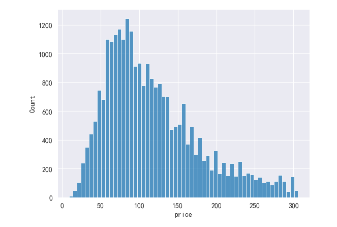
# 6. 问题分析及可视化
df.describe() # 描述所有信息
# 房价分布的直方图
plt.subplot(111)
# plt.hist(df['price'], bins=10)
sns.histplot(data=df, x='price')