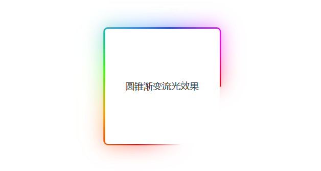
1. 效果图
2. 代码实现
html
<div class="flow-wrap">
  <div class="flow-box">圆锥渐变流光效果</div>
</div>
css
.flow-wrap {
  position: relative;
  z-index: 1;
}
.flow-box {
  position: relative;
  width: 300px;
  height: 300px;
  display: flex;
  justify-content: center;
  align-items: center;
  color: #333;
  font-size: 24px;
  font-family: sans-serif;
  background: #fff;
  border-radius: 8px;
  margin: 50px auto;
}

@property --angle {
  syntax: '<angle>';
  initial-value: 0deg;
  inherits: false;
}

.flow-box::after,
.flow-box::before {
  content: '';
  position: absolute;
  width: 100%;
  height: 100%;
  top: 50%;
  left: 50%;
  transform: translate(-50%, -50%);
  padding: 3px;
  z-index: -1;
  // transparent百分比控制流动条宽度,越小越宽
  background-image: conic-gradient(from var(--angle), transparent 20%, #ff0000, #ff9900, #33ff00, #0099ff, #0033ff, #ff00ff, #ff0000);
  border-radius: 10px;
  box-sizing: content-box;
  animation: flow 3s linear infinite;
}

// 发光效果
.flow-box::before {
  filter: blur(1.5rem);
  opacity: 0.5;
}

@keyframes flow {
  0% {
    --angle: 0deg;
  }
  100% {
    --angle: 360deg;
  }
}