做了这么多功能,最后得有个地方让用户吐槽。意见反馈功能看似简单,但设计得好的话能帮助我们快速发现问题、收集用户需求。这篇文章就来实现一个实用的反馈系统。
反馈数据结构的设计
首先需要定义反馈数据的结构。反馈包含用户的问题类型、标题、详细描述和可选的联系方式。
tsx
interface FeedbackItem {
  id: string;
  type: 'bug' | 'feature' | 'performance' | 'ui' | 'other';
  title: string;
  content: string;
  email?: string;
  timestamp: number;
  status: 'pending' | 'read' | 'resolved';
}
这个接口定义了反馈的完整结构。每个字段都有明确的用途:
id- 反馈的唯一标识,用于追踪和管理type- 反馈的分类,帮助我们快速定位问题所在的领域title- 反馈的标题,简洁地概括问题content- 详细的反馈内容,用户可以充分表达想法email- 可选的邮箱,方便后续跟进timestamp- 提交时间,用于排序和统计status- 反馈的处理状态,帮助我们追踪处理进度
设计考虑 - 通过
status字段,我们可以在后台追踪每条反馈的处理情况。这样用户提交反馈后,我们能清楚地知道哪些已读、哪些已解决。
反馈类型的定义
定义 App 支持的反馈类型。不同的类型能帮助我们更有效地分类和处理反馈。
tsx
const FEEDBACK_TYPES = [
  {id: 'bug', label: '报告 Bug', icon: '🐛', color: '#d32f2f'},
  {id: 'feature', label: '功能建议', icon: '💡', color: '#1976d2'},
  {id: 'performance', label: '性能问题', icon: '⚡', color: '#f57c00'},
  {id: 'ui', label: '界面反馈', icon: '🎨', color: '#7b1fa2'},
  {id: 'other', label: '其他', icon: '📝', color: '#00796b'},
];
每个反馈类型都有对应的图标和颜色。这样的设计有几个好处:
- 快速识别 - 用户一眼就能看出反馈的类型
- 视觉区分 - 不同的颜色让界面更生动
- 分类统计 - 后台可以按类型统计反馈数量
用户体验 - 通过图标和颜色的组合,用户可以快速选择反馈类型。这比单纯的文字下拉菜单更直观。
反馈页面的状态管理
反馈页面需要管理表单的各个字段状态。
tsx
export const FeedbackScreen = () => {
  const [selectedType, setSelectedType] = useState('bug');
  const [title, setTitle] = useState('');
  const [content, setContent] = useState('');
  const [email, setEmail] = useState('');
  const [isSubmitting, setIsSubmitting] = useState(false);
  const [submitSuccess, setSubmitSuccess] = useState(false);
这些状态分别管理:
selectedType- 用户选中的反馈类型title- 反馈标题的输入内容content- 反馈详情的输入内容email- 用户邮箱的输入内容isSubmitting- 是否正在提交,用于禁用按钮submitSuccess- 提交是否成功,用于显示成功提示
状态设计 - 分离各个字段的状态让代码更清晰。
isSubmitting和submitSuccess这两个状态用于控制 UI 的反馈。
反馈类型选择器
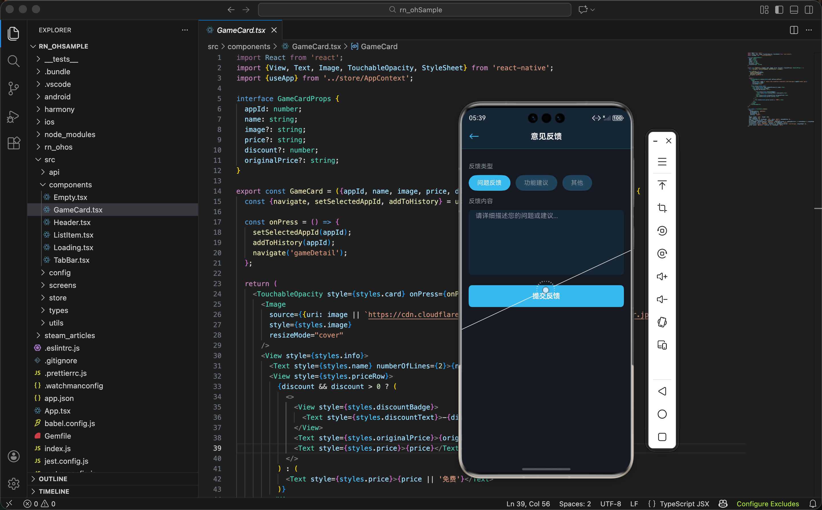
用户需要先选择反馈的类型。这里用一个水平滚动的按钮组来实现。
tsx
<View style={styles.typeSection}>
  <Text style={styles.sectionLabel}>反馈类型</Text>
  <ScrollView horizontal showsHorizontalScrollIndicator={false} style={styles.typeScroll}>
    {FEEDBACK_TYPES.map(type => (
      <TouchableOpacity
        key={type.id}
        style={[
          styles.typeButton,
          selectedType === type.id && {backgroundColor: type.color},
        ]}
        onPress={() => setSelectedType(type.id)}
      >
        <Text style={styles.typeIcon}>{type.icon}</Text>
        <Text style={styles.typeLabel}>{type.label}</Text>
      </TouchableOpacity>
    ))}
  </ScrollView>
</View>
这段代码的关键点:
- 水平滚动 - 用
ScrollView的horizontal属性让按钮可以水平滚动 - 动态样式 - 选中的按钮背景色会改变,提供清晰的视觉反馈
- 图标显示 - 每个类型都有对应的 emoji 图标
交互设计 - 水平滚动的按钮组在屏幕空间有限的情况下很实用。用户可以轻松滑动查看所有选项。
然后看样式部分:
tsx
typeSection: {paddingHorizontal: 16, paddingVertical: 12},
sectionLabel: {fontSize: 14, fontWeight: '600', color: '#fff', marginBottom: 8},
typeScroll: {marginHorizontal: -16},
typeButton: {
  paddingHorizontal: 12,
  paddingVertical: 8,
  marginHorizontal: 8,
  backgroundColor: '#2a475e',
  borderRadius: 20,
  alignItems: 'center',
  justifyContent: 'center',
},
typeIcon: {fontSize: 18, marginBottom: 2},
typeLabel: {fontSize: 12, color: '#fff'},
样式要点:
- 圆形按钮 -
borderRadius: 20让按钮看起来像胶囊形 - 内边距 - 给按钮足够的空间,方便点击
- 负边距 -
marginHorizontal: -16让滚动区域充满整个宽度
标题和内容输入
用户需要输入反馈的标题和详细内容。
tsx
<View style={styles.inputSection}>
  <Text style={styles.inputLabel}>反馈标题</Text>
  <TextInput
    style={styles.titleInput}
    placeholder="简洁地描述您的反馈"
    placeholderTextColor="#8f98a0"
    value={title}
    onChangeText={setTitle}
    maxLength={100}
  />
  <Text style={styles.charCount}>{title.length}/100</Text>
</View>

<View style={styles.inputSection}>
  <Text style={styles.inputLabel}>反馈详情</Text>
  <TextInput
    style={styles.contentInput}
    placeholder="请详细描述您遇到的问题或建议"
    placeholderTextColor="#8f98a0"
    value={content}
    onChangeText={setContent}
    multiline
    numberOfLines={6}
    maxLength={1000}
  />
  <Text style={styles.charCount}>{content.length}/1000</Text>
</View>
这两个输入框的设计:
- 字符限制 - 标题限制 100 字,内容限制 1000 字
- 字符计数 - 实时显示已输入的字符数
- 多行输入 - 内容输入框支持多行,让用户可以详细描述
输入体验 - 字符计数让用户知道还能输入多少。这防止了用户输入过长的内容导致被截断。
然后看样式:
tsx
inputSection: {paddingHorizontal: 16, paddingVertical: 12},
inputLabel: {fontSize: 14, fontWeight: '600', color: '#fff', marginBottom: 6},
titleInput: {
  paddingVertical: 10,
  paddingHorizontal: 12,
  backgroundColor: '#2a475e',
  borderRadius: 6,
  color: '#fff',
  fontSize: 14,
  marginBottom: 4,
},
contentInput: {
  paddingVertical: 10,
  paddingHorizontal: 12,
  backgroundColor: '#2a475e',
  borderRadius: 6,
  color: '#fff',
  fontSize: 14,
  textAlignVertical: 'top',
  marginBottom: 4,
},
charCount: {fontSize: 12, color: '#8f98a0', textAlign: 'right'},
样式设计:
- 背景色 - 输入框用
#2a475e与页面背景形成对比 - 顶部对齐 -
textAlignVertical: 'top'让多行输入框的文字从顶部开始 - 圆角 -
borderRadius: 6让输入框看起来更现代
邮箱输入和提交
用户可以选择提供邮箱地址,这样我们可以在处理完反馈后主动联系用户。
tsx
<View style={styles.inputSection}>
  <Text style={styles.inputLabel}>邮箱地址(可选)</Text>
  <TextInput
    style={styles.emailInput}
    placeholder="您的邮箱地址"
    placeholderTextColor="#8f98a0"
    value={email}
    onChangeText={setEmail}
    keyboardType="email-address"
  />
  <Text style={styles.hint}>提供邮箱后,我们会在处理您的反馈时与您联系</Text>
</View>
邮箱字段的特点:
- 可选字段 - 用户可以不填,尊重隐私
- 邮箱键盘 -
keyboardType="email-address"显示专用的邮箱输入键盘 - 提示文字 - 说明提供邮箱的好处
隐私保护 - 通过让邮箱字段可选,我们既能收集用户的联系方式,又不强制用户提供个人信息。
提交逻辑
提交反馈时需要验证必填字段,然后提交到服务器或本地存储。
tsx
const handleSubmit = async () => {
  if (!title.trim()) {
    Alert.alert('提示', '请输入反馈标题');
    return;
  }
  if (!content.trim()) {
    Alert.alert('提示', '请输入反馈内容');
    return;
  }

  setIsSubmitting(true);
  try {
    const feedback: FeedbackItem = {
      id: Date.now().toString(),
      type: selectedType as any,
      title: title.trim(),
      content: content.trim(),
      email: email.trim() || undefined,
      timestamp: Date.now(),
      status: 'pending',
    };

    // 提交到服务器
    const response = await fetch('https://api.example.com/feedback', {
      method: 'POST',
      headers: {'Content-Type': 'application/json'},
      body: JSON.stringify(feedback),
    });

    if (response.ok) {
      setSubmitSuccess(true);
      resetForm();
      setTimeout(() => setSubmitSuccess(false), 2000);
    }
  } catch (error) {
    Alert.alert('错误', '提交失败,请稍后重试');
  } finally {
    setIsSubmitting(false);
  }
};
提交流程的关键步骤:
- 字段验证 - 检查必填字段是否为空
- 数据构建 - 创建反馈对象,包含所有必要信息
- 网络请求 - 用
fetch提交到服务器 - 错误处理 - 捕获异常并显示提示
- 状态重置 - 提交成功后清空表单
用户反馈 - 通过 Alert 和成功提示,用户能清楚地知道提交是否成功。这提供了良好的用户体验。
提交按钮和成功提示
提交按钮应该在表单的底部,提交成功后显示成功提示。
tsx
<View style={styles.submitSection}>
  {submitSuccess && (
    <View style={styles.successMessage}>
      <Text style={styles.successIcon}>✓</Text>
      <Text style={styles.successText}>感谢您的反馈!</Text>
    </View>
  )}
  <TouchableOpacity
    style={[styles.submitButton, isSubmitting && styles.submitButtonDisabled]}
    onPress={handleSubmit}
    disabled={isSubmitting}
  >
    <Text style={styles.submitButtonText}>
      {isSubmitting ? '提交中...' : '提交反馈'}
    </Text>
  </TouchableOpacity>
</View>
这段代码的特点:
- 成功提示 - 提交成功后显示绿色的成功提示
- 按钮禁用 - 提交中时禁用按钮,防止重复提交
- 文字变化 - 提交中时显示"提交中..."
用户体验 - 通过禁用按钮和文字变化,用户知道反馈正在处理。成功提示给用户清晰的反馈。
然后看样式:
tsx
submitSection: {paddingHorizontal: 16, paddingVertical: 24},
successMessage: {
  flexDirection: 'row',
  alignItems: 'center',
  paddingVertical: 12,
  paddingHorizontal: 16,
  backgroundColor: '#1b5e20',
  borderRadius: 6,
  marginBottom: 12,
},
successIcon: {fontSize: 20, color: '#4caf50', marginRight: 8},
successText: {fontSize: 14, color: '#4caf50', fontWeight: '600'},
submitButton: {
  paddingVertical: 12,
  paddingHorizontal: 24,
  backgroundColor: '#66c0f4',
  borderRadius: 6,
  alignItems: 'center',
},
submitButtonDisabled: {backgroundColor: '#2a475e', opacity: 0.6},
submitButtonText: {fontSize: 16, fontWeight: '600', color: '#fff'},
样式设计:
- 成功提示 - 绿色背景
#1b5e20,让用户一眼看出是成功状态 - 按钮颜色 - Steam 蓝
#66c0f4,醒目且符合品牌风格 - 禁用状态 - 灰色背景和降低透明度,让用户知道按钮已禁用
页面的完整结构
反馈页面的整体布局:
tsx
return (
  <View style={styles.container}>
    <Header title="意见反馈" showBack />
    <ScrollView style={styles.content}>
      <TypeSelector />
      <TitleInput />
      <ContentInput />
      <EmailInput />
      <SubmitButton />
    </ScrollView>
    <TabBar />
  </View>
);
页面结构清晰:
- Header - 顶部导航栏
- 类型选择 - 让用户选择反馈类型
- 标题输入 - 输入反馈标题
- 内容输入 - 输入反馈详情
- 邮箱输入 - 可选的邮箱地址
- 提交按钮 - 提交反馈
- TabBar - 底部导航栏
流程设计 - 从上到下的流程让用户清楚地知道下一步应该做什么。这样的设计能提高表单的完成率。
样式汇总
反馈页面的完整样式定义:
tsx
const styles = StyleSheet.create({
  container: {flex: 1, backgroundColor: '#171a21'},
  content: {flex: 1, paddingVertical: 16},
  typeSection: {paddingHorizontal: 16, paddingVertical: 12},
  sectionLabel: {fontSize: 14, fontWeight: '600', color: '#fff', marginBottom: 8},
  typeScroll: {marginHorizontal: -16},
  typeButton: {
    paddingHorizontal: 12,
    paddingVertical: 8,
    marginHorizontal: 8,
    backgroundColor: '#2a475e',
    borderRadius: 20,
    alignItems: 'center',
  },
  typeIcon: {fontSize: 18, marginBottom: 2},
  typeLabel: {fontSize: 12, color: '#fff'},
  inputSection: {paddingHorizontal: 16, paddingVertical: 12},
  inputLabel: {fontSize: 14, fontWeight: '600', color: '#fff', marginBottom: 6},
  titleInput: {
    paddingVertical: 10,
    paddingHorizontal: 12,
    backgroundColor: '#2a475e',
    borderRadius: 6,
    color: '#fff',
    fontSize: 14,
    marginBottom: 4,
  },
  contentInput: {
    paddingVertical: 10,
    paddingHorizontal: 12,
    backgroundColor: '#2a475e',
    borderRadius: 6,
    color: '#fff',
    fontSize: 14,
    textAlignVertical: 'top',
    marginBottom: 4,
  },
  emailInput: {
    paddingVertical: 10,
    paddingHorizontal: 12,
    backgroundColor: '#2a475e',
    borderRadius: 6,
    color: '#fff',
    fontSize: 14,
  },
  charCount: {fontSize: 12, color: '#8f98a0', textAlign: 'right'},
  hint: {fontSize: 12, color: '#8f98a0', marginTop: 4},
  submitSection: {paddingHorizontal: 16, paddingVertical: 24},
  successMessage: {
    flexDirection: 'row',
    alignItems: 'center',
    paddingVertical: 12,
    paddingHorizontal: 16,
    backgroundColor: '#1b5e20',
    borderRadius: 6,
    marginBottom: 12,
  },
  successIcon: {fontSize: 20, color: '#4caf50', marginRight: 8},
  successText: {fontSize: 14, color: '#4caf50', fontWeight: '600'},
  submitButton: {
    paddingVertical: 12,
    paddingHorizontal: 24,
    backgroundColor: '#66c0f4',
    borderRadius: 6,
    alignItems: 'center',
  },
  submitButtonDisabled: {backgroundColor: '#2a475e', opacity: 0.6},
  submitButtonText: {fontSize: 16, fontWeight: '600', color: '#fff'},
});
配色方案:
#171a21- 页面背景,最深的颜色#2a475e- 输入框和未选中按钮的背景#66c0f4- Steam 蓝,用于强调和主要按钮#8f98a0- 灰色,用于次要文字和提示#1b5e20- 深绿色,用于成功提示背景#4caf50- 亮绿色,用于成功提示文字
小结
意见反馈功能虽然看似简单,但设计得当能显著提升用户体验:
- 分类反馈 - 通过反馈类型分类,我们能快速定位问题所在
- 表单验证 - 验证必填字段确保反馈的完整性
- 字符限制 - 防止用户输入过长的内容
- 可选邮箱 - 既能收集联系方式,又尊重用户隐私
- 清晰反馈 - 通过提示和成功消息让用户知道提交状态
- 简洁流程 - 从上到下的流程让用户快速完成反馈
欢迎加入开源鸿蒙跨平台社区:https://openharmonycrossplatform.csdn.net