通过网盘分享的文件:flutter1.zip
链接: https://pan.baidu.com/s/1jkLZ9mZXjNm0LgP6FTVRzw 提取码: 2t97
底部导航是 App 的骨架,决定了用户如何在不同功能模块之间切换。微动漫App 用底部导航连接首页、发现、收藏、我的四个主要页面。
这篇文章会实现底部导航功能,讲解 BottomNavigationBar 的使用、页面状态保持、导航项配置,以及如何设计一个流畅的导航体验。
底部导航的设计原则
底部导航适合 3-5 个主要功能入口:
太少:2 个以下用 Tab 或其他方式更合适。
太多:超过 5 个会显得拥挤,考虑用抽屉导航。
图标 + 文字:图标直观,文字明确,两者结合最佳。
当前位置:选中项要有明显的视觉区分。
页面结构
dart
import 'package:flutter/material.dart';
import 'home_screen.dart';
import 'explore_screen.dart';
import 'favorites_screen.dart';
import 'profile_screen.dart';
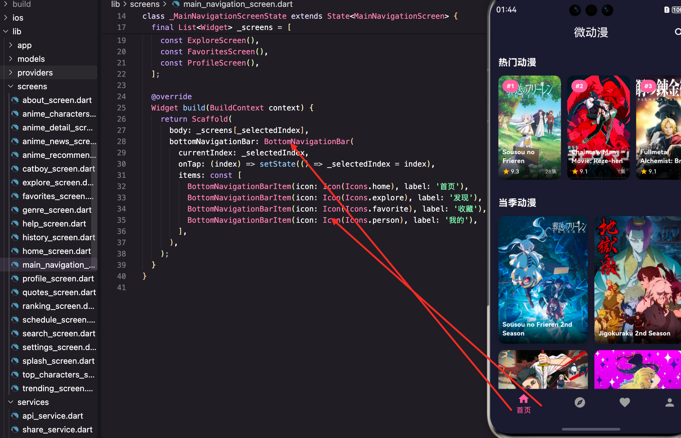
class MainNavigationScreen extends StatefulWidget {
const MainNavigationScreen({super.key});
@override
State<MainNavigationScreen> createState() => _MainNavigationScreenState();
}MainNavigationScreen 是导航容器,包含底部导航栏和各个子页面。
用 StatefulWidget 是因为需要管理当前选中的页面索引。
状态定义
dart
class _MainNavigationScreenState extends State<MainNavigationScreen> {
  int _selectedIndex = 0;

  final List<Widget> _screens = [
    const HomeScreen(),
    const ExploreScreen(),
    const FavoritesScreen(),
    const ProfileScreen(),
  ];
_selectedIndex 记录当前选中的页面索引,默认是 0(首页)。
_screens 是页面列表,顺序和导航项对应。
页面构建
dart
@override
Widget build(BuildContext context) {
  return Scaffold(
    body: _screens[_selectedIndex],
    bottomNavigationBar: BottomNavigationBar(
      currentIndex: _selectedIndex,
      onTap: (index) => setState(() => _selectedIndex = index),
      items: const [
        BottomNavigationBarItem(icon: Icon(Icons.home), label: '首页'),
        BottomNavigationBarItem(icon: Icon(Icons.explore), label: '发现'),
        BottomNavigationBarItem(icon: Icon(Icons.favorite), label: '收藏'),
        BottomNavigationBarItem(icon: Icon(Icons.person), label: '我的'),
      ],
    ),
  );
}
body 显示当前选中的页面,通过索引从 _screens 列表获取。
bottomNavigationBar 是底部导航栏。
currentIndex 是当前选中项的索引。
onTap 在点击导航项时触发,更新 _selectedIndex。
BottomNavigationBarItem 配置
dart
BottomNavigationBarItem(
  icon: Icon(Icons.home),
  label: '首页',
)
icon 是导航项的图标。
label 是导航项的文字标签。
还可以配置 activeIcon,选中时显示不同的图标:
dart
BottomNavigationBarItem(
  icon: Icon(Icons.home_outlined),
  activeIcon: Icon(Icons.home),
  label: '首页',
)
未选中时显示空心图标,选中时显示实心图标,区分更明显。
导航栏样式配置
在主题中配置导航栏样式:
dart
bottomNavigationBarTheme: const BottomNavigationBarThemeData(
  backgroundColor: Colors.white,
  selectedItemColor: primaryColor,
  unselectedItemColor: Colors.grey,
),
backgroundColor 是导航栏背景色。
selectedItemColor 是选中项的颜色。
unselectedItemColor 是未选中项的颜色。
也可以直接在 BottomNavigationBar 上配置:
dart
BottomNavigationBar(
  backgroundColor: Colors.white,
  selectedItemColor: Theme.of(context).primaryColor,
  unselectedItemColor: Colors.grey,
  // 其他配置
)
导航栏类型
dart
BottomNavigationBar(
  type: BottomNavigationBarType.fixed,
  // 其他配置
)BottomNavigationBarType.fixed:所有项等宽,适合 3-4 个项。
BottomNavigationBarType.shifting:选中项放大,有动画效果,适合 4-5 个项。
默认情况下,3 个及以下用 fixed,4 个及以上用 shifting。
页面状态保持
当前实现有个问题:切换页面后,之前页面的状态会丢失。
用 IndexedStack 保持状态:
dart
@override
Widget build(BuildContext context) {
  return Scaffold(
    body: IndexedStack(
      index: _selectedIndex,
      children: _screens,
    ),
    bottomNavigationBar: BottomNavigationBar(
      // 配置
    ),
  );
}
IndexedStack 会同时保持所有子页面的状态,只显示当前索引的页面。
缺点是所有页面都会被创建,内存占用更大。
懒加载页面
如果页面很重,可以懒加载:
dart
class _MainNavigationScreenState extends State<MainNavigationScreen> {
  int _selectedIndex = 0;
  final List<Widget?> _screens = [null, null, null, null];

  Widget _buildScreen(int index) {
    if (_screens[index] == null) {
      switch (index) {
        case 0:
          _screens[index] = const HomeScreen();
          break;
        case 1:
          _screens[index] = const ExploreScreen();
          break;
        case 2:
          _screens[index] = const FavoritesScreen();
          break;
        case 3:
          _screens[index] = const ProfileScreen();
          break;
      }
    }
    return _screens[index]!;
  }

  @override
  Widget build(BuildContext context) {
    return Scaffold(
      body: IndexedStack(
        index: _selectedIndex,
        children: List.generate(4, (i) => _buildScreen(i)),
      ),
      bottomNavigationBar: BottomNavigationBar(
        // 配置
      ),
    );
  }
}
页面只在第一次访问时创建,之后复用。
添加徽章
可以在导航项上显示徽章:
dart
BottomNavigationBarItem(
  icon: Badge(
    label: Text('3'),
    child: Icon(Icons.favorite_outline),
  ),
  activeIcon: Badge(
    label: Text('3'),
    child: Icon(Icons.favorite),
  ),
  label: '收藏',
)
Badge 是 Material 3 的徽章组件,显示在图标右上角。
可以用来显示未读消息数、收藏数等。
动态更新徽章
dart
class _MainNavigationScreenState extends State<MainNavigationScreen> {
  int _selectedIndex = 0;
  int _favoriteCount = 0;

  @override
  void initState() {
    super.initState();
    _loadFavoriteCount();
  }

  Future<void> _loadFavoriteCount() async {
    // 从 Provider 或本地存储获取收藏数
    final count = await FavoritesService.getCount();
    setState(() => _favoriteCount = count);
  }

  @override
  Widget build(BuildContext context) {
    return Scaffold(
      body: _screens[_selectedIndex],
      bottomNavigationBar: BottomNavigationBar(
        currentIndex: _selectedIndex,
        onTap: (index) => setState(() => _selectedIndex = index),
        items: [
          const BottomNavigationBarItem(icon: Icon(Icons.home), label: '首页'),
          const BottomNavigationBarItem(icon: Icon(Icons.explore), label: '发现'),
          BottomNavigationBarItem(
            icon: _favoriteCount > 0
                ? Badge(label: Text('$_favoriteCount'), child: const Icon(Icons.favorite_outline))
                : const Icon(Icons.favorite_outline),
            label: '收藏',
          ),
          const BottomNavigationBarItem(icon: Icon(Icons.person), label: '我的'),
        ],
      ),
    );
  }
}
收藏数大于 0 时显示徽章,否则只显示图标。
切换动画
可以给页面切换添加动画:
dart
@override
Widget build(BuildContext context) {
  return Scaffold(
    body: AnimatedSwitcher(
      duration: const Duration(milliseconds: 300),
      child: _screens[_selectedIndex],
    ),
    bottomNavigationBar: BottomNavigationBar(
      // 配置
    ),
  );
}
AnimatedSwitcher 在子组件切换时添加淡入淡出动画。
注意:这种方式不会保持页面状态。
自定义导航栏
如果默认的 BottomNavigationBar 不满足需求,可以自定义:
dart
bottomNavigationBar: Container(
  height: 60,
  decoration: BoxDecoration(
    color: Colors.white,
    boxShadow: [
      BoxShadow(
        color: Colors.black.withOpacity(0.1),
        blurRadius: 10,
        offset: const Offset(0, -2),
      ),
    ],
  ),
  child: Row(
    mainAxisAlignment: MainAxisAlignment.spaceAround,
    children: [
      _buildNavItem(0, Icons.home, '首页'),
      _buildNavItem(1, Icons.explore, '发现'),
      _buildNavItem(2, Icons.favorite, '收藏'),
      _buildNavItem(3, Icons.person, '我的'),
    ],
  ),
),
dart
Widget _buildNavItem(int index, IconData icon, String label) {
  final isSelected = _selectedIndex == index;
  return GestureDetector(
    onTap: () => setState(() => _selectedIndex = index),
    child: Column(
      mainAxisAlignment: MainAxisAlignment.center,
      children: [
        Icon(
          icon,
          color: isSelected ? Theme.of(context).primaryColor : Colors.grey,
        ),
        const SizedBox(height: 4),
        Text(
          label,
          style: TextStyle(
            fontSize: 12,
            color: isSelected ? Theme.of(context).primaryColor : Colors.grey,
          ),
        ),
      ],
    ),
  );
}
自定义导航栏可以实现更复杂的样式和动画。
中间凸起按钮
很多 App 的导航栏中间有个凸起的按钮:
dart
Scaffold(
  body: _screens[_selectedIndex],
  floatingActionButton: FloatingActionButton(
    onPressed: () {
      // 中间按钮的功能
    },
    child: const Icon(Icons.add),
  ),
  floatingActionButtonLocation: FloatingActionButtonLocation.centerDocked,
  bottomNavigationBar: BottomAppBar(
    shape: const CircularNotchedRectangle(),
    notchMargin: 8,
    child: Row(
      mainAxisAlignment: MainAxisAlignment.spaceAround,
      children: [
        _buildNavItem(0, Icons.home, '首页'),
        _buildNavItem(1, Icons.explore, '发现'),
        const SizedBox(width: 48),  // 中间留空
        _buildNavItem(2, Icons.favorite, '收藏'),
        _buildNavItem(3, Icons.person, '我的'),
      ],
    ),
  ),
)
BottomAppBar 配合 FloatingActionButton 实现凸起效果。
CircularNotchedRectangle 在导航栏上切出一个圆形缺口。
深色模式适配
导航栏会自动使用主题中配置的颜色:
dart
// 在主题中配置
bottomNavigationBarTheme: BottomNavigationBarThemeData(
  backgroundColor: isDark ? darkCard : Colors.white,
  selectedItemColor: primaryColor,
  unselectedItemColor: Colors.grey,
),
深色模式下用深色背景,浅色模式下用白色背景。
小结
底部导航涉及的技术点:BottomNavigationBar 、BottomNavigationBarItem 、IndexedStack 状态保持 、Badge 徽章 、BottomAppBar 自定义 、FloatingActionButton 凸起按钮。
底部导航是 App 的骨架,设计要点:3-5 个主要入口、图标 + 文字、选中项明显区分、考虑状态保持。
好的导航设计能让用户快速找到想要的功能,是 App 体验的基础。
欢迎加入开源鸿蒙跨平台社区:https://openharmonycrossplatform.csdn.net