目录
[1 径向基函数插值实战](#1 径向基函数插值实战)
[1.1 导入库](#1.1 导入库)
[1.2 数据准备](#1.2 数据准备)
[1.3 创建插值器并预测插值](#1.3 创建插值器并预测插值)
[1.4 可视化结果分析](#1.4 可视化结果分析)
[2 气象数据下载与可视化(示例)](#2 气象数据下载与可视化(示例))
[3 总结](#3 总结)
摘要
本周主要利用代码进行了径向基函数的插值实战,通过设计不同的数据分布对比了不同核的性能,并进行了可视化。除此之外还配置了API,下载并可视化了一小部分地表温度数据,为后续学习复现打下基础。
Abstract
This week, I mainly implemented Radial Basis Function interpolation in code. By designing different data distributions, I compared the performance of various kernels and conducted visualizations. Additionally, I configured the API, downloaded and visualized a small portion of surface temperature data, laying the groundwork for future learning and reproduction.
1 径向基函数插值实战
1.1 导入库
python
import numpy as np
import matplotlib.pyplot as plt
from scipy.interpolate import RBFInterpolator     # SciPy提供的现代 RBF 插值器
from sklearn.metrics import mean_squared_error, r2_score
RBFInterpolator 在 Scipy 1.7.0 版本才引入,如果下载的版本在其以前的话,可以考虑升级或使用旧接口 Rbf,只是功能可能较少。
1.2 数据准备
为了方便观察不同 RBF 核的差异,设计了如下三种数据分布:
第一种是有一个锐利的尖峰:
python
def create_test_data(n_points=100):

    np.random.seed(42)

    x = np.random.uniform(-2, 2, n_points)
    y = np.random.uniform(-2, 2, n_points)

    # 创建一个非常锐利的尖峰
    z = 3.0 * np.exp(-10 * ((x - 1) ** 2 + (y - 1) ** 2)) + \
        0.5 * np.exp(-0.5 * (x ** 2 + y ** 2))

    return np.column_stack([x, y]), z
第二种是有不连续的边缘与平台,测试不同核的边界处理:
python
def create_test_data(n_points=100):
np.random.seed(42)
x = np.random.uniform(-2, 2, n_points)
y = np.random.uniform(-2, 2, n_points)
# 创建阶梯函数效果
r = np.sqrt(x ** 2 + y ** 2)
z = np.zeros_like(r)
z[r < 0.5] = 0.2
z[(r >= 0.5) & (r < 1.0)] = 0.8
z[(r >= 1.0) & (r < 1.5)] = 0.4
z[r >= 1.5] = 0.0
# 添加一些噪声使边界不明显
z += 0.05 * np.random.randn(n_points)
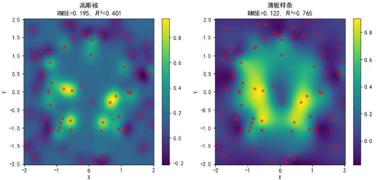
return np.column_stack([x, y]), z第三种则是有多个孤立的区域,测试不同核的局部支撑:
python
def create_test_data(n_points=100):
    np.random.seed(42)

    # 训练数据:包含三个区域+零值区域
    n_per_region = n_points // 4  # 每个区域75个点

    # 区域1:右上角山峰
    x1 = np.random.uniform(1.0, 2.0, n_per_region)
    y1 = np.random.uniform(1.0, 2.0, n_per_region)
    z1 = np.exp(-10 * ((x1 - 1.5) ** 2 + (y1 - 1.5) ** 2))

    # 区域2:左下角山峰
    x2 = np.random.uniform(-2.0, -1.0, n_per_region)
    y2 = np.random.uniform(-2.0, -1.0, n_per_region)
    z2 = np.exp(-8 * ((x2 + 1.5) ** 2 + (y2 + 1.5) ** 2))

    # 区域3:右下角山峰
    x3 = np.random.uniform(0.5, 1.5, n_per_region)
    y3 = np.random.uniform(-2.0, -1.0, n_per_region)
    z3 = 0.5 * np.exp(-12 * ((x3 - 1.0) ** 2 + (y3 + 1.5) ** 2))

    # 区域4:零值区域(也采样)
    x4 = np.random.uniform(-2, 2, n_per_region)
    y4 = np.random.uniform(-2, 2, n_per_region)
    # 确保不在其他三个区域内
    mask = ~(((x4 > 1) & (y4 > 1)) |
             ((x4 < -1) & (y4 < -1)) |
             ((x4 > 0) & (y4 < -0.5)))
    x4 = x4[mask][:n_per_region]
    y4 = y4[mask][:n_per_region]
    z4 = np.zeros(len(x4))

    # 合并所有数据
    x = np.concatenate([x1, x2, x3, x4])
    y = np.concatenate([y1, y2, y3, y4])
    z = np.concatenate([z1, z2, z3, z4])

    # 随机打乱
    indices = np.random.permutation(len(x))
    x = x[indices]
    y = y[indices]
    z = z[indices]

    return np.column_stack([x, y]), z
然后,生成训练和测试数据,并生成用于可视化的网格。
python
# 训练数据
train_points, train_values = create_test_data(80)

# 测试数据
test_points, test_true = create_test_data(30)

# 用于可视化的网格
grid_x, grid_y = np.mgrid[-2:2:100j, -2:2:100j]
grid_points = np.column_stack([grid_x.ravel(), grid_y.ravel()])
若最后绘制的图形不显示中文,可添加如下代码通过 rcParams 设置支持中文的字体。
python
plt.rcParams['font.sans-serif'] = ['SimHei'] # 设置字体为黑体rcParams 是是 Matplotlib 库的运行时配置参数字典,通过修改它可以全局地、一键式地改变之后创建的所有图形的默认样式,而无需在每个绘图函数中重复设置参数。
1.3 创建插值器并预测插值
python
# 定义不同的RBF核函数
kernels = [
    ("高斯核", "gaussian", 1),  # 名称, 类型, 形状参数
    ("薄板样条", "thin_plate_spline", None),
    ("三次样条", "cubic", None),
    ("线性核", "linear", None),
]

results = []
for name, kernel_type, epsilon in kernels:
    print(f"\n {name}")
    # 创建RBF插值器
    if epsilon:
        rbf = RBFInterpolator(train_points, train_values,
                              kernel=kernel_type, epsilon=epsilon)
    else:
        rbf = RBFInterpolator(train_points, train_values,
                              kernel=kernel_type)

    # 在测试集上预测
    test_pred = rbf(test_points)

    # 计算精度指标
    rmse = np.sqrt(mean_squared_error(test_true, test_pred))
    r2 = r2_score(test_true, test_pred)

    # 在网格上预测(用于可视化)
    grid_pred = rbf(grid_points).reshape(100, 100)

    results.append({
        'name': name,
        'type': kernel_type,
        'grid_pred': grid_pred,
        'rmse': rmse,
        'r2': r2
    })
1.4 可视化结果分析
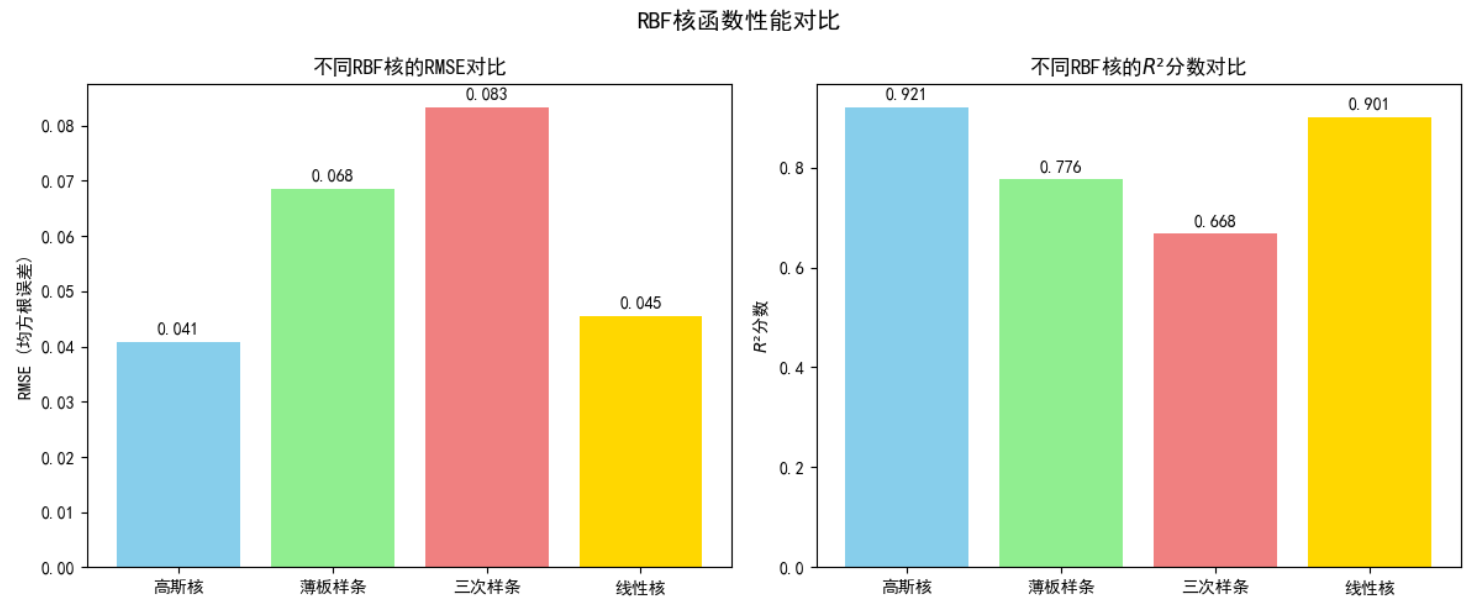
对于第一种数据分布(尖峰):
不同核插值效果如下:
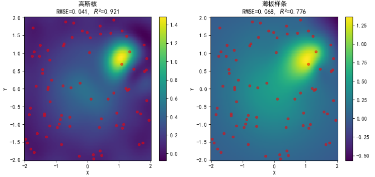
性能对比如下:
对于第二种数据分布(不连续的边缘与平台):
不同核插值效果如下:
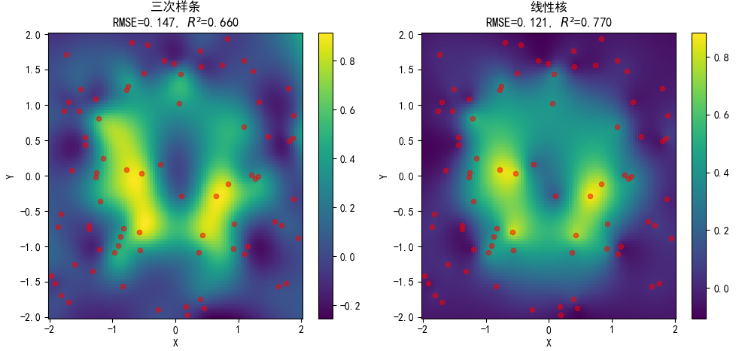
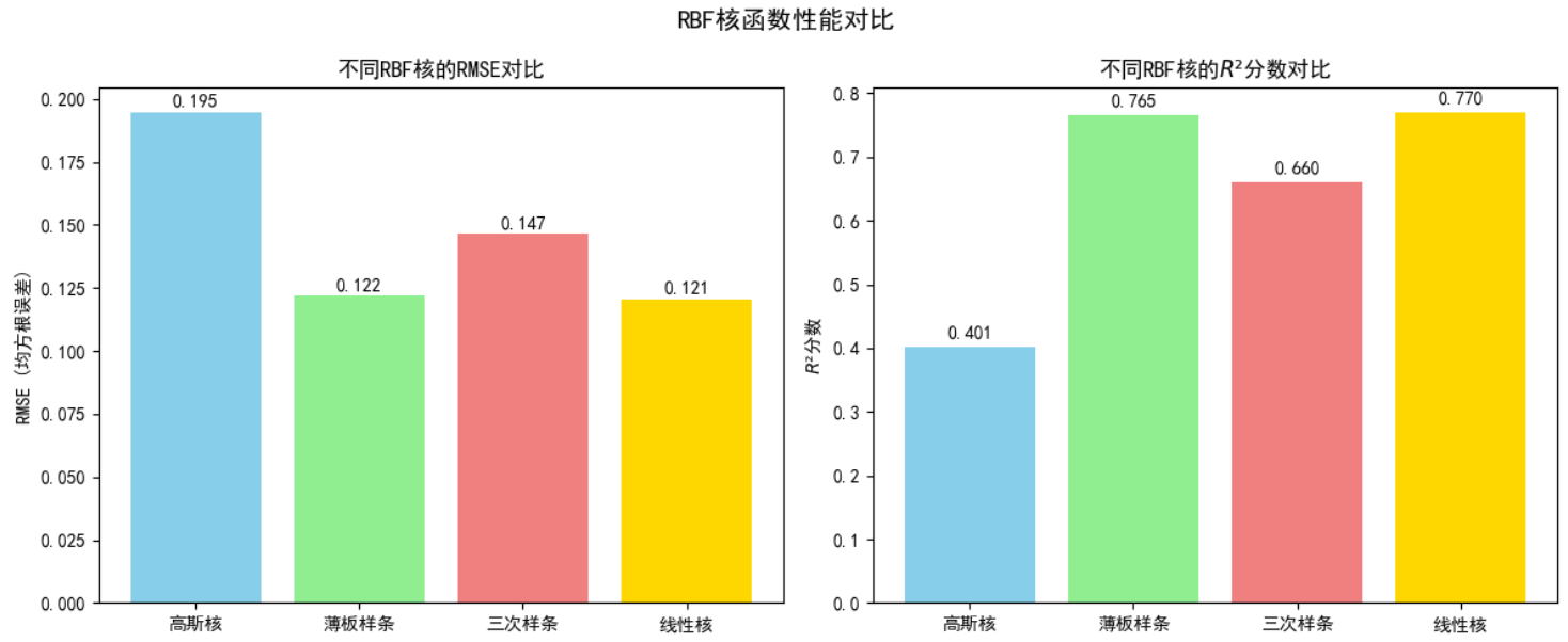
性能对比如下:
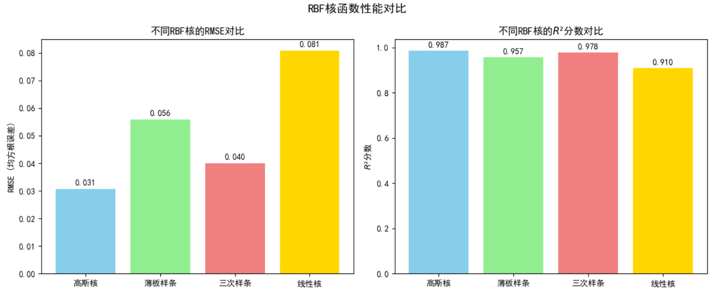
对于第三种数据分布(孤立区域):
不同核插值效果如下:
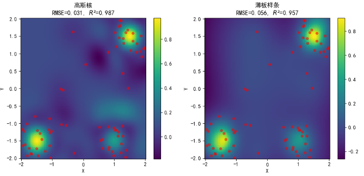
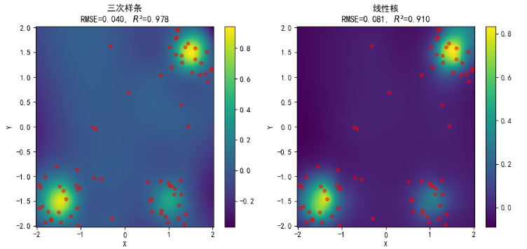
性能对比如下:
2 气象数据下载与可视化(示例)
下载气象数据前先注册一个Copernicus Climate Data Store 账号,获取对应 API 密钥并进行配置,配置过程主要为:新建一个 .cdsapirc 文本文档,填入 url 及 API key 信息并保存,可以通过下面代码进行检查:
python -c "import cdsapi; c = cdsapi.Client()"由于需要安装 cdsapi 包才能运行,故推荐提前创建虚拟环境,也能方便后续处理。
若报错如下:
则可能是前面新建的文件名不对(可能带了 .txt 的后缀)
然后,在网站首页搜索想要下载的数据,在此以 ERA5 hourly data on single levels 为例,下载京津冀地区 2026 年 1 月 2 日每小时的地表温度,会得到一个 xxx.nc 文件。
利用下面代码对数据文件进行读取打印:
python
import xarray as xr

file_path = './example.nc'
data = xr.open_dataset(file_path)

print("=== 数据集全局信息 ===")
得到数据集全局信息如下:
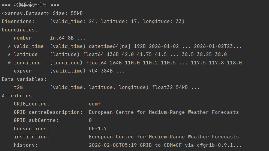
可以发现其核心变量为 t2m ,代表 2 米高处气温,数据维度包括 valid_time、latitude 与 longitude,分别表示 24 个时间点、17 个维度格点与 33 个经度格点(经纬度分辨率均为 0.25)
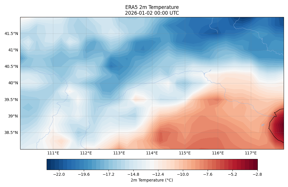
python
import matplotlib
matplotlib.use('TkAgg')
import matplotlib.pyplot as plt
import cartopy.crs as ccrs
import cartopy.feature as cfeature

# 选择第一个有效时间(valid_time),并将温度从开尔文转换为摄氏度
temperature_slice = data['t2m'].isel(valid_time=0) - 273.15

# 创建地图并绘图
fig, ax = plt.subplots(figsize=(10, 8), subplot_kw={'projection': ccrs.PlateCarree()})

# 使用 contourf 绘制填色图,它对网格数据的兼容性更好
im = ax.contourf(temperature_slice.longitude,
                 temperature_slice.latitude,
                 temperature_slice.values,
                 levels=60,  # 颜色分级数,可调整
                 cmap='RdBu_r',  # 红蓝配色,适合表示温度
                 transform=ccrs.PlateCarree())

# 添加地理特征
ax.add_feature(cfeature.COASTLINE, linewidth=0.8)
ax.add_feature(cfeature.BORDERS, linewidth=0.5, linestyle=':')
ax.add_feature(cfeature.LAKES, alpha=0.5)
ax.add_feature(cfeature.RIVERS, linewidth=0.5)

# 添加并自定义网格线
gl = ax.gridlines(draw_labels=True, linewidth=0.5, color='gray', alpha=0.5, linestyle='--')
gl.top_labels = False  # 关闭顶部标签
gl.right_labels = False  # 关闭右侧标签

# 添加颜色条
cbar = plt.colorbar(im, ax=ax, orientation='horizontal', pad=0.05, shrink=0.8)
cbar.set_label('2m Temperature (°C)')

# 设置标题(从 valid_time 坐标中获取时间字符串)
time_str = str(temperature_slice.valid_time.dt.strftime('%Y-%m-%d %H:%M').values)
ax.set_title(f'ERA5 2m Temperature\n{time_str} UTC')

plt.tight_layout()
plt.show()
由于刚开始绘制的图形无法显示,于是查询添加了代码 matplotlib.use('TkAgg') ,更改了其后端配置,最终得到图形如下所示:
3 总结
本周主要是进行了 RBF 在插值方面的代码实践,加深了对 RBF 结构与实际应用的理解。其次下载并可视化了了小型的气象数据。下周预计学习克里金法。