下载地址:https://posit.co/download/rstudio-desktop/
一、包
1.安装包
r
install.packages("tidyverse")
install.packages("patchwork")
2.加载包
linrary(包名):加载某个包
r
library(tidyverse)
r
library(patchwork)二、数据规整
1. 赋值
r
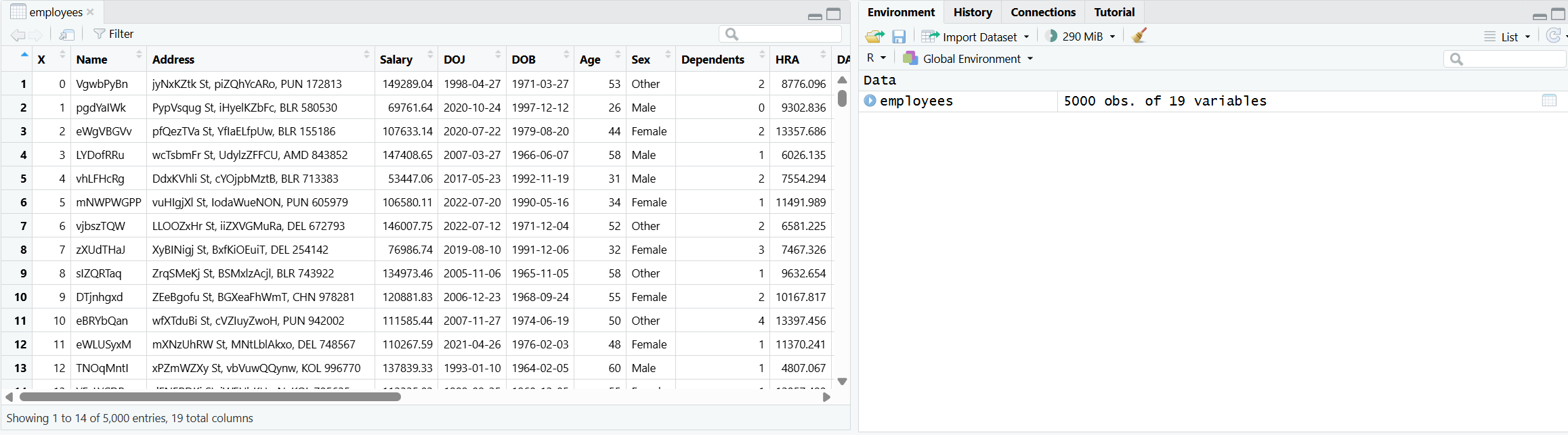
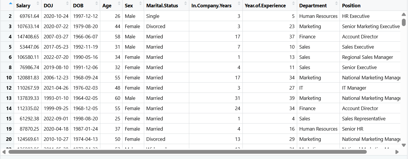
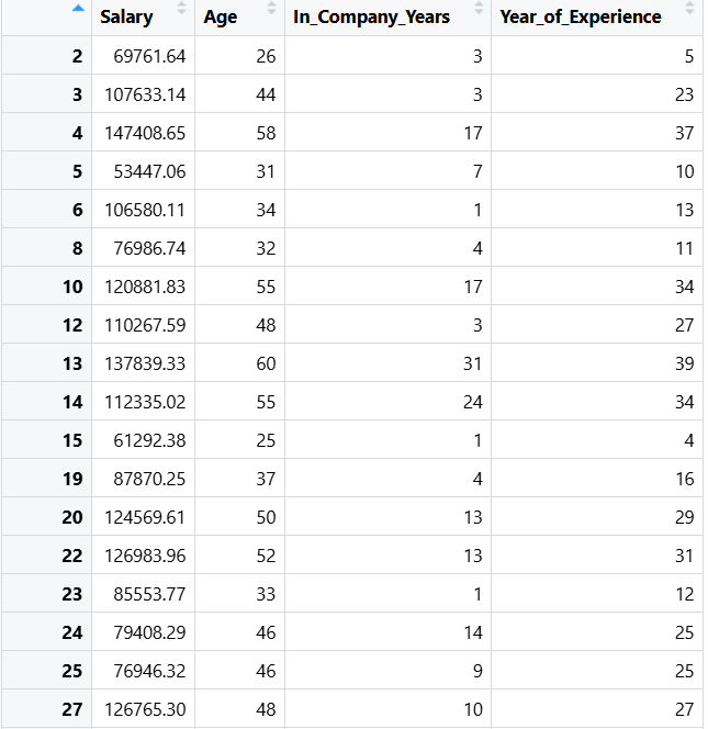
employees <- read.csv("D:\\NetdiskDownload\\Employee_dataset.csv")使用函数read.csv读取指定路径的 CSV 文件,并将读取的数据存储为数据框,赋值给变量 employees
2.查询列名
r
colnames(employees)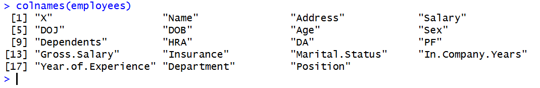
3.删除列
r
employees <- select(employees, -c("X", "Name", "Address", "Dependents", "HRA", "DA", "PF", "Insurance", "Gross.Salary"))select([代操作变量], [操作]):去掉列或保留列
-:代表去掉
c():将一个或多个值合并成一个集合
4.删除行
r
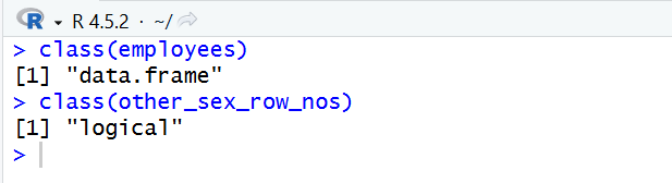
other_sex_row_nos <- employees$Sex == "Other"列出当前指定列数据为 "Other" 的
如果该列等于"Other" 返回 TRUE ,否则为 FALSE,并存入变量other_sex_row_nos
r
employees <- employees[!other_sex_row_nos, ]employees[行索引, 列索引]
employees[other_sex_row_nos, ]表示将为TRUE的行保留,FALSE丢弃,但是因为有 ! 取反,则保留下FALSE行的值,因为FALSE变为了TRUE,也就是除"Other"以外的值
去掉了性别为"Other"的行
5.重命名
r
employees |> rename(Joining_Date = DOJ, Birth_Date = DOB, Gender = Sex, Marital_Status = Marital.Status, In_Company_Years = In.Company.Years, Year_of_Experience = Year.of.Experience) -> employees|>:将前者传入后者
rename(新列名 = 旧列名):重命名
6.类型
6.1查看类型
class():查看数据类型
查看指定列的类型
r
> class(employees$Gender)
结果:[1] "character"
6.2 更改类型
r
employees$Gender <- as.factor(employees$Gender)
employees$Marital_Status <- as.factor(employees$Marital_Status)
employees$Department <- as.factor(employees$Department)
employees$Position <- as.factor(employees$Position)as.factor():将类型更改为factor
也就是将原本的文本类型更改为选项

6.3 显示结构
r
str(employees)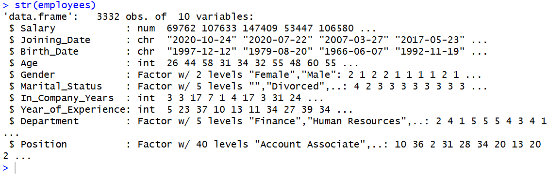
6.4 factor选项
查看已有选项
r
levels(employees$Marital_Status)
结果:[1] ""         "Divorced" "Married"  "Single"   "Widowed"
三、统计分析
1.统计摘要
summary(xxx):获得对xxx的基本统计摘要
r
> summary(employees)
     Salary       Joining_Date        Birth_Date             Age           Gender
 Min.   : 15215   Length:3332        Length:3332        Min.   :21.00   Female:1674
 1st Qu.: 70556   Class :character   Class :character   1st Qu.:30.75   Male  :1658
 Median : 96309   Mode  :character   Mode  :character   Median :40.00
 Mean   : 94013                                         Mean   :40.38
 3rd Qu.:121410                                         3rd Qu.:50.00
 Max.   :149991                                         Max.   :60.00

  Marital_Status In_Company_Years Year_of_Experience           Department
         :  87   Min.   :-1.000   Min.   : 0.00      Finance        :657
 Divorced: 524   1st Qu.: 3.000   1st Qu.: 9.75      Human Resources:696
 Married :1969   Median : 7.000   Median :19.00      IT             :659
 Single  : 515   Mean   : 9.739   Mean   :19.38      Marketing      :647
 Widowed : 237   3rd Qu.:15.000   3rd Qu.:29.00      Sales          :673
                 Max.   :39.000   Max.   :39.00

                       Position
 National Sales Manager    : 136
 QA Lead                   : 136
 Senior HR                 : 136
 Regional Account Head     : 131
 Senior Marketing Executive: 128
 Software Engineer III     : 128
(Other) :2537Min:最小值
Max:最大值
Mean:平均值
Median:中位数
1st Qu.:第一四分位数 - 排在第 25% 位上的数
3rd Qu.:第三四分位数 - 排在第 75% 位上的数
2.可视化 - 数据分布
2.1 直方图(Histogram)
r
p1 <- ggplot(employees, aes(x = Salary)) +
  geom_histogram(fill = "orange3", color = "white", bins = 10) +
  labs(title = "Salary Distribution of employees",
       subtitle = "From some fake company",
       x = "Salary",
       y = "Frequency") +
  theme(plot.title = element_text(face = "bold"))

print(p1)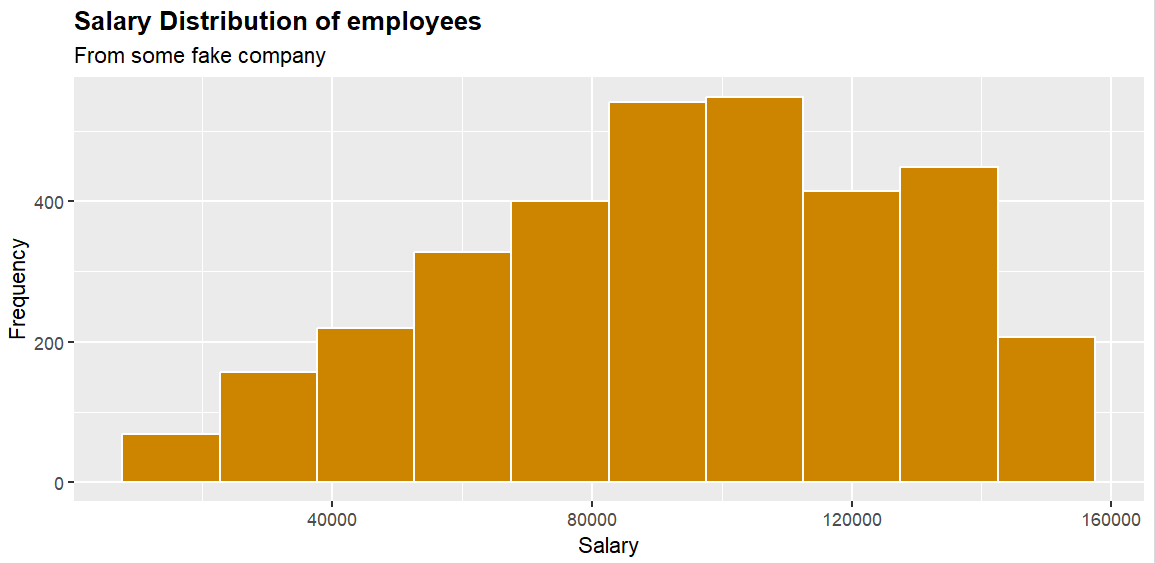
通过 + 可以将上述代码解释为4步
第一步 -->
ggplot(employees, aes(x = Salary)):创建画布,将employees放在第一个参数位置
第二个参数aes(x = xxx)为映射,而aes(x = Salary)就表示将Salary这个字段放在x轴上
整段就代表将 employees 中的 Salary 字段放在x轴上
第二步 -->
geom_histogram():画直方图
fill = "orange3":填充色
color = "white":边框颜色
bins = 10:数据分级设置为10,也就是10个区间
第三步 -->
labs():修改坐标轴、图例和图形标签
title:正标题
subtitle:副标题
x:x轴标题
y:y轴标题
第四步 -->
theme():修改图形主题中的元素样式
plot.title:图的标题
element_text():用于控制文字样式的函数
face = "bold":字体调节为粗体
2.2 箱形图(Boxplot)
r
p2 = ggplot(employees, aes(x = Department, y = Salary)) +
  geom_boxplot(color = "blue2", fill = "yellow2") +
  labs(title = "Salary distribution of employees by Department",
       subtitle = "From a fake company",
       x = "",
       y = "Salary")
print(p2)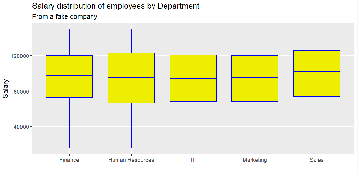
gemo_boxplot(xxx):画箱形图
箱子从上到下依次为:3rd Qu. -> Median -> 1st Qu.
箱子的高度(数据中间50%) --> 四分位距(Interquartile range) = Q3 - Q1
在箱型图中显示平均值:
r
p2 = ggplot(employees, aes(x = Department, y = Salary)) +
  geom_boxplot(color = "blue2", fill = "yellow2") +
  labs(title = "Salary distribution of employees by Department",
       subtitle = "From a fake company",
       x = "",
       y = "Salary") +
  stat_summary(fun = mean, geom = "point", shape = 20, size = 8,
               color = "white", fill = "white")
print(p2)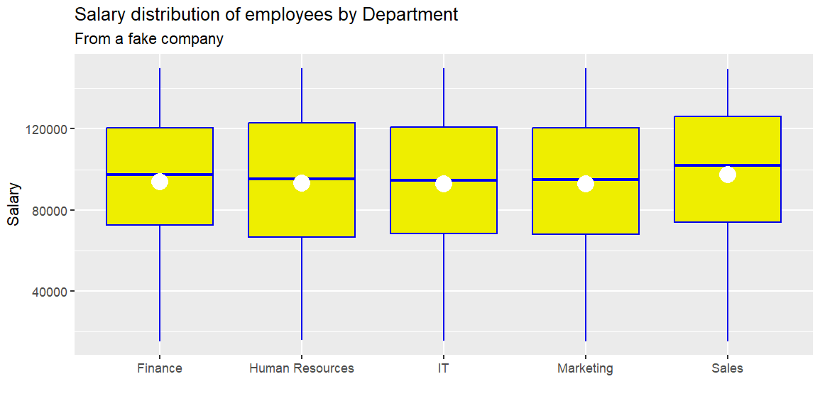
fun = xxxx:使用什么函数
mean(x):求平均值
geom = "point":将平均值显示为一个点
shape = 20:表示实心圆
size = 8:圆的大小
color、fill:颜色,边框
如果发现因数据过多导致堆叠
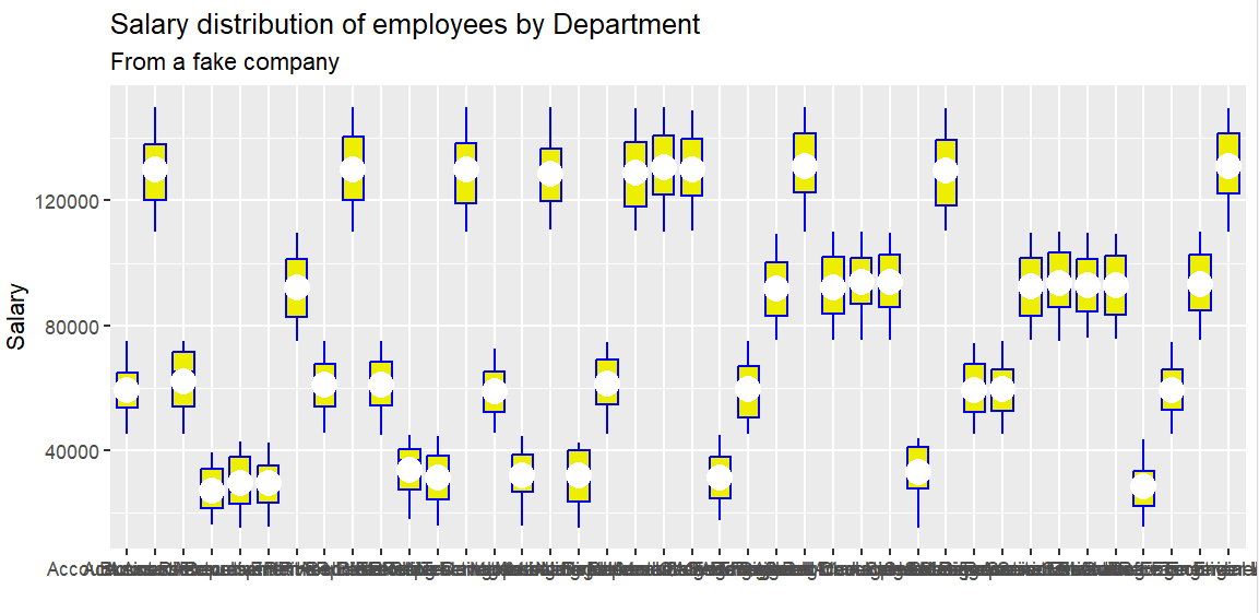
可以更改显示样式
r
p2 = ggplot(employees, aes(x = Position, y = Salary)) +
  geom_boxplot(color = "blue2", fill = "yellow2") +
  labs(title = "Salary distribution of employees by Department",
       subtitle = "From a fake company",
       x = "",
       y = "Salary") +
  stat_summary(fun = mean, geom = "point", shape = 20, size = 8,
               color = "white", fill = "white") +
  theme(axis.text.x = element_text(angle = 45, vjust = 1, hjust = 1))
print(p2)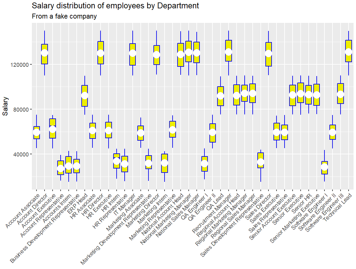
axis.text.x:X轴文本标签(刻度标签)
adgle:倾斜角度
vjust:垂直
hjust:水平
3.dplyr
r
employees |> summarise(MIN = min(Salary),
                       LQ = quantile(Salary, 0.25),
                       HQ = quantile(Salary, 0.75),
                       AVG = mean(Salary),
                       MEDIAN = median(Salary),
                       MAX = max(Salary)) -> tibble1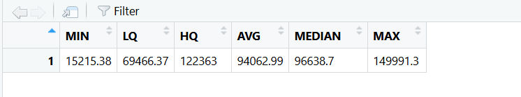
summarise():摘要
min():最小值
quantile(Salary, 0.25):1st Qu.
quantile(Salary, 0.75):3rd Qu.
mean():平均值
median():中位数
max():最大值
分组
r
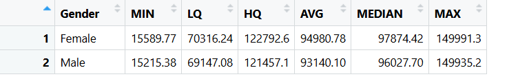
employees |> group_by(Gender)|>
                       summarise(MIN = min(Salary),
                       LQ = quantile(Salary, 0.25),
                       HQ = quantile(Salary, 0.75),
                       AVG = mean(Salary),
                       MEDIAN = median(Salary),
MAX = max(Salary)) -> tibble2group_by(Gender):按年龄分组
筛选
r
# 年薪大于10w的
employees |> group_by(Gender)|> tally(Salary >= 100000) -> tibble3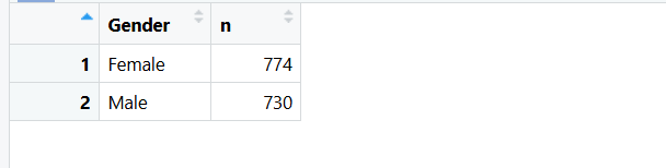
tally():计数
r
> str(tibble3)
tibble [2 × 2] (S3: tbl_df/tbl/data.frame)
 $ Gender: Factor w/ 2 levels "Female","Male": 1 2
$ n : int [1:2] 774 730tibble:现代化的 data frame
4.相关性
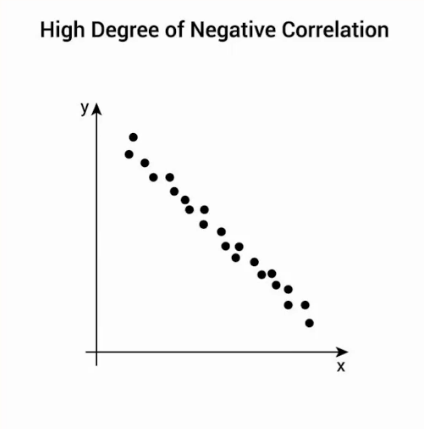
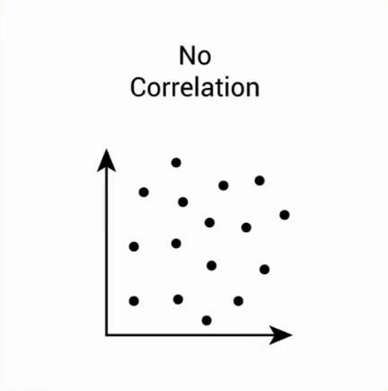
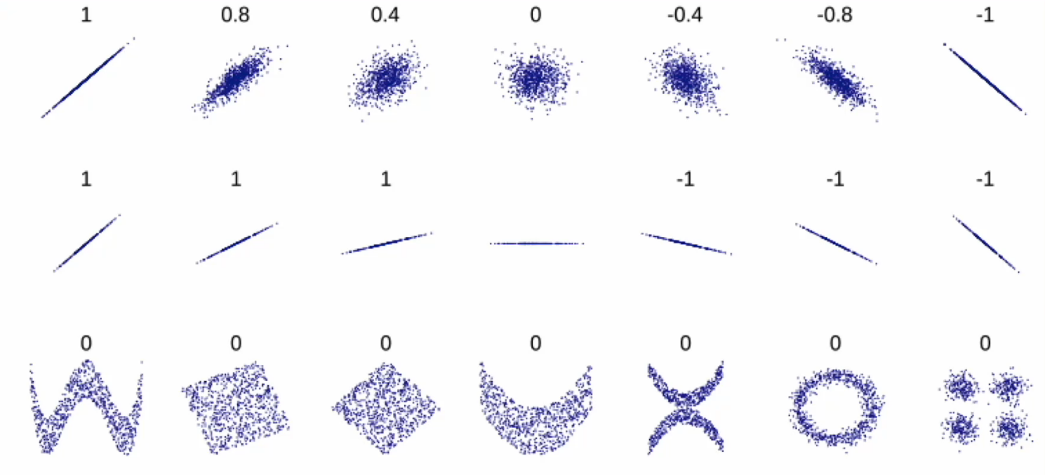
衡量一对连续数值型变量之间的线性关系
正相关和负相关

线性相关系数
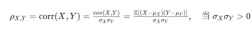
- ρX,Y:X 与 Y 的相关系数
- cov(X,Y):X 与 Y 的协方差
- σX,σY:X 和 Y 的标准差
- μX,μY:X 和 Y 的期望(均值)
- E⋅:期望算子
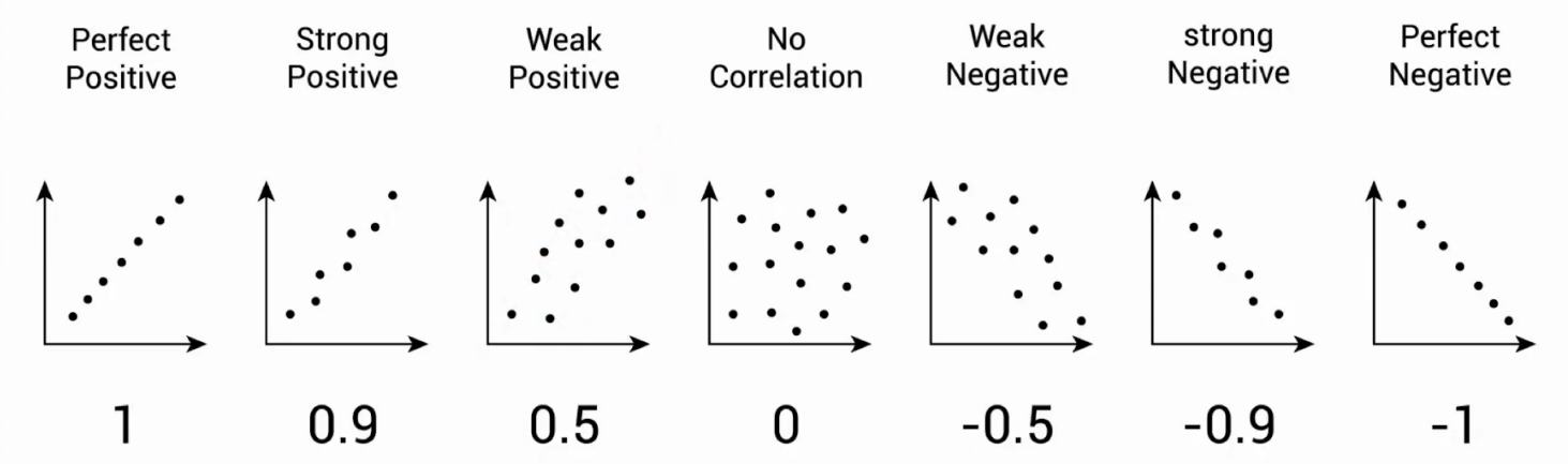
取值范围在-1, 1,越趋近于1,正相关性越强,越趋近于-1,负相关性越强
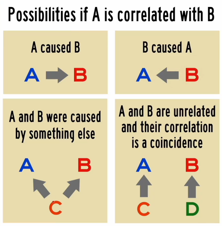
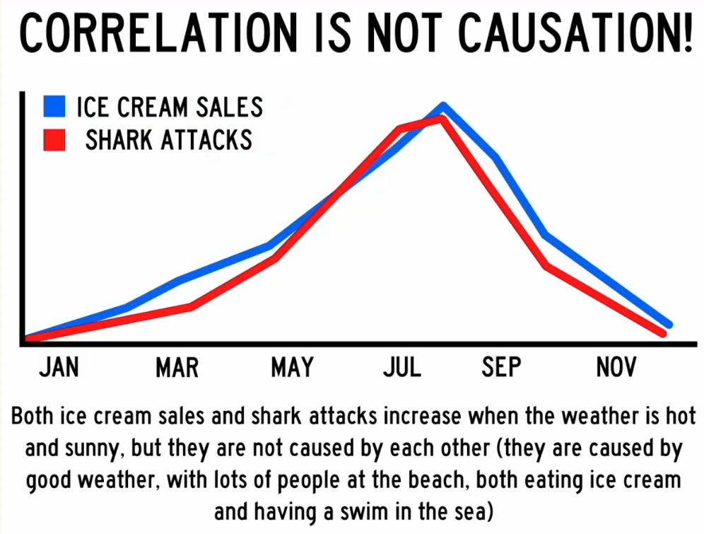
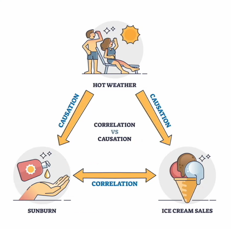
相关性不代表具有因果关系
| 分类 | 关系 |
|---|---|
| A 导致 B | 直接原因 |
| B 导致 A | 反向因果关系 |
| A 和 B 都是由 C 导致的 | 共因关系 |
| A 导致 B 并且 B 导致 A | 双向或循环因果关系 |
| A 和 B 之间没有关联 | 巧合 |
4.1 数字显示
r
employees |> select(c(Salary, Age, In_Company_Years, Year_of_Experience)) ->
cor_employees选出上述四列内容赋值给cor_employees
r
cor_matrix <- cor(cor_employees)cor():计算两两之间的相关系数
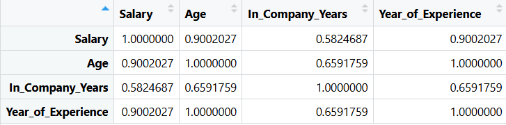
r
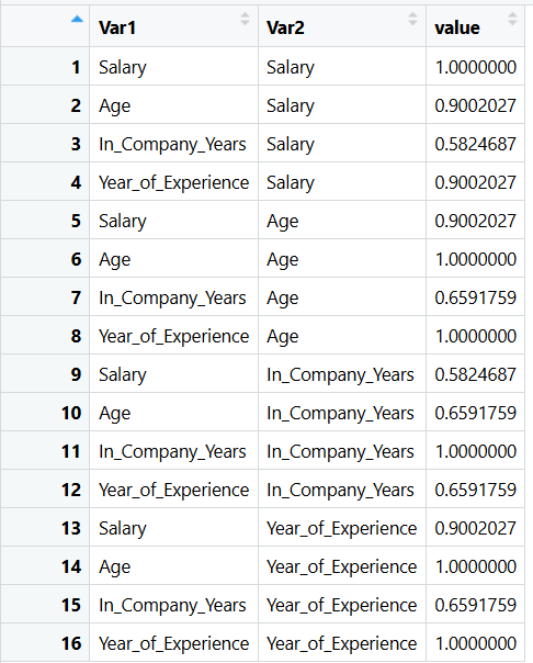
cor_table <- melt(cor_matrix)melt():把上一步结果转换为便于绘图的样式
4.2热图 Heat map
r
pc <- ggplot(cor_table, aes(x = Var1, y = Var2, fill = value)) +
  geom_tile() +
  scale_fill_gradient2(low = "steelblue4", mid = "white", high = "red4") +
  labs(title = "Correlation Matrix",
       subtitle = "Correlation Coefficients between 4 variables",
       x = "",
       y = "",
       fill = "Correlation\nCoefficient",
       caption = "Source: Employee data set") +
  theme(plot.title = element_text(size = 18, face = "bold"),
        legend.title = element_text(face = "bold", color = "brown", size = 10),
        axis.text.x = element_text(size = 14, face = "bold", angle = 45, vjust = 0.7),
        axis.text.y = element_text(size = 14, face = "bold")) +
  geom_text(aes(x = Var1, y = Var2, label = round(value, 2), color = "white"),
            fontface = "bold", size = 5)

print(pc)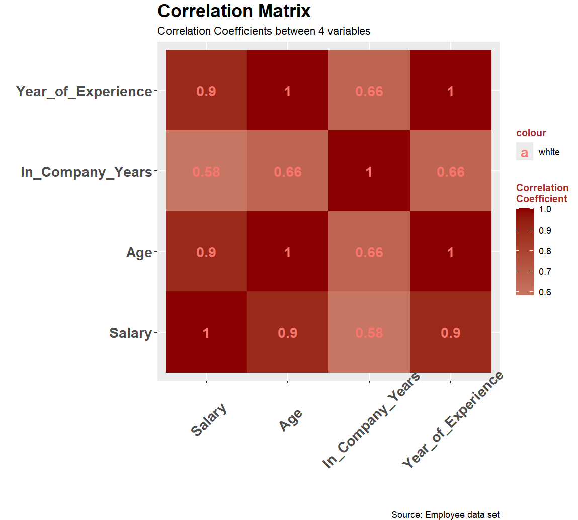
gemo_tile():用来绘制每一个格子
scale_fill_gradient2():绘制渐变色
legend.title:图例
gemo_text():添加文字
label:要显示的文字
round(value, 2):保留两位小数
r
scale_fill_gradient2(low = "steelblue4", mid = "white", high = "red4")这里可以通过添加参数来提高对比度,将中间值设置为0.5
r
scale_fill_gradient2(midpoint = 0.5, low = "steelblue4", mid = "white", high = "red4")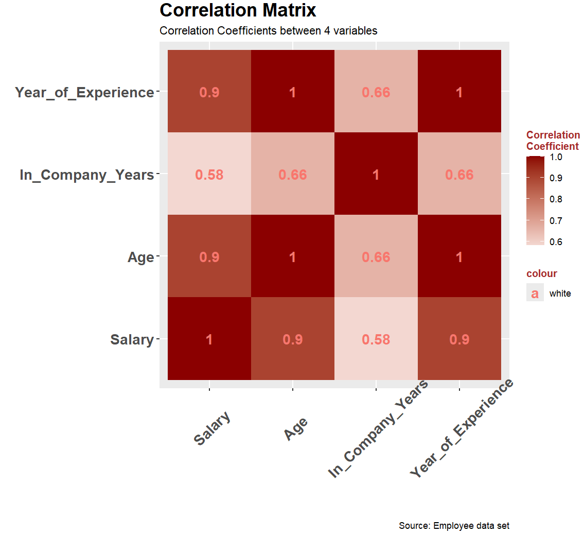
5. 显示已有所有图表
r
temp <- p1 + p2 + plot_layout(ncol = 2)
print(temp)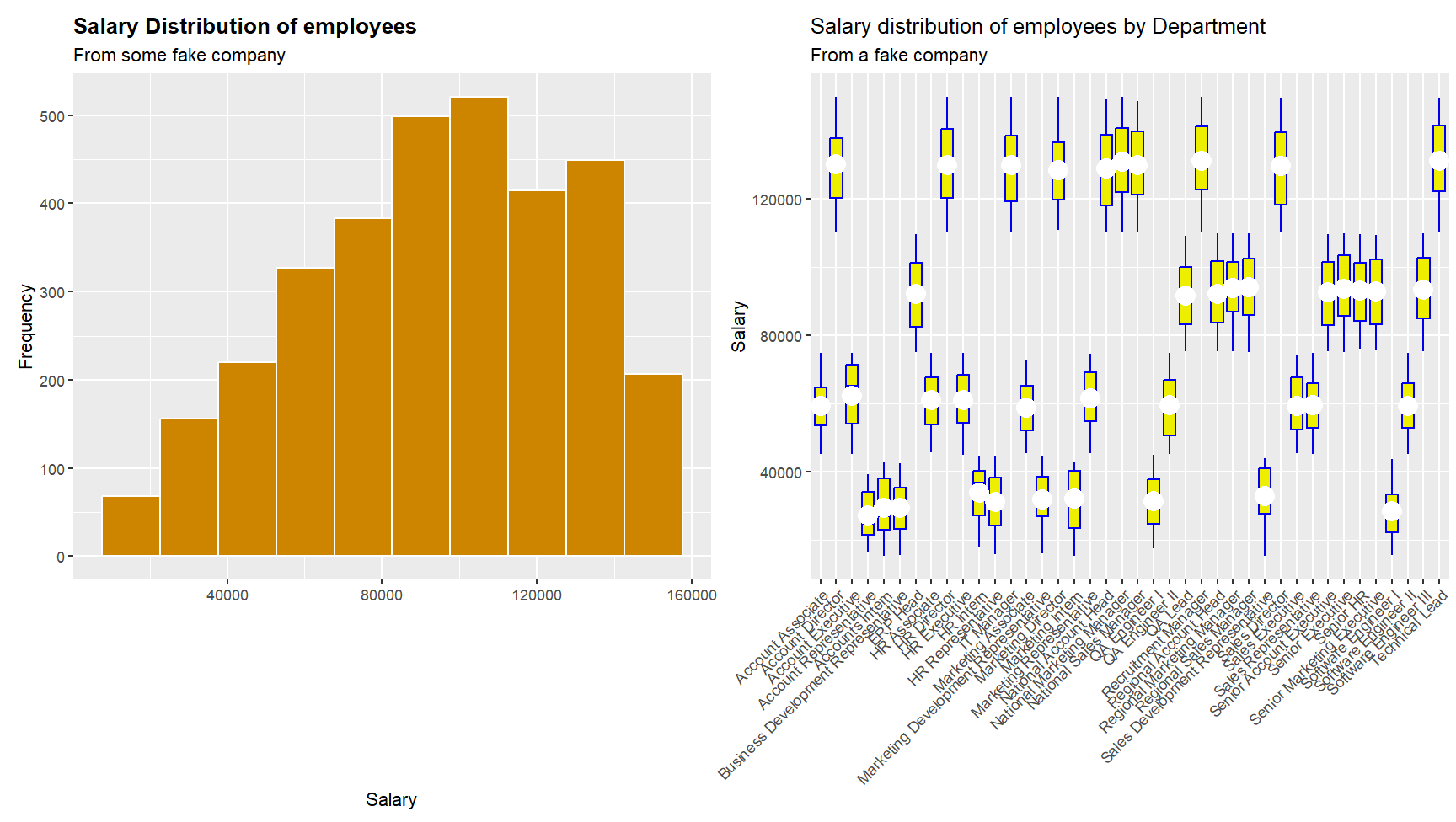
r
temp <- p1 + p2 + p3 + pc + plot_layout(ncol = 2)
print(temp)
6. 保存
write_csv(employees, "D:\\SystemFiles\\dawd\\cleaned_employyees.csv")
r
# install.packages("tidyverse")
# install.packages("patchwork")
# install.packages("reshape2")

library(tidyverse)
library(patchwork)
library(reshape2)

employees <- read.csv("D:\\NetdiskDownload\\Employee_dataset.csv")

employees <- select(employees, -c("X", "Name", "Address", "DOJ",
                                  "Dependents", "HRA", "DA",
                                  "PF", "Insurance", "Gross.Salary"))

other_sex_row_nos <- employees$Sex == "Other"
employees <- employees[!other_sex_row_nos, ]

empty_marital_status_rows <- employees$Marital.Status == ""
employees <- employees[!empty_marital_status_rows, ]

employees |> rename(Birth_Date = DOB,
                    Gender = Sex,
                    Marital_Status = Marital.Status,
                    In_Company_Years = In.Company.Years,
                    Year_of_Experience = Year.of.Experience) -> employees

employees$Gender <- as.factor(employees$Gender)
employees$Marital_Status <- as.factor(employees$Marital_Status)
employees$Department <- as.factor(employees$Department)
employees$Position <- as.factor(employees$Position)

p1 <- ggplot(employees, aes(x = Salary)) +
  geom_histogram(fill = "orange3", color = "white", bins = 10) +
  labs(title = "Salary Distribution of employees",
       subtitle = "From some fake company",
       x = "Salary",
       y = "Frequency") +
  theme(plot.title = element_text(face = "bold"))

print(p1)

p2 = ggplot(employees, aes(x = Position, y = Salary)) +
  geom_boxplot(color = "blue2", fill = "yellow2") +
  labs(title = "Salary distribution of employees by Department",
       subtitle = "From a fake company",
       x = "",
       y = "Salary") +
  stat_summary(fun = mean, geom = "point", shape = 20, size = 8,
               color = "white", fill = "white") +
  theme(axis.text.x = element_text(angle = 45, vjust = 1, hjust = 1))
print(p2)

p3 = ggplot(employees, aes(x = Year_of_Experience, y = Salary)) +
  geom_boxplot(color = "blue2", fill = "yellow2") +
  labs(title = "Salary distribution of employees by Department",
       subtitle = "From a fake company",
       x = "",
       y = "Salary") +
  stat_summary(fun = mean, geom = "point", shape = 20, size = 8,
               color = "white", fill = "white") +
  theme(axis.text.x = element_text(angle = 45, vjust = 1, hjust = 1))
print(p2)

# ------------------------------------------------------

employees |> summarise(MIN = min(Salary),
                       LQ = quantile(Salary, 0.25),
                       HQ = quantile(Salary, 0.75),
                       AVG = mean(Salary),
                       MEDIAN = median(Salary),
                       MAX = max(Salary)) -> tibble1

employees |> group_by(Gender)|>
                       summarise(MIN = min(Salary),
                       LQ = quantile(Salary, 0.25),
                       HQ = quantile(Salary, 0.75),
                       AVG = mean(Salary),
                       MEDIAN = median(Salary),
                       MAX = max(Salary)) -> tibble2

employees |> group_by(Gender)|> tally(Salary >= 100000) -> tibble3

# Correlation 相关性

employees |> select(c(Salary, Age, In_Company_Years, Year_of_Experience)) ->
  cor_employees

cor_matrix <- cor(cor_employees)

cor_table <- melt(cor_matrix)

head(cor_table)

pc <- ggplot(cor_table, aes(x = Var1, y = Var2, fill = value)) +
  geom_tile() +
  scale_fill_gradient2(midpoint = 0.5, low = "steelblue4", mid = "white", high = "red4") +
  labs(title = "Correlation Matrix",
       subtitle = "Correlation Coefficients between 4 variables",
       x = "",
       y = "",
       fill = "Correlation\nCoefficient",
       caption = "Source: Employee data set") +
  theme(plot.title = element_text(size = 18, face = "bold"),
        legend.title = element_text(face = "bold", color = "brown", size = 10),
        axis.text.x = element_text(size = 14, face = "bold", angle = 45, vjust = 0.7),
        axis.text.y = element_text(size = 14, face = "bold")) +
  geom_text(aes(x = Var1, y = Var2, label = round(value, 2), color = "white"),
            fontface = "bold", size = 5)

print(pc)

# Others

temp <- p1 + p2 + plot_layout(ncol = 2)
print(temp)

temp <- p1 + p2 + p3 + pc + plot_layout(ncol = 2, nrow = 2)
print(temp)

# save
write_csv(employees, "D:\\SystemFiles\\dawd\\cleaned_employyees.csv")