数据可视化指的是通过可视化表示来探索和呈现数据集内的规律。它与数据分析紧密相关,而数据分析指的是使用代码来探索数据集内的规律和关联。数据集既可以是用一行代码就能装下的小型数值列表,也可以是数万亿字节、包含多种信息的数据。
一、安装matplotlib
在pycharm输入以下命令进行安装
pip install --user matplotlib由于网络慢的问题,这里使用了清华镜像源进行安装
二、绘制简单的折线图
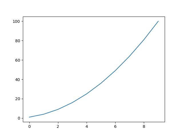
下面使用 Matplotlib 绘制一张简单的折线图,再对其进行定制,以实现信息更丰富的数据可视化效果。我们将使用平方数序列 1、4、9、16 和 25 来绘制这个图形,新建一个mpl_squares.py文件写以下代码:
python
"""指定matplotlib使用的后端(backend),解决兼容性问题:不同的环境(如PyCharm、Jupyter、终端)需要不同的后端"""
import matplotlib
matplotlib.use('TkAgg')  # 在导入pyplot之前设置

"""首先导入 pyplot 模块,并给它指定别名 plt,以免反复输入pyplot"""
import matplotlib.pyplot as plt
"""创建一个名为 squares 的列表,在其中存储要用来制作图形的数据"""
squares = [1, 4, 9, 16, 25]
"""变量 fig 表示由生成的一系列绘图构成的整个图形, 变量 ax 表示图形中的绘图"""
fig, ax = plt.subplots()
"""调用 plot() 方法,它将根据给定的数据以有浅显易懂的方式绘制绘图。plt.show() 函数打开 Matplotlib 查看器并显示绘图"""
ax.plot(squares)
plt.show()
绘制图像如下:
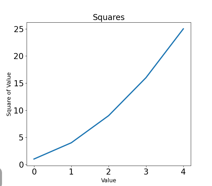
1. 修改标签文字和线条粗细
python
"""指定matplotlib使用的后端(backend),解决兼容性问题:不同的环境(如PyCharm、Jupyter、终端)需要不同的后端"""
import matplotlib
matplotlib.use('TkAgg')  # 在导入pyplot之前设置

"""首先导入 pyplot 模块,并给它指定别名 plt,以免反复输入pyplot"""
import matplotlib.pyplot as plt

"""创建一个名为 squares 的列表,在其中存储要用来制作图形的数据"""
squares = [1, 4, 9, 16, 25]

"""变量 fig 表示由生成的一系列绘图构成的整个图形, 变量 ax 表示图形中的绘图"""
fig, ax = plt.subplots()

"""参数 linewidth 决定了 plot() 绘制的线条的粗细"""
ax.plot(squares, linewidth=3)
# set_title() 方法给绘图指定标题
ax.set_title('Squares', fontsize=20)
# set_xlabel() 方法和 set_ylabel() 方法让你能够为每条轴设置标题
ax.set_xlabel('Value', fontsize=14)
ax.set_ylabel('Square of Value', fontsize=14)
# 设置刻度标记的样式
ax.tick_params(labelsize=20)
"""调用 plot() 方法,它将根据给定的数据以有浅显易懂的方式绘制绘图。plt.show() 函数打开 Matplotlib 查看器并显示绘图"""

plt.show()- linewidth 决定了 plot() 绘制的线条的粗细
- set_xlabel() 方法和 set_ylabel() 方法让你能够为每条轴设置标题
- tick_params() 方法设置刻度标记的样式
- fontsize 用于指定图中各种文字的大小
做出如下图:
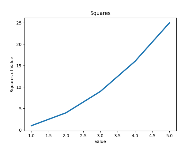
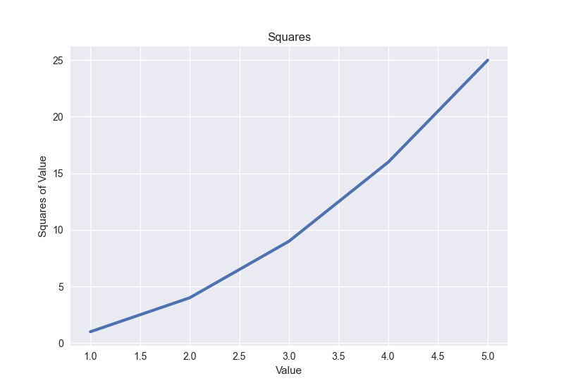
2. 校正绘图
图更容易看清后,我们发现数据绘制得并不正确:折线图的终点指出 4.0的平方为 25。下面来修复这个问题。在向 plot() 提供一个数值序列时,它假设第一个数据点对应的 x 坐标值为 0,但这里的第一个点对应的 x 坐标值应该为 1。为了改变这种默认行为,可给 plot() 同时提供输入值和输出值:
python
"""指定matplotlib使用的后端(backend),解决兼容性问题:不同的环境(如PyCharm、Jupyter、终端)需要不同的后端"""
import matplotlib
matplotlib.use('TkAgg')

import matplotlib.pyplot as plt
input_values =[1, 2, 3, 4, 5]
squares = [1, 4, 9, 16, 25]
fig, ax = plt.subplots()
ax.plot(input_values, squares, linewidth=3)
ax.set_title('Squares')
ax.set_xlabel('Value')
ax.set_ylabel('Squares of Value')
plt.show()
结果如下:
3. 使用内置样式
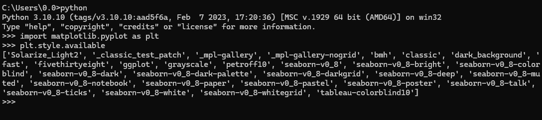
Matplotlib 提供了很多已定义好的样式,这些样式包含默认的背景色、网格线、线条粗细、字体、字号等设置,让你无须做太多定制就能生成引人瞩目的可视化效果。要看到能在你的系统中使用的所有样式,可在终端会话中执行如下命令:
要使用这些样式,可在调用 subplots() 的代码前添加如下代码行:
python
plt.style.use('seaborn-v0_8')代码如下:
python
import matplotlib
matplotlib.use('TkAgg')

import matplotlib.pyplot as plt
input_values = [1, 2, 3, 4, 5]
squares = [1, 4, 9, 16, 25]

# 使用可用的样式
plt.style.use('seaborn-v0_8')

fig, ax = plt.subplots()
ax.plot(input_values, squares, linewidth=3)
ax.set_title('Squares')
ax.set_xlabel('Value')
ax.set_ylabel('Squares of Value')
plt.show()
运行结果如下:
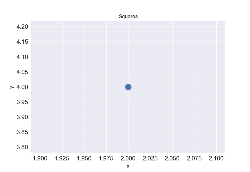
4. 使用 scatter() 绘制散点图并设置样式
要绘制单个点,可使用 scatter() 方法,并向它传递该点的 x 坐标值和 y 坐标值:
scatter_squares.py
python
import matplotlib
matplotlib.use('TkAgg')
import matplotlib.pyplot as plt
plt.style.use("seaborn-v0_8")
fig, ax = plt.subplots()
# 定义一个点的横坐标和纵坐标
ax.scatter(2, 4, s=100)
ax.set_title("Squares")
ax.set_xlabel("x", fontsize=14)
ax.set_ylabel("y", fontsize=14)
ax.tick_params(axis='both', which='major', labelsize=14)
plt.show()
运行结果如下:
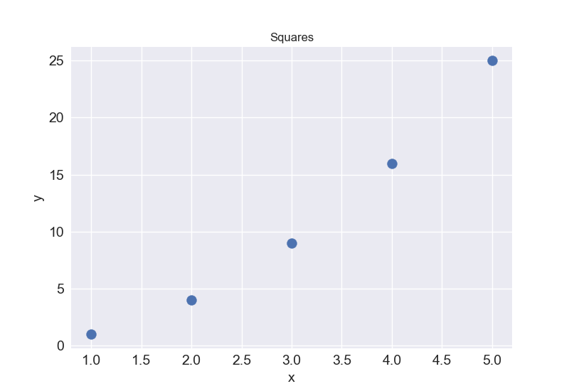
5. 使用 scatter() 绘制一系列点
要绘制一系列点,可向 scatter() 传递两个分别包含 x 坐标值和 y 坐标值的列表,如下所示:
python
import matplotlib
matplotlib.use('TkAgg')
import matplotlib.pyplot as plt
plt.style.use("seaborn-v0_8")
fig, ax = plt.subplots()
x_values = [1, 2, 3, 4, 5]
y_values = [1, 4, 9, 16, 25]
# 传递横坐标和纵坐标
ax.scatter(x_values, y_values, s=100)
ax.set_title("Squares")
ax.set_xlabel("x", fontsize=14)
ax.set_ylabel("y", fontsize=14)
ax.tick_params(axis='both', which='major', labelsize=14)
plt.show()
运行结果如下:
6. 自动计算数据
手动指定列表要包含的值效率不高,在需要绘制的点很多时尤其如此。好在可以不指定值,直接使用循环来计算。
下面是绘制 1000 个点的代码:
python
import matplotlib
matplotlib.use('TkAgg')
import matplotlib.pyplot as plt
plt.style.use("seaborn-v0_8")
fig, ax = plt.subplots()
# 生成1到1000序列
x_values = range(1, 1001)
# 对序列的每一个值取平方
y_values = [x**2 for x in x_values]
ax.scatter(x_values, y_values, s=10)
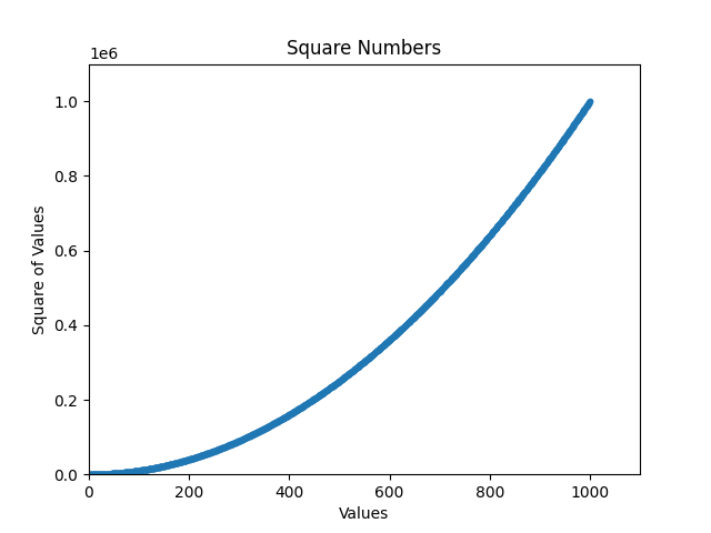
ax.set_title('Square Numbers')
ax.set_xlabel('Values')
ax.set_ylabel('Square of Values')
ax.axis([0, 1100, 0, 1_100_000])
plt.show()运行结果如下:
7. 定制刻度标记
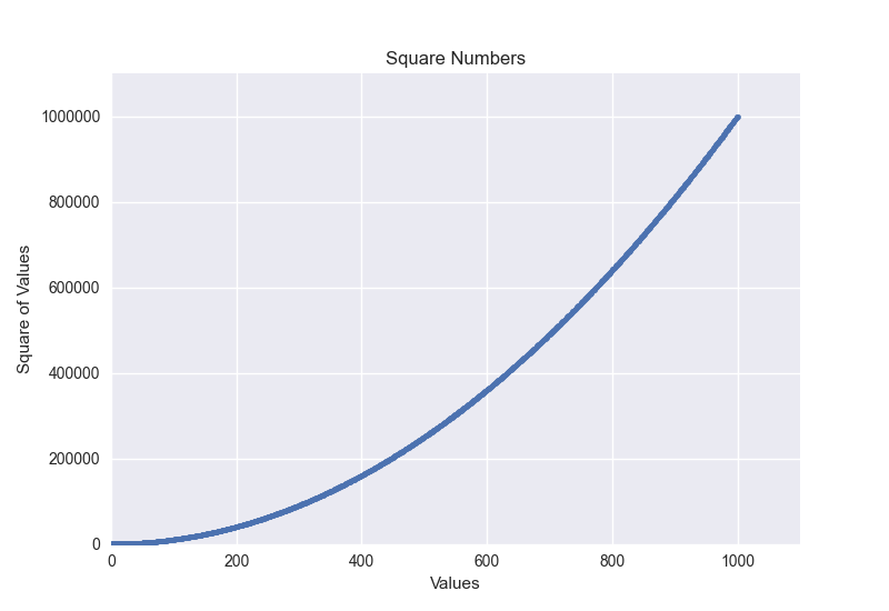
ax.ticklabel_format(style='plain') 是 Matplotlib 中用于设置坐标轴刻度标签显示格式 的一个方法。它的主要作用是强制坐标轴使用常规的数值格式(即"平实"格式)来显示刻度标签,而不是科学计数法。
python
import matplotlib
matplotlib.use('TkAgg')
import matplotlib.pyplot as plt
plt.style.use("seaborn-v0_8")
fig, ax = plt.subplots()
# 生成1到1000序列
x_values = range(1, 1001)
# 对序列的每一个值取平方
y_values = [x**2 for x in x_values]
ax.scatter(x_values, y_values, s=10)
ax.set_title('Square Numbers')
ax.set_xlabel('Values')
ax.set_ylabel('Square of Values')
ax.axis([0, 1100, 0, 1_100_000])
# 定制刻度标记
ax.ticklabel_format(style='plain')
plt.show()
运行结果如下:
8. 定制颜色
scatter() 传递参数 color 并将其设置为要使用的颜色的名称(用引号引起来),如下所示:
python
ax.scatter(x_values, y_values, color='red', s=10)还可以使用 RGB 颜色模式定制颜色,值越接近 0,指定的颜色越深;值越接近 1,指定的颜色越浅。
python
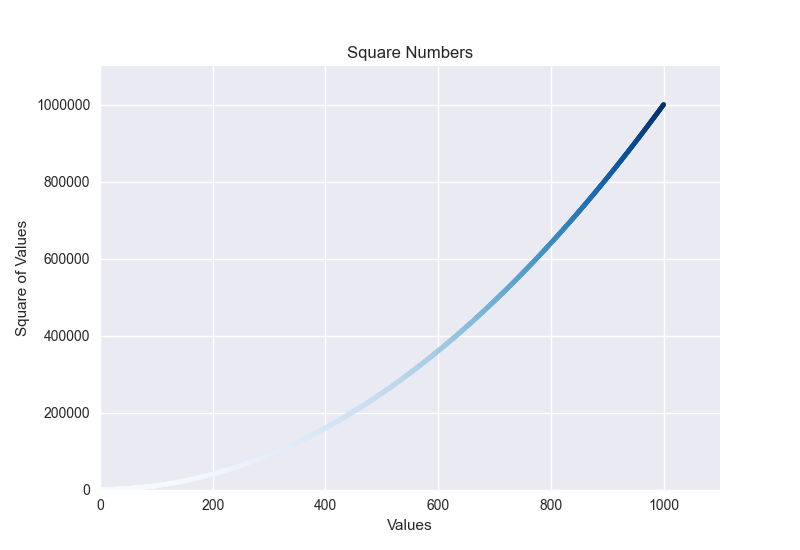
ax.scatter(x_values, y_values, color=(0, 0.8, 0), s=10)9. 使用颜色映射
颜色映射(colormap)是一个从起始颜色渐变到结束颜色的颜色序列。
python
ax.scatter(x_values, y_values, c=y_values, cmap=plt.cm.Blues, s=10)运行结果如下:
10. 自动保存绘图
如果要将绘图保存到文件中,而不是在 Matplotlib 查看器中显示它,可将 plt.show() 替换为 plt.savefig()
python
plt.savefig('squares_plot.png', bbox_inches='tight')三、随机游走
随机游走是由一系列简单的随机决策产生的行走路径。可以将随机游走看作一只晕头转向的蚂蚁每一步都沿随机的方向前行所经过的路径。
1. 创建 RandomWalk 类
为了模拟随机游走,我们将创建一个名为 RandomWalk 的类,用来随机地选择前进的方向。这个类需要三个属性:一个是跟踪随机游走次数的变量,另外两个是列表,分别存储随机游走经过的每个点的 x 坐标值和 y 坐标值。
RandomWalk 类只包含两个方法:init() 和 fill_walk(),后者计算随机游走经过的所有点。先来看看 init() 方法:
random_walk.py
python
# 使用 random 模块中的 choice() 来决定做出哪种选择
from random import choice
class RandomWalk:
    # 将随机游走包含的默认点数设置为 5000
    def __init__(self, num_points=5000):
        """初始化随机游走的属性"""
        self.num_points = num_points

        """所有随机游走都始于(0,0)"""
        self.x_values = [0]
        self.y_values = [0]
2. 选择方向
下面使用 fill_walk() 方法来生成游走包含的点。请将这个方法添加到刚才创建的 RandomWalk 类之下:
python
# 使用 random 模块中的 choice() 来决定做出哪种选择
from random import choice
class RandomWalk:
    # 将随机游走包含的默认点数设置为 5000
    """一个生成随机游走数据的类"""
    def __init__(self, num_points=5000):
        """初始化随机游走的属性"""
        self.num_points = num_points

        """所有随机游走都始于(0,0)"""
        self.x_values = [0]
        self.y_values = [0]

    def fill_walk(self):
        """计算随机游走包含的所有点"""
        # 不断游走,直到列表达到指定的长度
        while len(self.x_values) < self.num_points:
            # 决定前进的方向以及沿这个方向前进的距离
            x_direction = choice([1, -1])
            x_distance = choice([0, 1, 2, 3, 4])
            x_step = x_direction * x_distance
            y_direction = choice([1, -1])
            y_distance = choice([0, 1, 2, 3, 4])
            y_step = y_direction * y_distance

            # 拒绝原地踏步
            if x_step == 0 and y_step == 0:
                continue

            # 计算下一个点的 x 坐标值和 y 坐标值
            x = self.x_values[-1] + x_step
            y = self.y_values[-1] + y_step
            self.x_values.append(x)
            self.y_values.append(y)
使用 choice(1, -1) 给 x_direction 选择一个值,结果要么是表示向右走的 1,要么是表示向左走的 -1。接下来,choice(0, 1,2, 3, 4) 随机地选择沿指定的方向走多远(这个距离被赋给变量
x_distance)。列表中的 0 能够模拟只沿一条轴移动的情况。将移动方向乘以移动距离,确定沿 x 轴和 y 轴移动的距离。
如果 x_step 为正,将向右移动;为负将向左移动;为 0 将垂直移动。如果y_step 为正,将向上移动;为负将向下移动;为 0 将水平移动。如果x_step 和 y_step 都为 0,则意味着原地踏步。我们拒绝二者都为 0 的情况,接着执行下一次循环。
为了获取游走中下一个点的 x 坐标值,将 x_step 与 x_values 中的最后一个值相加,对 y 坐标值也做相同的处理。获得下一个点的 x 坐标值和 y 坐标值后,将它们分别追加到列表 x_values 和y_values 的末尾。
3. 绘制随机游走图
下面的代码将随机游走的所有点都绘制出来:
rw_visual.py
python
import matplotlib
import matplotlib.pyplot as plt

matplotlib.use('TkAgg')
from random_walk import RandomWalk
rw = RandomWalk()
rw.fill_walk()
plt.style.use('classic')
fig, ax = plt.subplots()
ax.scatter(rw.x_values, rw.y_values, s=15)
ax.set_aspect('equal')
plt.show()
运行结果如下:
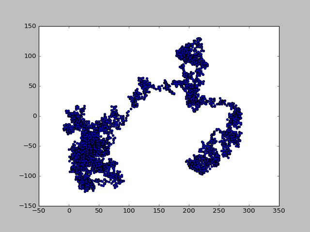
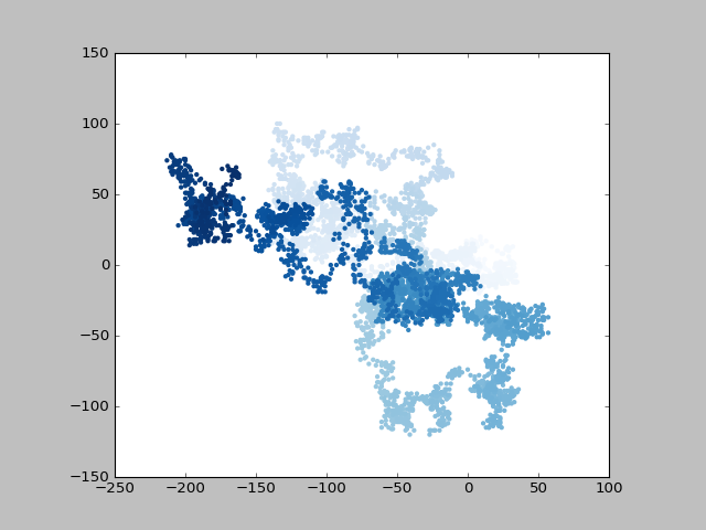
4. 给点着色
使用 range() 生成一个数值列表,列表长度值等于游走包含的点的个数。接下来,将这个列表赋给变量 point_numbers,以便后面使用它来设置每个游走点的颜色。将参数 c 设置point_numbers,指定使用颜色映射 Blues,并传递实参edgecolors='none' 以删除每个点的轮廓。最终的随机游走图从浅蓝色渐变为深蓝色,准确地指出从起点游走到终点的路径
python
import matplotlib
import matplotlib.pyplot as plt

matplotlib.use('TkAgg')
from random_walk import RandomWalk
while True:
    rw = RandomWalk()
    rw.fill_walk()
    plt.style.use('classic')
    fig, ax = plt.subplots()
    point_numbers = range(rw.num_points)
    ax.scatter(rw.x_values, rw.y_values, c=point_numbers,
               cmap=plt.cm.Blues,
               edgecolors='none', s=15)
    ax.set_aspect('equal')
    plt.show()
运行结果如下:
四、使用 Plotly 模拟掷骰子
1. 安装Plotly
python
pip install Plotly 2. 创建 Die 类
为了模拟掷一个骰子的情况,创建下面的类:
python
from random import randint
class Die:
    """表示一个骰子的类"""
    def __init__(self, num_sides=6):
        """骰子默认为 6 面的"""
        self.num_sides = num_sides
    def roll(self):
        """" 返回一个介于 1 和骰子面数之间的随机值"""
        return randint(1, self.num_sides)
3. 掷骰子
使用这个类来创建图形前,先来掷一个 D6,将结果打印出来,并确认结果是合理的:
python
from die import Die
die = Die()
results = []
for roll_num in range(100):
    result = die.roll()
    results.append(result)
print(results)
运行结果如下:
python
[5, 3, 4, 4, 1, 2, 3, 2, 1, 2, 3, 6, 2, 1, 2, 6, 3, 6, 2, 2, 3, 1, 5, 1, 2, 1, 5, 3, 6, 4, 2, 6, 2, 5, 1, 2, 3, 6, 1, 3, 2, 4, 1, 3, 5, 5, 2, 3, 3, 5, 6, 2, 2, 2, 4, 2, 3, 5, 1, 3, 1, 6, 1, 2, 1, 4, 2, 3, 6, 4, 1, 1, 2, 3, 3, 4, 5, 1, 3, 4, 3, 3, 2, 5, 5, 4, 6, 3, 5, 2, 6, 3, 5, 4, 1, 1, 2, 2, 5, 2, 4, 1, 5, 2, 3, 5, 4, 3, 1, 3, 5, 3, 5, 4, 5, 6, 2, 4, 6, 1, 1, 3, 1, 3, 3, 6, 6, 5, 6, 1, 4, 1, 3, 1, 4, 3, 3, 6, 3, 5, 1, 1, 5, 6, 2, 5, 1, 5, 3, 3, 4, 1, 6, 5, 5, 3, 2, 5, 5, 3, 1, 1, 4, 1, 2, 1, 2, 6, 2, 2, 2, 5, 4, 4, 6, 2, 4, 5, 2, 6, 3, 4, 4, 6, 3, 5, 1, 5, 2, 5, 3, 2, 3, 6, 6, 6, 1, 1, 1, 1, 1, 5, 5, 6, 3, 3, 5, 2, 3, 2, 2, 2, 3, 3, 2, 1, 4, 5, 2, 5, 5, 5, 3, 3, 1, 1, 6, 2, 5, 3, 5, 6, 2, 6, 1, 2, 6, 2, 5, 6, 5, 6, 1, 4, 6, 3, 6, 1, 6, 4, 4, 6, 6, 4, 1, 3, 2, 1, 4, 1, 5, 4, 6, 3, 6, 5, 4, 5, 4, 2, 5, 4, 5, 3, 6, 4, 6, 5, 3, 6, 4, 1, 2, 1, 2, 4, 2, 2, 2, 1, 3, 6, 6, 4, 5, 4, 5, 1, 6, 2, 2, 2, 3, 6, 6, 1, 1, 3, 1, 2, 1, 4, 4, 6, 6, 3, 6, 3, 3, 5, 5, 1, 2, 1, 2, 6, 2, 6, 2, 5, 3, 5, 1, 6, 5, 3, 5, 2, 6, 2, 5, 2, 2, 6, 2, 5, 4, 5, 4, 5, 5, 6, 5, 4, 5, 6, 2, 3, 4, 3, 2, 6, 2, 5, 2, 6, 1, 2, 4, 6, 6, 2, 4, 5, 2, 5, 6, 2, 3, 2, 3, 6, 6, 1, 2, 6, 2, 5, 2, 2, 5, 6, 5, 4, 2, 2, 3, 3, 1, 1, 6, 2, 6, 1, 6, 5, 4, 1, 3, 4, 1, 3, 5, 1, 6, 1, 5, 6, 1, 6, 2, 6, 1, 1, 5, 6, 1, 6, 1, 5, 6, 4, 4, 5, 3, 3, 4, 2, 3, 3, 4, 5, 6, 1, 1, 2, 1, 1, 3, 2, 2, 1, 5, 5, 3, 5, 3, 5, 6, 4, 2, 1, 2, 4, 6, 5, 2, 5, 4, 1, 6, 1, 2, 5, 3, 3, 1, 2, 5, 5, 6, 2, 2, 2, 5, 3, 2, 4, 1, 4, 1, 4, 1, 5, 4, 6, 1, 2, 5, 5, 4, 1, 6, 2, 4, 1, 3, 2, 4, 2, 3, 1, 5, 2, 4, 5, 4, 5, 2, 6, 5, 2, 5, 1, 2, 1, 4, 1, 2, 1, 6, 5, 4, 6, 1, 4, 4, 3, 3, 1, 4, 1, 2, 2, 2, 1, 2, 6, 1, 5, 3, 4, 2, 3, 6, 5, 5, 1, 2, 2, 4, 2, 1, 6, 5, 1, 5, 4, 5, 3, 1, 2, 1, 4, 4, 6, 5, 3, 3, 3, 4, 2, 4, 6, 1, 5, 5, 4, 3, 1, 5, 1, 6, 1, 6, 5, 3, 4, 5, 3, 5, 4, 6, 2, 5, 6, 6, 1, 2, 2, 3, 4, 1, 1, 6, 1, 1, 1, 3, 5, 5, 6, 5, 4, 3, 2, 6, 2, 1, 5, 5, 6, 3, 3, 5, 2, 1, 2, 3, 3, 4, 3, 6, 6, 6, 5, 3, 5, 2, 5, 4, 5, 5, 4, 1, 1, 4, 5, 5, 5, 1, 3, 2, 5, 4, 4, 3, 1, 4, 1, 3, 6, 3, 1, 3, 5, 5, 1, 2, 1, 4, 1, 6, 4, 2, 2, 6, 3, 2, 4, 6, 4, 4, 3, 2, 5, 4, 2, 3, 4, 4, 5, 5, 5, 4, 3, 6, 4, 3, 4, 1, 6, 1, 4, 4, 6, 6, 6, 4, 5, 6, 2, 3, 2, 2, 1, 2, 2, 1, 3, 4, 1, 6, 3, 4, 4, 4, 6, 5, 3, 5, 4, 5, 3, 2, 2, 1, 6, 5, 1, 1, 1, 2, 1, 1, 1, 5, 4, 2, 4, 5, 2, 5, 3, 1, 3, 2, 5, 4, 4, 2, 6, 4, 3, 6, 2, 2, 4, 1, 6, 5, 1, 5, 3, 2, 3, 3, 2, 4, 4, 6, 1, 2, 2, 5, 2, 5, 3, 2, 4, 5, 5, 3, 6, 3, 1, 1, 3, 5, 5, 4, 5, 5, 6, 5, 3, 5, 1, 1, 5, 1, 4, 4, 1, 3, 1, 1, 4, 2, 4, 5, 3, 5, 5, 6, 2, 4, 3, 4, 6, 6, 3, 1, 4, 6, 3, 5, 1, 2, 2, 1, 4, 5, 4, 6, 3, 3, 3, 2, 2, 2, 3, 1, 3, 5, 1, 3, 4, 1, 3, 3, 6, 1, 5, 5, 3, 1, 2, 4, 5, 5, 1, 5, 1, 1, 6, 2, 1, 6, 3, 1, 4, 1, 1, 4, 4, 5, 4, 3, 2, 5, 6, 4, 3, 5, 2, 2, 3, 1, 2, 6, 1, 2, 4, 2, 5, 4, 1, 3, 2, 3, 5, 4, 5, 2, 1, 2, 4, 1, 3, 1, 6, 2, 3, 5, 4, 1, 3, 4, 6, 1, 5, 6, 6, 6, 2, 4, 1, 1, 6, 2, 2, 6, 5, 1, 2, 2, 2, 1, 1, 2, 3, 5, 3, 2, 5, 6, 5, 3, 4, 5, 4, 3, 2, 2, 3, 5, 4, 4, 4, 3, 2, 3, 6, 5, 5, 2, 3, 1, 6, 1, 5, 2, 5, 4, 1, 1, 1, 1, 4]4. 分析结果
为了分析掷一个 D6 的结果,计算每个点数出现的次数:
python
from die import Die
die = Die()
results = []
# 由于不再将结果打印出来,因此可将模拟掷骰子的次数增加到 1000
for roll_num in range(1000):
    result = die.roll()
    results.append(result)
# 创建空列表 frequencies,用于存储每个点数出现的次数
frequencies = []
# 生成所有可能的点数(这里为 1 到骰子的面数)
poss_results = range(1, die.num_sides + 1)
# 遍历这些点数并计算每个点数在 results 中出现了多少次
for value in poss_results:
    frequency = results.count(value)
    # 再将这个值追加到列表 frequencies 的末尾
    frequencies.append(frequency)
print(frequencies)
运行结果如下:
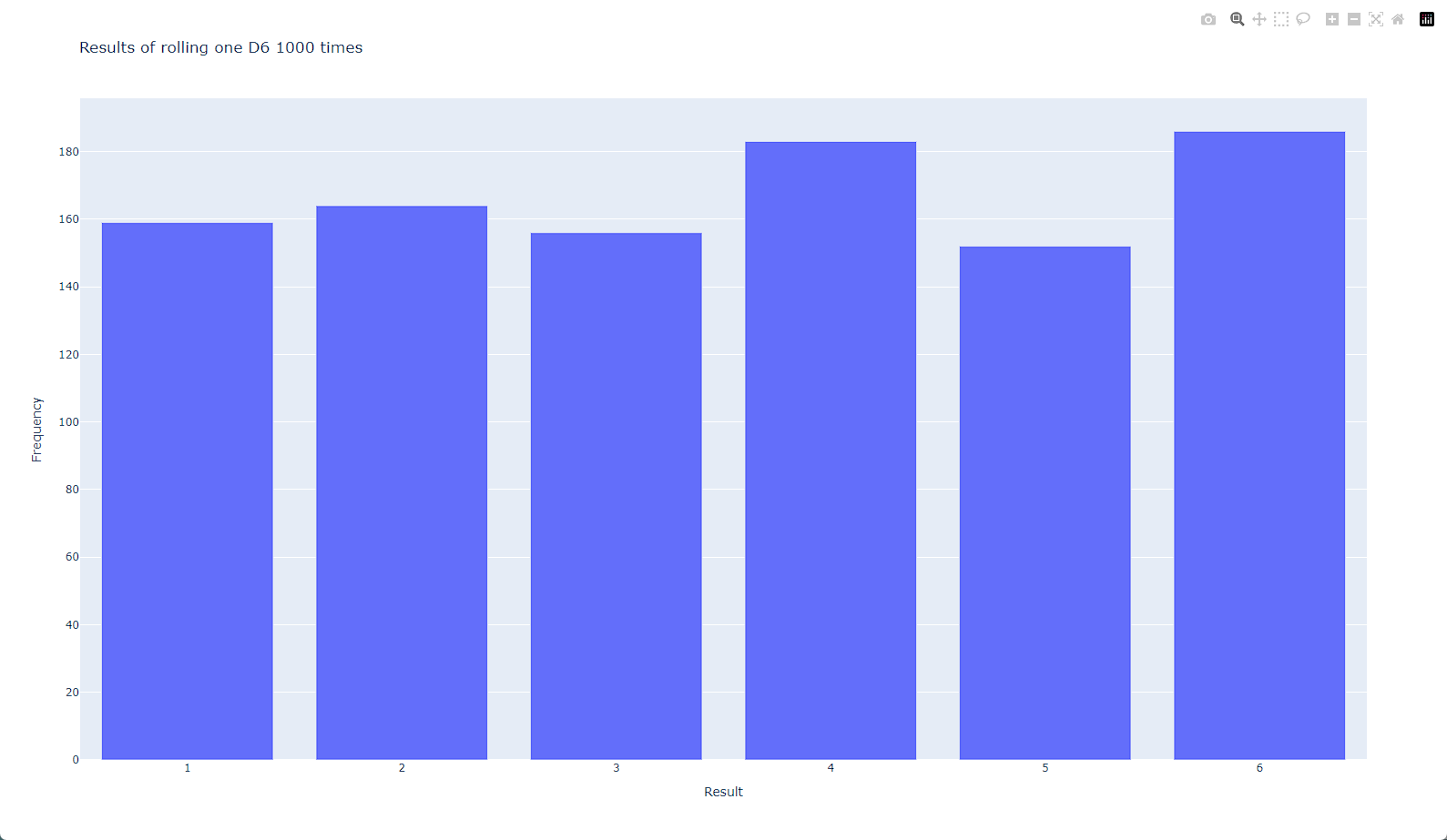
5. 绘制直方图
导入模块 plotly.express,并按照惯例给它指定别名 px。然后,使用函数 px.bar() 创建一个直方图。
python
from die import Die
import plotly.express as px
die = Die()
results = []
# 由于不再将结果打印出来,因此可将模拟掷骰子的次数增加到 1000
for roll_num in range(1000):
    result = die.roll()
    results.append(result)
# 创建空列表 frequencies,用于存储每个点数出现的次数
frequencies = []
# 生成所有可能的点数(这里为 1 到骰子的面数)
poss_results = range(1, die.num_sides + 1)
# 遍历这些点数并计算每个点数在 results 中出现了多少次
for value in poss_results:
    frequency = results.count(value)
    # 再将这个值追加到列表 frequencies 的末尾
    frequencies.append(frequency)
print(frequencies)
# 对结果进行直方图的绘制
fig = px.bar(x=poss_results, y=frequencies)
fig.show()
运行结果如下:
 6. 定制绘图
要使用 Plotly 定制绘图,一种方式是在调用生成绘图的函数(这里是px.bar())时传递一些可选参数。下面演示了如何指定图题并给每条坐标轴添加标签:
python
from die import Die
import plotly.express as px
die = Die()
results = []
# 由于不再将结果打印出来,因此可将模拟掷骰子的次数增加到 1000
for roll_num in range(1000):
    result = die.roll()
    results.append(result)
# 创建空列表 frequencies,用于存储每个点数出现的次数
frequencies = []
# 生成所有可能的点数(这里为 1 到骰子的面数)
poss_results = range(1, die.num_sides + 1)
# 遍历这些点数并计算每个点数在 results 中出现了多少次
for value in poss_results:
    frequency = results.count(value)
    # 再将这个值追加到列表 frequencies 的末尾
    frequencies.append(frequency)
print(frequencies)
# 对结果进行直方图的绘制
# 定义标题
title = "Results of rolling one D6 1000 times"
# 定义标签
labels = {'x': 'Result', 'y': 'Frequency'}
fig = px.bar(x=poss_results, y=frequencies, title=title, labels=labels)
fig.show()
运行结果如下:
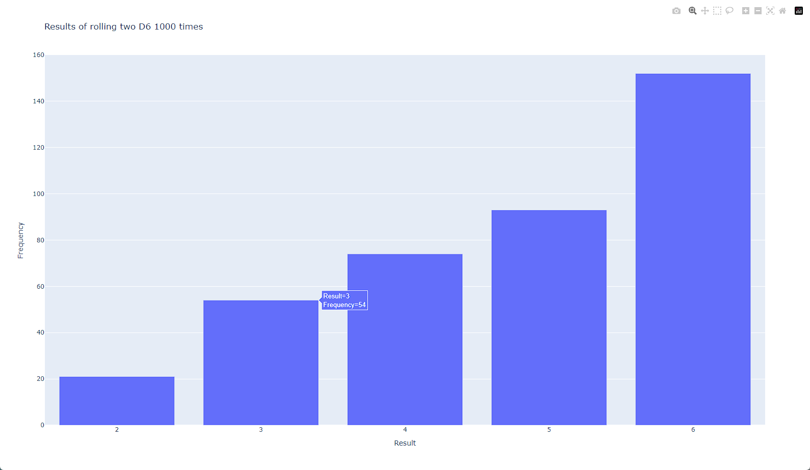
7. 同时掷两个骰子
同时掷两个骰子时,得到的点数往往更多,结果分布情况也有所不同。下面来修改前面的代码,创建两个 D6 以模拟同时掷两个骰子的情况。每次掷两个骰子时,都将两个骰子的点数相加,并将结果存储在 results 中
python
from die import Die
import plotly.express as px
# 创建两个 D6
die_1 = Die()
die_2 = Die()
results = []
# 由于不再将结果打印出来,因此可将模拟掷骰子的次数增加到 1000
for roll_num in range(1000):
    # 掷骰子多次,并将结果存储到一个列表中
    result = die_1.roll() + die_2.roll()
    results.append(result)
# 创建空列表 frequencies,用于存储每个点数出现的次数
frequencies = []
# 可能出现的最小总点数为两个骰子的最小可能点数之和(2),可能出现的最大总点数为两个骰子的最大可能点数之和(12),
# 这个值被赋给 max_result生成所有可能的点数(这里为 1 到骰子的面数)
max_result = die_1.num_sides + die_2.num_sides
poss_results = range(2, die_1.num_sides + 1)
# 遍历这些点数并计算每个点数在 results 中出现了多少次
for value in poss_results:
    frequency = results.count(value)
    # 再将这个值追加到列表 frequencies 的末尾
    frequencies.append(frequency)
print(frequencies)
# 对结果进行直方图的绘制
# 定义标题
title = "Results of rolling two D6 1000 times"
# 定义标签
labels = {'x': 'Result', 'y': 'Frequency'}
fig = px.bar(x=poss_results, y=frequencies, title=title, labels=labels)
fig.show()
运行结果如下:
8. 保存图形
生成你喜欢的图形后,就可以通过浏览器将其保存为 HTML 文件了,不过你也可以用代码完成这项任务。要将图形保存为 HTML 文件,可将fig.show() 替换为 fig.write_html():
python
fig.write_html('dice_visual_d6d10.html')