前言
网站换肤,一个看似简单却暗藏玄机的功能。小到个人博客的深色模式,大到企业级 SaaS 平台的多租户品牌定制,都离不开一套优雅的主题切换方案。但你知道吗?实现换肤的方式远不止一种,选错了方案,后期维护可能让你痛不欲生。
本文结合真实代码实践,系统梳理 3 种主流实现方案,从原理到选型,帮你做出最合适的技术决策。
换肤的本质是什么?
抛开表象,网站换肤的核心只有一件事:
在不改变页面结构的前提下,动态切换视觉样式。
这里的"样式"包括但不限于:
- 背景色、文字颜色
- 边框、阴影
- 品牌色、强调色
- 主题相关的图片或图标
关键在于:如何组织 CSS,以及何时触发样式切换。
方案一:CSS 类切换
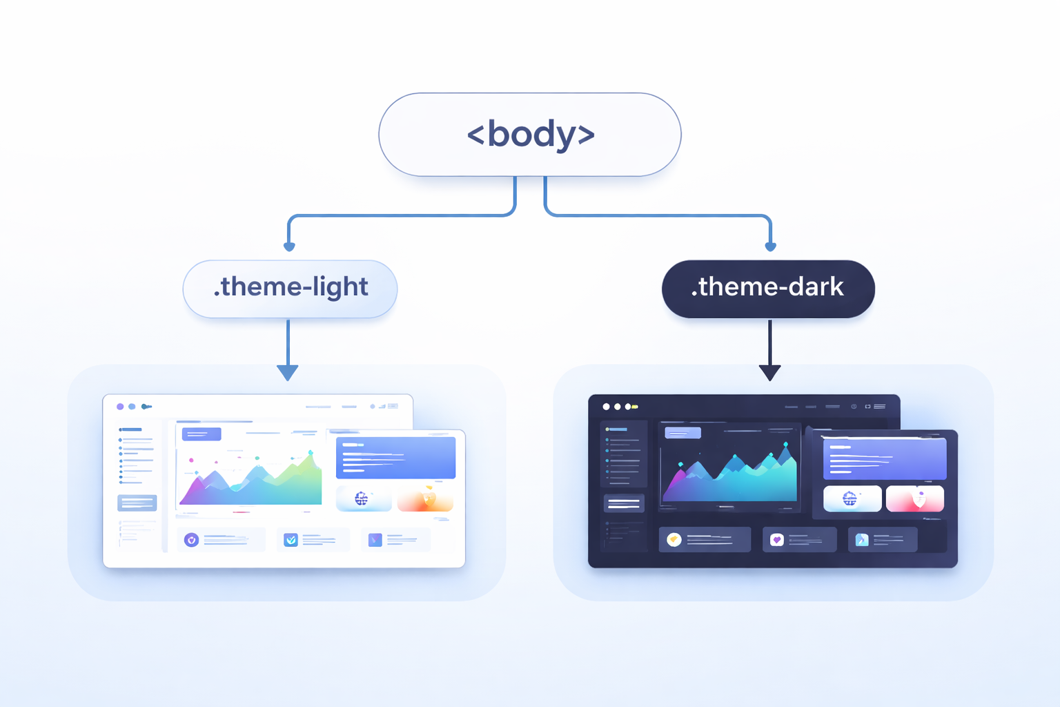
实现思路
这是最直观、最容易理解的方式:
- 在
body上添加主题类名(如theme-light、theme-dark) - CSS 根据不同的类名编写对应主题样式
- JS 切换
body上的类名来换肤
css
/* 浅色主题 */
body.theme-light {
  background: #f8fafc;
  color: #1e293b;
}

/* 暗色主题 */
body.theme-dark {
  background: #0f172a;
  color: #e2e8f0;
}

/* 每个组件都要为不同主题写样式 */
body.theme-light .card {
  background: #ffffff;
  border-color: #e2e8f0;
}

body.theme-dark .card {
  background: #1e293b;
  border-color: #334155;
}
js
function applyTheme(theme) {
  const body = document.body;
  body.classList.remove('theme-light', 'theme-dark', 'theme-warm');
  body.classList.add(`theme-${theme}`);
}
优点
- 上手简单:对初学者极其友好,代码意图一目了然
- 兼容性好:不依赖任何现代 CSS 特性,老旧浏览器也能完美运行
- 改造成本低:现有项目接入无压力,不需要重构样式体系
缺点
- 样式膨胀:主题增多时,CSS 体积线性增长。每个主题都要为每个组件重复编写样式
- 维护困难:新增主题需要复制大量样式代码,容易遗漏或出错
- 缺乏抽象:颜色值散落在各处,难以统一管理和调整
适用场景
- 学习换肤原理的 Demo 或教学项目
- 主题数量较少(≤ 3 个)的小型官网或博客
案例源码
HTML 结构
html
<!DOCTYPE html>
<html lang="zh-CN">

<head>
  <meta charset="UTF-8">
  <title>换肤方案一:CSS类切换</title>
  <link rel="stylesheet" href="./css/base.css">
  <link rel="stylesheet" href="./css/theme.css">
</head>

<body class="theme-light">
  <div class="container">
    <!-- 头部区域 -->
    <div class="header">
      <h2>方案一:CSS类切换</h2>
      <div class="theme-group">
        <button class="theme-btn active" data-theme="light">☀️ 浅色</button>
        <button class="theme-btn" data-theme="dark">🌙 暗色</button>
        <button class="theme-btn" data-theme="warm">🔥 暖色</button>
      </div>
    </div>

    <!-- 内容卡片 -->
    <div class="card">
      <h3>编程的技艺</h3>
      <p>编程不仅是写代码,更是一种思考的方式。当你面对一个空白编辑器时,你面对的不仅是语法和逻辑,更是如何将模糊的想法转化为精确的指令。这个过程教会你分解问题、抽象思考、耐心调试。每一次报错都是一次学习,每一次重构都是一次进步。</p>
      <p>随着时间的推移,你会发现自己不再害怕错误,而是把它们当作通往解决方案的路标。这种心态的转变,或许比任何技术本身都更有价值。</p>
    </div>

    <div class="card">
      <h3>持续学习</h3>
      <p>技术世界日新月异,但核心的思维方式是相通的。掌握一门语言后,学习第二门会更容易;理解一个框架的设计理念,就能举一反三。真正的能力不在于记住多少API,而在于解决问题的能力。</p>
      <p>保持好奇,保持谦逊,与不确定性共处------这是编程带给我们的持久财富。</p>
    </div>

    <!-- 操作卡片 -->
    <div class="card">
      <h3>主题操作</h3>
      <div class="action-group">
        <button id="saveThemeBtn" class="action-btn">💾 保存偏好</button>
        <button id="clearThemeBtn" class="action-btn">🗑️ 清除偏好</button>
        <button id="showThemeBtn" class="action-btn">📌 当前主题</button>
      </div>
      <p class="hint">💡 保存后刷新页面会记住您的主题选择</p>
    </div>

    <footer>
      <small>网站换肤效果 · 前端老石人</small>
    </footer>
  </div>

  <script src="./js/main.js"></script>
</body>

</html>
CSS 样式
css
* {
  margin: 0;
  padding: 0;
  box-sizing: border-box;
}

body {
  min-height: 100vh;
  padding: 2rem;
  font-family: Arial, Helvetica, sans-serif;
  line-height: 1.6;
}

.container {
  max-width: 720px;
  margin: 0 auto;
}

.header {
  display: flex;
  justify-content: space-between;
  align-items: center;
  flex-wrap: wrap;
  gap: 1rem;
  margin-bottom: 2rem;
  padding-bottom: 1rem;
  border-bottom: 1px solid;
}

.header h2 {
  font-size: 1.5rem;
  font-weight: 600;
  letter-spacing: -0.3px;
}

.theme-group {
  display: flex;
  gap: 0.6rem;
}

.theme-btn {
  padding: 0.5rem 1.2rem;
  border: none;
  font-size: 0.9rem;
  font-weight: 500;
  border-radius: 2rem;
  cursor: pointer;
  transition: background-color 0.2s ease, color 0.2s ease;
}

.card {
  margin-bottom: 1.5rem;
  padding: 1.8rem;
  border-radius: 1rem;
  transition: background-color 0.25s ease, border-color 0.25s ease, box-shadow 0.25s ease;
}

.card h3 {
  margin-bottom: 0.75rem;
  font-size: 1.25rem;
  font-weight: 600;
}

.card p {
  margin-bottom: 0.75rem;
  line-height: 1.7;
}

.card p:last-child {
  margin-bottom: 0;
}

.action-group {
  display: flex;
  gap: 0.8rem;
  flex-wrap: wrap;
  margin: 0.75rem 0;
}

.action-btn {
  padding: 0.5rem 1rem;
  border: none;
  font-size: 0.85rem;
  font-weight: 500;
  border-radius: 0.5rem;
  cursor: pointer;
  transition: background-color 0.2s ease, color 0.2s ease;
}

.hint {
  font-size: 0.8rem;
  margin-top: 0.75rem;
  opacity: 0.7;
}

footer {
  margin-top: 2rem;
  padding-top: 1rem;
  border-top: 1px solid;
  text-align: center;
  font-size: 0.75rem;
  transition: border-color 0.25s ease, color 0.25s ease;
}

footer small {
  font-size: 13px;
}
css
/* ---------- 浅色主题 ---------- */
body.theme-light {
  background: #f8fafc;
  color: #1e293b;
}

body.theme-light .header {
  border-bottom-color: #e2e8f0;
}

body.theme-light .theme-btn {
  background: #e2e8f0;
  color: #1e293b;
}

body.theme-light .theme-btn.active {
  background: #3b82f6;
  color: white;
}

body.theme-light .theme-btn:hover:not(.active) {
  background: #cbd5e1;
}

body.theme-light .card {
  border: 1px solid #e2e8f0;
  background: #ffffff;
  box-shadow: 0 1px 3px rgba(0, 0, 0, 0.05);
}

body.theme-light .action-btn {
  background: #e2e8f0;
  color: #1e293b;
}

body.theme-light .action-btn:hover {
  background: #cbd5e1;
}

body.theme-light footer {
  border-top-color: #e2e8f0;
  color: #64748b;
}

/* ---------- 暗色主题 ---------- */
body.theme-dark {
  background: #0f172a;
  color: #e2e8f0;
}

body.theme-dark .header {
  border-bottom-color: #1e293b;
}

body.theme-dark .theme-btn {
  background: #1e293b;
  color: #e2e8f0;
}

body.theme-dark .theme-btn.active {
  background: #6366f1;
  color: white;
}

body.theme-dark .theme-btn:hover:not(.active) {
  background: #334155;
}

body.theme-dark .card {
  border: 1px solid #334155;
  background: #1e293b;
  box-shadow: 0 1px 3px rgba(0, 0, 0, 0.3);
}

body.theme-dark .action-btn {
  border: 1px solid #334155;
  background: #1e293b;
  color: #e2e8f0;
}

body.theme-dark .action-btn:hover {
  background: #334155;
}

body.theme-dark footer {
  border-top-color: #1e293b;
  color: #94a3b8;
}

/* ---------- 暖色主题 ---------- */
body.theme-warm {
  background: #fef7e8;
  color: #3b2a1f;
}

body.theme-warm .header {
  border-bottom-color: #f0e0c0;
}

body.theme-warm .theme-btn {
  background: #f0e0c0;
  color: #3b2a1f;
}

body.theme-warm .theme-btn.active {
  background: #d97a2b;
  color: white;
}

body.theme-warm .theme-btn:hover:not(.active) {
  background: #e8d0a8;
}

body.theme-warm .card {
  border: 1px solid #f0e0c0;
  background: #ffffff;
  box-shadow: 0 1px 3px rgba(100, 60, 20, 0.08);
}

body.theme-warm .action-btn {
  background: #f0e0c0;
  color: #3b2a1f;
}

body.theme-warm .action-btn:hover {
  background: #e8d0a8;
}

body.theme-warm footer {
  border-top-color: #f0e0c0;
  color: #9a7b4c;
}
JS 行为
js
// 主题换肤:通过切换 body 的 class 实现
(function () {
  // 常量配置
  const THEME_STORAGE_KEY = 'theme_class_switch';
  const DEFAULT_THEME = 'light';

  // 所有支持的主题
  const THEMES = ['light', 'dark', 'warm'];

  // 主题显示名称映射
  const THEME_LABEL_MAP = {
    light: '浅色',
    dark: '暗色',
    warm: '暖色'
  };

  // 预先生成所有主题 class,后续切换时直接复用
  const THEME_CLASS_LIST = THEMES.map(function (theme) {
    return `theme-${theme}`;
  });

  // DOM 缓存
  const body = document.body;
  const themeButtons = Array.from(document.querySelectorAll('.theme-btn'));

  const saveBtn = document.getElementById('saveThemeBtn');
  const clearBtn = document.getElementById('clearThemeBtn');
  const showBtn = document.getElementById('showThemeBtn');

  // 工具函数

  /**
   * 判断主题值是否合法
   * @param {string} theme
   * @returns {boolean}
   */
  function isValidTheme(theme) {
    return THEMES.includes(theme);
  }

  /**
   * 获取主题中文名
   * @param {string} theme
   * @returns {string}
   */
  function getThemeLabel(theme) {
    return THEME_LABEL_MAP[theme] || THEME_LABEL_MAP[DEFAULT_THEME];
  }

  /**
   * 获取当前页面主题
   * 从 body 的 class 中查找当前匹配的主题
   * @returns {string}
   */
  function getCurrentTheme() {
    const matchedTheme = THEMES.find(function (theme) {
      return body.classList.contains(`theme-${theme}`);
    });

    return matchedTheme || DEFAULT_THEME;
  }

  /**
   * 更新主题按钮的激活状态
   * 只有当前主题对应按钮保留 active
   * @param {string} theme
   */
  function updateActiveButton(theme) {
    themeButtons.forEach(function (button) {
      const isActive = button.dataset.theme === theme;
      button.classList.toggle('active', isActive);
    });
  }

  /**
   * 应用主题
   * 核心逻辑:
   * 1. 移除旧主题 class
   * 2. 添加新主题 class
   * 3. 更新按钮激活状态
   * @param {string} theme
   */
  function applyTheme(theme) {
    if (!isValidTheme(theme)) {
      return;
    }

    body.classList.remove(...THEME_CLASS_LIST);
    body.classList.add(`theme-${theme}`);

    updateActiveButton(theme);
  }

  // 保存当前主题到本地
  function saveThemePreference() {
    const currentTheme = getCurrentTheme();
    localStorage.setItem(THEME_STORAGE_KEY, currentTheme);
    alert('已保存 ' + getThemeLabel(currentTheme) + ' 主题偏好');
  }

  // 清除主题偏好,并恢复默认主题
  function clearThemePreference() {
    localStorage.removeItem(THEME_STORAGE_KEY);
    applyTheme(DEFAULT_THEME);
    alert('已清除偏好,恢复浅色主题');
  }

  // 显示当前主题信息
  function showCurrentTheme() {
    const currentTheme = getCurrentTheme();
    alert('当前主题:' + getThemeLabel(currentTheme));
  }

  /**
   * 初始化主题
   * 优先读取本地保存的主题,否则使用默认主题
   */
  function initTheme() {
    const savedTheme = localStorage.getItem(THEME_STORAGE_KEY);
    const initialTheme = isValidTheme(savedTheme) ? savedTheme : DEFAULT_THEME;
    applyTheme(initialTheme);
  }

  /**
   * 处理页面点击事件
   * 使用事件委托统一处理主题按钮点击
   * 这样只需要绑定一次事件,后续新增主题按钮也无需重复绑定
   * @param {MouseEvent} event
   */
  function handleDocumentClick(event) {
    const themeButton = event.target.closest('.theme-btn');

    if (!themeButton) {
      return;
    }

    const theme = themeButton.dataset.theme;

    if (isValidTheme(theme)) {
      applyTheme(theme);
    }
  }

  // 事件绑定
  document.addEventListener('click', handleDocumentClick);

  if (saveBtn) {
    saveBtn.addEventListener('click', saveThemePreference);
  }

  if (clearBtn) {
    clearBtn.addEventListener('click', clearThemePreference);
  }

  if (showBtn) {
    showBtn.addEventListener('click', showCurrentTheme);
  }

  // 初始化
  initTheme();
})();
方案二:CSS 变量切换
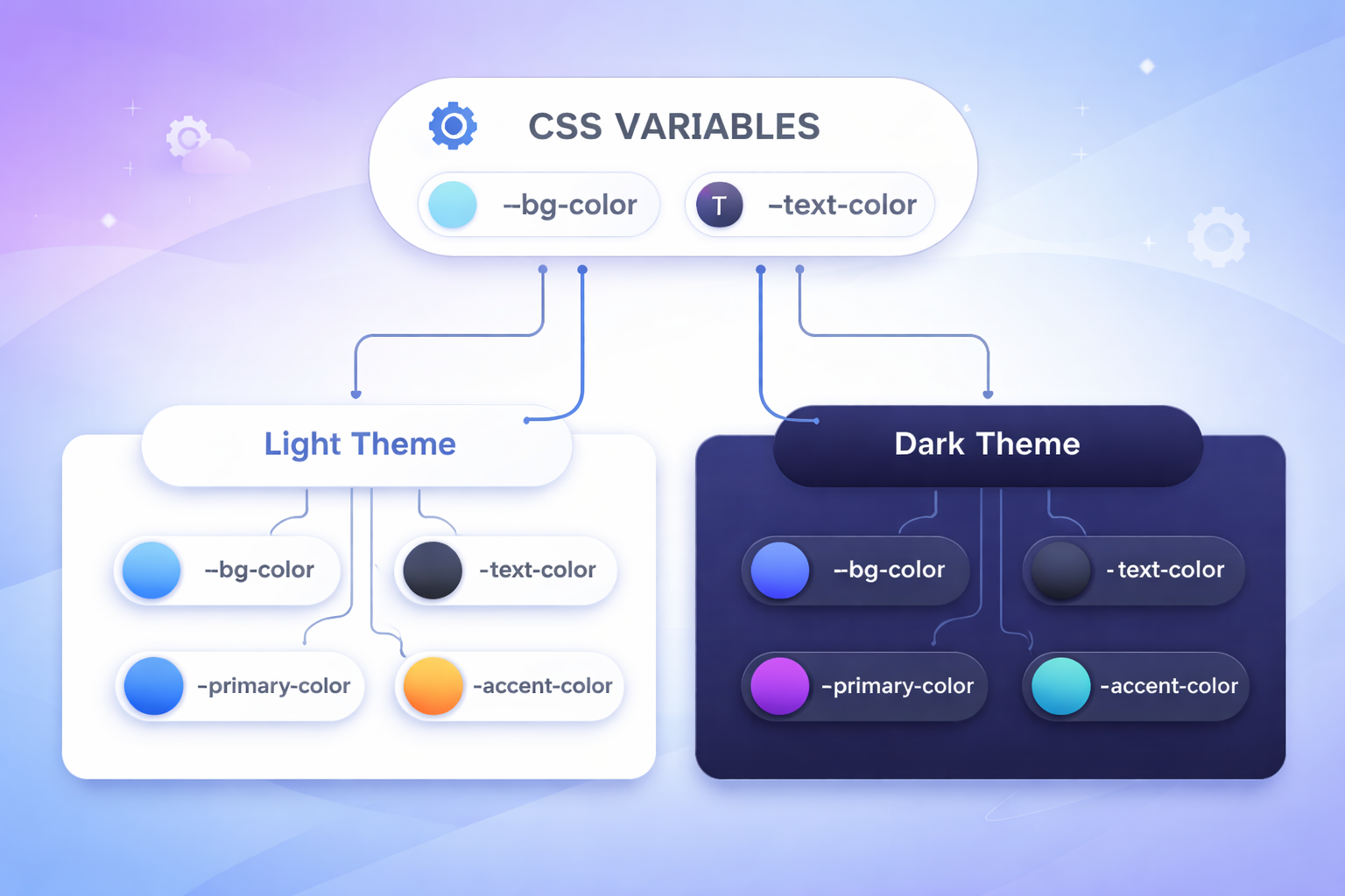
实现思路
这是方案一的升级版,也是目前最推荐的方案。核心思路是将样式与主题值分离:
- 将颜色、边框等视觉属性抽象为 CSS 变量
- 组件样式只使用变量,不写死具体值
- 不同主题定义各自的变量值
- JS 切换
body类名来切换变量集合
css
/* 基础样式 - 只使用变量,完全不写具体颜色值 */
.card {
  background: var(--card-bg);
  color: var(--text-primary);
  border: 1px solid var(--border-color);
  box-shadow: var(--card-shadow);
}

.button {
  background: var(--btn-bg);
  color: var(--btn-text);
}

.button:hover {
  background: var(--btn-hover-bg);
}

/* 浅色主题 - 只定义变量值 */
body.theme-light {
  --card-bg: #ffffff;
  --text-primary: #1e293b;
  --border-color: #e2e8f0;
  --card-shadow: 0 1px 3px rgba(0, 0, 0, 0.05);
  --btn-bg: #e2e8f0;
  --btn-text: #1e293b;
  --btn-hover-bg: #cbd5e1;
}

/* 暗色主题 - 只需重新定义变量 */
body.theme-dark {
  --card-bg: #1e293b;
  --text-primary: #e2e8f0;
  --border-color: #334155;
  --card-shadow: 0 1px 3px rgba(0, 0, 0, 0.3);
  --btn-bg: #1e293b;
  --btn-text: #e2e8f0;
  --btn-hover-bg: #334155;
}
js
// JS 逻辑与方案一完全相同,但效果天差地别
function applyTheme(theme) {
  const body = document.body;
  body.classList.remove('theme-light', 'theme-dark', 'theme-warm');
  body.classList.add(`theme-${theme}`);
}
优点
- 维护成本极低:新增主题只需添加一组变量定义,组件样式完全不需要改动
- 代码复用率高:所有组件样式只写一次,所有主题自动适配
- 结构清晰:基础样式与主题配置天然分离,符合设计系统理念
缺点
- 抽象门槛:需要合理设计变量体系。变量命名混乱会导致后期维护困难
- 改造有成本:老项目需要将硬编码颜色逐一替换为变量,工作量较大
- 能力边界:如果主题差异涉及布局结构、背景图片等,CSS 变量可能不够用
适用场景
- 中大型前端项目(首选方案)
- 设计系统、组件库开发
- 团队有多人协作,需要清晰样式规范的项目
💡 实践建议:除非有特殊理由,否则 CSS 变量方案应该成为你的默认选择。
案例源码
HTML 结构
html
<!DOCTYPE html>
<html lang="zh-CN">

<head>
  <meta charset="UTF-8">
  <title>换肤方案二:CSS变量切换</title>
  <link rel="stylesheet" href="./css/base.css">
  <link rel="stylesheet" href="./css/theme.css">
</head>

<body class="theme-light">
  <div class="container">
    <!-- 头部区域 -->
    <div class="header">
      <h2>方案二:CSS变量切换</h2>
      <div class="theme-group">
        <button class="theme-btn active" data-theme="light">☀️ 浅色</button>
        <button class="theme-btn" data-theme="dark">🌙 暗色</button>
        <button class="theme-btn" data-theme="warm">🔥 暖色</button>
      </div>
    </div>

    <!-- 内容卡片 -->
    <div class="card">
      <h3>编程的技艺</h3>
      <p>编程不仅是写代码,更是一种思考的方式。当你面对一个空白编辑器时,你面对的不仅是语法和逻辑,更是如何将模糊的想法转化为精确的指令。这个过程教会你分解问题、抽象思考、耐心调试。每一次报错都是一次学习,每一次重构都是一次进步。</p>
      <p>随着时间的推移,你会发现自己不再害怕错误,而是把它们当作通往解决方案的路标。这种心态的转变,或许比任何技术本身都更有价值。</p>
    </div>

    <div class="card">
      <h3>持续学习</h3>
      <p>技术世界日新月异,但核心的思维方式是相通的。掌握一门语言后,学习第二门会更容易;理解一个框架的设计理念,就能举一反三。真正的能力不在于记住多少API,而在于解决问题的能力。</p>
      <p>保持好奇,保持谦逊,与不确定性共处------这是编程带给我们的持久财富。</p>
    </div>

    <!-- 操作卡片 -->
    <div class="card">
      <h3>主题操作</h3>
      <div class="action-group">
        <button id="saveThemeBtn" class="action-btn">💾 保存偏好</button>
        <button id="clearThemeBtn" class="action-btn">🗑️ 清除偏好</button>
        <button id="showThemeBtn" class="action-btn">📌 当前主题</button>
      </div>
      <p class="hint">💡 保存后刷新页面会记住您的主题选择</p>
    </div>

    <footer>
      <small>网站换肤效果 · 前端老石人</small>
    </footer>
  </div>

  <script src="./js/main.js"></script>
</body>

</html>
CSS 样式
css
* {
  margin: 0;
  padding: 0;
  box-sizing: border-box;
}

body {
  min-height: 100vh;
  padding: 2rem;
  background-color: var(--bg-primary);
  font-family: Arial, Helvetica, sans-serif;
  line-height: 1.6;
  color: var(--text-primary);
}

.container {
  max-width: 720px;
  margin: 0 auto;
}

.header {
  display: flex;
  justify-content: space-between;
  align-items: center;
  flex-wrap: wrap;
  gap: 1rem;
  margin-bottom: 2rem;
  padding-bottom: 1rem;
  border-bottom: 1px solid var(--border-color);
}

.header h2 {
  font-size: 1.5rem;
  font-weight: 600;
  letter-spacing: -0.3px;
}

.theme-group {
  display: flex;
  gap: 0.6rem;
}

.theme-btn {
  padding: 0.5rem 1.2rem;
  border: none;
  background-color: var(--btn-bg);
  font-size: 0.9rem;
  font-weight: 500;
  color: var(--btn-text);
  border-radius: 2rem;
  cursor: pointer;
  transition: background-color 0.2s ease, color 0.2s ease;
}

.theme-btn.active {
  background-color: var(--accent-color);
  color: var(--accent-text);
}

.theme-btn:hover:not(.active) {
  background-color: var(--btn-hover-bg);
}

.card {
  margin-bottom: 1.5rem;
  padding: 1.8rem;
  border: 1px solid var(--border-color);
  background-color: var(--card-bg);
  border-radius: 1rem;
  box-shadow: var(--card-shadow);
  transition: background-color 0.25s ease, color 0.25s ease, border-color 0.25s ease, box-shadow 0.25s ease;
}

.card h3 {
  margin-bottom: 0.75rem;
  font-size: 1.25rem;
  font-weight: 600;
  color: var(--text-primary);
}

.card p {
  margin-bottom: 0.75rem;
  line-height: 1.7;
  color: var(--text-secondary);
}

.card p:last-child {
  margin-bottom: 0;
}

.action-group {
  display: flex;
  gap: 0.8rem;
  flex-wrap: wrap;
  margin: 0.75rem 0;
}

.action-btn {
  padding: 0.5rem 1rem;
  border: none;
  background-color: var(--btn-bg);
  font-size: 0.85rem;
  font-weight: 500;
  color: var(--btn-text);
  border-radius: 0.5rem;
  cursor: pointer;
  transition: background-color 0.2s ease, color 0.2s ease;
}

.action-btn:hover {
  background-color: var(--btn-hover-bg);
}

.hint {
  margin-top: 0.75rem;
  font-size: 0.8rem;
  color: var(--text-muted);
}

footer {
  margin-top: 2rem;
  padding-top: 1rem;
  border-top: 1px solid var(--border-color);
  text-align: center;
  font-size: 0.75rem;
  color: var(--text-muted);
  transition: border-color 0.25s ease, color 0.25s ease;
}

footer small {
  font-size: 13px;
}
css
/* ============================================
   核心原理:定义全局CSS变量,通过 body 类名切换变量值
   优势:代码更简洁,新增主题只需添加一组变量定义
   ============================================ */

/* ---------- 浅色主题(默认) ---------- */
:root,
body.theme-light {
  /* 背景色 */
  --bg-primary: #f8fafc;
  --card-bg: #ffffff;

  /* 文字色 */
  --text-primary: #1e293b;
  --text-secondary: #475569;
  --text-muted: #64748b;

  /* 边框色 */
  --border-color: #e2e8f0;

  /* 按钮色 */
  --btn-bg: #e2e8f0;
  --btn-text: #1e293b;
  --btn-hover-bg: #cbd5e1;

  /* 强调色 */
  --accent-color: #3b82f6;
  --accent-text: #ffffff;

  /* 阴影 */
  --card-shadow: 0 1px 3px rgba(0, 0, 0, 0.05);
}

/* ---------- 暗色主题 ---------- */
body.theme-dark {
  --bg-primary: #0f172a;
  --card-bg: #1e293b;

  --text-primary: #e2e8f0;
  --text-secondary: #cbd5e1;
  --text-muted: #94a3b8;

  --border-color: #334155;

  --btn-bg: #1e293b;
  --btn-text: #e2e8f0;
  --btn-hover-bg: #334155;

  --accent-color: #6366f1;
  --accent-text: #ffffff;

  --card-shadow: 0 1px 3px rgba(0, 0, 0, 0.3);
}

/* ---------- 暖色主题 ---------- */
body.theme-warm {
  --bg-primary: #fef7e8;
  --card-bg: #ffffff;

  --text-primary: #3b2a1f;
  --text-secondary: #5c4a32;
  --text-muted: #9a7b4c;

  --border-color: #f0e0c0;

  --btn-bg: #f0e0c0;
  --btn-text: #3b2a1f;
  --btn-hover-bg: #e8d0a8;

  --accent-color: #d97a2b;
  --accent-text: #ffffff;

  --card-shadow: 0 1px 3px rgba(100, 60, 20, 0.08);
}
JS 行为
js
(function () {
  // 常量配置
  const STORAGE_KEY = 'theme_css_vars';
  const DEFAULT_THEME = 'light';
  const THEME_PREFIX = 'theme-';

  const THEME_INFO = {
    light: '浅色',
    dark: '暗色',
    warm: '暖色'
  };

  // 返回一个数组
  const THEME_LIST = Object.keys(THEME_INFO);
  const THEME_CLASS_LIST = THEME_LIST.map(function (theme) {
    return THEME_PREFIX + theme;
  });

  // DOM 缓存
  const body = document.body;
  const themeGroup = document.querySelector('.theme-group');
  const themeButtons = Array.from(themeGroup.querySelectorAll('.theme-btn'));

  const saveBtn = document.getElementById('saveThemeBtn');
  const clearBtn = document.getElementById('clearThemeBtn');
  const showBtn = document.getElementById('showThemeBtn');

  // 工具函数
  // 判断主题是否有效
  function isValidTheme(theme) {
    return THEME_LIST.includes(theme);
  }

  // 获取主题中文名
  function getThemeName(theme) {
    return THEME_INFO[theme] || THEME_INFO[DEFAULT_THEME];
  }

  // 生成主题 class 名
  function getThemeClassName(theme) {
    return THEME_PREFIX + theme;
  }

  // 获取当前主题
  function getCurrentTheme() {
    const matchedTheme = THEME_LIST.find(function (theme) {
      return body.classList.contains(getThemeClassName(theme));
    });

    return matchedTheme || DEFAULT_THEME;
  }
  // 更新按钮激活状态
  function updateActiveButton(theme) {
    themeButtons.forEach(function (button) {
      button.classList.toggle('active', button.dataset.theme === theme);
    });
  }

  /**
   * 应用主题
   * 关键逻辑:
   * 1. 移除旧主题 class
   * 2. 添加新主题 class
   * 3. 同步按钮选中状态
   */
  function applyTheme(theme) {
    if (!isValidTheme(theme)) {
      return;
    }

    body.classList.remove(...THEME_CLASS_LIST);
    body.classList.add(getThemeClassName(theme));

    updateActiveButton(theme);
  }
  // 保存当前主题到本地存储
  function saveTheme() {
    const currentTheme = getCurrentTheme();
    localStorage.setItem(STORAGE_KEY, currentTheme);
    alert('已保存 ' + getThemeName(currentTheme) + ' 主题偏好');
  }
  // 清除已保存主题,并恢复默认主题
  function clearTheme() {
    localStorage.removeItem(STORAGE_KEY);
    applyTheme(DEFAULT_THEME);
    alert('已清除偏好,恢复浅色主题');
  }

  // 显示当前主题信息
  function showTheme() {
    const currentTheme = getCurrentTheme();
    alert('当前主题:' + getThemeName(currentTheme));
  }

  /**
   * 初始化主题
   * 优先读取本地缓存,没有则使用默认主题
   */
  function initTheme() {
    const savedTheme = localStorage.getItem(STORAGE_KEY);
    const initialTheme = isValidTheme(savedTheme) ? savedTheme : DEFAULT_THEME;
    applyTheme(initialTheme);
  }

  // 事件绑定

  /**
   * 使用事件委托处理主题按钮点击
   * 当前结构里所有换肤按钮都在 .theme-group 中,
   * 直接绑定在父元素上更贴合页面结构,也更方便维护
   */
  function handleThemeSwitch(event) {
    const button = event.target.closest('.theme-btn');

    if (!button || !themeGroup.contains(button)) {
      return;
    }

    const theme = button.dataset.theme;

    if (isValidTheme(theme)) {
      applyTheme(theme);
    }
  }

  if (themeGroup) {
    themeGroup.addEventListener('click', handleThemeSwitch);
  }

  if (saveBtn) {
    saveBtn.addEventListener('click', saveTheme);
  }

  if (clearBtn) {
    clearBtn.addEventListener('click', clearTheme);
  }

  if (showBtn) {
    showBtn.addEventListener('click', showTheme);
  }

  // 初始化执行
  initTheme();
})();
方案三:多套 CSS 文件切换
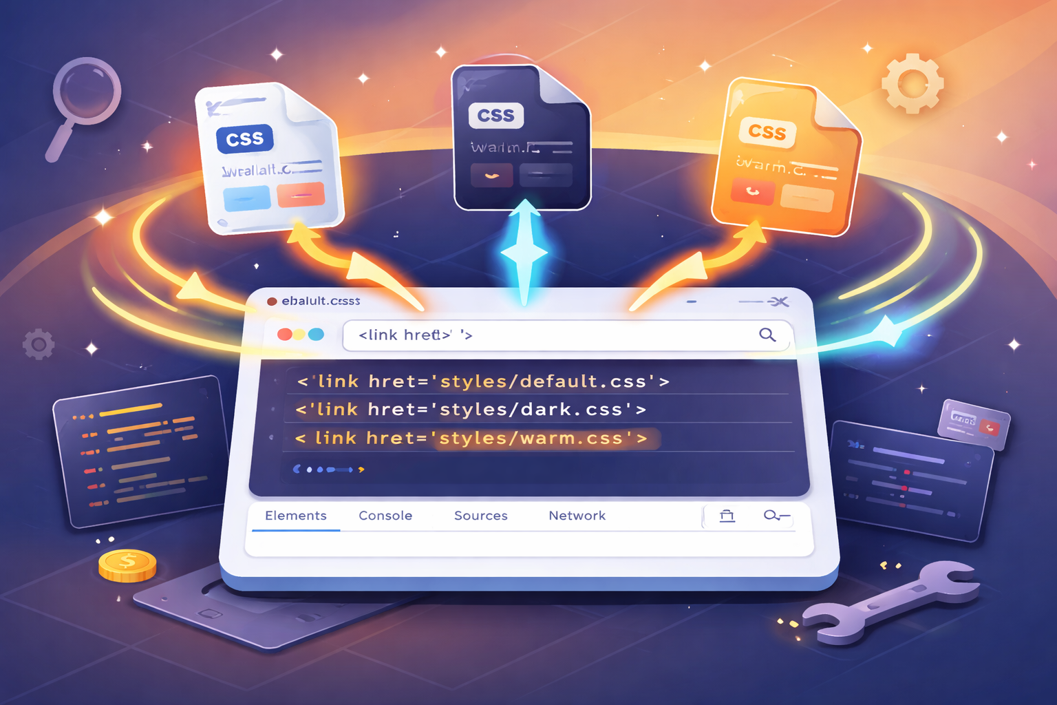
实现思路
这个方案不再依赖类名,而是直接从资源层面切换样式文件。根据实现方式的不同,又可以细分为两种思路:
思路一:直接替换 href
html
<!-- 公共样式始终加载 -->
<link rel="stylesheet" href="./css/base.css">
<!-- 主题样式通过 JS 动态切换 href -->
<link id="themeStylesheet" rel="stylesheet" href="./css/default.css">
js
function applyTheme(theme) {
  const themeLink = document.getElementById('themeStylesheet');
  themeLink.href = `./css/${theme}.css`;
}
思路二:使用 alternate stylesheet
html
<!-- 公共样式始终加载 -->
<link rel="stylesheet" href="./css/base.css">
<!-- 默认主题正常加载,其他主题标记为 alternate -->
<link rel="stylesheet" href="./css/default.css" title="default">
<link rel="alternate stylesheet" href="./css/dark.css" title="dark">
<link rel="alternate stylesheet" href="./css/warm.css" title="warm">
js
function applyTheme(theme) {
  const themeLinks = document.querySelectorAll('link[title]');
  // 禁用所有主题样式表
  themeLinks.forEach(link => link.disabled = true);
  // 启用目标主题
  const target = Array.from(themeLinks).find(link => link.title === theme);
  if (target) target.disabled = false;
}两种思路的本质相同:都是通过切换加载不同的 CSS 文件来实现换肤。区别仅在于:
- 思路一直接修改
href,更直观、更常用 - 思路二利用浏览器原生机制,语义更清晰,但认知成本稍高
主题文件的内容示例(default.css):
css
body {
  background: #f8fafc;
  color: #1e293b;
}

.card {
  background: #ffffff;
  border: 1px solid #e2e8f0;
  box-shadow: 0 1px 3px rgba(0, 0, 0, 0.05);
}

.button {
  background: #e2e8f0;
  color: #1e293b;
}

.button:hover {
  background: #cbd5e1;
}
优点
- 主题隔离彻底:每套主题完全独立,互不干扰,不会出现样式污染
- 适合差异大的场景:不同主题可以有不同的布局、字体、甚至交互效果
- 便于独立维护:不同主题可由不同团队分别管理,适合多租户场景
缺点
- 资源加载延迟:首次切换未加载的主题时有网络请求,可能出现短暂无样式
- 代码重复:如果主题间差异不大(比如只有颜色不同),会有大量重复 CSS
- 同步成本高:修改公共组件样式时,可能需要同步更新多个主题文件
适用场景
- 多品牌、多租户系统(如 SaaS 平台的不同客户)
- 主题之间视觉差异巨大(如不同节日活动页)
- 首屏样式体积敏感的大型应用
案例源码
修改 href
HTML 结构
html
<!DOCTYPE html>
<html lang="zh-CN">

<head>
  <meta charset="UTF-8">
  <meta name="viewport" content="width=device-width, initial-scale=1.0">
  <title>换肤方案三:多套CSS文件切换</title>
  <!-- 公共样式:始终加载 -->
  <link rel="stylesheet" href="./css/base.css">
  <!-- 主题样式:通过 JS 动态切换 href -->
  <link id="themeStylesheet" rel="stylesheet" href="./css/default.css">
</head>

<body>
  <div class="container">
    <!-- 头部区域 -->
    <div class="header">
      <h2>方案三:多套CSS文件切换</h2>
      <div class="theme-group">
        <button class="theme-btn active" data-theme="default" type="button">☀️ 浅色</button>
        <button class="theme-btn" data-theme="dark" type="button">🌙 暗色</button>
        <button class="theme-btn" data-theme="warm" type="button">🔥 暖色</button>
      </div>
    </div>

    <!-- 内容卡片 -->
    <div class="card">
      <h3>编程的技艺</h3>
      <p>编程不仅是写代码,更是一种思考的方式。当你面对一个空白编辑器时,你面对的不仅是语法和逻辑,更是如何将模糊的想法转化为精确的指令。这个过程教会你分解问题、抽象思考、耐心调试。每一次报错都是一次学习,每一次重构都是一次进步。
      </p>
      <p>随着时间的推移,你会发现自己不再害怕错误,而是把它们当作通往解决方案的路标。这种心态的转变,或许比任何技术本身都更有价值。</p>
    </div>

    <div class="card">
      <h3>持续学习</h3>
      <p>技术世界日新月异,但核心的思维方式是相通的。掌握一门语言后,学习第二门会更容易;理解一个框架的设计理念,就能举一反三。真正的能力不在于记住多少API,而在于解决问题的能力。</p>
      <p>保持好奇,保持谦逊,与不确定性共处------这是编程带给我们的持久财富。</p>
    </div>

    <!-- 操作卡片 -->
    <div class="card">
      <h3>主题操作</h3>
      <div class="action-group">
        <button id="saveThemeBtn" class="action-btn" type="button">💾 保存偏好</button>
        <button id="clearThemeBtn" class="action-btn" type="button">🗑️ 清除偏好</button>
        <button id="showThemeBtn" class="action-btn" type="button">📌 当前主题</button>
      </div>
      <p class="hint">💡 保存后刷新页面会记住您的主题选择</p>
    </div>

    <footer>
      <small>网站换肤效果 · 前端老石人</small>
    </footer>
  </div>

  <script src="./js/main.js"></script>
</body>

</html>
CSS 样式
css
* {
  margin: 0;
  padding: 0;
  box-sizing: border-box;
}

body {
  min-height: 100vh;
  padding: 2rem;
  font-family: Arial, Helvetica, sans-serif;
  line-height: 1.6;
}

.container {
  max-width: 720px;
  margin: 0 auto;
}

.header {
  display: flex;
  justify-content: space-between;
  align-items: center;
  flex-wrap: wrap;
  gap: 1rem;
  margin-bottom: 2rem;
  padding-bottom: 1rem;
  border-bottom: 1px solid;
}

.header h2 {
  font-size: 1.5rem;
  font-weight: 600;
  letter-spacing: -0.3px;
}

.theme-group {
  display: flex;
  gap: 0.6rem;
}

.theme-btn {
  padding: 0.5rem 1.2rem;
  border: none;
  font-size: 0.9rem;
  font-weight: 500;
  border-radius: 2rem;
  cursor: pointer;
  transition: background-color 0.2s ease, color 0.2s ease;
}

.card {
  margin-bottom: 1.5rem;
  padding: 1.8rem;
  border-radius: 1rem;
  transition: background-color 0.25s ease, color 0.25s ease, border-color 0.25s ease, box-shadow 0.25s ease;
}

.card h3 {
  margin-bottom: 0.75rem;
  font-size: 1.25rem;
  font-weight: 600;
}

.card p {
  margin-bottom: 0.75rem;
  line-height: 1.7;
}

.card p:last-child {
  margin-bottom: 0;
}

.action-group {
  display: flex;
  gap: 0.8rem;
  flex-wrap: wrap;
  margin: 0.75rem 0;
}

.action-btn {
  padding: 0.5rem 1rem;
  border: none;
  font-size: 0.85rem;
  font-weight: 500;
  border-radius: 0.5rem;
  cursor: pointer;
  transition: background-color 0.2s ease, color 0.2s ease;
}

.hint {
  margin-top: 0.75rem;
  font-size: 0.8rem;
  opacity: 0.7;
}

footer {
  margin-top: 2rem;
  padding-top: 1rem;
  border-top: 1px solid;
  text-align: center;
  font-size: 0.75rem;
  transition: border-color 0.25s ease, color 0.25s ease;
}

footer small {
  font-size: 13px;
}
css
body {
  background: #f8fafc;
  color: #1e293b;
}

.header {
  border-bottom-color: #e2e8f0;
}

.theme-btn {
  background: #e2e8f0;
  color: #1e293b;
}

.theme-btn.active {
  background: #3b82f6;
  color: white;
}

.theme-btn:hover:not(.active) {
  background: #cbd5e1;
}

.card {
  border: 1px solid #e2e8f0;
  background: #ffffff;
  box-shadow: 0 1px 3px rgba(0, 0, 0, 0.05);
}

.card h3 {
  color: #1e293b;
}

.card p {
  color: #475569;
}

.action-btn {
  background: #e2e8f0;
  color: #1e293b;
}

.action-btn:hover {
  background: #cbd5e1;
}

.hint {
  color: #64748b;
}

footer {
  border-top-color: #e2e8f0;
  color: #64748b;
}
css
body {
  background: #0f172a;
  color: #e2e8f0;
}

.header {
  border-bottom-color: #1e293b;
}

.theme-btn {
  background: #1e293b;
  color: #e2e8f0;
}

.theme-btn.active {
  background: #6366f1;
  color: white;
}

.theme-btn:hover:not(.active) {
  background: #334155;
}

.card {
  border: 1px solid #334155;
  background: #1e293b;
  box-shadow: 0 1px 3px rgba(0, 0, 0, 0.3);
}

.card h3 {
  color: #e2e8f0;
}

.card p {
  color: #cbd5e1;
}

.action-btn {
  background: #1e293b;
  color: #e2e8f0;
  border: 1px solid #334155;
}

.action-btn:hover {
  background: #334155;
}

.hint {
  color: #94a3b8;
}

footer {
  border-top-color: #1e293b;
  color: #94a3b8;
}
css
body {
  background: #fef7e8;
  color: #3b2a1f;
}

.header {
  border-bottom-color: #f0e0c0;
}

.theme-btn {
  background: #f0e0c0;
  color: #3b2a1f;
}

.theme-btn.active {
  background: #d97a2b;
  color: white;
}

.theme-btn:hover:not(.active) {
  background: #e8d0a8;
}

.card {
  border: 1px solid #f0e0c0;
  background: #ffffff;
  box-shadow: 0 1px 3px rgba(100, 60, 20, 0.08);
}

.card h3 {
  color: #3b2a1f;
}

.card p {
  color: #5c4a32;
}

.action-btn {
  background: #f0e0c0;
  color: #3b2a1f;
}

.action-btn:hover {
  background: #e8d0a8;
}

.hint {
  color: #9a7b4c;
}

footer {
  border-top-color: #f0e0c0;
  color: #9a7b4c;
}
JS 行为
js
(function () {
  // 常量配置
  const STORAGE_KEY = 'theme_css_file';
  const DEFAULT_THEME = 'default';

  // 主题名称与文件路径映射
  const THEME_CONFIG = {
    default: {
      name: '浅色',
      href: './css/default.css'
    },
    dark: {
      name: '暗色',
      href: './css/dark.css'
    },
    warm: {
      name: '暖色',
      href: './css/warm.css'
    }
  };

  // DOM 缓存
  const themeLink = document.getElementById('themeStylesheet');
  const themeGroup = document.querySelector('.theme-group');
  const themeButtons = Array.from(themeGroup.querySelectorAll('.theme-btn'));

  const saveBtn = document.getElementById('saveThemeBtn');
  const clearBtn = document.getElementById('clearThemeBtn');
  const showBtn = document.getElementById('showThemeBtn');

  // 工具函数
  // 判断主题是否有效
  function isValidTheme(theme) {
    return Object.prototype.hasOwnProperty.call(THEME_CONFIG, theme);
  }

  // 获取主题中文名称
  function getThemeName(theme) {
    if (!isValidTheme(theme)) {
      return THEME_CONFIG[DEFAULT_THEME].name;
    }

    return THEME_CONFIG[theme].name;
  }

  /**
   * 更新主题按钮选中状态
   * 当前主题对应按钮添加 active,其余移除
   */
  function updateActiveButton(theme) {
    themeButtons.forEach(function (button) {
      button.classList.toggle('active', button.dataset.theme === theme);
    });
  }

  /**
   * 应用主题
   * 核心逻辑:
   * 1. 修改主题 link 的 href,切换不同 CSS 文件
   * 2. 同步更新按钮激活状态
   */
  function applyTheme(theme) {
    if (!themeLink || !isValidTheme(theme)) {
      return;
    }

    themeLink.href = THEME_CONFIG[theme].href;
    themeLink.dataset.theme = theme;

    updateActiveButton(theme);
  }

  /**
   * 获取当前主题
   * 优先从 link 的 data-theme 中读取,避免反复解析 href
   */
  function getCurrentTheme() {
    const currentTheme = themeLink ? themeLink.dataset.theme : '';

    if (isValidTheme(currentTheme)) {
      return currentTheme;
    }

    return DEFAULT_THEME;
  }

  // 保存主题偏好
  function saveTheme() {
    const currentTheme = getCurrentTheme();
    localStorage.setItem(STORAGE_KEY, currentTheme);
    alert('已保存 ' + getThemeName(currentTheme) + ' 主题偏好');
  }

  // 清除主题偏好,并恢复默认主题
  function clearTheme() {
    localStorage.removeItem(STORAGE_KEY);
    applyTheme(DEFAULT_THEME);
    alert('已清除偏好,恢复浅色主题');
  }
  // 显示当前主题
  function showTheme() {
    const currentTheme = getCurrentTheme();
    alert('当前主题:' + getThemeName(currentTheme));
  }

  /**
   * 初始化主题
   * 优先读取本地已保存主题,否则使用默认主题
   */
  function initTheme() {
    const savedTheme = localStorage.getItem(STORAGE_KEY);
    const initialTheme = isValidTheme(savedTheme) ? savedTheme : DEFAULT_THEME;
    applyTheme(initialTheme);
  }

  /**
   * 处理主题切换点击
   * 主题按钮都在 .theme-group 中,使用事件委托更适合当前结构
   */
  function handleThemeSwitch(event) {
    const button = event.target.closest('.theme-btn');

    if (!button || !themeGroup.contains(button)) {
      return;
    }

    const theme = button.dataset.theme;

    if (isValidTheme(theme)) {
      applyTheme(theme);
    }
  }

  // 事件绑定
  if (themeGroup) {
    themeGroup.addEventListener('click', handleThemeSwitch);
  }

  if (saveBtn) {
    saveBtn.addEventListener('click', saveTheme);
  }

  if (clearBtn) {
    clearBtn.addEventListener('click', clearTheme);
  }

  if (showBtn) {
    showBtn.addEventListener('click', showTheme);
  }

  // 初始化
  initTheme();
})();
替代样式表
HTML 结构
html
<!DOCTYPE html>
<html lang="zh-CN">

<head>
  <meta charset="UTF-8">
  <meta name="viewport" content="width=device-width, initial-scale=1.0">
  <title>换肤方案三:多套CSS文件切换</title>
  <!-- 公共样式:始终生效 -->
  <link rel="stylesheet" href="./css/base.css">
  <!-- 主题样式表:根据 title 切换 -->
  <link rel="stylesheet" href="./css/default.css" title="default">
  <link rel="alternate stylesheet" href="./css/dark.css" title="dark">
  <link rel="alternate stylesheet" href="./css/warm.css" title="warm">
</head>

<body>
  <div class="container">
    <!-- 头部区域 -->
    <div class="header">
      <h2>方案三:多套CSS文件切换</h2>
      <div class="theme-group">
        <button class="theme-btn active" data-theme="default" type="button">☀️ 浅色</button>
        <button class="theme-btn" data-theme="dark" type="button">🌙 暗色</button>
        <button class="theme-btn" data-theme="warm" type="button">🔥 暖色</button>
      </div>
    </div>

    <!-- 内容卡片 -->
    <div class="card">
      <h3>编程的技艺</h3>
      <p>编程不仅是写代码,更是一种思考的方式。当你面对一个空白编辑器时,你面对的不仅是语法和逻辑,更是如何将模糊的想法转化为精确的指令。这个过程教会你分解问题、抽象思考、耐心调试。每一次报错都是一次学习,每一次重构都是一次进步。
      </p>
      <p>随着时间的推移,你会发现自己不再害怕错误,而是把它们当作通往解决方案的路标。这种心态的转变,或许比任何技术本身都更有价值。</p>
    </div>

    <div class="card">
      <h3>持续学习</h3>
      <p>技术世界日新月异,但核心的思维方式是相通的。掌握一门语言后,学习第二门会更容易;理解一个框架的设计理念,就能举一反三。真正的能力不在于记住多少API,而在于解决问题的能力。</p>
      <p>保持好奇,保持谦逊,与不确定性共处------这是编程带给我们的持久财富。</p>
    </div>

    <!-- 操作卡片 -->
    <div class="card">
      <h3>主题操作</h3>
      <div class="action-group">
        <button id="saveThemeBtn" class="action-btn" type="button">💾 保存偏好</button>
        <button id="clearThemeBtn" class="action-btn" type="button">🗑️ 清除偏好</button>
        <button id="showThemeBtn" class="action-btn" type="button">📌 当前主题</button>
      </div>
      <p class="hint">💡 保存后刷新页面会记住您的主题选择</p>
    </div>

    <footer>
      <small>网站换肤效果 · 前端老石人</small>
    </footer>
  </div>

  <script src="./js/main.js"></script>
</body>

</html>
CSS 样式同上
JS 行为
js
(function () {

  // 常量配置
  const STORAGE_KEY = 'theme_alternate_stylesheet';
  const DEFAULT_THEME = 'default';

  const THEME_NAME_MAP = {
    default: '浅色',
    dark: '暗色',
    warm: '暖色'
  };

  // DOM 缓存
  const themeLinks = Array.from(document.querySelectorAll('link[title]'));
  const themeGroup = document.querySelector('.theme-group');
  const themeButtons = Array.from(themeGroup.querySelectorAll('.theme-btn'));

  const saveBtn = document.getElementById('saveThemeBtn');
  const clearBtn = document.getElementById('clearThemeBtn');
  const showBtn = document.getElementById('showThemeBtn');

  // 工具函数

  /**
   * 判断主题是否有效
   * 有对应 title 的样式表才视为有效主题
   */
  function isValidTheme(theme) {
    return themeLinks.some(function (link) {
      return link.title === theme;
    });
  }

  // 获取主题中文名
  function getThemeName(theme) {
    return THEME_NAME_MAP[theme] || THEME_NAME_MAP[DEFAULT_THEME];
  }

  /**
   * 更新按钮激活状态
   * 当前主题对应按钮添加 active
   */
  function updateActiveButton(theme) {
    themeButtons.forEach(function (button) {
      button.classList.toggle('active', button.dataset.theme === theme);
    });
  }

  /**
   * 禁用所有备选样式表
   * 然后启用 title 匹配的那一个
   *
   * 实现思路:
   * 1. 先把所有带 title 的主题样式表禁用
   * 2. 再根据按钮的 data-theme 与 link.title 匹配
   * 3. 匹配成功后,启用目标样式表
   */
  function applyTheme(theme) {
    if (!isValidTheme(theme)) {
      return;
    }

    themeLinks.forEach(function (link) {
      link.disabled = true;
    });

    themeLinks.forEach(function (link) {
      if (link.title === theme) {
        link.disabled = false;
      }
    });

    updateActiveButton(theme);
  }

  /**
   * 获取当前启用的主题
   * 从未禁用的 link[title] 中找到当前主题
   */
  function getCurrentTheme() {
    const enabledLink = themeLinks.find(function (link) {
      return !link.disabled;
    });

    return enabledLink ? enabledLink.title : DEFAULT_THEME;
  }

  // 保存当前主题到本地
  function saveTheme() {
    const currentTheme = getCurrentTheme();
    localStorage.setItem(STORAGE_KEY, currentTheme);
    alert('已保存 ' + getThemeName(currentTheme) + ' 主题偏好');
  }

  //清除主题偏好,并恢复默认主题
  function clearTheme() {
    localStorage.removeItem(STORAGE_KEY);
    applyTheme(DEFAULT_THEME);
    alert('已清除偏好,恢复浅色主题');
  }

  // 显示当前主题信息
  function showTheme() {
    const currentTheme = getCurrentTheme();
    alert('当前主题:' + getThemeName(currentTheme));
  }

  /**
   * 初始化主题
   * 优先使用本地存储的主题,否则使用默认主题
   */
  function initTheme() {
    const savedTheme = localStorage.getItem(STORAGE_KEY);
    const initialTheme = isValidTheme(savedTheme) ? savedTheme : DEFAULT_THEME;
    applyTheme(initialTheme);
  }

  /**
   * 处理主题切换点击
   * 使用事件委托,减少重复绑定
   */
  function handleThemeSwitch(event) {
    const button = event.target.closest('.theme-btn');

    if (!button || !themeGroup.contains(button)) {
      return;
    }

    const theme = button.dataset.theme;

    if (isValidTheme(theme)) {
      applyTheme(theme);
    }
  }

  // 事件绑定
  if (themeGroup) {
    themeGroup.addEventListener('click', handleThemeSwitch);
  }

  if (saveBtn) {
    saveBtn.addEventListener('click', saveTheme);
  }

  if (clearBtn) {
    clearBtn.addEventListener('click', clearTheme);
  }

  if (showBtn) {
    showBtn.addEventListener('click', showTheme);
  }

  // 初始化
  initTheme();
})();
三种方案的横向对比
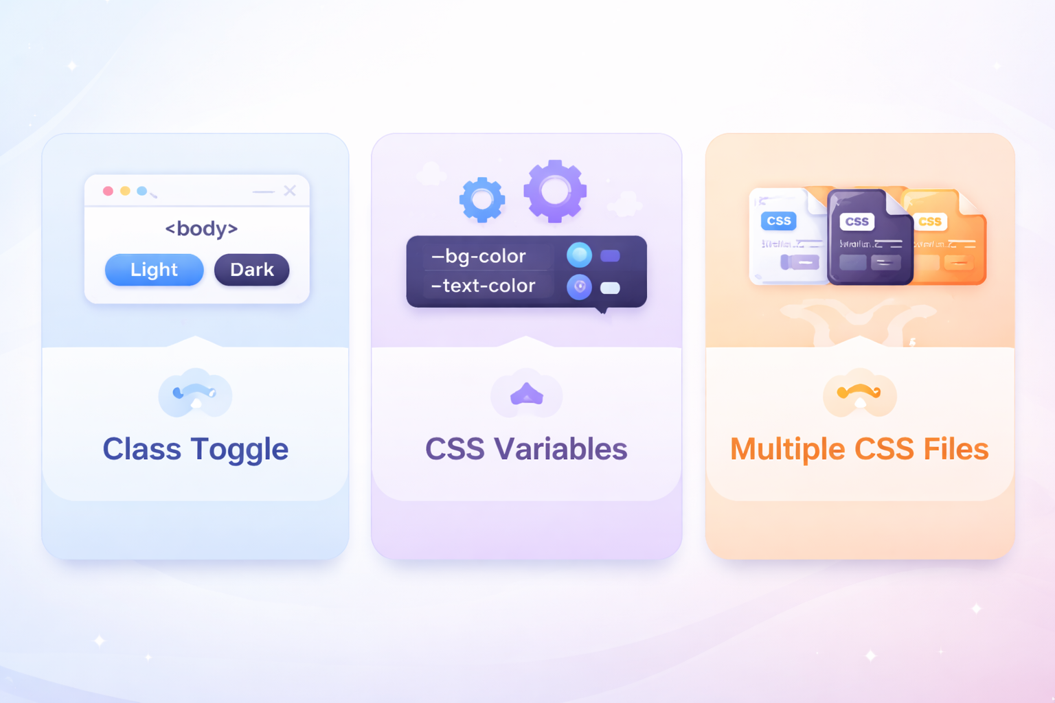
从维护成本看
CSS 变量 < CSS 类 < 多套文件- CSS 变量:新增主题只需添加一组变量定义,组件代码零改动
- CSS 类切换:新增主题需要为每个组件编写主题样式
- 多套文件:新增主题需要复制整个样式文件并保持同步
从扩展性看
| 场景 | 推荐方案 |
|---|---|
| 主题数量会持续增长 | CSS 变量 |
| 主题间差异较小(仅颜色、阴影等) | CSS 变量 |
| 主题间差异很大(布局、字体、图标都不同) | 多套文件 |
| 临时性、活动类主题 | 多套文件 |
| 多租户/白标产品 | 多套文件 |
从性能体验看
| 方案 | 切换速度 | 首屏加载 | 额外请求 |
|---|---|---|---|
| CSS 类切换 | 极快(改类名) | 加载全部样式 | 无 |
| CSS 变量 | 极快(改类名) | 加载全部变量定义 | 无 |
| 多套文件 | 可能有延迟 | 只加载当前主题 | 切换时有请求 |
从代码角度理解差异
下面用同一个组件的样式定义,直观对比三种方案的区别:
CSS 类切换方案
css
/* 每个主题都要重复写整个组件的样式 */
body.theme-light .card {
  background: #ffffff;
  border-color: #e2e8f0;
  color: #1e293b;
}

body.theme-dark .card {
  background: #1e293b;
  border-color: #334155;
  color: #e2e8f0;
}

body.theme-warm .card {
  background: #ffffff;
  border-color: #f0e0c0;
  color: #3b2a1f;
}
CSS 变量方案
css
/* 组件样式只写一次 */
.card {
  background: var(--card-bg);
  border-color: var(--border-color);
  color: var(--text-primary);
}

/* 主题只定义变量,新增主题只需加一组变量 */
body.theme-light {
  --card-bg: #ffffff;
  --border-color: #e2e8f0;
  --text-primary: #1e293b;
}

body.theme-dark {
  --card-bg: #1e293b;
  --border-color: #334155;
  --text-primary: #e2e8f0;
}
多套文件方案
css
/* default.css - 完整组件样式 */
.card {
  background: #ffffff;
  border-color: #e2e8f0;
  color: #1e293b;
}

/* dark.css - 完整组件样式(重复) */
.card {
  background: #1e293b;
  border-color: #334155;
  color: #e2e8f0;
}
可以看到,CSS 变量方案在代码复用和维护性上有明显优势。
快速选型表
| 你的情况 | 推荐方案 |
|---|---|
| 学习换肤原理、写 Demo | CSS 类切换 |
| 个人博客、简单官网(≤3 个主题) | CSS 类切换 或 CSS 变量 |
| 中后台系统、需要长期维护 | CSS 变量 |
| 组件库、设计系统 | CSS 变量 |
| SaaS 多租户、白标产品 | 多套文件 |
| 节日活动页、差异巨大的主题 | 多套文件 |
| 需要动态添加新主题 | 多套文件 |
结语
网站换肤功能的实现,折射出前端项目对样式体系的组织能力。
从三种方案中可以看出一条清晰的演进路径:
- CSS 类切换:直观但粗糙,适合快速实现和理解原理
- CSS 变量:优雅且可维护,是大多数项目的最佳选择
- 多套文件切换:彻底隔离,适合多品牌、差异大的复杂场景
真正的关键不是选"最先进"的方案,而是选择最符合项目结构、团队能力和未来扩展方向的方案。
希望这篇文章能帮助你在实际项目中做出正确的技术决策。