使用Jupyter lab测试执行代码验证。
NumPy
NumPy 是一个开源的 Python 库,用于处理大型多维数组和矩阵,并支持各种线性代数运算。速度比原生的Python快几十或上百倍。
安装:
sh
pip install numpyarray 数组是NumPy中的基本数据结构,用于处理多维数组。array 数组与 Python 的list 类似,但array 数组中的元素必须为同一类型。
创建数组
py
import numpy as np

# 创建一个数组
arr = np.array([1, 2, 3, 4, 5])
print(arr)

# 创建一个二维数组
arr = np.array([[1, 2, 3], [4, 5, 6]])
print(arr)

# 创建用0填充的数组
arr = np.zeros((3, 3))
print(arr)

# 创建用1填充的数组
arr = np.ones((3, 3))
print(arr)

# 创建空数组,空数组内容随机
arr = np.empty((3, 3))
print(arr)

# 创建一个范围数组
arr = np.arange(0, 10, 2)
print(arr)

# 创建一个线性分布数组
arr = np.linspace(0, 10, 5)
print(arr)默认创建的数据元素类型为float64,可以通过参数dtype指定数据元素类型。
维度/形状
py
arr = np.array(
    [[[1, 2, 3], [4, 5, 6]], [[7, 8, 9], [10, 11, 12]], [[13, 14, 15], [16, 17, 18]]]
)

# 获取数组的维度
print(arr.ndim)

# 获取数组的形状
print(arr.shape)

# 获取数组有多少元素
print(arr.size)
重构数组
py
arr = np.array([[1, 2, 3], [4, 5, 6]])

# 将数组重构为 1D
print(arr.ravel())

# 将数组重构为 2D
print(arr.reshape(3, 2))

# 将数组重构为 3D
print(arr.reshape(1, 2, 3))
维度扩展
py
arr = np.array([1, 2, 3])

# 扩展行
print(arr[np.newaxis, :])

# 扩展列
print(arr[:, np.newaxis])
在指定位置扩展维度:
py
arr = np.array([[1, 2, 3], [4, 5, 6]])

print(np.expand_dims(arr, axis=1))
索引/切片
py
arr = np.array([[1, 2, 3], [4, 5, 6]])

# 切片
print(arr[1:])

# 筛选
print(arr[arr > 3])
运算
py
arr1 = np.array([[1, 2, 3],[4, 5, 6]])

# 乘法
print(arr1 * 2)

# 减法
print(arr1 - 2)

# 求和
print(arr1.sum())

# 按行求和
print(arr1.sum(axis=0))

# 按列求和
print(arr1.sum(axis=1))
Pandas
Pandas 是一个开源的 Python 库,用于数据处理和数据分析。Pandas 构建在NumPy 库之上。Pandas 引入了数据帧和数据索引对象,用于处理数据。
安装:
sh
pip install pandasSeries
Series 是Pandas中的基本数据结构,用于处理一维数组。Series 可以看做是NumPy数组的扩展,增加了索引功能。
py
import pandas as pd
import numpy as np

# 创建 Series
series = pd.Series([1, 2, 3, 4, 5])

# 带索引的 Series
series = pd.Series([1, 2, 3, 4, 5], index=['a', 'b', 'c', 'd', 'e'])

# 创建 Series 通过字典
series = pd.Series({'a': 1, 'b': 2, 'c': 3, 'd': 4, 'e': 5})

# 创建 Series 通过 NumPy 数组
series = pd.Series(np.array([1, 2, 3, 4, 5]))
DataFrame
DataFrame 是Pandas中的基本数据结构,用于处理二维数组。DataFrame 可以看做是Series的集合,每个Series都对应一个列。
py
import pandas as pd

# 创建 DataFrame
df = pd.DataFrame([[1, 2, 3], [4, 5, 6]])

# 创建 DataFrame 通过字典
df = pd.DataFrame({'a': [1, 2, 3], 'b': [4, 5, 6]})

# 创建带行索引
df = pd.DataFrame([[1, 2, 3], [4, 5, 6]], index=['a', 'b'])

# 创建带列索引
df = pd.DataFrame([[1, 2, 3], [4, 5, 6]], columns=['a', 'b','c'])
数据视图
DataFrame 提供了数据视图功能,可以查看数据。
py
import pandas as pd

df = pd.DataFrame(
    [[1, 2, 3], [4, 5, 6], [7, 8, 9]], index=["A", "B", "C"], columns=["a", "b", "c"]
)

# 底部1行 默认 5行
print(df.tail(1))

# 顶部1行
print(df.head(1))

# 获取行索引
print(df.index)

# 获取列索引
print(df.columns)

# 转为numpy 数组
print(df.to_numpy())

# 获取数据类型
print(df.dtypes)

# 获取数据描述
print(df.describe())

# 按照索引排序 0 - row ,1 - columns
print(df.sort_index(axis=1, ascending=False))

# 按照数据值排序
print(df.sort_values(by="a", ascending=False))
访问数据
py
import pandas as pd

# 取列维度数据
print(df["a"])
# or
print(df.a)

# 取行维度数据
print(df.loc["A"])
# 或按位置取
print(df.iloc[0])

# 取多个列维度数据
print(df[["a", "b"]])

# 切片数据
print(df[1:3])

# 取第一行第一列
print(df.loc["A", "a"])
# or
print(df.iloc[0, 0])
# or
print(df.at["A", "a"])

# 取多个行多个列数据
print(df.loc[["A", "B"], ["a", "b"]])

# 按照列数据筛选
print(df[df["a"] > 2])

# 筛选所有数据
print(df[df > 2])
缺失值处理
通常缺失值使用np.nan 代替。
py
# 基于原始数据扩建
dfr = df.reindex(columns=["a", "b", "c", "d"])

# 清除缺失值
dfr.loc["A", "d"] = 10 # 保证有一行完整数据
dfd = dfr.dropna(how="any")

# 填充缺失值
dff = dfr.fillna(value=99)
运算
py
# 求平均值
print(df.mean())

# 求行平均值
print(df.mean(axis=1))

# 操作每一个值
print(df.transform(lambda x: x * 2))

# 合并
print(pd.concat([df, df]))

# 分组求平均值
print(df.groupby("a").mean())

# 统计某列值出现的次数
print(df['a'].value_counts())

# 修改列值
df['a'] = df['a'].apply(lambda x: x * 2)
print(df['a'])
数据导入/导出
Pandas 提供了数据导入/导出功能,可以导入 CSV、Excel 等格式的数据。
py
import pandas as pd

# 导出 CSV 数据
df.to_csv("data.csv")

# 导入 CSV 数据
df = pd.read_csv("data.csv")

# 导出 Excel 数据
df.to_excel("data.xlsx")

# 导入 Excel 数据
df = pd.read_excel("data.xlsx")
Excel 操作需要安装依赖openpyxl
Matplotlib
Matplotlib 是 Python 的一个绘图库,用于创建二维和三维图表。
安装
sh
pip install matplotlib全局配置
py
import matplotlib.pyplot as plt

# 使用美化样式,内部已有的主题
plt.style.use("seaborn-v0_8-whitegrid")

# 设置全局字体
plt.rcParams["font.sans-serif"] = ["SimHei"] # windows
plt.rcParams["font.sans-serif"] = ["Arial Unicode MS"] # mac
plt.rcParams["axes.unicode_minus"] = False

# 提高图形质量
plt.rcParams["figure.dpi"] = 150

# 导出高清图
plt.savefig("fig.png", dpi=300,bbox_inches="tight",facecolor="white")
plt.savefig("fig.svg", dpi=300,bbox_inches="tight")
基础图表
py
import matplotlib.pyplot as plt
import numpy as np

# 绘制一个折线图
fig, ax = plt.subplots()
ax.plot([1, 2, 3, 4], [1, 2, 3, 4])
plt.show()

# 设置标题
fig, ax = plt.subplots()
ax.plot([1, 2, 3, 4], [1, 2, 3, 4])
ax.set_title("折线图")
plt.show()

# 设置坐标轴标签
fig, ax = plt.subplots()
ax.plot([1, 2, 3, 4], [1, 2, 3, 4])
ax.set_xlabel("X")
ax.set_ylabel("Y")
plt.show()

# 绘制一个柱状图
fig, ax = plt.subplots()
ax.bar([1, 2, 3, 4], [1, 2, 3, 4])
plt.show()

# 绘制一个饼图
fig, ax = plt.subplots()
ax.pie([1, 2, 3, 4], labels=["A", "B", "C", "D"])
plt.show()

# 绘制一个箱线图
fig, ax = plt.subplots()
ax.boxplot([[1, 2, 3, 4], [1, 2, 3, 4]])
plt.show()

# 绘制一个热力图
fig, ax = plt.subplots()
ax.imshow([[2, 3, 4, 5], [1, 2, 3, 4]])
plt.show()

# 绘制一个散点图
fig, ax = plt.subplots()
ax.scatter([1, 2, 3, 4], [1, 2, 3, 4])
plt.show()
复杂图表
py
# 绘制三条折线图
fig, ax = plt.subplots()
ax.plot([1,2,3,4],[5,10,20,34], label="A")
ax.plot([1, 2, 3, 4], [15, 25, 13, 34], label="B")
ax.plot([1, 2, 3, 4], [11, 12, 13, 24], label="C")

plt.legend()
plt.show()

# 标记数据点
fig, ax = plt.subplots()
ax.plot([1,2,3,4],[5,10,20,34], marker="o",color="#D9A85D")
plt.show()

# 绘制多个子图
fig, axs = plt.subplots(1, 2)
axs[0].plot([1,2,3,4],[5,10,20,34])
axs[1].plot([1,2,3,4],[5,10,20,34])
plt.show()

# 关键点标注
fig, ax = plt.subplots()
ax.plot([1,2,3,4],[5,10,20,34])
ax.annotate("关键点", xy=(2, 10), xytext=(2, 15), arrowprops=dict(facecolor="black", shrink=0.05))
plt.show()
数据集清洗分析
在Kaggle上获取数据集,进行数据清洗分析。
任务:清洗真实的泰坦尼克号的存活数据,输出可视化报告。
下载好数据后,开始处理:
py
import pandas as pd
import matplotlib.pyplot as plt

# plt的全局配置代码
# ...

# 读取真实数据
df = pd.read_csv("train.csv")
print(f"数据形状:{df.shape}")
print(df.head())
print(df.describe())
# 查看缺失值
print(df.info())
数据清洗
处理脏数据,比如缺失值填充、重复数据清理、统一格式、删除无用列等。
py
# 填充Age缺失值 (用中位数)
df["Age"] = df["Age"].fillna(df["Age"].median())

# 填充Embarked缺失值 (用众数)
df["Embarked"] = df["Embarked"].fillna(df["Embarked"].mode()[0])

# 删除Cabin列 (缺失太多)
df = df.drop("Cabin", axis=1)

print("\n 数据清洗后:")
print(df.isnull().sum())
分析&可视化
py
# 性别 vs 存活率
fig, axes = plt.subplots(1, 3,figsize=(15, 4))

survival_by_sex = df.groupby("Sex")["Survived"].mean()
survival_by_sex.plot(kind="bar", ax=axes[0],color=["#FF6B6B", "#4ECDC4"])
axes[0].set_title("性别 vs 存活率")
axes[0].set_ylabel("存活率")
axes[0].set_xticklabels(["女性", "男性"],rotation=0)

# 船舱等级 vs 存活率
survival_by_pclass = df.groupby("Pclass")["Survived"].mean()
survival_by_pclass.plot(kind="bar", ax=axes[1],color=["#FF6B6B", "#4ECDC4","#FFE66D"])
axes[1].set_title("船舱等级 vs 存活率")
axes[1].set_ylabel("存活率")
axes[1].set_xlabel("船舱等级")

# 年龄分布 vs 存活
axes[2].hist(df[df["Survived"] == 1]["Age"], bins=20, alpha=0.5, color="#FF6B6B", label="存活")
axes[2].hist(df[df["Survived"] == 0]["Age"], bins=20, alpha=0.5, color="#4ECDC4", label="未存活")
axes[2].set_title("年龄分布 vs 存活")
axes[2].set_xlabel("年龄")
axes[2].legend()

plt.tight_layout()
plt.savefig("titanic_analysis.png",dpi=300,bbox_inches="tight")
plt.show()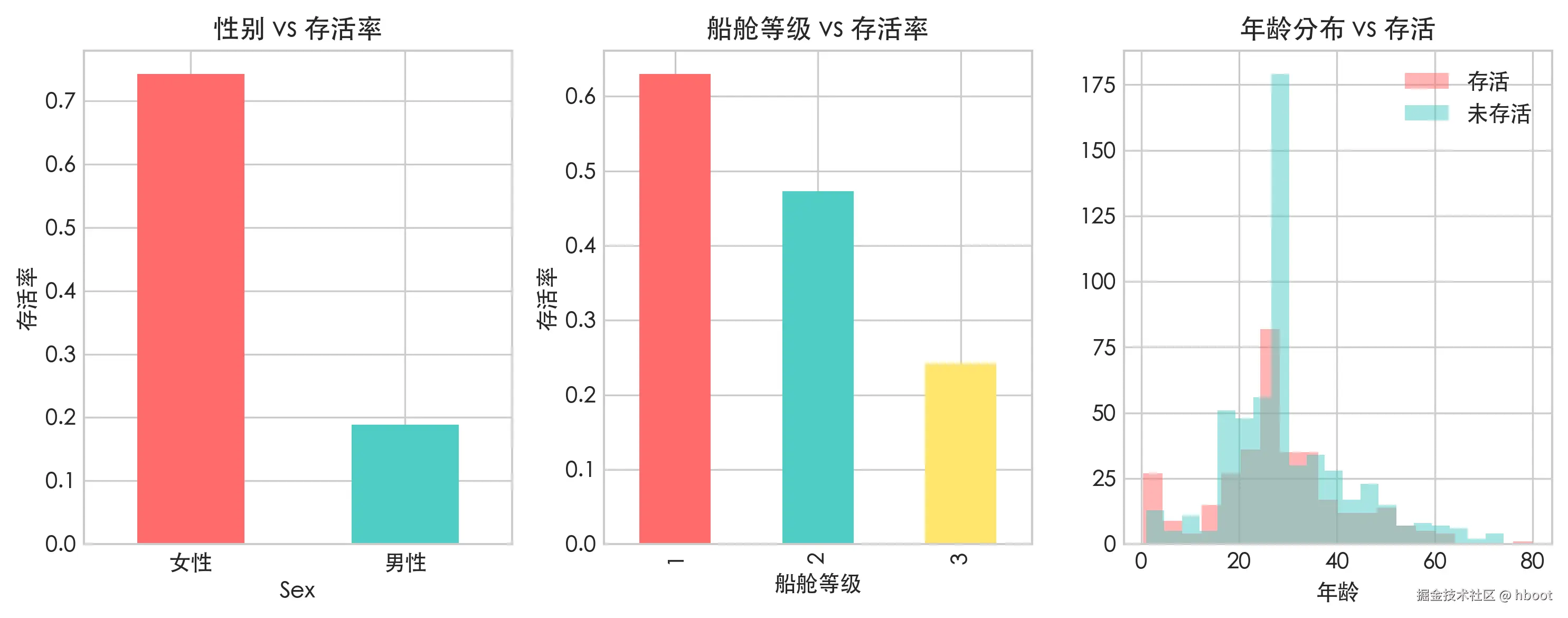
py
# 相关性热力图
fig, ax = plt.subplots(figsize=(10, 8))

numeric_cols = df[['Survived', 'Pclass', 'Age', 'SibSp', 'Parch', 'Fare']]
corr = numeric_cols.corr()
im = ax.imshow(corr, cmap='RdYlGn',vmin=-1, vmax=1)

ax.set_xticks(range(len(corr.columns)))
ax.set_yticks(range(len(corr.columns)))
ax.set_xticklabels(corr.columns,rotation=45)
ax.set_yticklabels(corr.columns)

for i in range(len(corr.columns)):
    for j in range(len(corr.columns)):
        ax.text(j, i, f"{corr.iloc[i,j]:.2f}", ha="center", va="center")
plt.colorbar(im)
ax.set_title("相关性热力图")

plt.tight_layout()
plt.savefig("titanic_correlation.png",dpi=300,bbox_inches="tight")
plt.show()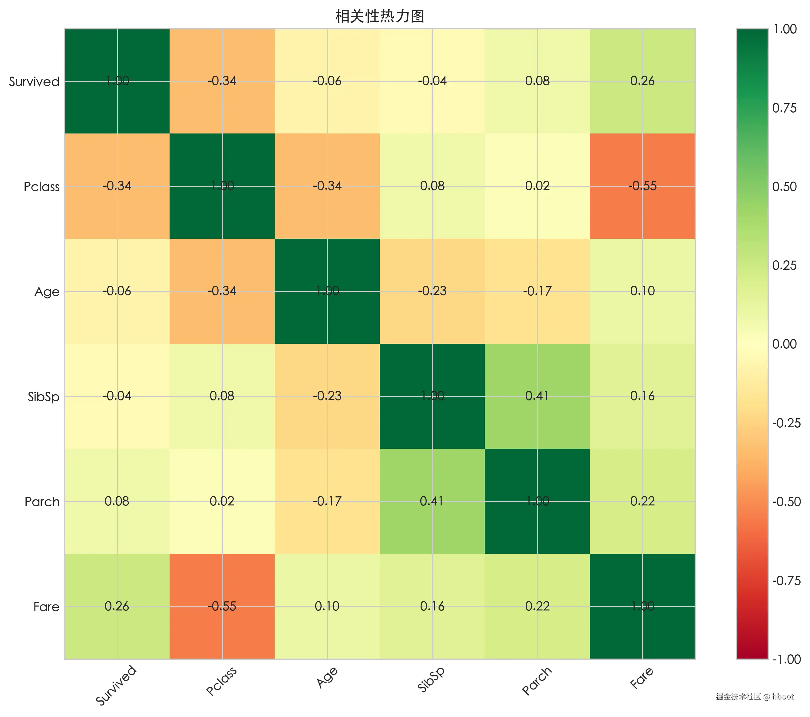
输出结论
py
print("\n==== 结论 ====")
print(f"1. 女性存活率:{survival_by_sex['female']:.1%}, 男性存活率:{survival_by_sex['male']:.1%}")
print(f"2. 一等舱存活率:{survival_by_pclass[1]:.1%}, 二等舱存活率:{survival_by_pclass[2]:.1%}, 三等舱存活率:{survival_by_pclass[3]:.1%}")
print(f"3. 年龄与存活相关系数:{corr.loc['Age', 'Survived']:.3f}")
标准分析报告
js
┌─────────────────────────────────────────────────────────┐
│  封面                                                    │
│  ├── 报告标题                                            │
│  ├── 分析目标                                            │
│  ├── 数据来源                                            │
│  ├── 分析日期                                            │
│  └── 分析人                                              │
├─────────────────────────────────────────────────────────┤
│  目录(可选,报告较长时需要)                              │
├─────────────────────────────────────────────────────────┤
│  1. 摘要                                                │
│     └── 一页纸总结关键发现和结论(给没时间看全文的人)       │
├─────────────────────────────────────────────────────────┤
│  2. 数据说明                                            │
│     ├── 2.1 数据来源与获取方式                            │
│     ├── 2.2 字段说明(数据字典)                          │
│     └── 2.3 数据量级(多少行、多少列、时间范围)            │
├─────────────────────────────────────────────────────────┤
│  3. 数据质量评估                                         │
│     ├── 3.1 缺失值统计                                   │
│     ├── 3.2 异常值检查                                   │
│     ├── 3.3 重复数据                                     │
│     └── 3.4 数据类型是否正确                              │
├─────────────────────────────────────────────────────────┤
│  4. 数据清洗                                             │
│     ├── 4.1 清洗策略(为什么这样处理)                     │
│     ├── 4.2 清洗代码                                     │
│     └── 4.3 清洗前后对比                                  │
├─────────────────────────────────────────────────────────┤
│  5. 探索性分析(核心)                                    │
│     ├── 5.1 单变量分析(每个字段单独看分布)                │
│     ├── 5.2 双变量分析(两两关系)                        │
│     ├── 5.3 多变量交叉分析(组合关系)                     │
│     └── 每个小节 = 图表 + 数据 + 文字解读                  │
├─────────────────────────────────────────────────────────┤
│  6. 结论与建议                                           │
│     ├── 6.1 关键发现(用数字说话)                        │
│     ├── 6.2 业务建议 / 模型建议                           │
│     └── 6.3 局限性与改进方向                              │
├─────────────────────────────────────────────────────────┤
│  附录                                                    │
│     ├── 完整代码                                         │
│     ├── 参考资料                                         │
│     └── 术语解释                                         │
└─────────────────────────────────────────────────────────┘