文章目录
- 前言
- 一、实现原理
- [二、series ------type: "pictorialBar" 简介](#二、series ——type: "pictorialBar" 简介)
-
- [2.1 常用属性](#2.1 常用属性)
- 三、代码实战
-
- [3.1 封装一个echarts通用组件 echarts.vue](#3.1 封装一个echarts通用组件 echarts.vue)
- [3.2 实现一个立方体柱状图](#3.2 实现一个立方体柱状图)
- [3.3 实现一个渐变立方体柱状图](#3.3 实现一个渐变立方体柱状图)
- 总结
前言
在前端开发的数据可视化场景中,ECharts 是一个强大且灵活的工具,它能创建各种复杂而美观的图表。本文将详细阐述如何利用 ECharts实现3D立方体柱状图
一、实现原理
3D立方体柱状图实现原理跟上一篇文章Vue3 Echarts 3D圆柱体柱状图实现
,实现方式是类似的,总共分3个部分组合合成上下2个菱形面+中间基础柱状图,基础柱状图又可根据实际需要拆成左右2个柱状图组合而成或者通过单个柱子水平线性渐变模拟中间棱线。
如上图所示上下2个独立菱形面往普通柱状图靠,调到合适位置变成如下效果:

上下两个菱形可通过 echarts ------series------ type: "pictorialBar" 自定义图形实现,请查看下章节介绍
基础柱状图通过线性渐变颜色模拟菱线,核心代码:
javascript
{
      type: "bar",
      barWidth: 50, //柱子宽度
      itemStyle: {
        //柱子样式
        color: {
          //渐变颜色
          type: "linear",
          x: 0,
          y: 0,
          x2: 1,//水平方向
          y2: 0,
          colorStops: [
          { offset: 0, color: "rgba(57, 206, 255, 1)" },
          { offset: 0.49, color: "rgba(57, 206, 255, 1)" },
          { offset: 0.50, color: "rgba(57, 206, 255, 0.9)" },
          { offset: 0, color: "rgba(57, 206, 255, 1)" },
          ],
        },
      }
上述代码通过水平渐变方式使得柱状图正中间1%宽度颜色透明度降低0.1模拟菱线。
二、series ------type: "pictorialBar" 简介
type: "pictorialBar" 是 ECharts 中的一种特殊柱状图类型,它允许使用自定义图形(如图片、形状)来代替传统的柱状条,为数据可视化增添更多创意和灵活性。
type: "pictorialBar"也被叫作象形柱图。它首先是个柱状图,但是柱状图的柱子并不显示。这些柱子我们称为『基准柱(reference bar)』,根据基准柱来定位和显示各种象形图形(包括图片)。
每个象形图形根据基准柱的定位,是通过 symbolPosition、symbolOffset 来调整其于基准柱的相对位置。
2.1 常用属性
-
symbol 图形类型,默认圆形
可选值 'circle'(圆形), 'rect'(直角长方形), 'roundRect'(圆角长方形), 'triangle'(三角形), 'diamond'(菱形), 'pin'(漏斗), 'arrow'(箭头), 'none'(无)
-
symbolSize 图形的大小,默认值 '100%', '100%'
可以用数组分开表示宽和高,例如 20, 10 表示标记宽为20,高为10,也可以设置成诸如 10 这样单一的数字,表示 10, 10。
可以设置成绝对值(如 10),也可以设置成百分比(如 '120%'、'55%', 23)。
- symbolPosition 图形的定位位置
可选择 start':图形边缘与柱子开始的地方内切,'end':图形边缘与柱子结束的地方内切。'center':图形在柱子里居中。
-
symbolOffset 图形相对于原本位置的偏移,默认0, 0
-
data 系列中的数据内容数组。数组项通常为具体的数据项。
更多属性可以查阅官方文档
本例需求通过上面几个属性我们就能构建一个菱形面
例如:
javascript
 {
      type: "pictorialBar",
      symbol:'diamond',//菱形
      symbolSize: [50, 22],//50x22尺寸
      symbolOffset: [0, -11],//向上偏移11px
      symbolPosition:'end',//位于顶部
 }
三、代码实战
以vue3为代码为示例
3.1 封装一个echarts通用组件 echarts.vue
echarts.vue
javascript
<template>
	<div class="echarts-box">
		<div ref="echartRef" class="charts" ></div>
	</div>
</template>
<script setup>
import { ref, onMounted, onBeforeUnmount, watch, nextTick, markRaw } from 'vue';
import * as echarts from 'echarts';
const props = defineProps({
	// 图表配置
	data: {
		type: Object,
		default: () => {},
	},
});
const echartRef = ref();

let dom = null;

//设置图表配置
const setOptions = (options) => {
	//清除画布
	dom && dom.clear();
	//重新渲染
	dom && dom.setOption(options);
};


watch(
	() => props.data,
	(val) => {
		nextTick(() => {
			//默认关闭动画
			setOptions({animation: false,...val});
		});
	},
	{ deep: true, immediate: true }
);
const emits= defineEmits(['click'])
onMounted(() => {
	//初始化
	dom = markRaw(echarts.init(echartRef.value));
	//点击事件
    dom.on('click',  (param)=> {
		emits('click',param)
	  } )
});
onBeforeUnmount(() => {
	//离开销毁
	echarts.dispose(dom);
	dom = null;
});

defineExpose({
	setOptions,
});
</script>
<style lang="scss" scoped>
.echarts-box {
	width: 100%;
	height: 100%;
	box-sizing: border-box;
}

.charts {
	width: 100%;
	height: 100%;
}
</style>
上述代码封装了一个echarts通用组件,只需传入data图表配置数据就会重新渲染,需要注意的是组件默认继承父元素的宽高(100%),所以父元素需要设置尺寸。
3.2 实现一个立方体柱状图
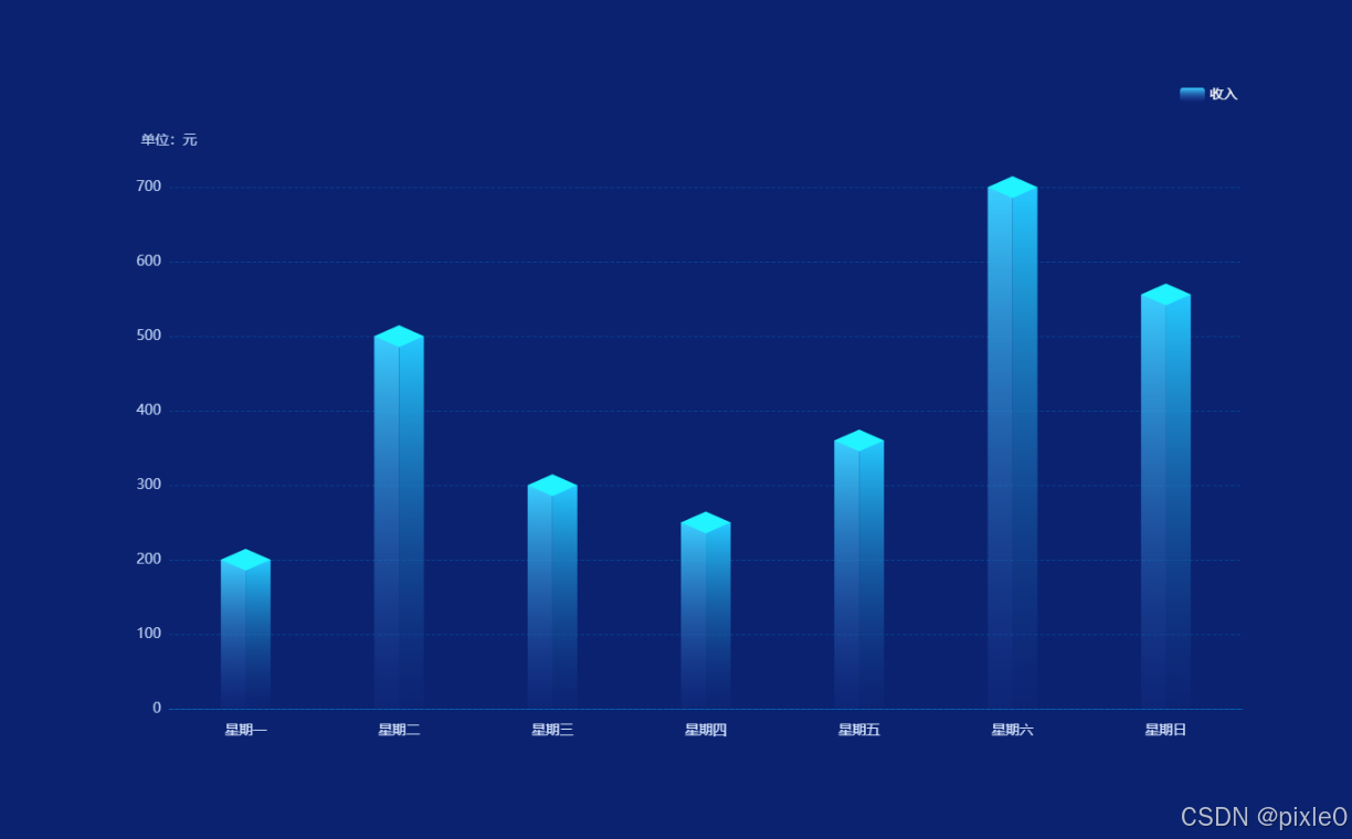
(1)首先实现一个基础柱状图
demo.vue
javascript
<template>
  <div class="container">
    <div class="echarts-view">
      <Echarts :data="data" />
    </div>
  </div>
</template>
<script setup>
import Echarts from "./echarts.vue";
import { ref } from "vue";

const data = ref({
  //位置
  grid: {
    left: "5%",
    right: "5%",
    bottom: "10%",
    top: "15%",
  },
  //提示框
  tooltip: {},
  //图例
  legend: {
    show: true,
    right: "5%",
    textStyle: {
      color: "#fff",
      fontSize: 14,
    },
  },
  //x轴
  xAxis: {
    type: "category",
    //坐标轴轴线
    axisLine: {
      show: true,
      lineStyle: {
        color: "rgba(0, 176, 255,0.3)",
      },
    },
    //刻度
    axisTick: {
      show: false,
    },
    //分割线
    splitLine: {
      show: false,
    },
    // x轴文字
    axisLabel: {
      color: "#D8E6FF",
      fontSize: 14,
      margin: 15,
    },
    data: [
      "星期一",
      "星期二",
      "星期三",
      "星期四",
      "星期五",
      "星期六",
      "星期日",
    ],
  },
  //y轴
  yAxis: {
    name: "单位:元", //单位文字
    nameTextStyle: {
      //单位样式
      color: "#BCD0F4",
      nameLocation: "start",
      fontSize: 14,
    },
    nameGap: 40, //单位与y轴距离
    type: "value",
    //分割线
    splitLine: {
      show: true,
      lineStyle: {
        color: "rgba(0, 176, 255, 0.2)",
        type: "dashed",
      },
    },
    //坐标轴轴线
    axisLine: {
      show: false,
    },
    //刻度数值文字样式
    axisLabel: {
      color: "#BCD0F4",
      fontSize: 14,
    },
  },
  //数据
  series: [
    //中间柱状图
    {
      type: "bar",
      barWidth: 50, //柱子宽度
      itemStyle: {//柱子样式
        color:'rgba(57, 206, 255, 1)'
      },
      name: "收入",
      data: [200, 500, 300, 250, 360, 700, 556],
    },
  ],
});
</script>
<style scoped>
.container {
  width: 100%;
  height: 100%;
  display: flex;
  flex-direction: column;
  justify-content: center;
  background-color: #0a2270;
  align-items: center;
}
.echarts-view {
  height: 700px;
  width: 1200px;
}
</style>
运行效果:
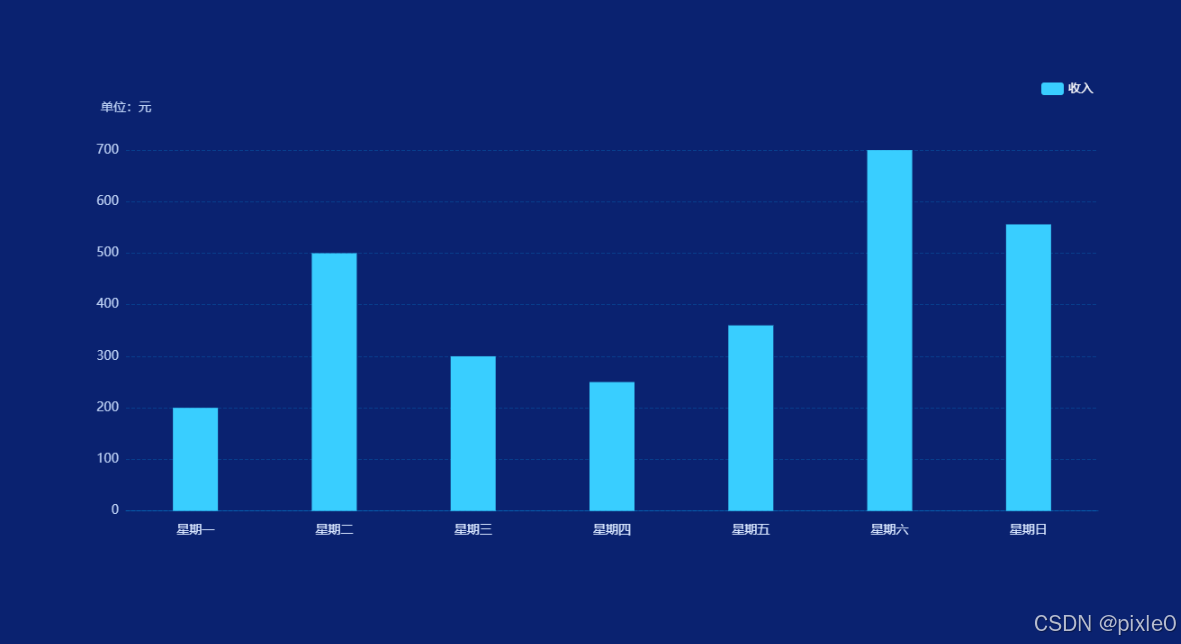
上述代码渲染一个最基础的柱状图
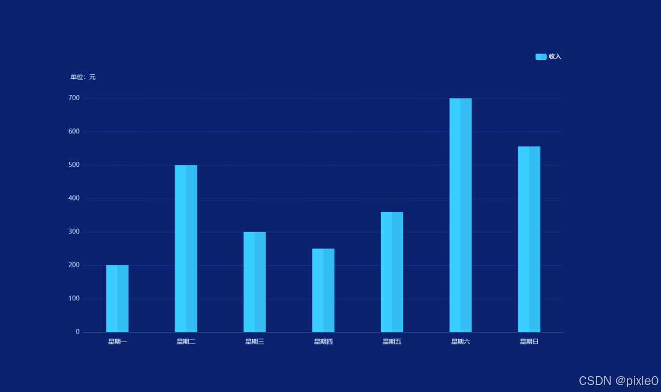
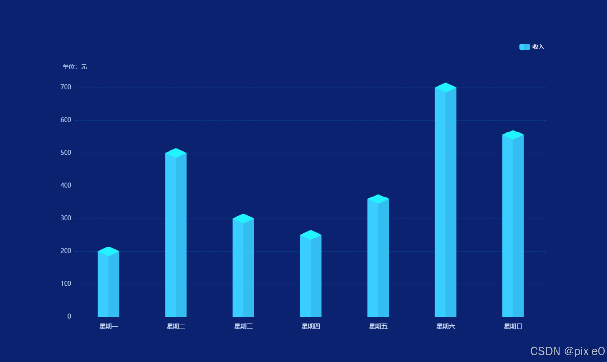
(2)添加立方体棱线
修改柱子颜色为渐变
javascript
 ......
 ......
 {
      type: "bar",
      barWidth: 50, //柱子宽度
      itemStyle: { //柱子样式
        color: {
          //渐变颜色
          type: "linear",
          x: 0,
          y: 0,
          x2: 1,//水平渐变
          y2: 0,
          colorStops: [
          { offset: 0, color: "rgba(57, 206, 255, 1)" },
          { offset: 0.49, color: "rgba(57, 206, 255, 1)" },
          { offset: 0.50, color: "rgba(57, 206, 255, 0.9)" },//降低透明度模拟棱线
          { offset: 0, color: "rgba(57, 206, 255, 1)" },
          ],
        },
      },
      name: "收入",
      data: [200, 500, 300, 250, 360, 700, 556],
  },
.....
.....
运行效果:
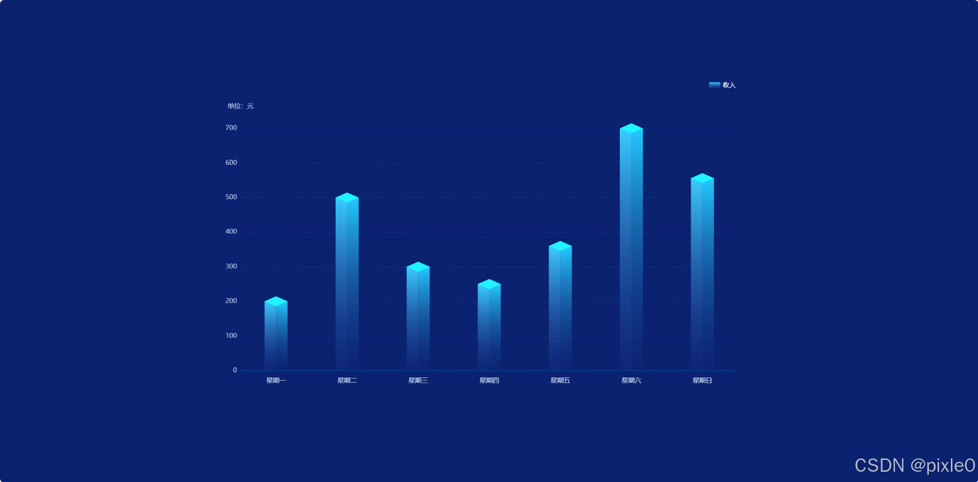
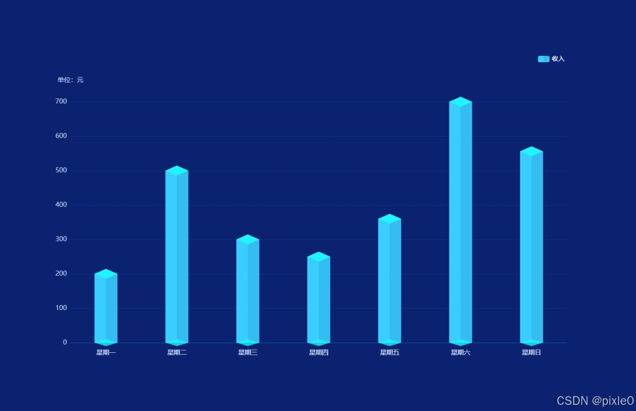
(3)添加上下2个菱形平面
(底面可以根据实际情况选择是否添加)
javascript
 ......
 ......
 //中间基础柱状图
 {
      type: "bar",
      barWidth: 50, //柱子宽度
      itemStyle: { //柱子样式
        color: {
          //渐变颜色
          type: "linear",
          x: 0,
          y: 0,
          x2: 1,//水平渐变
          y2: 0,
          colorStops: [
          { offset: 0, color: "rgba(57, 206, 255, 1)" },
          { offset: 0.49, color: "rgba(57, 206, 255, 1)" },
          { offset: 0.50, color: "rgba(57, 206, 255, 0.9)" },//降低透明度模拟棱线
          { offset: 0, color: "rgba(57, 206, 255, 1)" },
          ],
        },
      },
      name: "收入",
      data: [200, 500, 300, 250, 360, 700, 556],
      //顶部菱形面
    {
      type: "pictorialBar",
      symbol:'diamond',
      symbolSize: [50, 22],
      symbolOffset: [0, -11],//向上偏移菱形高度一半
      symbolPosition:'end',
      z: 12,
      itemStyle: {
        color: props.pictorialBarColor[0],
      },
      name: "收入",
      data: [200, 500, 300, 250, 360, 700, 556],
    },
    //底部菱形面
    {
      type: "pictorialBar",
      symbol:'diamond',
      symbolSize: [50, 15],
      symbolOffset: [0, 7.5],向上偏移菱形高度一半
      z: 12,
      itemStyle: {
        color: props.pictorialBarColor[1],
      },
      name: "收入",
      data: [200, 500, 300, 250, 360, 700, 556],
    },
运行效果:
底部菱形不加效果:
完整代码:
bar-3d.vue (立方体柱状图组件封装)
javascript
<!-- 立方体柱状图 -->
<template>
  <div class="bar-wrap">
    <Echarts :data="data" />
  </div>
</template>

<script setup>
import Echarts from "../components/echarts.vue";
import { computed } from "vue";
const props = defineProps({
  grid: {
    type: Object,
    default: () => ({
      left: "5%",
      right: "5%",
      bottom: "10%",
      top: "15%",
    }),
  },
  legend:{
    type: Object,
    default: () => {},
  },
  series: {
    type: Object,
    default: () => {},
  },
  xAxis: {
    type: Array,
    default: () => {},
  },
  yAxis: {
    type: Object,
    default: () => {},
  },
  //单位
  unit: {
    type: String,
    default: "",
  },
  //上下菱形面颜色
  pictorialBarColor: {
    type: Array,
    default: () => ["#21F3FF", " rgba(33, 243, 255,0.8)"],
  },
});

//echarts配置
const data = computed(() => {
  let { name, data } = props.series;

  //series配置处理
  let seriesData = [
    //中间柱状图
    {
      type: "bar",
      barWidth: 50, //柱子宽度
      barGap:0,

      itemStyle: {
        //柱子样式
        color: {
          //渐变颜色
          type: "linear",
          x: 0,
          y: 0,
          x2: 1,
          y2: 0,
          colorStops: [
          { offset: 0, color: "rgba(57, 206, 255, 1)" },
          { offset: 0.49, color: "rgba(57, 206, 255, 1)" },
          { offset: 0.50, color: "rgba(57, 206, 255, 0.9)" },
          { offset: 0, color: "rgba(57, 206, 255, 1)" },
          ],
        },
      },
      ...props.series,

    },
    //顶部菱形面
    {
      type: "pictorialBar",
      symbol:'diamond',
      symbolSize: [50, 22],
      symbolOffset: [0, -11],
      symbolPosition:'end',
      z: 12,
      itemStyle: {
        color: props.pictorialBarColor[0],
      },
      name,
      data: data.map((item) => {
        return {
          value: item,
          itemStyle: {
            opacity: item > 0 ? 1 : 0, //值为0时隐藏
          },
        };
      }),
    },
    //底部菱形面
    {
      type: "pictorialBar",
      symbol:'diamond',
      symbolSize: [50, 15],
      symbolOffset: [0, 7.5],
      z: 12,
      itemStyle: {
        color: props.pictorialBarColor[1],
      },
      name,
      data: data.map((item) => {
        return {
          value: item,
          itemStyle: {
            opacity: item > 0 ? 1 : 0,
          },
        };
      }),
    },
  ];

  return {
    grid: props.grid,
    tooltip: {},
    legend: {
      show: true,
      right: "5%",
      textStyle: {
        color: "#fff",
        fontSize: 14,
      },
      ...props.legend
    },
    //x轴
    xAxis: {
      type: "category",
      axisLine: {
        show: true,
        lineStyle: {
          color: "rgba(0, 176, 255,0.3)",
        },
      },
      axisTick: {
        show: false,
      },
      splitLine: {
        show: false,
      },
      // x轴文字
      axisLabel: {
        color: "#D8E6FF",
        fontSize: 14,
        margin: 15,
      },
      data: props.xAxis,
    },
    //y轴
    yAxis: {
      name: props.unit ? `单位:${props.unit}` : "", //单位文字
      nameTextStyle: {
        //单位样式
        color: "#BCD0F4",
        nameLocation: "start",
        fontSize: 14,
      },
      nameGap: 40, //单位与y轴距离
      type: "value",
      splitLine: {
        show: true,
        lineStyle: {
          color: "rgba(0, 176, 255, 0.2)",
          type: "dashed",
        },
      },
      axisLine: {
        show: false,
      },
      //刻度数值样式
      axisLabel: {
        color: "#BCD0F4",
        fontSize: 14,
      },
      ...props.yAxis,
    },
    series: seriesData,
  };
});
</script>
<style scoped lang="scss">
.bar-wrap {
  width: 100%;
  height: 100%;
}
</style>
页面调用
demo.vue
javascript
<template>
  <div class="container">
    <div class="echarts-view">
      <Bar3D unit="元" :xAxis="xAxisData" :series="seriesData" />
    </div>
  </div>
</template>
<script setup>
import Bar3D from "./components/bar-3d2.vue";
import { ref } from "vue";

//x轴标签
const xAxisData = ref([
  "星期一",
  "星期二",
  "星期三",
  "星期四",
  "星期五",
  "星期六",
  "星期日",
]);

//数据
const seriesData = ref({
  name: "收入",
  data: [200, 500, 300, 250, 360, 700, 556],
});


</script>
<style scoped>
.container {
  width: 100%;
  height: 100%;
  display: flex;
  flex-direction: column;
  justify-content: center;
  background-color: #0a2270;
  align-items: center;
}
.echarts-view {
  height: 700px;
  width: 1200px;
}
</style>
3.3 实现一个渐变立方体柱状图
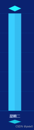
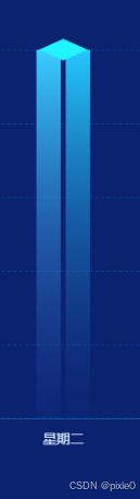
需求升级需要实现一个从上到下渐变透明的立方体柱状图如下图所示:
该需求渐变方向是垂直方向,而前面例子我们用水平渐变方向来模拟菱线,柱状图无法同时使用2个方向来实现渐变效果。显然一个柱状图无法满足需求。这个时候我们需要使用2个小柱状图左右合并成一个大柱状图,而贴合的分界线由于颜色的差异形成一条菱线。再者去掉底部菱形。
设置柱状图间距为0变为

核心代码:
javascript
//左边柱状图
    {
      type: "bar",
      barWidth: 25, //柱子宽度
      barGap:0,//设置左右柱状图间距为0
      itemStyle: {
        //柱子样式
        color: {
          //渐变颜色
          type: "linear",
          x: 0,
          y: 0,
          x2: 0,
          y2: 1,//垂直方向渐变
          colorStops: [
          { offset: 0, color: "rgba(57, 206, 255, 1)" },
            { offset: 1, color: "rgba(45, 72, 173, 0.1)" },
          ],
        },
      },
      name: "收入",
      data: [200, 500, 300, 250, 360, 700, 556],
    },
    //右边柱状图
    {
      type: "bar",
      barWidth: 25, //柱子宽度
      itemStyle: {
        //柱子样式
        color: {
          type: "linear",
          x: 0,
          y: 0,
          x2: 0,
          y2: 1,
          colorStops: [
            { offset: 0, color: "rgba(36, 201, 255, 1)" },
            { offset: 1, color: "rgba(20, 43, 128, 0.2)" },
          ],
        },
      },
      name: "收入",
      data: [200, 500, 300, 250, 360, 700, 556],
    },
    //顶部圆面
    {
      type: "pictorialBar",
      symbol:'diamond',
      .....
      .....
完整代码:
bar-3d.vue (立方体柱状图(垂直渐变)组件封装)
javascript
<!-- 柱状图 -->
<template>
  <div class="bar-wrap">
    <Echarts :data="data" />
  </div>
</template>

<script setup>
import Echarts from "../components/echarts.vue";
import { computed } from "vue";
const props = defineProps({
  grid: {
    type: Object,
    default: () => ({
      left: "5%",
      right: "5%",
      bottom: "10%",
      top: "15%",
    }),
  },
  legend:{
    type: Object,
    default: () => {},
  },
  series: {
    type: Object,
    default: () => {},
  },
  xAxis: {
    type: Array,
    default: () => {},
  },
  yAxis: {
    type: Object,
    default: () => {},
  },
  //单位
  unit: {
    type: String,
    default: "",
  },
  //上下圆面颜色
  pictorialBarColor: {
    type: Array,
    default: () => ["#21F3FF", "rgba(31,97,234,0.4)"],
  },
});

//echarts配置
const data = computed(() => {
  let { name, data } = props.series;

  //series配置处理
  let seriesData = [
    //左边柱状图
    {
      type: "bar",
      barWidth: 25, //柱子宽度
      barGap:0,

      itemStyle: {
        //柱子样式
        color: {
          //渐变颜色
          type: "linear",
          x: 0,
          y: 0,
          x2: 0,
          y2: 1,
          colorStops: [
          { offset: 0, color: "rgba(57, 206, 255, 1)" },
            { offset: 1, color: "rgba(45, 72, 173, 0.1)" },
          ],
        },
      },
      ...props.series,

    },
    //右边柱状图
    {
      type: "bar",
      barWidth: 25, //柱子宽度
      itemStyle: {
        //柱子样式
        color: {
          type: "linear",
          x: 0,
          y: 0,
          x2: 0,
          y2: 1,
          colorStops: [
            { offset: 0, color: "rgba(36, 201, 255, 1)" },
            { offset: 1, color: "rgba(20, 43, 128, 0.2)" },
          ],
        },
      },
      ...props.series,
    },
    //顶部菱面
    {
      type: "pictorialBar",
      symbol:'diamond',
      symbolSize: [50, 22],
      symbolOffset: [0, -11],
      symbolPosition:'end',

      z: 12,
      itemStyle: {
        color: props.pictorialBarColor[0],
      },
      name,
      data: data.map((item) => {
        return {
          value: item,
          itemStyle: {
            opacity: item > 0 ? 1 : 0, //值为0时隐藏
          },
        };
      }),
    },
  ];

  return {
    grid: props.grid,
    tooltip: {},
    legend: {
      show: true,
      right: "5%",
      textStyle: {
        color: "#fff",
        fontSize: 14,
      },
      ...props.legend
    },
    //x轴
    xAxis: {
      type: "category",
      axisLine: {
        show: true,
        lineStyle: {
          color: "rgba(0, 176, 255,0.3)",
        },
      },
      axisTick: {
        show: false,
      },
      splitLine: {
        show: false,
      },
      // x轴文字
      axisLabel: {
        color: "#D8E6FF",
        fontSize: 14,
        margin: 15,
      },
      data: props.xAxis,
    },
    //y轴
    yAxis: {
      name: props.unit ? `单位:${props.unit}` : "", //单位文字
      nameTextStyle: {
        //单位样式
        color: "#BCD0F4",
        nameLocation: "start",
        fontSize: 14,
      },
      nameGap: 40, //单位与y轴距离
      type: "value",
      splitLine: {
        show: true,
        lineStyle: {
          color: "rgba(0, 176, 255, 0.2)",
          type: "dashed",
        },
      },
      axisLine: {
        show: false,
      },
      //刻度数值样式
      axisLabel: {
        color: "#BCD0F4",
        fontSize: 14,
      },
      ...props.yAxis,
    },
    series: seriesData,
  };
});
</script>
<style scoped lang="scss">
.bar-wrap {
  width: 100%;
  height: 100%;
}
</style>
总结
通过组合使用 type: bar 和 type: "pictorialBar"灵活应用我们成功实现了 3D 立方体柱状图。你可以根据实际需求,进一步调整图表的样式和配置,创造出更加美观和实用的可视化效果。对于3D柱状图的实现方法还有其他的方式例如结合three.js 3D渲染引擎来实现等,而本文介绍的方法是相对比较简单的方式,具体开发中可根据实际需要进行选择。