Python金融入门
- [1. 加载数据与可视化](#1. 加载数据与可视化)
-
- [1.1. 加载数据](#1.1. 加载数据)
- [1.2. 折线图](#1.2. 折线图)
- [1.3. 重采样](#1.3. 重采样)
- [1.4. K线图 / 蜡烛图](#1.4. K线图 / 蜡烛图)
- [1.5. 挑战1](#1.5. 挑战1)
- [2. 计算](#2. 计算)
-
- [2.1. 收益 / 回报](#2.1. 收益 / 回报)
- [2.2. 绘制收益图](#2.2. 绘制收益图)
- [2.3. 累积收益](#2.3. 累积收益)
- [2.4. 波动率](#2.4. 波动率)
- [2.5. 挑战2](#2.5. 挑战2)
- [3. 滚动窗口](#3. 滚动窗口)
-
- [3.1. 创建移动平均线](#3.1. 创建移动平均线)
- [3.2. 绘制移动平均线](#3.2. 绘制移动平均线)
- [3.3 Challenge](#3.3 Challenge)
- [4. 技术分析](#4. 技术分析)
-
- [4.1. OBV](#4.1. OBV)
- [4.2. 累积/派发指标(A/D)](#4.2. 累积/派发指标(A/D))
- [4.3. RSI](#4.3. RSI)

1. 加载数据与可视化
1.1. 加载数据
python
# 导入所需库
from matplotlib import dates
import matplotlib.pyplot as plt
import numpy as np
import pandas as pd
import yfinance as yf
python
# 使用Y Finance库下载S&P500数据以及2010年至2019年底的Apple数据
raw = yf.download('SPY AAPL', start='2010-01-01', end='2019-12-31')
python
raw
# Y Finance使用日期作为索引列, 每行代表一天。
# 查看列:这里有所谓的分层或多索引列,可以看到调整后的收盘价,因为我们同时要求苹果和标准普尔 500指数
# 所以我们在它下面有两个子列,可以看到收盘价、最高值、最低值、开盘价、 和Volumn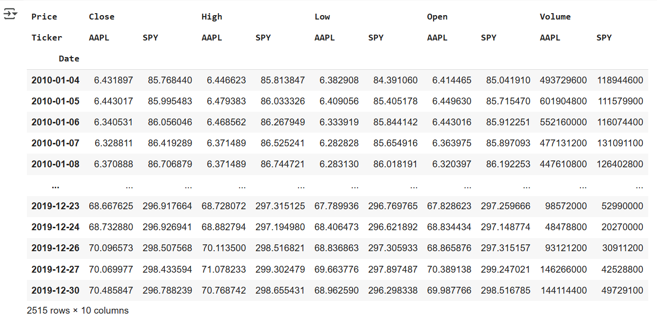
python
# 检查数据帧的columns属性
raw.columns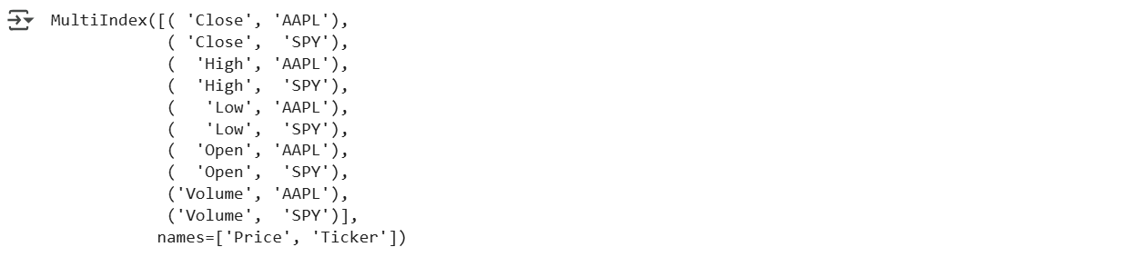
python
# 查看pipe的用法
raw.pipe?
python
import yfinance as yf

#fix_cols():重命名多层列索引为单层(只保留子列名)
def fix_cols(df):
  columns = df.columns
  outer = [col[0] for col in columns]
  df.columns = outer
  return df

# 加载与清洗逻辑封装在一个函数里,便于复用
def tweak_data():
  raw = yf.download('SPY AAPL',start='2010-01-01', end='2019-12-31')

  return (raw
          .iloc[:,::2]
          .pipe(fix_cols)) # pipe():在链式调用中插入一个自定义函数。

tweak_data()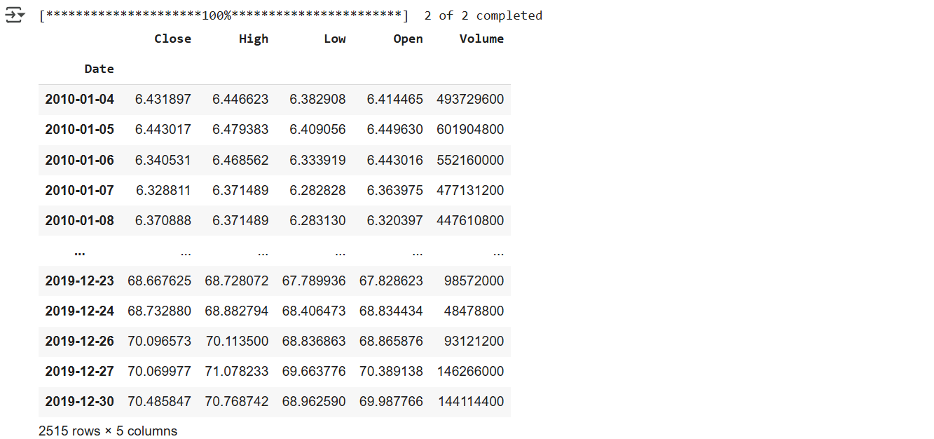
1.2. 折线图
创建线图,并整绘图的细节(如选择列、大小等)。
python
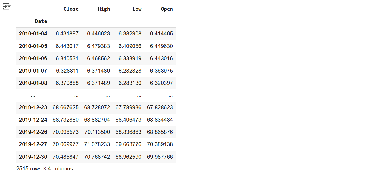
(raw
    .iloc[:,:-2:2] #从第0列开始,到倒数第2列,步长为2
    .pipe(fix_cols)
)
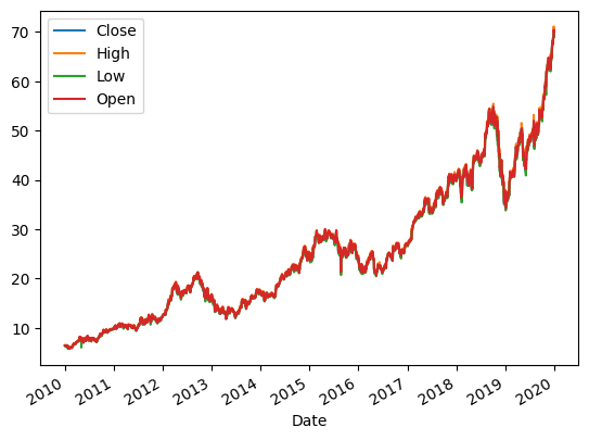
python
(raw
    .iloc[:,:-2:2]
    .pipe(fix_cols)
    .plot()
)
python
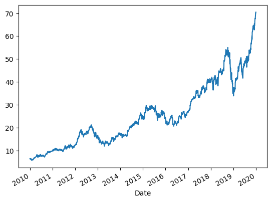
(raw
    .iloc[:,:-2:2]
    .pipe(fix_cols)
    .Close
    .plot()
)
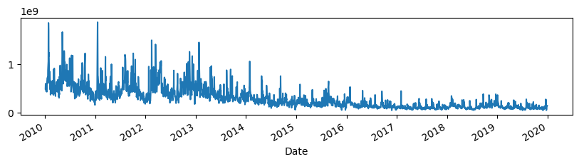
python
(raw
    .iloc[:,::2]
    .pipe(fix_cols)
    .Volume
    .plot(figsize=(10,2))  # 10英寸宽,2英寸高
)
1.3. 重采样
重新采样(resampling) 是将时间序列数据的频率从一个粒度转换为另一个粒度的过程,如从每日 → 每月,Pandas 提供了.resample() 方法。
python
(raw
    .iloc[:,::2]
    .pipe(fix_cols)
    .Close  # 每日收盘价
    .plot()
)
按月份分组:
python
(raw
    .iloc[:,::2]
    .pipe(fix_cols)
    .resample('M')  # offset alias
    .Close
)
python
(raw
    .iloc[:,::2]
    .pipe(fix_cols)
    .resample('M')  # offset alias
    .Close
    .mean()
    .plot()  # 索引中有日期,列中有值,这样就可以绘制了
)
1.4. K线图 / 蜡烛图
python
fig, ax = plt.subplots(figsize=(10,5))
def plot_candle(df, ax):
  # wick
  ax.vlines(x=df.index, ymin=df.Low, ymax=df.High, colors='k', linewidth=1)
  # red - decrease
  red = df.query('Open > Close')
  ax.vlines(x=red.index, ymin=red.Close, ymax=red.Open, colors='r', linewidth=3)
  # green - increase
  green = df.query('Open <= Close')
  ax.vlines(x=green.index, ymin=green.Close, ymax=green.Open, colors='g', linewidth=3)
  ax.xaxis.set_major_locator(dates.MonthLocator())
  ax.xaxis.set_major_formatter(dates.DateFormatter('%b-%y'))
  ax.xaxis.set_minor_locator(dates.DayLocator())
  return df

(raw
    .iloc[:,::2]
    .pipe(fix_cols)
    .resample('d')
    .agg({'Open':'first', 'High':'max', 'Low':'min', 'Close':'last'})
    .loc['jan 2018':'jun 2018']
    .pipe(plot_candle, ax)
)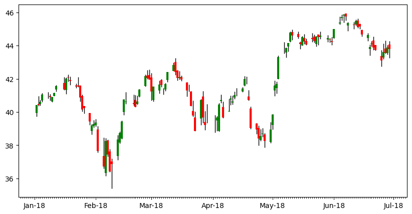
1.5. 挑战1
Plot the candles for the time period of Sep 2019 to Dec 2019. 可以做做看
2. 计算
Goal
- Explore Pandas methods like
.pct_change - Plotting with Pandas
- Refactoring to functions
2.1. 收益 / 回报
在金融中,"回报"通常指某个资产价格在两个时间点之间的相对变化。在Pandas中使用.pct_change() 方法计算百分比变化(Percentage Change),默认按前一行计算百分比变化(periods=1)。

python
# 使用aapl存储
aapl = (raw
        .iloc[:,::2]
        .pipe(fix_cols)
        )
aapl
python
# returns
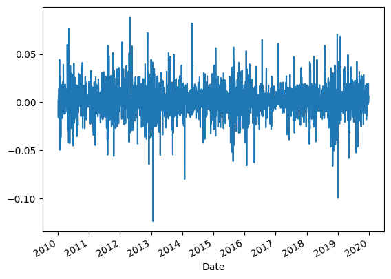
aapl.pct_change()2.2. 绘制收益图
使用 .plot() 方法,查看回报的日常变化趋势。
python
# plot returns
(aapl
 .pct_change()
 .Close
 .plot()
)
很多高频噪声,看起来像"毛毛虫":
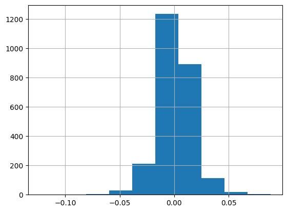
使用 .hist() 方法来观察回报的 分布情况(正负、极值、对称性等)。
python
# Histogram of Returns
(aapl
 .pct_change()
 .Close
 .hist()
)
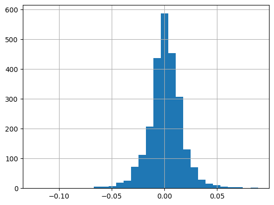
bins=30 表示分成 30 个区间,可以更细致地看到分布:
python
# Change bins
(aapl
 .pct_change()
 .Close
 .hist(bins=30)
)
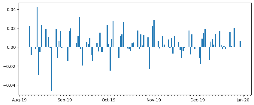
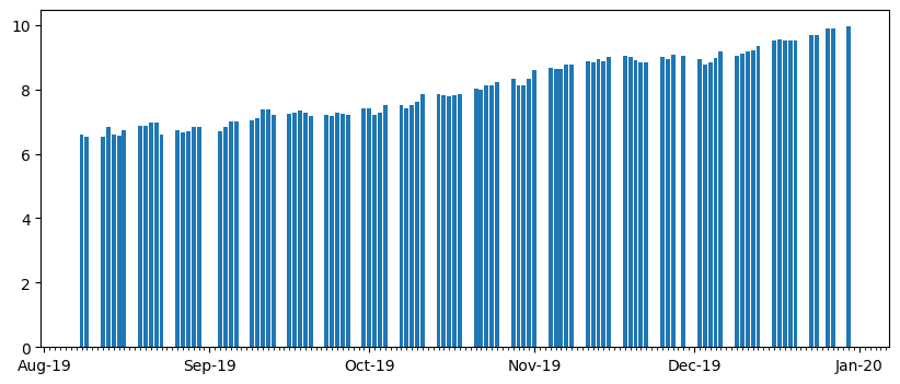
条形图用于查看一小段时间内每日的正负回报(比如最近 100 天):
python
# Understanding plotting in Pandas is a huge lever
# Bar Plot Returns
(aapl
 .pct_change()
 .Close
 .iloc[-100:]  # 获取最后100个值
 .plot.bar()
)
Pandas 会把日期索引变成"分类变量",导致 X 轴标签重叠、无法格式化。
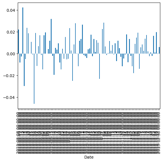
即使调整标签,也会显示成 1970-01 等错误日期:
python
# Bar Plot of Returns
# Sadly dates are broken with Pandas bar plots
# 1970s?
fig, ax = plt.subplots(figsize=(10, 4))
(aapl
  .pct_change()
  .Close
  .iloc[-100:]
  .plot.bar(ax=ax)
)
ax.xaxis.set_major_locator(dates.MonthLocator())
ax.xaxis.set_major_formatter(dates.DateFormatter('%b-%y'))
ax.xaxis.set_minor_locator(dates.DayLocator())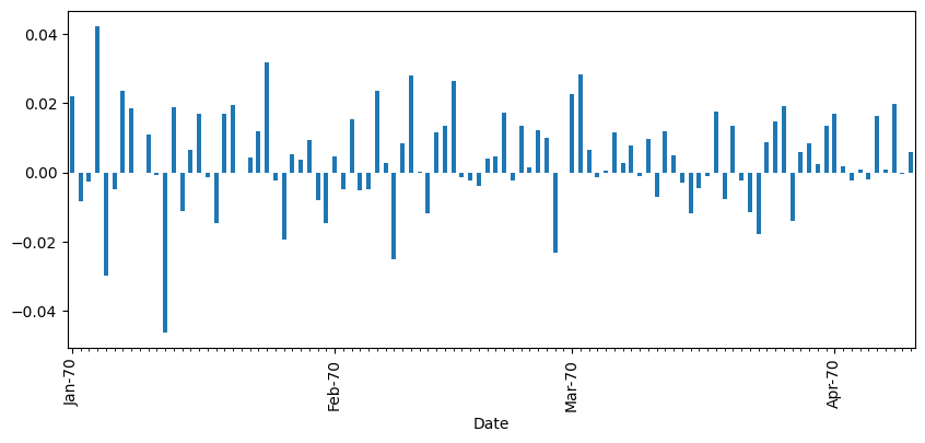
解决办法:使用 Matplotlib 手动绘制条形图
python
# Returns - using matplotlib
def my_bar(ser, ax):
  ax.bar(ser.index, ser)
  ax.xaxis.set_major_locator(dates.MonthLocator())
  ax.xaxis.set_major_formatter(dates.DateFormatter('%b-%y'))
  ax.xaxis.set_minor_locator(dates.DayLocator())
  return ser

fig, ax = plt.subplots(figsize=(10, 4))
_ = (aapl
  .pct_change()
  .Close
  .iloc[-100:]
  .pipe(my_bar, ax)
)
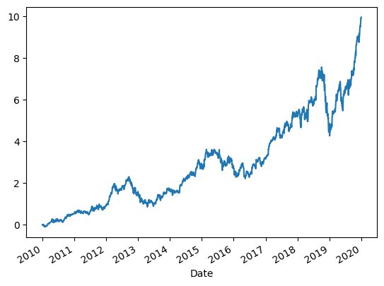
2.3. 累积收益
Goal:
- More complicated Pandas
- Refactoring into a function
- Explore source
- Creating new columns with
.assign - Illustrate lambda
Cumulative Returns is the amount that investment has gained or lost over time:
(current_price-original_price)/original_price
python
(aapl
 .Close
 .plot()
 )
逐步计算:
python
(aapl
 .Close
 .sub(aapl.Close[0])  # substract
 .div(aapl.Close[0])  # divide
 .plot()
 )
基于日收益的累积积:
python
# alternatte calculation
(aapl
 .Close # 取出收盘价序列
 .pct_change() # 计算日收益率(百分比变化)
 .add(1)  # 转换为收益倍率 (1 + r)
 .cumprod() # 计算累积乘积:累计收益倍率
 .sub(1) # 转换为累计收益率:累计倍率 - 1
 .plot() # 绘图
 )
函数化重构:
python
# create a function for calculating
def calc_cum_returns(df,col):
  ser = df[col]
  return (ser
          .sub(ser[0])
          .div(ser[0]))
(aapl
  .pipe(calc_cum_returns,'Close')
  .plot()
)
python
# Lambda is an *anonymous function*

def get_returns(df):
  return calc_cum_returns(df,'Close')

get_returns(aapl)
lambda这里我不太明白
python
(lambda df: get_returns(df))(aapl)
python
# Create a new column
(aapl
 .assign(cum_returns=lambda df: calc_cum_returns(df,'Close'))
)
python
# Returns - using matplotlib
def my_bar(ser, ax):
  ax.bar(ser.index, ser)
  ax.xaxis.set_major_locator(dates.MonthLocator())
  ax.xaxis.set_major_formatter(dates.DateFormatter('%b-%y'))
  ax.xaxis.set_minor_locator(dates.DayLocator())
  return ser

fig, ax = plt.subplots(figsize=(10, 4))
_ = (aapl
.pipe(calc_cum_returns, 'Close')
.iloc[-100:]
.pipe(my_bar, ax)
)
2.4. 波动率
Goals
- More complicated Pandas
- Learn about rolling operations
波动性(英语:volatility,又称波动率),指金融资产在一定时间段的变化性。在股票市场,以每天收市价计算的波动性称为历史波幅(Historical Volatility),以股票期权估算的未来波动性称为引申波幅(Implied Volatility)。着名的VIX指数是标准普尔500指数期权的30日引申波幅,以年度化表示。(维基百科)
python
(aapl
 .Close
 .mean()
)
python
(aapl
 .Close
 .std()
)
python
(aapl
 .assign(pct_change_close=aapl.Close.pct_change())
 .pct_change_close
 .std()
)
以滑动窗口方式计算"过去 N 天"的波动性:
python
(aapl
 .assign(close_vol=aapl.rolling(30).Close.std(),
         per_vol=aapl.Close.pct_change().rolling(30).std())
 .iloc[:,-2:]
 .plot(subplots=True)
)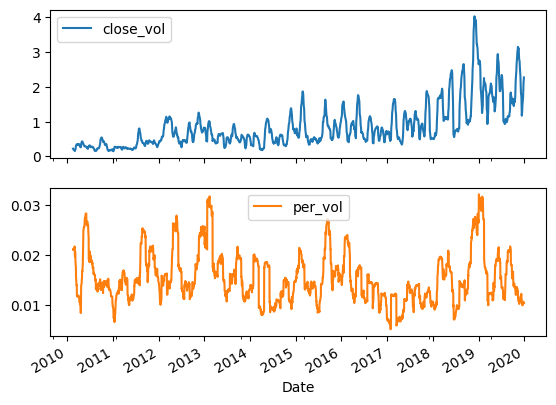
以固定周期(如每 15 天)进行分组计算标准差:
python
# 15 day volatility
(aapl
 .assign(pct_change_close=aapl.Close.pct_change()) # 创建一个名为百分比变化的列
 .resample('15D') # 15天为一个分组
 .std()
)
python
# 15 day rolling volatility
(aapl
 .assign(pct_change_close=aapl.Close.pct_change()) # 创建一个名为百分比变化的列
 .rolling(window=15, min_periods=15)
 .std()
)
python
# 15 day volatility
# note if column name conflicts with method need to use
# index access ([])
(aapl
 .assign(pct_change=aapl.Close.pct_change())
 .rolling(window=15, min_periods=15)
 .std()
 ['pct_change']
 .plot()
 )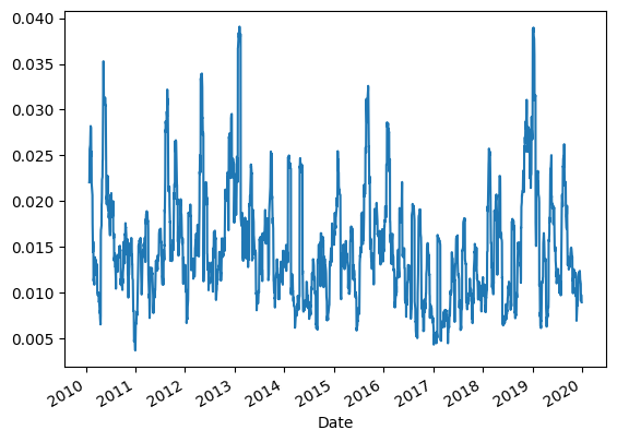
2.5. 挑战2
Plot the rolling volatility over 30-day sliding windows for 2015-2019。(可以参考上面的代码)
3. 滚动窗口
3.1. 创建移动平均线
对苹果公司股票(aapl)的价格数据进行三日移动平均(ma3)的计算:
python
(aapl
.assign(s1=aapl.Close.shift(1),
s2=aapl.Close.shift(2),
ma3=lambda df_:df_.loc[:, ['Close', 's1', 's2']].mean(axis='columns'),
ma3_builtin=aapl.Close.rolling(3).mean()
)
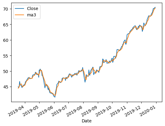
)3.2. 绘制移动平均线
python
(aapl
  .assign(s1=aapl.Close.shift(1),
          s2=aapl.Close.shift(2),
          ma3=lambda df_:df_.loc[:, ['Close', 's1', 's2']].mean(axis='columns'),
          ma3_builtin=aapl.Close.rolling(3).mean()
        )
  [['Close','ma3']]
  .iloc[-200:]
  .plot()
)
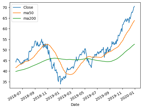
可视化苹果公司股票的收盘价与其 50 日、200 日移动平均线(MA):
python
(aapl
 .assign(
        ma50=aapl.Close.rolling(50).mean(),
        ma200=aapl.Close.rolling(200).mean(),
        )
[['Close', 'ma50', 'ma200']]
.iloc[-400:]
.plot()
)
如下图可以看到:Close(原始收盘价)是日常波动最明显的一条线;ma50是比较敏感的短期趋势线;而ma200是更平滑的长期趋势线。
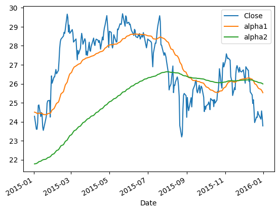
3.3 Challenge
Create a plot with three lines:
- AAPL close price in 2015
- Exponential moving average with alpha =. 0392
- Exponential moving average with alpha =. 00995
Hint:Use the .ewm method to create a rolling aggregator.
python
aapl.ewm?
python
(aapl
 .loc['2015']
 .assign(
        alpha1=aapl.Close.ewm(alpha=0.0392).mean(),
        alpha2=aapl.Close.ewm(alpha=0.00995).mean(),
        )
[['Close', 'alpha1', 'alpha2']]
.plot()
)
alpha=0.0392:较高,表示更敏感,近期数据权重大,从而曲线更贴近原始价格;alpha=0.00995:较低,更平滑,趋势线更慢反应价格波动。
4. 技术分析
4.1. OBV
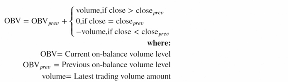
OBV(On-Balance Volume,能量潮指标),是一种常见的技术分析指标,用来结合价格走势和成交量判断趋势强度。OBV 是一个累加值:如果今日收盘价 > 昨日 → 当日成交量加到 OBV 上;如果今日收盘价 < 昨日 → 当日成交量从 OBV 中减去;如果收盘价不变 → OBV 保持不变,如下图:
下面函数的实现逻辑是对的,但是效率不高,会触发FutureWarning:
python
# naive
def calc_obv(df):
  df = df.copy()
  df["OBV"] = 0.0

  # Loop through the data and calculate OBV
  for i in range(1, len(df)):
    # 如果该仓位的收盘价大于前一个收盘值
    if df["Close"][i] > df["Close"][i - 1]:
      df["OBV"][i]=df["OBV"][i - 1] + df["Volume"][i]
    elif df["Close"][i] < df["Close"][i - 1]:
      df["OBV"][i]=df["OBV"][i -1]-df["Volume"][i]
    else:
      df["OBV"][i] = df["OBV"][i - 1]
  return df

calc_obv(aapl)
用 Pandas 向量化方式计算 OBV并使用 %timeit 测试:
python
%%timeit
# This is painful
(aapl
  .assign(close_prev=aapl.Close.shift(1),
          vol=0,
          obv=lambda adf: adf.vol.where(cond=adf.Close == adf.close_prev,
                                        other=adf.Volume.where(cond=adf.Close > adf.close_prev,
                                        other =- adf.Volume.where(cond=adf.Close < adf.close_prev, other=0)
                                        )).cumsum()

        )
)
用 np.select 实现 OBV 的向量化计算:
python
(aapl
  .assign(prev_close=aapl.Close.shift(1),
          vol=np.select([aapl.Close> aapl.Close.shift(1),
                         aapl.Close == aapl.Close.shift(1),
                        aapl.Close < aapl.Close.shift(1)],
                        [aapl.Volume, 0, -aapl.Volume]),
          obv=lambda df_:df_. vol.cumsum(),
        )
)
将 OBV 的向量化计算封装成函数 calc_obv():
python
def calc_obv(df, close_col='Close', vol_col='Volume'):
  close = df[close_col]
  vol = df[vol_col]
  close_shift = close.shift(1)
  return (df
    .assign(vol=np.select([close > close_shift,
                           close == close_shift,
                          close < close_shift],
                          [vol, 0, -vol]),
            obv=lambda df_:df_. vol.fillna(0).cumsum()
            )
      ['obv']

)

(aapl
  .assign(obv=calc_obv)
)
4.2. 累积/派发指标(A/D)
A/D 指标(Accumulation/Distribution Line,累积/派发线)是技术分析中衡量资金流入流出的常用指标之一。
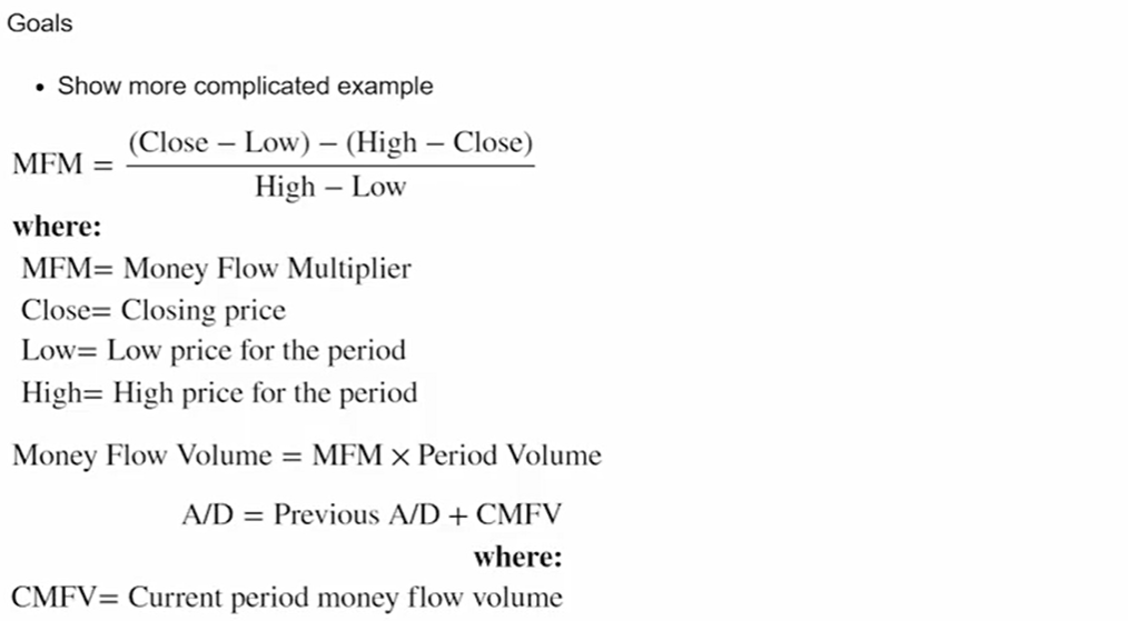
- MFM(Money Flow Multiplier):资金流动乘数,用于衡量收盘价相对当天价格区间的位置,范围在-1, 1,越接近 1 表示更靠近高点(资金流入),越接近 -1 表示更靠近低点(资金流出)。
- Money Flow Volume(资金流动量):把价格位置信息与成交量结合起来,收盘越靠近高点,且成交量越大,说明有更多资金"流入"。
- A/D 是一个累计值,用来判断市场是否处于吸筹(Accumulation)还是派发(Distribution)。
实现逻辑:
python
(aapl
 .assign(mfm=((aapl.Close - aapl.Low) - (aapl.High - aapl.Close))/(aapl.High - aapl.Low),
         mfv=lambda df_:df_.mfm * df_.Volume, # lambda将采用数据帧的当前值
         cmfv=lambda df_:df_.mfv.cumsum()
         )

)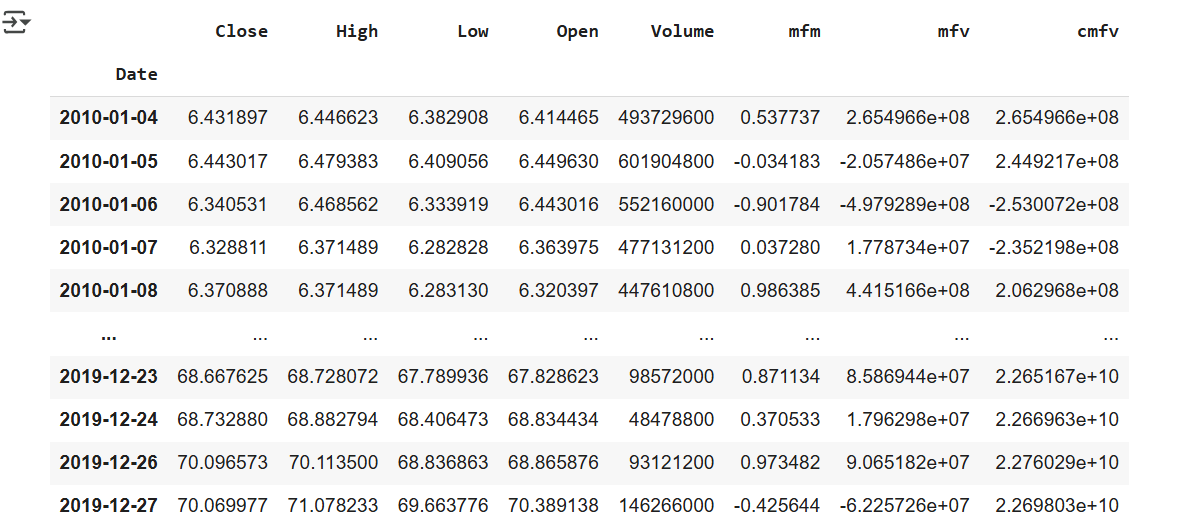
python
# 重构为一个函数
def calc_ad(df, close_col='Close', low_col='Low', high_col='High',vol_col='Volume'):
close = df[close_col]
low = df[low_col]
high = df[high_col]
return (df
.assign(mfm=((close - low) -(high - close))/(high - low),
mfv=lambda df_: df_. mfm * df_[vol_col],
cmfv=lambda df_: df_. mfv.cumsum())
.cmfv
)
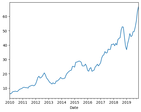
(aapl
.assign(ad=calc_ad)
.ad
.plot()
)!在这里插入图片描述(https://i-blog.csdnimg.cn/direct/9b0a4fe5d9624d968f56b97b499d801c.png
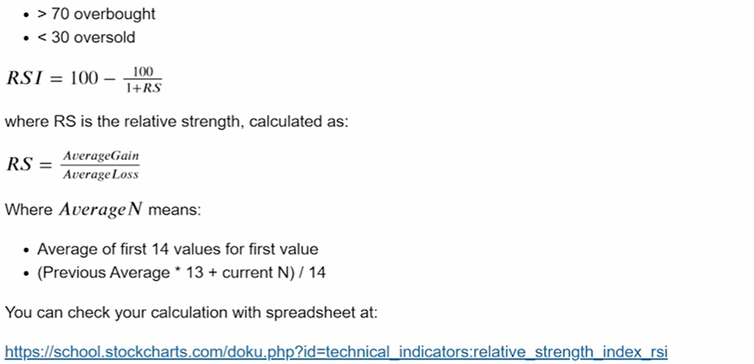
4.3. RSI
Create code to create an Relative Strength Income(RSI) column. Relative Strength Index is a popular momentum indicator
RSI(Relative Strength Index, 相对强弱指数)是一种常用的技术分析指标,用于衡量股票或其他资产价格的近期涨跌强度,帮助判断市场是否处于超买或超卖状态。RSI 的应用意义:
- 超买区:RSI 通常高于 70,意味着价格上涨过快,可能出现回调。
- 超卖区:RSI 通常低于 30,意味着价格下跌过快,可能出现反弹。
- 趋势判断:RSI 可以帮助确认价格趋势的强度和反转信号。
python
(aapl
 .assign(mfm=((aapl.Close - aapl.Low) - (aapl.High - aapl.Close))/(aapl.High - aapl.Low),
         mfv=lambda df_:df_.mfm * df_.Volume, # lambda将采用数据帧的当前值
         cmfv=lambda df_:df_.mfv.cumsum()
         )

)
python
# prompt: Create 14-day RSI column

def rsi(df: pd.DataFrame, window: int = 14) -> pd.DataFrame:
  """
  Calculates the Relative Strength Index (RSI) for a given DataFrame.

  Args:
    df: The input DataFrame with a 'Close' column.
    window: The lookback window for RSI calculation (default is 14).

  Returns:
    The DataFrame with an added 'RSI' column.
  """
  delta = df['Close'].diff()

  up, down = delta.copy(), delta.copy()
  up[up < 0] = 0
  down[down > 0] = 0

  # Use rolling mean
  avg_gain = up.rolling(window=window).mean()
  avg_loss = abs(down.rolling(window=window).mean())

  rs = avg_gain / avg_loss
  df['RSI'] = 100 - (100 / (1 + rs))

  return df.RSI

# aapl = rsi(aapl)
# print(aapl.head(16))
(aapl
  .assign(rsi_14=rsi(aapl))
  .rsi_14
  # .plot()
)