【声明】本博客所有内容均为个人业余时间创作,所述技术案例均来自公开开源项目(如Github,Apache基金会),不涉及任何企业机密或未公开技术,如有侵权请联系删除
背景
上篇 blog
【Ubuntu】【Hugo】搭建私人博客:侧边导航栏(三)
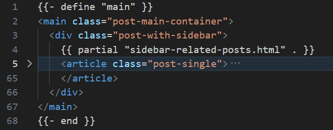
分析了 Flexbox 和 Grid 两种布局方式,并给除了 sidebar-related-posts.html 模板,下面就 sidebar-related-posts.html 继续分析
搭建私人博客
sidebar-related-posts.html 内容如下
go
{{ $currentPage := . }}
{{ $relatedPages := slice }}
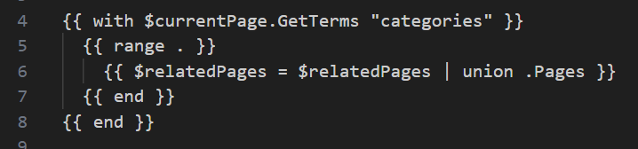
{{ with $currentPage.GetTerms "categories" }}
{{ range . }}
{{ $relatedPages = $relatedPages | union .Pages }}
{{ end }}
{{ end }}
{{ if $relatedPages }}
<div class="sidebar-related">
<h4>相关分类文章</h4>
<ul>
{{ range first 10 (shuffle (uniq $relatedPages)) }}
{{ if ne .Permalink $currentPage.Permalink }}
<li><a href="{{ .Permalink }}">{{ .Title }}</a></li>
{{ end }}
{{ end }}
</ul>
</div>
{{ end }}第二部分:根据 categories 分类查找相关文章
这里有几个点:
GetTerms "categories":获取当前文章所属的所有分类with:Go 模板标准库的控制结构,相当于如果这个值存在且非空,则进入下面的块内range:遍历当前文章的所有分类,比如["【Ubuntu】","【Gitlab】"].Page:获取该分类下的所有文章页面union:Hugo 内置模板函数(非原生 Go 模板语法),可以将当前分类的文章列表合并到$relatedPages中,并自动去重,比如假设当前文章同时属于分类 A 和 分类 B,其中,分类 A 有文章[1,2,3],分类 B 有文章[3,4,5],那么合并后$relatedPages = [1,2,3,4,5]
第三部分:渲染相关文章列表(最多10篇,排除自己这篇)
go
{{ if $relatedPages }}
<div class="sidebar-related">
  <h4>相关分类文章</h4>
  <ul>
如果找到了相关文章(此时列表非空),才显示侧边栏区域
go
{{ range first 10 (shuffle (uniq $relatedPages)) }}这行是核心,从右往左看,这里 () 是 Hugo 对管道 | 的等价写法:
uniq $relatedPages:去除重复文章,因为多个分类可能包含同一篇文章shuffle (...):随机打乱顺序,避免总是显示最新或最旧的first 10 (...):只取前 10 篇
go
{{ if ne .Permalink $currentPage.Permalink }}
  <li><a href="{{ .Permalink }}">{{ .Title }}</a></li>
{{ end }}
这里 ne 表示 no equal 不等于,也就是排除当前文章自己,否则会推荐自己,只负责现时其他文章的标题链接
OK,总结一下,sidebar-related-posts.html 模板的作用就是:基于当前文章的分类,智能推荐一批相关,不重复,不包含自己的其他文章,最多10篇,顺序随机
OK,分析完侧边栏模板,再来看 CSS 布局,下面先直接给出基于前面 blog 介绍的 single.html 与 sidebar-related-posts.html 的 CSS 布局
css
/* === 仅在文章页限制主容器宽度 === */
body .main:has(.post-with-sidebar) {
  max-width: 1920px !important;
  margin: 0 auto !important; /* 居中 */
}

/* === 双栏布局:确保 .post-with-sidebar 占满可用宽度 === */
.post-with-sidebar {
  display: flex !important;
  flex-direction: row !important;
  gap: 2rem !important;
}

.post-with-sidebar .sidebar-related {
  width: 300px !important;
  flex-shrink: 0 !important;
  position: sticky !important;
  top: calc(var(--header-height, 80px) + 1rem) !important;
  height: calc(100vh - var(--header-height, 80px) - 2rem) !important;
  overflow-y: auto !important;
  padding-right: 1rem !important;
  border-right: 1px solid var(--border-color, #eee) !important;
  background: var(--theme-bg, #fff) !important;
  box-sizing: border-box !important;
  margin-top: 3rem !important;
  margin-bottom: 2rem !important;
}

.post-with-sidebar .sidebar-related,
.post-with-sidebar .sidebar-related *,
.post-with-sidebar .sidebar-related a {
  font-size: 1rem !important;
  line-height: 1.5 !important;
  color: var(--text-color-secondary, #666) !important;
}

.post-with-sidebar .post-single {
  flex: 1 !important;
  max-width: 720px !important;
  min-width: 400px !important;
  margin-top: 3rem !important;
  margin-bottom: 2rem !important;
}

/* === 移动端适配 === */
@media (max-width: 768px) {
  .post-with-sidebar {
    flex-direction: column !important;
  }
  .post-with-sidebar .sidebar-related {
    height: auto !important;
    position: static !important;
    border-right: none !important;
    border-bottom: 1px solid var(--border-color, #eee) !important;
    padding-bottom: 1rem !important;
    margin-bottom: 1.5rem !important;
  }
}

/* === 强制修复文章顶部间距 === */
.post-with-sidebar .post-single {
  margin-top: 3rem !important; /* 增大顶部间距 */
  margin-bottom: 2rem !important;
}
OK,再来详细分析下这里的布局
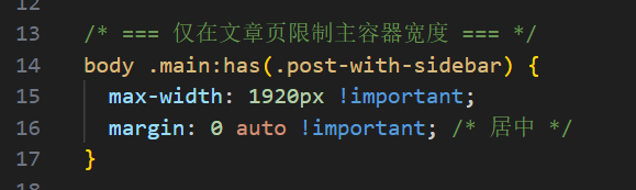
body .main:has(.post-with-sidebar):表示选中 <body> 下的 .main 元素,前提是 .main 的内部要包含一个 class 为 .post-with-sidebar 的子元素,这里的 :has() 是 CSS 父选择器(新特性,现代浏览器支持,但旧版比如 IE 不支持)
比如这里编译后,可以看到 <body> 中的 .main 元素里包含了 .post-with-sidebar
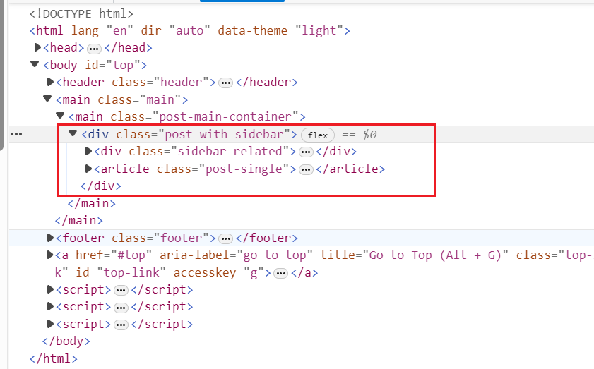
这个特点和 single.html 里面定义的结构是一样的,.main 包含 .post-with-sidebar,.post-with-sidebar 再包含 sidebar-related-posts.html 和 article
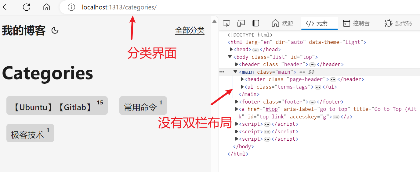
这个包含 .post-with-sidebar 条件的意义在于,这个 CSS 样式布局,只针对 single.html,也就是文章内容,才有双栏布局,比如下面其他页面,比如分类页面,是没有 .post-with-sidebar 的,也就不需要双栏布局
然后是设置 .main 样式(双栏布局)的 CSS 样式
-
max-width: 1920px: 最大宽度不超过 1920 像素(一般显示器分辨率是 1920x1080)

-
margin: 0 auto:水平居中,左右 margin 自动 -
!important:强制覆盖其他可能存在的样式,如果发生插件冲突时优先选择这个 CSS 样式
这样整体效果可以让文章页的内容区域不会太宽(提升阅读体验),居中对齐,就和原来的单栏布局差不多
OK,本篇先到这里,如有疑问,欢迎评论区留言讨论,祝各位功力大涨,技术更上一层楼!!!更多内容见下篇 blog
【Ubuntu】【Hugo】搭建私人博客:侧边导航栏(五)