
一:摘要:
本文聚焦于Button 组件的迁移:从 Bootstrap 的 btn 系列切换到 Angular Material(M3)体系下的 mat-raised-button 与 mat-icon-button。涵盖风险清单、语义映射、M3 主题策略、自动化替换脚本、验证方案与问题处理(如禁用按钮的 Tooltip)。
二:背景与目标:
• 现状:项目已并存 @angular/material@18 和 ngx-bootstrap@8,且已有全局 M3 主题。
• 迁移范围:仅替换 <button>,不修改 <a>。
• Material 规则:只使用 mat-raised-button 与 mat-icon-button;M3 下不使用 color 属性(该属性仅在 M2 生效),用 类名+Scoped 主题实现色彩与状态。
三:风险清单(迁移前应知):
1. 颜色来源变化:
Bootstrap 的 btn-primary/secondary/danger 是静态色;Material M3 的色彩来自主题(palettes/roles),不再靠 color="..."。
2. 尺寸与密度:
Bootstrap 的 btn-lg/btn-sm/btn-block 需迁移为布局 CSS 或主题密度(M3 的 density),无 1:1 类映射。
3. Ripple & Overlay:
Material 默认有涟漪(ripple)与 overlay 行为;如需关闭或局部调整,需使用 disableRipple 或覆盖 CSS 变量。
4. 组件搭配规则:
避免无效或冲突组合(例如 mat-menu-item 只能用于菜单项,不可与 mat-raised-button 嵌套)。
5. 交互事件差异:
事件绑定语法保持不变,但禁用态、焦点行为、Keyboard 支持等可能不同。
四:语义映射(btn → mat)
原则:语义优先(primary/success/danger 等表达语义),通过类名绑定到局部主题作用域。
• 基本按钮
Bootstrap:<button class="btn btn-primary">提交
Material(M3):<button mat-raised-button class="mat-btn mat-btn-primary">提交
• 仅图标按钮(无文字或以图标为主)
Bootstrap:<button class="btn btn-light">
Material(M3):<button mat-icon-button aria-label="编辑" class="mat-btn mat-btn-icon">
说明:保留 <i class="fa ...">;加上 aria-label 以提升可访问性。
• 块级宽度(btn-block)
Bootstrap:btn-block
Material:通过容器 CSS(如 .w-100 或 display: block; width:100%),不强制修改按钮本身。
五:M3 主题策略(局部主题作用域)
为不同语义(如 success/danger/warn/info)提供局部主题类,并在模板中用类名选择:
处于将来升级的考虑,我们使用M3主题,更多请参阅:主题
全局主题(已存在)示例
css
@use 'sass:map';
@use '@angular/material' as mat;
@include mat.core();

$theme: mat.define-theme((
  color: (
    theme-type: light,
    primary: mat.$azure-palette,
  ),
  typography: (
    brand-family: 'Comic Sans',
    bold-weight: 900
  ),
  density: (
    scale: -1
  )
));

html {
  @include mat.all-component-themes($theme);
}
局部主题(成功样式)示例:
新建主题及效果,颜色选值 文档,当然也可以自定义。
css
@use '@angular/material' as mat;
@use 'global' as var;
@use 'sass:map';

// 从你的自定义调色板集合里取出 success(假设 var.$palettes 结构与 M3 tones 一致)
$_success: map.get(var.$palettes, success);

// ------ 关键:构造"辅助调色板集合"并合并到 primary ------
// 如果你在 var.$palettes 中也维护了 secondary / neutral / neutral-variant / error,按需取出;
// 若没有,可以先用默认或从设计稿里补齐。
$_rest: (
  secondary: map.get(var.$palettes, secondary),
  neutral: map.get(var.$palettes, neutral),
  neutral-variant: map.get(var.$palettes, neutral-variant),
  error: map.get(var.$palettes, error),
);

// 把辅助调色板合入 primary,得到一个"完整的 M3 primary palette"
$_primary: map.merge($_success, $_rest);

// 如果你也需要自定义 tertiary,可同样合并(这里演示保留默认)
// 用你自己的 tertiary,或用 Angular Material 预置的某个 M3 palette
$_tertiary: map.merge(
  map.get(var.$palettes, tertiary),
  $_rest
);

$success-theme: mat.define-theme((
  color: (
    theme-type: light,
    primary: $_primary,
    tertiary: $_tertiary,
  ),
  typography: (
    plain-family: 'Open Sans, sans-serif',
    brand-family: 'Open Sans, sans-serif',
    bold-weight: 700,
    medium-weight: 500,
    regular-weight: 300,
  ),
  density: (
    scale: -1,
  ),
));

// 把 "success 主题" 仅应用到 .mat-btn-success 作用域
.mat-btn-success {
  @include mat.button-theme($success-theme);
}
不要忘了把这个按钮主题文件应用到全局文件中。
css
@use 'mat-btn' as btn;
其它主题以此类推
六:迁移脚本
js
// scripts/migrate-buttons.mjs
import { promises as fs } from 'node:fs';
import path from 'node:path';
/**
* Usage examples:
* node scripts/migrate-buttons.mjs --dir=client/app/components --ext=.html --backup
* node scripts/migrate-buttons.mjs --dry-run
*/
const args = new Map(
process.argv.slice(2).flatMap(a => {
const m = a.match(/^--([^=]+)(?:=(.+))?$/);
return m ? [[m[1], m[2] ?? true]] : [];
}),
);
const ROOT_DIR = path.resolve(process.cwd(), args.get('dir') || 'client/app/components');
const EXT = String(args.get('ext') || '.html');
const DRY_RUN = Boolean(args.get('dry-run'));
const BACKUP = Boolean(args.get('backup'));
// Bootstrap -> mat-btn-*(后缀保持一致)
const SAME_SUFFIX = [
'primary', 'secondary', 'success', 'info', 'danger', 'warning', 'light', 'dark', 'link',
];
const CLASS_MAP = new Map([
// 实心
...SAME_SUFFIX.map(sfx => [`btn-${sfx}`, `mat-btn-${sfx}`]),
// outline 同样保持后缀一致(最终仍映射到同一类,外观统一为 raised)
...SAME_SUFFIX.map(sfx => [`btn-outline-${sfx}`, `mat-btn-${sfx}`]),
]);
// 移除的 Bootstrap 基类
const BOOTSTRAP_BASE_CLASSES = new Set(['btn', 'btn-sm', 'btn-lg']);
// Material 冲突/跳过的组件型指令(遵守组件规则)
const MATERIAL_SKIP_ATTRS = [
'mat-menu-item', // 菜单项:不能再挂按钮指令
'mat-fab', // 浮动按钮:独占元素
'mat-mini-fab',
];
// 已有目标外观 → 整个按钮跳过
const MATERIAL_TARGET_ATTRS = [
'mat-raised-button',
'mat-icon-button',
];
// 递归列出指定扩展名文件
async function listFiles(dir, ext, acc = []) {
const entries = await fs.readdir(dir, { withFileTypes: true });
for (const e of entries) {
const full = path.join(dir, e.name);
if (e.isDirectory()) {
await listFiles(full, ext, acc);
} else if (e.isFile() && full.endsWith(ext)) {
acc.push(full);
}
}
return acc;
}
// 是否仅图标内容(<i class="fa ..."> 或 <mat-icon>,且无文本)
function isIconOnly(innerHtml) {
const cleaned = innerHtml
.replace(/<!--[\s\S]*?-->/g, '')
.replace(/\s+/g, '')
.replace(/ /g, '');
const onlyFA = /^<i[^>]*class=["'][^"']*?\bfa\b[^"']*["'][^>]*><\/i>$/.test(cleaned)
|| /^<i[^>]*class=["'][^"']*?\bfa\b[^"']*["'][^>]*\/>$/.test(cleaned);
const onlyMatI = /^<mat-icon\b[^>]*>[\s\S]*<\/mat-icon>$/.test(cleaned);
return onlyFA || onlyMatI;
}
// 迁移 class 属性:映射 Bootstrap 类、移除基类、保留其他自定义类
function migrateClassAttr(openTag) {
const m = openTag.match(/\bclass\s*=\s*(['"])(.*?)\1/i);
if (!m) return openTag;
const quote = m[1];
const classes = m[2].trim().split(/\s+/);
const keep = [];
const add = new Set();
for (const c of classes) {
if (BOOTSTRAP_BASE_CLASSES.has(c)) continue; // 去掉 btn/btn-sm/btn-lg
const mapped = CLASS_MAP.get(c);
if (mapped) { add.add(mapped); continue; }
keep.push(c); // 其他类保留(如 pull-right/view-chart 等)
}
const next = Array.from(new Set([...keep, ...add])).join(' ').trim();
const newAttr = next ? `class=${quote}${next}${quote}` : '';
return openTag.replace(m[0], newAttr || '').replace(/\s+>/, '>');
}
// 清理与按钮外观相关的 Material 属性(为统一外观做准备)& 移除 M2 的 color 属性(M3 无效)
function stripMaterialButtonAttrs(openTag) {
// 仅移除会与我们"统一外观"冲突的按钮属性:mat-button/mat-flat/stroked
let s = openTag.replace(/\s+mat-(?:button|flat-button|stroked-button)\b/g, '');
// 移除 color="..."(M3 不使用 color)
s = s.replace(/\s+color\s*=\s*(['"]).*?\1/g, '');
return s;
}
// 检查是否包含任意属性
function hasAnyAttr(openTag, attrList) {
return attrList.some(a => new RegExp(`\\b${a}\\b`).test(openTag));
}
// 注入唯一允许的外观属性:mat-icon-button 或 mat-raised-button
function injectMaterialAttr(openTag, iconOnly) {
const attr = iconOnly ? 'mat-icon-button' : 'mat-raised-button';
return openTag.replace(/^<\s*button\b/, match => `${match} ${attr}`);
}
// 迁移一个完整的 <button>...</button> 片段
function transformButtonTag(full) {
const openTagMatch = full.match(/^<\s*button\b[^>]*>/i);
if (!openTagMatch) return full;
const openTag = openTagMatch[0];
const inner = full.slice(openTag.length, full.lastIndexOf('</')).trim();
// 1) 已有目标外观 → 完整跳过(不改任何内容)
if (hasAnyAttr(openTag, MATERIAL_TARGET_ATTRS)) {
return full;
}
// 2) Material 冲突组件(菜单项/浮动按钮)→ 不注入按钮外观,仅做类迁移 & 移除 color
if (hasAnyAttr(openTag, MATERIAL_SKIP_ATTRS)) {
let nextOpen = migrateClassAttr(openTag);
nextOpen = nextOpen.replace(/\s+color\s*=\s*(['"]).*?\1/g, ''); // 移除 M2 color
return nextOpen + full.slice(openTag.length);
}
// 3) 普通按钮路径:
// a. 类迁移
// b. 清理其它按钮外观(mat-button/mat-flat/mat-stroked)
// c. 注入两种允许外观之一
const iconOnly = isIconOnly(inner);
let nextOpen = migrateClassAttr(openTag);
nextOpen = stripMaterialButtonAttrs(nextOpen);
nextOpen = injectMaterialAttr(nextOpen, iconOnly);
return nextOpen + full.slice(openTag.length);
}
// 对整份 HTML 做替换(只处理 <button>,不动 <a>)
function transformHtml(html) {
return html.replace(/<button\b[^>]*>[\s\S]*?<\/button>/gi, tag => transformButtonTag(tag));
}
async function main() {
console.log(`Scanning: ${ROOT_DIR} (ext: ${EXT})`);
const files = await listFiles(ROOT_DIR, EXT);
let changed = 0;
for (const f of files) {
const src = await fs.readFile(f, 'utf8');
const out = transformHtml(src);
if (out !== src) {
if (DRY_RUN) {
console.log(`~ would migrate: ${path.relative(process.cwd(), f)}`);
continue;
}
if (BACKUP) {
await fs.writeFile(`${f}.bak`, src, 'utf8');
}
await fs.writeFile(f, out, 'utf8');
changed++;
console.log(`✓ migrated: ${path.relative(process.cwd(), f)}`);
}
}
console.log(`\nDone. Updated files: ${changed}/${files.length}`);
}
main().catch(err => {
console.error(err);
process.exit(1);
});七:验证与回归(批量与视觉)
1:正则批量扫描
用 grep 或脚本检查关键点:
js
// 冲突检查,应无输出
grep -R --line-number "<button[^>]*mat-menu-item[^>]*mat-raised-button" client/app/components
grep -R --line-number "<button[^>]*mat-menu-item[^>]*mat-icon-button" client/app/components

// 非 <button> 修改检查,应无输出
grep -R --line-number "<a[^>]*mat-raised-button" client/app/components

// 类名映射检查,应无输出
grep -R --line-number "btn-" client/app/components
2:使用脚本辅助验证
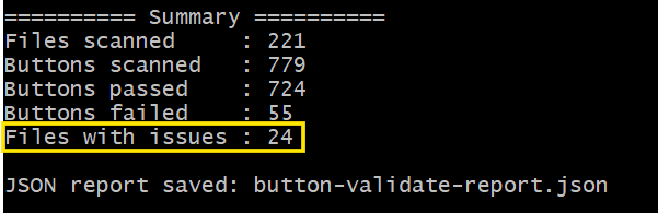
validate-buttons.mjs是通过验收目标的规则生成的,运行之后很容易发现哪些文件存在问题:
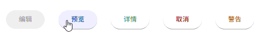
3:视觉回归和人工抽样检查
matTooltip不显示了:
因为大多数浏览器对于禁用的元素不会触发mouseenter事件。一种解决方法是将 matTooltip 添加到父元素:
html
<div matTooltip="当前记录不可编辑" matTooltipClass="body">
    <button mat-raised-button type="button" class="mat-btn-success" [disabled]="true">编辑</button>
</div>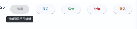
Material 样式未生效:检查模块注册与主题引入顺序;确保 @include mat.all-component-themes(...) 已应用到 html 或全局作用域;局部主题文件通过 @use 引入。
总结:
• 明确语义(primary/success...)→ 用类名+局部主题映射到 M3。
• 自动化脚本只处理 <button>,避免跨组件误改。
• 验证脚本 + 视觉回归,快速发现 Tooltip 、模块注册等细节问题。