通过网盘分享的文件:flutter1.zip
链接: https://pan.baidu.com/s/1jkLZ9mZXjNm0LgP6FTVRzw 提取码: 2t97
加载状态是用户体验的重要环节。传统的转圈圈让用户不知道要等多久,而骨架屏(Shimmer Loading)能预示内容的布局,让等待变得不那么焦虑。
这篇文章会实现骨架屏加载组件,讲解 shimmer 动画原理、深色模式适配,以及如何设计一个通用的骨架屏组件。
骨架屏 vs 转圈圈
为什么骨架屏比转圈圈更好?
预期管理:骨架屏展示了内容的大致布局,用户知道加载完会是什么样子。
感知速度:研究表明,骨架屏让用户感觉加载更快,即使实际时间一样。
视觉连贯:骨架屏到真实内容的过渡更自然,不会有突然出现的感觉。
减少焦虑:转圈圈让人不知道要等多久,骨架屏让等待变得可预期。
shimmer 包的使用
Flutter 有个 shimmer 包,提供了闪烁动画效果:
yaml
dependencies:
  shimmer: ^3.0.0
dart
import 'package:shimmer/shimmer.dart';shimmer 的原理是在子组件上叠加一个从左到右移动的高亮条,产生闪烁效果。
骨架屏组件结构
dart
import 'package:flutter/material.dart';
import 'package:shimmer/shimmer.dart';

class ShimmerLoading extends StatelessWidget {
  final int itemCount;
  final bool isGrid;

  const ShimmerLoading({super.key, this.itemCount = 6, this.isGrid = true});
itemCount 控制骨架项的数量,默认 6 个。
isGrid 控制是网格还是列表形式,默认是网格。
两个参数就能适应大多数场景。
深色模式适配
dart
@override
Widget build(BuildContext context) {
  final isDark = Theme.of(context).brightness == Brightness.dark;
  final baseColor = isDark ? Colors.grey[800]! : Colors.grey[300]!;
  final highlightColor = isDark ? Colors.grey[700]! : Colors.grey[100]!;
骨架屏的颜色要适配深色模式:
浅色模式:baseColor 是浅灰色,highlightColor 是更浅的灰色。
深色模式:baseColor 是深灰色,highlightColor 是稍浅的深灰色。
这样骨架屏在任何主题下都能和谐融入界面。
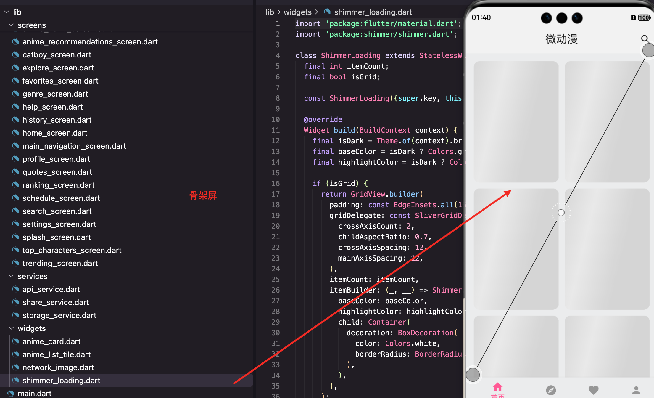
网格形式骨架屏
dart
if (isGrid) {
  return GridView.builder(
    padding: const EdgeInsets.all(16),
    gridDelegate: const SliverGridDelegateWithFixedCrossAxisCount(
      crossAxisCount: 2,
      childAspectRatio: 0.7,
      crossAxisSpacing: 12,
      mainAxisSpacing: 12,
    ),
    itemCount: itemCount,
    itemBuilder: (_, __) => Shimmer.fromColors(
      baseColor: baseColor,
      highlightColor: highlightColor,
      child: Container(
        decoration: BoxDecoration(
          color: Colors.white,
          borderRadius: BorderRadius.circular(12),
        ),
      ),
    ),
  );
}
网格骨架屏的布局和真实的动漫卡片网格一致:2 列、0.7 的宽高比、12 像素间距。
Shimmer.fromColors 包裹占位容器,添加闪烁动画。
itemBuilder 的两个参数都不用,所以用 _ 和 __ 表示。
列表形式骨架屏
dart
return ListView.builder(
  padding: const EdgeInsets.all(16),
  itemCount: itemCount,
  itemBuilder: (_, __) => Shimmer.fromColors(
    baseColor: baseColor,
    highlightColor: highlightColor,
    child: Container(
      height: 80,
      margin: const EdgeInsets.only(bottom: 12),
      decoration: BoxDecoration(
        color: Colors.white,
        borderRadius: BorderRadius.circular(12),
      ),
    ),
  ),
);
列表骨架屏每项高度 80 像素,底部间距 12 像素,和真实的列表项布局一致。
Shimmer.fromColors 详解
dart
Shimmer.fromColors(
  baseColor: Colors.grey[300]!,
  highlightColor: Colors.grey[100]!,
  child: Container(
    color: Colors.white,
    // 其他属性
  ),
)
baseColor 是基础颜色,占位块的主要颜色。
highlightColor 是高亮颜色,闪烁时的亮色。
child 是要添加闪烁效果的组件。
shimmer 会在 child 上叠加一个从左到右移动的渐变高亮,产生闪烁效果。
更精细的骨架屏
可以设计更接近真实内容的骨架屏:
dart
Widget _buildDetailedShimmerItem() {
  return Shimmer.fromColors(
    baseColor: baseColor,
    highlightColor: highlightColor,
    child: Container(
      padding: const EdgeInsets.all(12),
      child: Row(
        children: [
          // 图片占位
          Container(
            width: 50,
            height: 70,
            decoration: BoxDecoration(
              color: Colors.white,
              borderRadius: BorderRadius.circular(8),
            ),
          ),
          const SizedBox(width: 12),
          // 文字占位
          Expanded(
            child: Column(
              crossAxisAlignment: CrossAxisAlignment.start,
              children: [
                Container(
                  height: 16,
                  width: double.infinity,
                  decoration: BoxDecoration(
                    color: Colors.white,
                    borderRadius: BorderRadius.circular(4),
                  ),
                ),
                const SizedBox(height: 8),
                Container(
                  height: 12,
                  width: 100,
                  decoration: BoxDecoration(
                    color: Colors.white,
                    borderRadius: BorderRadius.circular(4),
                  ),
                ),
              ],
            ),
          ),
        ],
      ),
    ),
  );
}
这个骨架屏模拟了列表项的布局:左边是图片占位,右边是两行文字占位。
用户一看就知道加载完会是什么样的列表。
单个卡片骨架屏
有时候只需要一个骨架卡片:
dart
class ShimmerCard extends StatelessWidget {
  const ShimmerCard({super.key});

  @override
  Widget build(BuildContext context) {
    final isDark = Theme.of(context).brightness == Brightness.dark;
    return Shimmer.fromColors(
      baseColor: isDark ? Colors.grey[800]! : Colors.grey[300]!,
      highlightColor: isDark ? Colors.grey[700]! : Colors.grey[100]!,
      child: Container(
        decoration: BoxDecoration(
          color: Colors.white,
          borderRadius: BorderRadius.circular(12),
        ),
      ),
    );
  }
}
ShimmerCard 是一个简单的骨架卡片,可以在任何需要的地方使用。
骨架屏的使用方式
dart
// 网格骨架屏
if (isLoading) {
  return const ShimmerLoading(itemCount: 8, isGrid: true);
}

// 列表骨架屏
if (isLoading) {
  return const ShimmerLoading(itemCount: 6, isGrid: false);
}

// 在 FutureBuilder 中使用
FutureBuilder<List<Anime>>(
  future: _animeFuture,
  builder: (context, snapshot) {
    if (snapshot.connectionState == ConnectionState.waiting) {
      return const ShimmerLoading(itemCount: 8, isGrid: true);
    }
    // 显示真实数据
  },
)
骨架屏替代了传统的 CircularProgressIndicator,用户体验更好。
自定义动画速度
shimmer 的动画速度可以调整:
dart
Shimmer.fromColors(
  baseColor: baseColor,
  highlightColor: highlightColor,
  period: const Duration(milliseconds: 1500),  // 动画周期
  child: Container(...),
)
period 控制一次闪烁的时间,默认是 1500 毫秒。
时间短闪烁快,给人加载很快的感觉;时间长闪烁慢,更平静。
自定义动画方向
dart
Shimmer.fromColors(
  baseColor: baseColor,
  highlightColor: highlightColor,
  direction: ShimmerDirection.ltr,  // 从左到右
  child: Container(...),
)
ShimmerDirection 有四个值:ltr(左到右)、rtl(右到左)、ttb(上到下)、btt(下到上)。
默认是 ltr,符合阅读习惯。
不使用 shimmer 包的实现
如果不想引入额外的包,可以自己实现:
dart
class CustomShimmer extends StatefulWidget {
  final Widget child;

  const CustomShimmer({super.key, required this.child});

  @override
  State<CustomShimmer> createState() => _CustomShimmerState();
}

class _CustomShimmerState extends State<CustomShimmer>
    with SingleTickerProviderStateMixin {
  late AnimationController _controller;

  @override
  void initState() {
    super.initState();
    _controller = AnimationController(
      duration: const Duration(milliseconds: 1500),
      vsync: this,
    )..repeat();
  }

  @override
  void dispose() {
    _controller.dispose();
    super.dispose();
  }

  @override
  Widget build(BuildContext context) {
    return AnimatedBuilder(
      animation: _controller,
      builder: (context, child) {
        return ShaderMask(
          shaderCallback: (bounds) {
            return LinearGradient(
              begin: Alignment.centerLeft,
              end: Alignment.centerRight,
              colors: const [
                Colors.grey,
                Colors.white,
                Colors.grey,
              ],
              stops: [
                _controller.value - 0.3,
                _controller.value,
                _controller.value + 0.3,
              ],
            ).createShader(bounds);
          },
          child: child,
        );
      },
      child: widget.child,
    );
  }
}
用 AnimationController 控制动画,ShaderMask 叠加渐变效果。
原理是让渐变的位置随时间移动,产生闪烁效果。
骨架屏的设计原则
布局一致:骨架屏的布局要和真实内容一致,让过渡自然。
颜色协调:颜色要和背景协调,不能太突兀。
数量合理:骨架项的数量要和预期的数据量接近。
动画适度:闪烁不能太快也不能太慢,1-2 秒一个周期比较合适。
骨架屏的过渡动画
从骨架屏到真实内容可以加过渡动画:
dart
AnimatedSwitcher(
  duration: const Duration(milliseconds: 300),
  child: isLoading
      ? const ShimmerLoading(key: ValueKey('shimmer'))
      : ListView.builder(
          key: const ValueKey('content'),
          itemCount: items.length,
          itemBuilder: (_, i) => ItemWidget(item: items[i]),
        ),
)
AnimatedSwitcher 在子组件切换时添加淡入淡出动画。
key 必须不同,AnimatedSwitcher 才知道是不同的组件。
局部骨架屏
有时候只需要局部加载:
dart
Column(
  children: [
    // 已加载的头部
    const HeaderWidget(),

    // 加载中的列表
    if (isLoading)
      const Expanded(child: ShimmerLoading(isGrid: false))
    else
      Expanded(
        child: ListView.builder(...),
      ),
  ],
)
头部已经有数据,只有列表部分在加载,就只显示列表的骨架屏。
骨架屏的性能
骨架屏有动画,要注意性能:
dart
// 不要在骨架屏里放太多复杂的组件
Shimmer.fromColors(
  baseColor: baseColor,
  highlightColor: highlightColor,
  child: Container(
    decoration: BoxDecoration(
      color: Colors.white,
      borderRadius: BorderRadius.circular(12),
    ),
  ),
)
骨架屏的 child 应该尽量简单,只用 Container 和基本形状。
不要在骨架屏里放 Image、Text 等复杂组件,它们不会显示,只会浪费性能。
小结
骨架屏涉及的技术点:shimmer 包 、Shimmer.fromColors 、深色模式适配 、AnimatedSwitcher 过渡动画 、自定义动画实现。
骨架屏比转圈圈更好的原因:预示内容布局、感知速度更快、视觉过渡自然、减少等待焦虑。
设计骨架屏要注意:布局和真实内容一致、颜色和背景协调、动画速度适中、child 组件简单。
好的加载状态能显著提升用户体验,骨架屏是现代 App 的标配。
欢迎加入开源鸿蒙跨平台社区:https://openharmonycrossplatform.csdn.net