文章目录
-
- [SnipTrip 简介](#SnipTrip 简介)
- 设计目标
- 菜单结构与尺寸基线
- 菜单定位逻辑(贴纸边缘优先)
- [核心材质方案(iOS 26 Liquid Glass)](#核心材质方案(iOS 26 Liquid Glass))
-
- 1) 外壳玻璃(统一采样) 外壳玻璃(统一采样))
- 2) 玻璃元素统一容器 玻璃元素统一容器)
- 3) 按下高光(交互态) 按下高光(交互态))
- 深色模式增强方案(折射感更强)
-
- 1) 外壳轻微 tint 外壳轻微 tint)
- 2) 亮边高光(rim highlight) 亮边高光(rim highlight))
- 3) 顶部反光带 顶部反光带)
- 4) 内层厚度(夹层雾面) 内层厚度(夹层雾面))
- 5) 背景环境光(菜单出现时) 背景环境光(菜单出现时))
- 浅色模式策略(保持轻盈)
- [iOS 26 以下的降级策略](#iOS 26 以下的降级策略)
- 参数清单(可直接对照实现)
- 菜单效果展示
- 总结
SnipTrip 简介
SnipTrip 是一款 iOS 贴纸拼贴与画布编辑应用:从照片中生成贴纸、放置到 A4 画布上进行拖拽、缩放、旋转编辑,并支持导出与分享。界面采用液态玻璃质感与 Apple Intelligence 风格光晕,强调可交互区域与视觉层级,并在深浅色模式下保持统一的质感与辨识度。
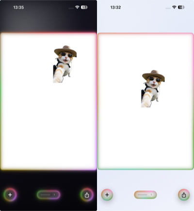
左:深色模式 | 右:浅色模式
设计目标
- 系统语义优先:以 iOS 26 Liquid Glass 语义为主,避免手绘模糊。
- 菜单层级清晰:外壳统一采样,内部按钮结构清楚。
- 深浅色一致:浅色轻盈,深色折射感强。
- 交互反馈克制:按下才出现高光,不添加常驻背景。
- 兼容降级:iOS 26 以下保持相近质感。
菜单结构与尺寸基线
布局层级
菜单采用 VStack(spacing: 0) 组织内容,使用 Divider() 分组:
- 复制
- 置顶 / 置底 / 镜像 / 重置变换
- 删除
- Tips(可选)
swift
VStack(spacing: 0) {
    menuButton("复制")
    Divider()
    menuButton("置顶")
    menuButton("置底")
    menuButton("镜像")
    menuButton("重置变换")
    Divider()
    deleteButton
    if showTip { Divider(); tipsRow }
}
尺寸与触控区域
- 菜单宽度:
228 - 行高:
50 - 行内左右内边距:
18 - Tips 高度:
34 - Divider 高度:系统默认 1px
swift
.frame(height: 50)
.frame(maxWidth: .infinity, alignment: .leading)
.padding(.horizontal, 18)
这套尺寸保证触控区域稳定,也便于后续定位与边界计算。
菜单定位逻辑(贴纸边缘优先)
菜单出现位置采用 右 → 左 → 下 → 上 优先级,并结合 menuSafeBounds 进行 clamp,避免越界与遮挡。
- 间距
gap = 12 - 内边距
padding = 16 - 菜单尺寸来自
menuWidth与menuHeight
swift
let rightFits = rightEdge + gap + halfWidth <= maxX
if rightFits { return CGPoint(x: rightEdge + gap + halfWidth, y: clampY) }

let leftFits = leftEdge - gap - halfWidth >= minX
if leftFits { return CGPoint(x: leftEdge - gap - halfWidth, y: clampY) }

let bottomFits = bottomEdge + gap + halfHeight <= maxY
if bottomFits { return CGPoint(x: clampX, y: bottomEdge + gap + halfHeight) }

let topFits = topEdge - gap - halfHeight >= minY
if topFits { return CGPoint(x: clampX, y: topEdge - gap - halfHeight) }
优先沿贴纸侧边展开,减少遮挡;无法满足时退化到边界内 clamp。
核心材质方案(iOS 26 Liquid Glass)
1) 外壳玻璃(统一采样)
玻璃效果只施加在菜单外壳,保证采样一致:
swift
.glassEffect(.regular, in: RoundedRectangle(cornerRadius: 22, style: .continuous))2) 玻璃元素统一容器
多玻璃元素放在同一 GlassEffectContainer 内,避免采样不一致导致的"假玻璃"。
swift
GlassEffectContainer {
    menuContent
}
3) 按下高光(交互态)
交互高光仅在按下时出现,避免常驻背景。按钮本体保持透明。
swift
struct MenuPressHighlightStyle: ButtonStyle {
    let cornerRadius: CGFloat
    func makeBody(configuration: Configuration) -> some View {
        configuration.label
            .overlay {
                if configuration.isPressed {
                    RoundedRectangle(cornerRadius: cornerRadius, style: .continuous)
                        .strokeBorder(.white.opacity(0.12), lineWidth: 0.6)
                        .blendMode(.screen)
                }
            }
    }
}
深色模式增强方案(折射感更强)
深色模式下玻璃易发灰,需要补充高光与对比。
1) 外壳轻微 tint
swift
.tint(.white.opacity(0.10))- 作用:让玻璃更"有色温",折射感明显。
- 建议区间:
0.06 ~ 0.14。
2) 亮边高光(rim highlight)
swift
.overlay {
    RoundedRectangle(cornerRadius: 22, style: .continuous)
        .strokeBorder(
            LinearGradient(
                colors: [
                    .white.opacity(0.22),
                    .white.opacity(0.08),
                    .clear
                ],
                startPoint: .topLeading,
                endPoint: .bottomTrailing
            ),
            lineWidth: 0.8
        )
        .blendMode(.screen)
}- 作用:补足玻璃边缘反射。
- 线宽区间:
0.6 ~ 1.0 px。
3) 顶部反光带
swift
.overlay {
    RoundedRectangle(cornerRadius: 22, style: .continuous)
        .fill(
            LinearGradient(
                colors: [
                    .white.opacity(0.14),
                    .white.opacity(0.04),
                    .clear
                ],
                startPoint: .top,
                endPoint: .center
            )
        )
        .blendMode(.screen)
}- 作用:提供"反光雾带"的材质层次。
- 透明度区间:
0.10 ~ 0.18。
4) 内层厚度(夹层雾面)
swift
.background {
    RoundedRectangle(cornerRadius: 22, style: .continuous)
        .fill(.white.opacity(0.04))
        .blur(radius: 0.5)
}- 作用:产生玻璃厚度感。
- 透明度区间:
0.03 ~ 0.06。
5) 背景环境光(菜单出现时)
swift
RadialGradient(
    colors: [.white.opacity(0.12), .white.opacity(0.04), .clear],
    center: .topLeading,
    startRadius: 10,
    endRadius: 240
)
.blendMode(.screen)- 作用:增强折射对比度,不改变界面结构。
浅色模式策略(保持轻盈)
浅色模式强调干净与层级,外壳保留轻描边,避免过度高光堆叠。
- 仅保留
strokeBorder轻描边 - 不额外叠加雾面或强反光
iOS 26 以下的降级策略
在旧系统上使用 .regularMaterial 与渐变高光叠加,保持相近视觉。
swift
.background {
    RoundedRectangle(cornerRadius: 22, style: .continuous)
        .fill(.regularMaterial)
        .overlay(sheenGradient)
        .overlay(tintGradient)
}sheenGradient:模拟玻璃高光tintGradient:补充色彩层次
参数清单(可直接对照实现)
cornerRadius: 22menuWidth: 228rowHeight: 50rowPadding: 18tipHeight: 34gap: 12menuPadding: 16- 深色
tint: 0.10 - 高光描边:
0.8 px,0.22 / 0.08 / clear渐变 - 顶部反光带:
0.14 / 0.04 / clear - 内层厚度:
0.04+blur 0.5 - 环境光:
0.12 / 0.04 / clear,startRadius 10,endRadius 240
菜单效果展示
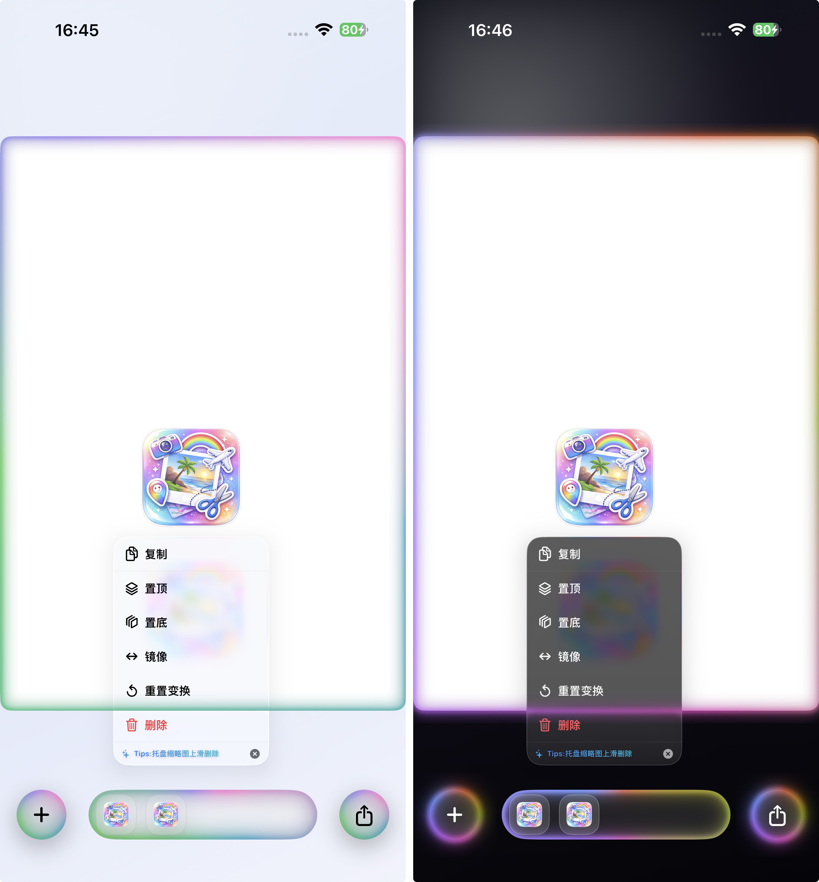
深色模式强调折射与高光;浅色模式强调轻盈与层级
总结
SnipTrip 的菜单 Liquid Glass 方案以系统语义为基础,通过统一采样、清晰分组、深浅色差异化高光与可控交互反馈,实现清晰层级与自然材质感。深色模式重点补强折射信号,浅色模式保持轻盈克制,兼顾视觉质感与交互可读性。