📖 前言:掌握语言的DNA
如果说第一篇是探索GUI开发的"星辰大海",那么本篇将带你深入QML语言的"基因序列"。就像建筑师需要精通建筑材料,画家需要掌握色彩理论一样,要成为QML开发高手,你必须深入理解这门声明式语言的每一个语法细节、每一种设计模式和每一种最佳实践。
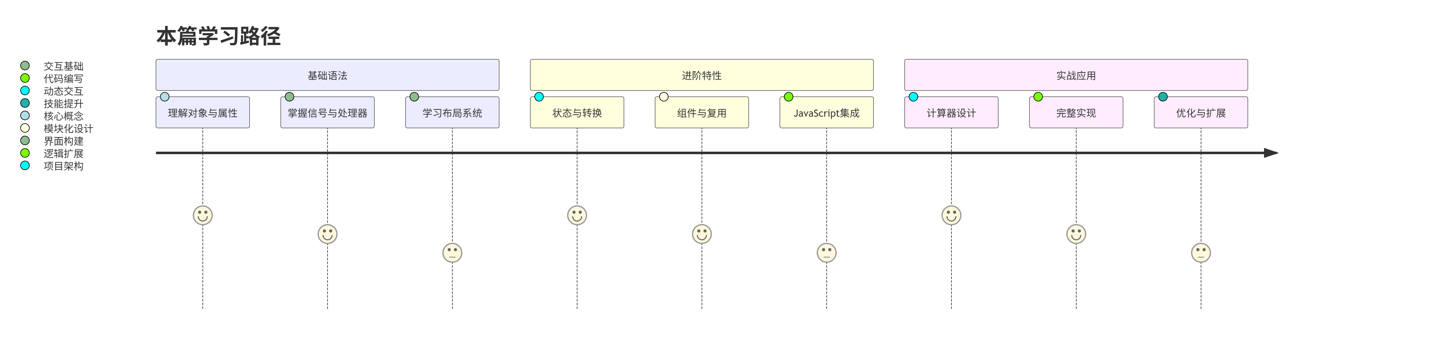
在本篇中,我们将通过构建一个功能完整的计算器应用,系统性地学习QML的核心语法。这不是一个简单的"Hello World",而是一个包含多种交互、状态管理和布局技巧的实用工具。通过这个项目,你将不仅仅是"知道"语法,更是"掌握"如何运用这些语法构建真实的应用程序。
准备好探索QML语言的奥秘了吗?让我们开始吧!
🎯 本篇学习目标
阅读完本篇,你将能够:
-
✅ 深入理解QML对象模型和属性系统
-
✅ 掌握QML的信号槽机制和事件处理
-
✅ 精通QML的布局系统和视觉元素
-
✅ 学会使用状态和转换创建动态UI
-
✅ 理解组件化开发和代码复用
-
✅ 掌握JavaScript在QML中的高级用法
-
✅ 独立构建一个功能完整的计算器应用
-
✅ 理解QML代码的性能优化原则
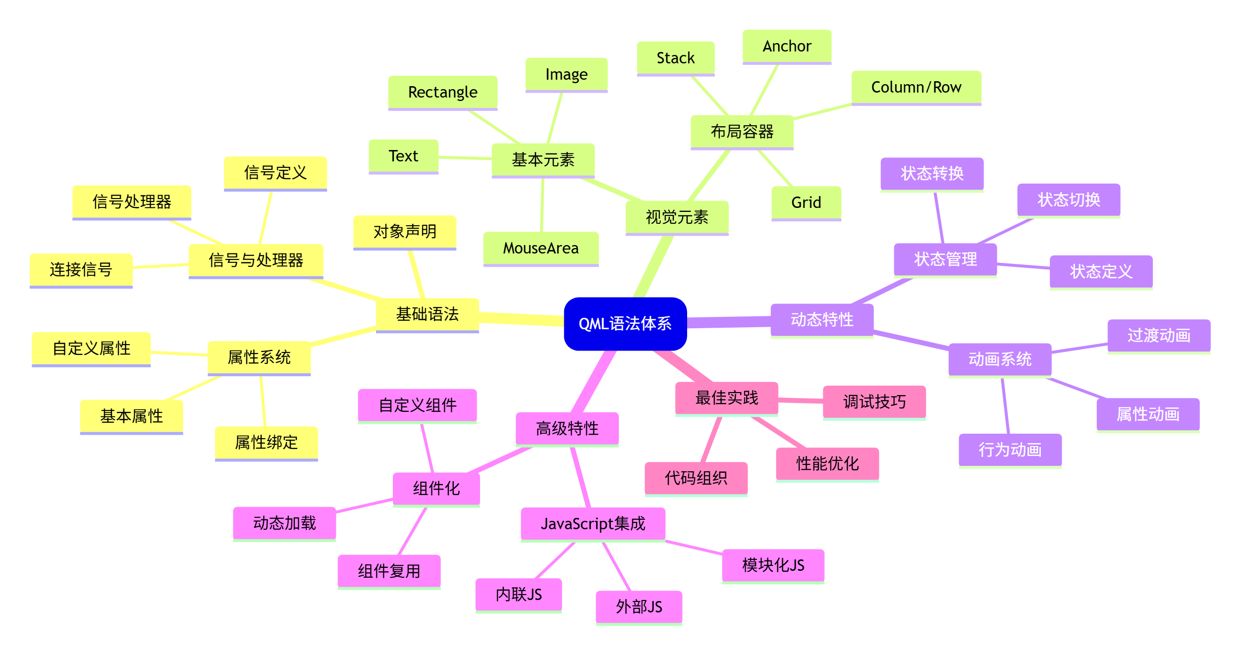
📊 知识地图:QML语法全览
1. QML对象模型:一切都是对象
1.1 对象声明与属性
QML的核心是对象树。在QML中,一切皆是对象,每个对象都有属性、信号和方法。让我们从最基本的对象声明开始。
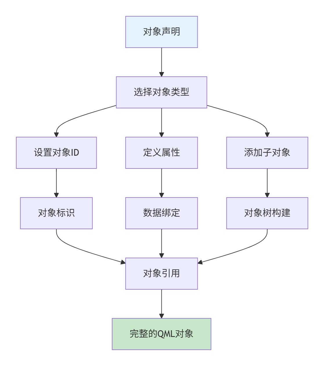
基本对象声明语法:
javascript
// 语法:对象类型 { 属性: 值; 子对象 {} }
对象类型 {
    id: 对象标识符
    属性1: 值1
    属性2: 值2

    子对象类型 {
        id: 子对象标识符
        属性: 值
    }
}
实际示例:
javascript
import QtQuick 2.15

Rectangle {
    // id是对象的唯一标识符,在同一作用域内必须唯一
    id: root

    // 基本属性设置
    width: 300
    height: 200
    color: "lightblue"
    radius: 10

    // 子对象
    Text {
        id: titleText
        text: "欢迎使用QML"
        font.pixelSize: 24
        color: "white"
        anchors.centerIn: parent
    }
}
1.2 属性系统深度解析
QML的属性系统是其响应式编程的核心。理解属性系统是掌握QML的关键。
1.2.1 属性类型
javascript
Rectangle {
    id: example

    // 1. 基本类型属性
    property int count: 0                    // 整数
    property real scale: 1.0                 // 浮点数
    property bool isActive: true             // 布尔值
    property string message: "Hello"         // 字符串
    property color backgroundColor: "blue"   // 颜色
    property var complexData: {              // 任意类型
        "name": "QML",
        "version": 2.15
    }

    // 2. 列表类型属性
    property list<Item> items                // Item对象列表
    property list<string> names: ["Alice", "Bob"]  // 字符串列表

    // 3. 对象类型属性
    property Rectangle targetRect: null      // Rectangle对象引用

    // 4. 只读属性
    readonly property int calculatedValue: width * height

    // 5. 别名属性
    property alias textValue: innerText.text
    property alias innerColor: innerRect.color

    // 子对象
    Rectangle {
        id: innerRect
        width: 100; height: 50
        color: "red"

        Text {
            id: innerText
            text: "Inner Text"
        }
    }
}
1.2.2 属性绑定与赋值
理解属性绑定与赋值的区别至关重要:
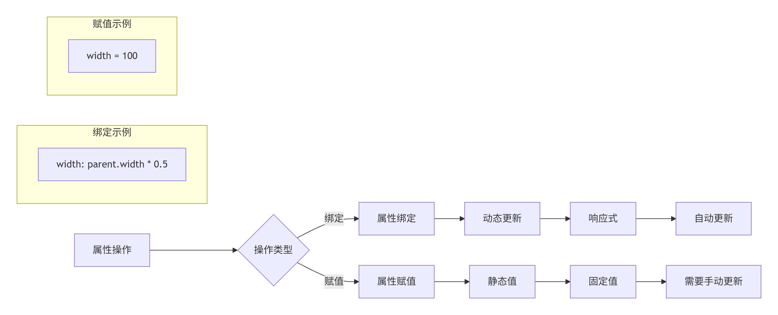
代码示例对比:
javascript
import QtQuick 2.15

Rectangle {
    id: container
    width: 400
    height: 300

    // 示例1:属性绑定(响应式)
    Rectangle {
        id: boundRect
        width: parent.width * 0.5  // 绑定到父对象宽度的一半
        height: parent.height * 0.5
        color: "lightgreen"

        Text {
            text: "绑定宽度:" + width
            anchors.centerIn: parent
        }
    }

    // 示例2:属性赋值(静态)
    Rectangle {
        id: assignedRect
        width: 100  // 固定值
        height: 100
        color: "lightcoral"
        x: 10
        y: boundRect.height + 20

        Text {
            text: "固定宽度:" + parent.width
            anchors.centerIn: parent
        }
    }

    // 示例3:动态改变绑定
    Rectangle {
        id: dynamicRect
        property bool useHalfWidth: true

        // 条件绑定
        width: useHalfWidth ? parent.width * 0.5 : 200
        height: 100
        color: "lightblue"
        x: 10
        y: assignedRect.y + assignedRect.height + 20

        MouseArea {
            anchors.fill: parent
            onClicked: parent.useHalfWidth = !parent.useHalfWidth
        }

        Text {
            text: "点击切换绑定\n当前:" + (parent.useHalfWidth ? "一半宽度" : "200像素")
            anchors.centerIn: parent
        }
    }

    // 控制按钮:演示绑定与赋值的区别
    Rectangle {
        id: controlPanel
        width: 200
        height: 80
        color: "#f0f0f0"
        radius: 5
        border.color: "#ccc"
        x: boundRect.width + 20
        y: 20

        Column {
            anchors.centerIn: parent
            spacing: 5

            Text {
                text: "容器宽度:" + container.width
                font.bold: true
            }

            Button {
                text: "增大容器宽度"
                onClicked: container.width += 50
            }

            Button {
                text: "绑定矩形宽度 = 100"
                onClicked: boundRect.width = 100  // 这会破坏绑定!
            }
        }
    }
}
关键点:
-
绑定:使用冒号(:)创建响应式关系
-
赋值:使用等号(=)设置静态值(会破坏已有绑定)
-
重新绑定 :使用
Qt.binding()函数
javascript
// 重新绑定的正确方式
function restoreBinding() {
    boundRect.width = Qt.binding(function() {
        return parent.width * 0.5
    })
}
1.3 信号与处理器
信号和处理器是QML中对象间通信的基础。理解这种机制对于创建交互式应用至关重要。
1.3.1 信号定义与发射
javascript
import QtQuick 2.15

Rectangle {
    id: signalExample
    width: 300
    height: 200
    color: "lightgray"

    // 1. 定义信号
    signal buttonClicked(string buttonName, int clickCount)
    signal dataChanged(var newData)
    signal simpleSignal  // 无参数信号

    // 2. 发射信号的方法
    function triggerSignals() {
        // 方法1:直接调用信号函数
        buttonClicked("main", 5)

        // 方法2:使用emit关键字
        emit dataChanged({"value": 42, "status": "active"})

        // 方法3:简单信号
        simpleSignal()
    }

    // 3. 自动信号(某些属性变化时自动发射)
    property int counter: 0
    onCounterChanged: {
        console.log("计数器变化:", counter)
    }

    Column {
        anchors.centerIn: parent
        spacing: 10

        Button {
            text: "发射所有信号"
            onClicked: signalExample.triggerSignals()
        }

        Button {
            text: "增加计数 (" + signalExample.counter + ")"
            onClicked: signalExample.counter++
        }
    }
}
1.3.2 信号处理方式
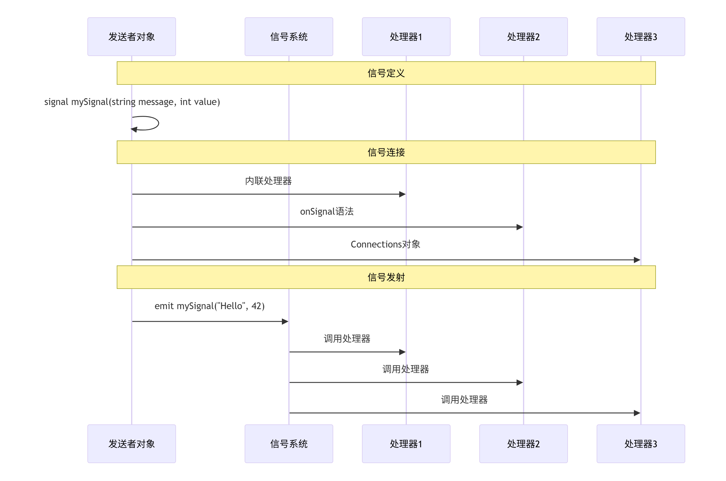
QML提供了多种方式处理信号,每种方式都有其适用场景:
javascript
import QtQuick 2.15
import QtQuick.Controls 2.15

Rectangle {
    id: handlerExample
    width: 500
    height: 400
    color: "#f5f5f5"

    // 定义一些测试信号
    signal testSignal(string message)
    signal numberSignal(int value)
    signal complexSignal(var data)

    // 子对象
    Rectangle {
        id: sourceObject
        width: 200
        height: 150
        color: "lightblue"
        radius: 10
        x: 20
        y: 20

        signal innerSignal(string info)

        Text {
            text: "信号源"
            anchors.centerIn: parent
            font.bold: true
        }

        MouseArea {
            anchors.fill: parent
            onClicked: {
                // 发射内部信号
                sourceObject.innerSignal("来自内部的信号")
                // 发射父对象信号
                handlerExample.testSignal("通过点击发送")
            }
        }
    }

    // 日志显示
    Rectangle {
        id: logArea
        width: 460
        height: 200
        color: "white"
        border.color: "#ddd"
        radius: 5
        x: 20
        y: 180

        ListView {
            id: logView
            anchors.fill: parent
            anchors.margins: 5
            model: ListModel {}

            delegate: Text {
                text: message
                color: type === "error" ? "red" : "black"
                font.pixelSize: 12
            }
        }

        function addLog(type, msg) {
            logView.model.insert(0, {"type": type, "message": msg})
            if (logView.model.count > 10) {
                logView.model.remove(10)
            }
        }
    }

    // ==================== 信号处理方式1:内联处理器 ====================
    Rectangle {
        id: method1
        width: 150
        height: 100
        color: "#e8f5e8"
        radius: 5
        border.color: "#4caf50"
        x: 240
        y: 20

        Text {
            text: "方法1\n内联处理器"
            anchors.centerIn: parent
            horizontalAlignment: Text.AlignHCenter
        }

        // 内联处理器 - 直接在信号源上定义
        Connections {
            target: sourceObject
            function onInnerSignal(info) {
                logArea.addLog("info", "内联处理器: " + info)
            }
        }
    }

    // ==================== 信号处理方式2:onSignal语法 ====================
    Rectangle {
        id: method2
        width: 150
        height: 100
        color: "#fff3e0"
        radius: 5
        border.color: "#ff9800"
        x: 240
        y: 130

        Text {
            text: "方法2\nonSignal语法"
            anchors.centerIn: parent
            horizontalAlignment: Text.AlignHCenter
        }

        // onSignal语法 - 在对象自身中处理
        Component.onCompleted: {
            console.log("组件加载完成")
        }

        onWidthChanged: {
            logArea.addLog("info", "宽度变化: " + width)
        }
    }

    // ==================== 信号处理方式3:Connections对象 ====================
    Rectangle {
        id: method3
        width: 150
        height: 100
        color: "#f3e5f5"
        radius: 5
        border.color: "#9c27b0"
        x: 240
        y: 240

        Text {
            text: "方法3\nConnections对象"
            anchors.centerIn: parent
            horizontalAlignment: Text.AlignHCenter
        }
    }

    // 全局Connections对象
    Connections {
        target: handlerExample

        // 使用新的函数语法
        function onTestSignal(message) {
            logArea.addLog("signal", "Connections处理: " + message)
        }

        function onNumberSignal(value) {
            logArea.addLog("signal", "数字信号: " + value)
        }
    }

    // ==================== 信号处理方式4:信号连接函数 ====================
    Rectangle {
        id: method4
        width: 150
        height: 100
        color: "#e3f2fd"
        radius: 5
        border.color: "#2196f3"
        x: 240
        y: 350

        Text {
            text: "方法4\nconnect()函数"
            anchors.centerIn: parent
            horizontalAlignment: Text.AlignHCenter
        }

        Component.onCompleted: {
            // 使用connect函数动态连接信号
            handlerExample.testSignal.connect(function(msg) {
                logArea.addLog("dynamic", "动态连接: " + msg)
            })

            // 连接到对象方法
            handlerExample.numberSignal.connect(handleNumber)
        }

        function handleNumber(value) {
            logArea.addLog("dynamic", "处理方法: " + value)
        }
    }

    // 测试按钮
    Column {
        x: 20
        y: 390
        spacing: 5

        Button {
            text: "发射测试信号"
            onClicked: handlerExample.testSignal("测试消息")
        }

        Button {
            text: "发射数字信号"
            onClicked: handlerExample.numberSignal(Math.floor(Math.random() * 100))
        }

        Button {
            text: "发射复杂信号"
            onClicked: handlerExample.complexSignal({
                "name": "测试数据",
                "value": 123,
                "active": true
            })
        }

        Button {
            text: "清空日志"
            onClicked: logView.model.clear()
        }
    }
}
信号处理方式对比表:
| 处理方式 | 语法示例 | 优点 | 缺点 | 适用场景 |
|---|---|---|---|---|
| 内联处理器 | onClicked: { ... } |
简洁直观 | 只能处理一个信号 | 简单交互 |
| onSignal语法 | onWidthChanged: ... |
自动生成处理器 | 信号名必须匹配 | 属性变化处理 |
| Connections对象 | Connections { target: obj; onSignal: ... } |
灵活,可连接任意对象 | 语法稍复杂 | 连接外部对象信号 |
| connect()函数 | signal.connect(handler) |
动态连接/断开 | 需要手动管理 | 运行时动态连接 |
2. 视觉元素与布局系统
2.1 基本视觉元素
QML提供了丰富的视觉元素,让我们从最基本的开始:
javascript
import QtQuick 2.15
Rectangle {
id: visualElements
width: 600
height: 500
color: "#f8f9fa"
// 标题
Text {
text: "QML基本视觉元素"
font.pixelSize: 24
font.bold: true
color: "#2c3e50"
anchors.horizontalCenter: parent.horizontalCenter
y: 20
}
Grid {
id: elementsGrid
columns: 2
spacing: 20
anchors.centerIn: parent
// ==================== 1. Rectangle ====================
Column {
spacing: 5
Text {
text: "1. Rectangle"
font.bold: true
color: "#3498db"
}
Rectangle {
width: 200
height: 120
color: "#3498db"
radius: 10
border.color: "#2980b9"
border.width: 2
// 渐变填充
gradient: Gradient {
GradientStop { position: 0.0; color: "#3498db" }
GradientStop { position: 1.0; color: "#2c3e50" }
}
Text {
text: "圆角矩形\n带边框和渐变"
color: "white"
anchors.centerIn: parent
horizontalAlignment: Text.AlignHCenter
}
}
}
// ==================== 2. Text ====================
Column {
spacing: 5
Text {
text: "2. Text"
font.bold: true
color: "#e74c3c"
}
Rectangle {
width: 200
height: 120
color: "#f8f9fa"
border.color: "#ddd"
border.width: 1
Column {
anchors.centerIn: parent
spacing: 8
Text {
text: "普通文本"
color: "#2c3e50"
}
Text {
text: "粗体文本"
font.bold: true
color: "#e74c3c"
}
Text {
text: "大号文本"
font.pixelSize: 20
color: "#27ae60"
}
Text {
text: "富文本<b>加粗</b> <i>斜体</i>"
textFormat: Text.RichText
color: "#8e44ad"
}
}
}
}
// ==================== 3. Image ====================
Column {
spacing: 5
Text {
text: "3. Image"
font.bold: true
color: "#2ecc71"
}
Rectangle {
width: 200
height: 120
color: "#f8f9fa"
border.color: "#ddd"
border.width: 1
// 使用在线图片或本地图片
Image {
id: sampleImage
source: "https://via.placeholder.com/150x80/2ecc71/ffffff?text=QML+Image"
width: 150
height: 80
anchors.centerIn: parent
// 图片填充模式
fillMode: Image.PreserveAspectFit
// 异步加载
asynchronous: true
// 加载状态处理
onStatusChanged: {
if (status === Image.Error) {
console.log("图片加载失败")
}
}
}
Text {
text: sampleImage.sourceSize.width + "×" + sampleImage.sourceSize.height
font.pixelSize: 10
color: "#7f8c8d"
anchors.bottom: parent.bottom
anchors.horizontalCenter: parent.horizontalCenter
}
}
}
// ==================== 4. MouseArea ====================
Column {
spacing: 5
Text {
text: "4. MouseArea"
font.bold: true
color: "#f39c12"
}
Rectangle {
id: mouseRect
width: 200
height: 120
color: "#f1c40f"
radius: 10
property int clickCount: 0
Text {
text: "点击我\n点击次数:" + parent.clickCount
color: "white"
font.bold: true
anchors.centerIn: parent
horizontalAlignment: Text.AlignHCenter
}
// MouseArea覆盖整个矩形
MouseArea {
anchors.fill: parent
// 鼠标悬停
hoverEnabled: true
// 点击事件
onClicked: {
mouseRect.clickCount++
mouseRect.color = Qt.lighter("#f1c40f", 1.2)
}
// 双击事件
onDoubleClicked: {
mouseRect.clickCount = 0
mouseRect.color = "#f1c40f"
}
// 鼠标进入
onEntered: {
mouseRect.border.width = 2
mouseRect.border.color = "#f39c12"
}
// 鼠标离开
onExited: {
mouseRect.border.width = 0
}
// 鼠标位置跟踪
onPositionChanged: {
var x = Math.floor(mouse.x)
var y = Math.floor(mouse.y)
// 可以在这里添加鼠标位置相关逻辑
}
}
}
}
}
// ==================== 5. 其他常用元素 ====================
Column {
x: 20
y: 320
spacing: 10
Text {
text: "5. 其他常用元素"
font.bold: true
color: "#9b59b6"
}
Row {
spacing: 10
// Canvas - 自定义绘图
Rectangle {
width: 100
height: 100
color: "#f8f9fa"
border.color: "#ddd"
Canvas {
id: canvasExample
anchors.fill: parent
onPaint: {
var ctx = getContext("2d")
ctx.clearRect(0, 0, width, height)
// 画圆
ctx.fillStyle = "#9b59b6"
ctx.beginPath()
ctx.arc(50, 50, 40, 0, Math.PI * 2)
ctx.fill()
// 画文字
ctx.fillStyle = "white"
ctx.font = "bold 16px Arial"
ctx.textAlign = "center"
ctx.textBaseline = "middle"
ctx.fillText("Canvas", 50, 50)
}
}
}
// Loader - 动态加载组件
Rectangle {
width: 100
height: 100
color: "#f8f9fa"
border.color: "#ddd"
property bool showCircle: true
Loader {
id: loaderExample
anchors.fill: parent
sourceComponent: parent.showCircle ? circleComponent : rectComponent
}
Component {
id: circleComponent
Rectangle {
color: "#e74c3c"
radius: width / 2
Text {
text: "圆形"
color: "white"
anchors.centerIn: parent
}
}
}
Component {
id: rectComponent
Rectangle {
color: "#3498db"
Text {
text: "矩形"
color: "white"
anchors.centerIn: parent
}
}
}
MouseArea {
anchors.fill: parent
onClicked: parent.showCircle = !parent.showCircle
}
}
// Repeater - 重复元素
Rectangle {
width: 100
height: 100
color: "#f8f9fa"
border.color: "#ddd"
Flow {
anchors.fill: parent
anchors.margins: 5
Repeater {
model: 9
Rectangle {
width: 20
height: 20
color: index % 2 ? "#2ecc71" : "#27ae60"
Text {
text: index + 1
color: "white"
font.pixelSize: 10
anchors.centerIn: parent
}
}
}
}
}
}
}
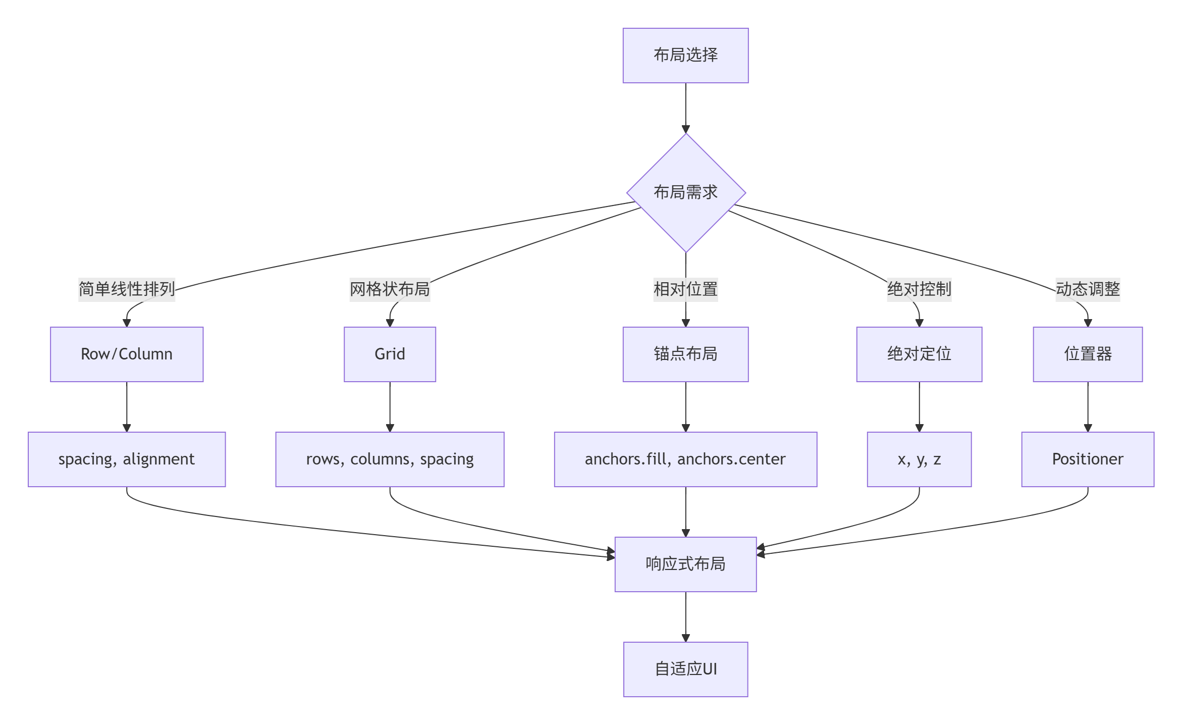
}2.2 布局系统详解
QML提供了多种布局方式,每种方式适合不同的场景。理解各种布局的优缺点对于创建响应式UI至关重要。
2.2.1 基础布局容器
javascript
import QtQuick 2.15
import QtQuick.Layouts 1.15
Rectangle {
id: layoutDemo
width: 800
height: 600
color: "#f5f7fa"
// 标题
Text {
text: "QML布局系统详解"
font.pixelSize: 28
font.bold: true
color: "#1a237e"
anchors.horizontalCenter: parent.horizontalCenter
y: 20
}
// 布局选择标签
TabBar {
id: layoutTabs
width: parent.width - 40
anchors.horizontalCenter: parent.horizontalCenter
y: 70
TabButton { text: "Column/Row" }
TabButton { text: "Grid" }
TabButton { text: "锚点布局" }
TabButton { text: "GridLayout" }
TabButton { text: "综合示例" }
}
// 布局内容
StackLayout {
width: parent.width - 40
height: 400
anchors.horizontalCenter: parent.horizontalCenter
y: 120
currentIndex: layoutTabs.currentIndex
// ==================== 1. Column和Row布局 ====================
Rectangle {
id: columnRowTab
color: "transparent"
Column {
spacing: 20
// Column示例
Column {
spacing: 10
Text {
text: "Column布局(垂直排列)"
font.bold: true
color: "#0d47a1"
}
Rectangle {
width: 300
height: 150
color: "white"
border.color: "#ddd"
radius: 5
Column {
id: columnExample
anchors.centerIn: parent
spacing: 8
Repeater {
model: 4
Rectangle {
width: 200
height: 30
color: ["#bbdefb", "#90caf9", "#64b5f6", "#42a5f5"][index]
radius: 3
Text {
text: "项目 " + (index + 1)
color: "white"
anchors.centerIn: parent
}
}
}
}
}
}
// Row示例
Column {
spacing: 10
Text {
text: "Row布局(水平排列)"
font.bold: true
color: "#0d47a1"
}
Rectangle {
width: 300
height: 150
color: "white"
border.color: "#ddd"
radius: 5
Row {
id: rowExample
anchors.centerIn: parent
spacing: 8
Repeater {
model: 4
Rectangle {
width: 50
height: 80
color: ["#c8e6c9", "#a5d6a7", "#81c784", "#66bb6a"][index]
radius: 3
Text {
text: index + 1
color: "white"
font.bold: true
font.pixelSize: 20
anchors.centerIn: parent
}
}
}
}
}
}
// 布局属性控制
Column {
spacing: 10
width: 300
Text {
text: "布局属性控制"
font.bold: true
color: "#0d47a1"
}
Row {
spacing: 10
Column {
spacing: 5
Text { text: "间距:"; font.pixelSize: 12 }
Slider {
id: spacingSlider
from: 0
to: 30
value: 8
onValueChanged: {
columnExample.spacing = value
rowExample.spacing = value
}
}
}
Column {
spacing: 5
Text { text: "对齐方式:"; font.pixelSize: 12 }
ComboBox {
id: alignmentCombo
model: ["左对齐", "居中", "右对齐"]
onCurrentIndexChanged: {
var alignments = [Qt.AlignLeft, Qt.AlignHCenter, Qt.AlignRight]
columnExample.horizontalAlignment = alignments[currentIndex]
}
}
}
}
}
}
}
// ==================== 2. Grid布局 ====================
Rectangle {
id: gridTab
color: "transparent"
Column {
spacing: 20
// 基础Grid示例
Column {
spacing: 10
Text {
text: "Grid布局(网格排列)"
font.bold: true
color: "#004d40"
}
Rectangle {
width: 300
height: 200
color: "white"
border.color: "#ddd"
radius: 5
Grid {
id: gridExample
anchors.centerIn: parent
columns: 3
rows: 3
spacing: 5
Repeater {
model: 9
Rectangle {
width: 60
height: 60
color: ["#b2dfdb", "#80cbc4", "#4db6ac", "#26a69a"][index % 4]
radius: 5
Text {
text: index + 1
color: "white"
font.bold: true
font.pixelSize: 20
anchors.centerIn: parent
}
}
}
}
}
}
// Grid属性控制
Column {
spacing: 10
width: 300
Text {
text: "网格属性控制"
font.bold: true
color: "#004d40"
}
Grid {
columns: 2
spacing: 10
Column {
spacing: 5
Text { text: "列数:"; font.pixelSize: 12 }
SpinBox {
id: columnsSpin
from: 1
to: 5
value: 3
onValueChanged: gridExample.columns = value
}
}
Column {
spacing: 5
Text { text: "行数:"; font.pixelSize: 12 }
SpinBox {
id: rowsSpin
from: 1
to: 5
value: 3
onValueChanged: gridExample.rows = value
}
}
Column {
spacing: 5
Text { text: "水平间距:"; font.pixelSize: 12 }
Slider {
id: hSpacingSlider
from: 0
to: 20
value: 5
onValueChanged: gridExample.spacing = Qt.point(value, vSpacingSlider.value)
}
}
Column {
spacing: 5
Text { text: "垂直间距:"; font.pixelSize: 12 }
Slider {
id: vSpacingSlider
from: 0
to: 20
value: 5
onValueChanged: gridExample.spacing = Qt.point(hSpacingSlider.value, value)
}
}
}
}
// 流式布局
Column {
spacing: 10
Text {
text: "流式布局(Flow)"
font.bold: true
color: "#004d40"
}
Rectangle {
width: 300
height: 120
color: "white"
border.color: "#ddd"
radius: 5
Flow {
anchors.fill: parent
anchors.margins: 10
spacing: 5
Repeater {
model: 12
Rectangle {
width: 40
height: 40
color: index % 2 ? "#ffccbc" : "#ffab91"
radius: 3
Text {
text: index + 1
anchors.centerIn: parent
}
}
}
}
}
}
}
}
// ==================== 3. 锚点布局 ====================
Rectangle {
id: anchorsTab
color: "transparent"
Column {
spacing: 20
Text {
text: "锚点布局(相对定位)"
font.bold: true
color: "#bf360c"
}
Rectangle {
width: 400
height: 300
color: "white"
border.color: "#ddd"
radius: 5
// 父容器
Rectangle {
id: anchorParent
width: 300
height: 200
color: "#f5f5f5"
border.color: "#bdbdbd"
anchors.centerIn: parent
// 中心对象
Rectangle {
id: centerRect
width: 80
height: 80
color: "#ff9800"
radius: 10
anchors.centerIn: parent
Text {
text: "中心"
anchors.centerIn: parent
color: "white"
}
}
// 左上角
Rectangle {
width: 60
height: 40
color: "#2196f3"
anchors.left: parent.left
anchors.top: parent.top
anchors.margins: 10
Text {
text: "左上"
anchors.centerIn: parent
color: "white"
font.pixelSize: 12
}
}
// 右上角
Rectangle {
width: 60
height: 40
color: "#2196f3"
anchors.right: parent.right
anchors.top: parent.top
anchors.margins: 10
Text {
text: "右上"
anchors.centerIn: parent
color: "white"
font.pixelSize: 12
}
}
// 左下角
Rectangle {
width: 60
height: 40
color: "#2196f3"
anchors.left: parent.left
anchors.bottom: parent.bottom
anchors.margins: 10
Text {
text: "左下"
anchors.centerIn: parent
color: "white"
font.pixelSize: 12
}
}
// 右下角
Rectangle {
width: 60
height: 40
color: "#2196f3"
anchors.right: parent.right
anchors.bottom: parent.bottom
anchors.margins: 10
Text {
text: "右下"
anchors.centerIn: parent
color: "white"
font.pixelSize: 12
}
}
// 填充底部
Rectangle {
height: 30
color: "#4caf50"
anchors.left: parent.left
anchors.right: parent.right
anchors.bottom: parent.bottom
anchors.margins: 5
Text {
text: "底部栏"
anchors.centerIn: parent
color: "white"
}
}
// 填充顶部
Rectangle {
height: 30
color: "#9c27b0"
anchors.left: parent.left
anchors.right: parent.right
anchors.top: parent.top
anchors.margins: 5
Text {
text: "顶部栏"
anchors.centerIn: parent
color: "white"
}
}
}
}
// 锚点关系图示
Column {
spacing: 10
width: 400
Text {
text: "锚点关系图示"
font.bold: true
color: "#bf360c"
}
Rectangle {
width: 400
height: 120
color: "white"
border.color: "#ddd"
radius: 5
// 图示说明
Grid {
anchors.centerIn: parent
columns: 2
spacing: 20
Column {
spacing: 5
Row {
spacing: 5
Rectangle { width: 20; height: 20; color: "#2196f3" }
Text { text: "anchors.left"; font.pixelSize: 12 }
}
Row {
spacing: 5
Rectangle { width: 20; height: 20; color: "#4caf50" }
Text { text: "anchors.right"; font.pixelSize: 12 }
}
Row {
spacing: 5
Rectangle { width: 20; height: 20; color: "#ff9800" }
Text { text: "anchors.top"; font.pixelSize: 12 }
}
Row {
spacing: 5
Rectangle { width: 20; height: 20; color: "#9c27b0" }
Text { text: "anchors.bottom"; font.pixelSize: 12 }
}
}
Column {
spacing: 5
Row {
spacing: 5
Rectangle { width: 20; height: 20; color: "#2196f3" }
Text { text: "anchors.centerIn"; font.pixelSize: 12 }
}
Row {
spacing: 5
Rectangle { width: 20; height: 20; color: "#4caf50" }
Text { text: "anchors.fill"; font.pixelSize: 12 }
}
Row {
spacing: 5
Rectangle { width: 20; height: 20; color: "#ff9800" }
Text { text: "anchors.margins"; font.pixelSize: 12 }
}
Row {
spacing: 5
Rectangle { width: 20; height: 20; color: "#9c27b0" }
Text { text: "anchors.horizontalCenter"; font.pixelSize: 12 }
}
}
}
}
}
}
}
// ==================== 4. GridLayout ====================
Rectangle {
id: gridLayoutTab
color: "transparent"
Column {
spacing: 20
Text {
text: "GridLayout(自动网格布局)"
font.bold: true
color: "#4a148c"
}
Rectangle {
width: 400
height: 300
color: "white"
border.color: "#ddd"
radius: 5
GridLayout {
id: advancedGrid
anchors.fill: parent
anchors.margins: 20
columns: 3
rows: 3
columnSpacing: 10
rowSpacing: 10
// 跨行跨列示例
Rectangle {
Layout.fillWidth: true
Layout.fillHeight: true
Layout.columnSpan: 2
Layout.rowSpan: 2
color: "#e1bee7"
radius: 5
Text {
text: "2列 × 2行"
anchors.centerIn: parent
}
}
Rectangle {
Layout.fillWidth: true
Layout.fillHeight: true
color: "#bbdefb"
radius: 5
Text {
text: "单元格 3"
anchors.centerIn: parent
}
}
Rectangle {
Layout.fillWidth: true
Layout.fillHeight: true
Layout.columnSpan: 2
color: "#c8e6c9"
radius: 5
Text {
text: "跨2列"
anchors.centerIn: parent
}
}
Rectangle {
Layout.fillWidth: true
Layout.fillHeight: true
Layout.rowSpan: 2
color: "#fff9c4"
radius: 5
Text {
text: "跨2行"
anchors.centerIn: parent
}
}
Rectangle {
Layout.fillWidth: true
Layout.fillHeight: true
color: "#ffccbc"
radius: 5
Text {
text: "单元格 7"
anchors.centerIn: parent
}
}
Rectangle {
Layout.fillWidth: true
Layout.fillHeight: true
color: "#f8bbd0"
radius: 5
Text {
text: "单元格 8"
anchors.centerIn: parent
}
}
}
}
// GridLayout控制
Column {
spacing: 10
width: 400
Text {
text: "GridLayout属性控制"
font.bold: true
color: "#4a148c"
}
Grid {
columns: 2
spacing: 10
Column {
spacing: 5
Text { text: "列数:"; font.pixelSize: 12 }
SpinBox {
from: 2
to: 4
value: 3
onValueChanged: advancedGrid.columns = value
}
}
Column {
spacing: 5
Text { text: "行数:"; font.pixelSize: 12 }
SpinBox {
from: 2
to: 4
value: 3
onValueChanged: advancedGrid.rows = value
}
}
}
}
}
}
// ==================== 5. 综合示例 ====================
Rectangle {
id: combinedTab
color: "transparent"
Column {
spacing: 20
Text {
text: "布局综合示例 - 模拟应用界面"
font.bold: true
color: "#006064"
}
Rectangle {
width: 500
height: 350
color: "white"
border.color: "#ddd"
radius: 5
// 模拟应用界面
ColumnLayout {
anchors.fill: parent
anchors.margins: 10
spacing: 10
// 顶部标题栏
Rectangle {
Layout.fillWidth: true
Layout.preferredHeight: 50
color: "#1565c0"
radius: 5
RowLayout {
anchors.fill: parent
anchors.margins: 10
Text {
text: "我的应用"
color: "white"
font.bold: true
font.pixelSize: 20
}
Item { Layout.fillWidth: true }
Rectangle {
Layout.preferredWidth: 30
Layout.preferredHeight: 30
color: "white"
radius: 15
Text {
text: "U"
anchors.centerIn: parent
color: "#1565c0"
font.bold: true
}
}
}
}
// 主要内容区域
Rectangle {
Layout.fillWidth: true
Layout.fillHeight: true
color: "#f5f5f5"
radius: 5
GridLayout {
anchors.fill: parent
anchors.margins: 10
columns: 2
// 左侧边栏
ColumnLayout {
Layout.fillHeight: true
Layout.preferredWidth: 150
spacing: 10
Repeater {
model: ["首页", "消息", "设置", "帮助", "关于"]
Rectangle {
Layout.fillWidth: true
Layout.preferredHeight: 40
color: index === 0 ? "#e3f2fd" : "white"
border.color: index === 0 ? "#2196f3" : "#ddd"
radius: 3
Text {
text: modelData
anchors.centerIn: parent
color: index === 0 ? "#2196f3" : "#666"
}
}
}
Item { Layout.fillHeight: true }
}
// 右侧内容
ColumnLayout {
Layout.fillWidth: true
Layout.fillHeight: true
spacing: 10
// 卡片1
Rectangle {
Layout.fillWidth: true
Layout.preferredHeight: 100
color: "white"
border.color: "#ddd"
radius: 5
Column {
anchors.centerIn: parent
spacing: 5
Text {
text: "欢迎使用"
font.bold: true
font.pixelSize: 18
}
Text {
text: "这是一个综合布局示例,展示了多种布局方式的组合使用。"
color: "#666"
}
}
}
// 卡片2
Rectangle {
Layout.fillWidth: true
Layout.fillHeight: true
color: "white"
border.color: "#ddd"
radius: 5
GridLayout {
anchors.fill: parent
anchors.margins: 10
columns: 2
Repeater {
model: 6
Rectangle {
Layout.fillWidth: true
Layout.fillHeight: true
color: ["#f3e5f5", "#e8eaf6", "#e3f2fd"][index % 3]
radius: 3
Text {
text: "项目 " + (index + 1)
anchors.centerIn: parent
}
}
}
}
}
}
}
}
// 底部状态栏
Rectangle {
Layout.fillWidth: true
Layout.preferredHeight: 30
color: "#e0e0e0"
radius: 3
Text {
text: "就绪"
anchors.verticalCenter: parent.verticalCenter
anchors.left: parent.left
anchors.leftMargin: 10
color: "#666"
}
Text {
text: "© 2024 我的公司"
anchors.verticalCenter: parent.verticalCenter
anchors.right: parent.right
anchors.rightMargin: 10
color: "#666"
font.pixelSize: 12
}
}
}
}
}
}
}
}2.2.2 布局选择指南
了解每种布局的适用场景很重要,这里是一个快速参考:
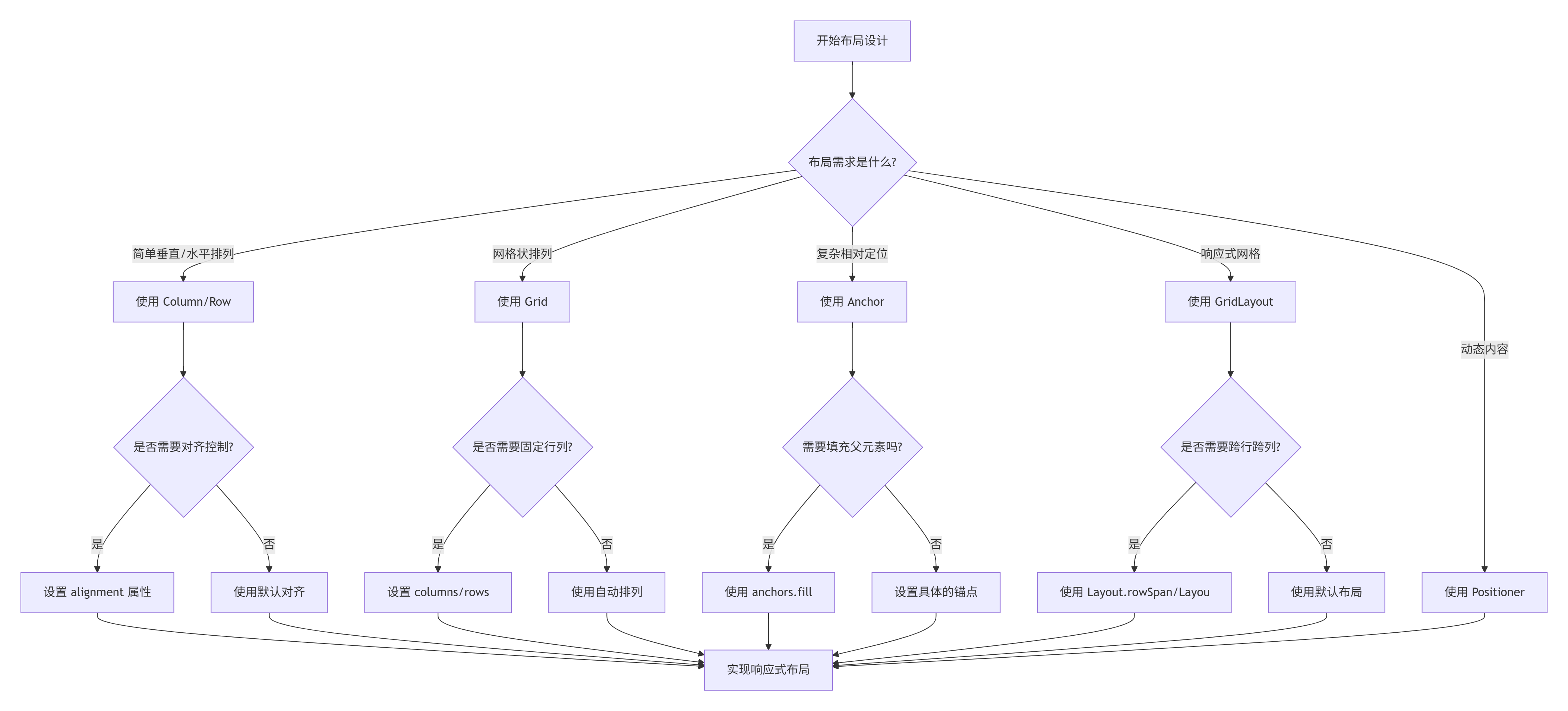
布局性能优化建议:
-
避免过度嵌套:布局嵌套不要超过4层
-
使用合适的布局:简单的排列用Column/Row,复杂的用Anchor
-
避免频繁变化:尽量减少布局属性的动态变化
-
使用Loader延迟加载:不需要立即显示的内容可以延迟加载
-
缓存复杂布局:使用CacheBuffer提高滚动性能
3. 状态管理与转换
3.1 状态系统基础
状态系统是QML创建动态交互界面的核心。让我们通过一个实际的例子来理解状态管理:
javascript
import QtQuick 2.15
import QtQuick.Controls 2.15
Rectangle {
id: stateDemo
width: 600
height: 400
color: "#f8f9fa"
// 标题
Text {
text: "QML状态管理系统"
font.pixelSize: 24
font.bold: true
color: "#1a237e"
anchors.horizontalCenter: parent.horizontalCenter
y: 20
}
// 示例1:基本状态切换
Column {
id: basicExample
x: 30
y: 70
spacing: 10
Text {
text: "1. 基本状态切换"
font.bold: true
color: "#0d47a1"
}
// 状态切换按钮
Rectangle {
id: toggleButton
width: 200
height: 50
color: "#2196f3"
radius: 5
property bool isActive: false
Text {
text: parent.isActive ? "激活状态" : "默认状态"
color: "white"
font.bold: true
anchors.centerIn: parent
}
// 状态定义
states: [
State {
name: "active"
when: toggleButton.isActive
PropertyChanges {
target: toggleButton
color: "#4caf50"
scale: 1.1
}
PropertyChanges {
target: buttonText
text: "✓ 已激活"
}
}
]
// 状态转换
transitions: [
Transition {
from: "*"
to: "*"
// 颜色动画
ColorAnimation {
target: toggleButton
properties: "color"
duration: 300
}
// 缩放动画
NumberAnimation {
target: toggleButton
properties: "scale"
duration: 300
}
}
]
MouseArea {
anchors.fill: parent
onClicked: parent.isActive = !parent.isActive
}
}
// 状态信息显示
Rectangle {
width: 200
height: 60
color: "white"
border.color: "#ddd"
radius: 5
Column {
anchors.centerIn: parent
spacing: 5
Text {
id: stateInfo
text: "当前状态: " + (toggleButton.isActive ? "active" : "默认")
font.pixelSize: 12
}
Text {
text: "颜色: " + toggleButton.color
font.pixelSize: 10
color: "#666"
}
}
}
}
// 示例2:多状态管理
Column {
id: multiStateExample
x: 300
y: 70
spacing: 10
Text {
text: "2. 多状态管理"
font.bold: true
color: "#004d40"
}
// 状态对象
Rectangle {
id: multiStateRect
width: 250
height: 120
color: "white"
border.color: "#ddd"
radius: 5
// 状态定义
states: [
State {
name: "normal"
PropertyChanges {
target: displayRect
color: "#e3f2fd"
x: 20
y: 20
width: 60
height: 60
}
},
State {
name: "highlighted"
PropertyChanges {
target: displayRect
color: "#bbdefb"
x: 80
y: 20
width: 80
height: 40
}
},
State {
name: "selected"
PropertyChanges {
target: displayRect
color: "#90caf9"
x: 140
y: 20
width: 100
height: 80
}
},
State {
name: "disabled"
PropertyChanges {
target: displayRect
color: "#f5f5f5"
x: 20
y: 20
width: 60
height: 60
opacity: 0.5
}
}
]
// 当前状态
state: "normal"
// 显示矩形
Rectangle {
id: displayRect
color: "#e3f2fd"
radius: 3
Text {
text: multiStateRect.state
anchors.centerIn: parent
font.bold: true
}
}
// 状态切换按钮
Row {
anchors.bottom: parent.bottom
anchors.horizontalCenter: parent.horizontalCenter
anchors.bottomMargin: 10
spacing: 5
Repeater {
model: ["normal", "highlighted", "selected", "disabled"]
Button {
text: modelData
highlighted: multiStateRect.state === modelData
onClicked: multiStateRect.state = modelData
}
}
}
}
// 状态转换
Text {
text: "状态转换配置"
font.bold: true
font.pixelSize: 12
color: "#004d40"
}
Row {
spacing: 10
CheckBox {
id: enableAnimation
text: "启用动画"
checked: true
}
CheckBox {
id: enableSequential
text: "顺序动画"
checked: false
}
}
}
// 示例3:状态切换与条件状态
Column {
id: conditionalExample
x: 30
y: 250
spacing: 10
Text {
text: "3. 条件状态与when属性"
font.bold: true
color: "#bf360c"
}
Rectangle {
width: 250
height: 120
color: "white"
border.color: "#ddd"
radius: 5
property int score: 0
// 条件状态
states: [
State {
name: "poor"
when: score < 60
PropertyChanges {
target: scoreIndicator
color: "#ef5350"
width: 50
}
},
State {
name: "average"
when: score >= 60 && score < 80
PropertyChanges {
target: scoreIndicator
color: "#ffb74d"
width: 100
}
},
State {
name: "good"
when: score >= 80 && score < 90
PropertyChanges {
target: scoreIndicator
color: "#66bb6a"
width: 150
}
},
State {
name: "excellent"
when: score >= 90
PropertyChanges {
target: scoreIndicator
color: "#4caf50"
width: 200
}
}
]
Column {
anchors.centerIn: parent
spacing: 10
// 分数指示器
Rectangle {
id: scoreBar
width: 200
height: 20
color: "#f5f5f5"
radius: 10
Rectangle {
id: scoreIndicator
height: parent.height
radius: 10
color: "#ef5350"
width: 50
// 动画
Behavior on width {
NumberAnimation { duration: 500 }
}
Behavior on color {
ColorAnimation { duration: 500 }
}
}
}
// 分数显示
Text {
text: "分数: " + parent.parent.score + " - " + parent.parent.state
font.bold: true
}
// 分数控制
Row {
spacing: 5
Button {
text: "-10"
onClicked: parent.parent.parent.score = Math.max(0, parent.parent.parent.score - 10)
}
Button {
text: "+10"
onClicked: parent.parent.parent.score = Math.min(100, parent.parent.parent.score + 10)
}
Button {
text: "随机"
onClicked: parent.parent.parent.score = Math.floor(Math.random() * 101)
}
}
}
}
}
// 示例4:状态组与复杂转换
Column {
id: complexExample
x: 300
y: 250
spacing: 10
Text {
text: "4. 复杂状态与转换"
font.bold: true
color: "#4a148c"
}
Rectangle {
width: 250
height: 120
color: "white"
border.color: "#ddd"
radius: 5
// 动画对象
Rectangle {
id: animRect
width: 50
height: 50
color: "#9c27b0"
radius: 5
// 状态定义
states: [
State {
name: "left"
PropertyChanges {
target: animRect
x: 10
y: 10
rotation: 0
}
},
State {
name: "right"
PropertyChanges {
target: animRect
x: 190
y: 10
rotation: 180
}
},
State {
name: "bottom"
PropertyChanges {
target: animRect
x: 100
y: 60
rotation: 90
}
},
State {
name: "center"
PropertyChanges {
target: animRect
x: 100
y: 10
rotation: 360
}
}
]
// 默认状态
state: "left"
// 复杂转换
transitions: [
Transition {
from: "*"
to: "*"
// 并行动画
ParallelAnimation {
NumberAnimation {
properties: "x,y"
duration: 1000
easing.type: Easing.InOutQuad
}
RotationAnimation {
duration: 1000
direction: RotationAnimation.Clockwise
}
ColorAnimation {
duration: 1000
}
}
}
]
}
// 状态控制
Row {
anchors.bottom: parent.bottom
anchors.horizontalCenter: parent.horizontalCenter
anchors.bottomMargin: 10
spacing: 5
Repeater {
model: ["left", "center", "right", "bottom"]
Button {
text: modelData
highlighted: animRect.state === modelData
onClicked: {
// 随机颜色
animRect.color = Qt.rgba(
Math.random(),
Math.random(),
Math.random(),
1
)
animRect.state = modelData
}
}
}
}
}
// 转换配置
Column {
spacing: 5
Text {
text: "动画配置"
font.bold: true
font.pixelSize: 12
color: "#4a148c"
}
Row {
spacing: 10
Column {
spacing: 2
Text {
text: "持续时间: " + durationSlider.value + "ms"
font.pixelSize: 10
}
Slider {
id: durationSlider
from: 100
to: 2000
value: 1000
}
}
Column {
spacing: 2
Text {
text: "缓动类型"
font.pixelSize: 10
}
ComboBox {
id: easingCombo
model: ["Linear", "InOutQuad", "OutBounce", "InOutBack"]
width: 100
}
}
}
}
}
}3.2 状态管理最佳实践
通过前面的示例,我们了解了状态管理的基础。现在让我们总结一些最佳实践:
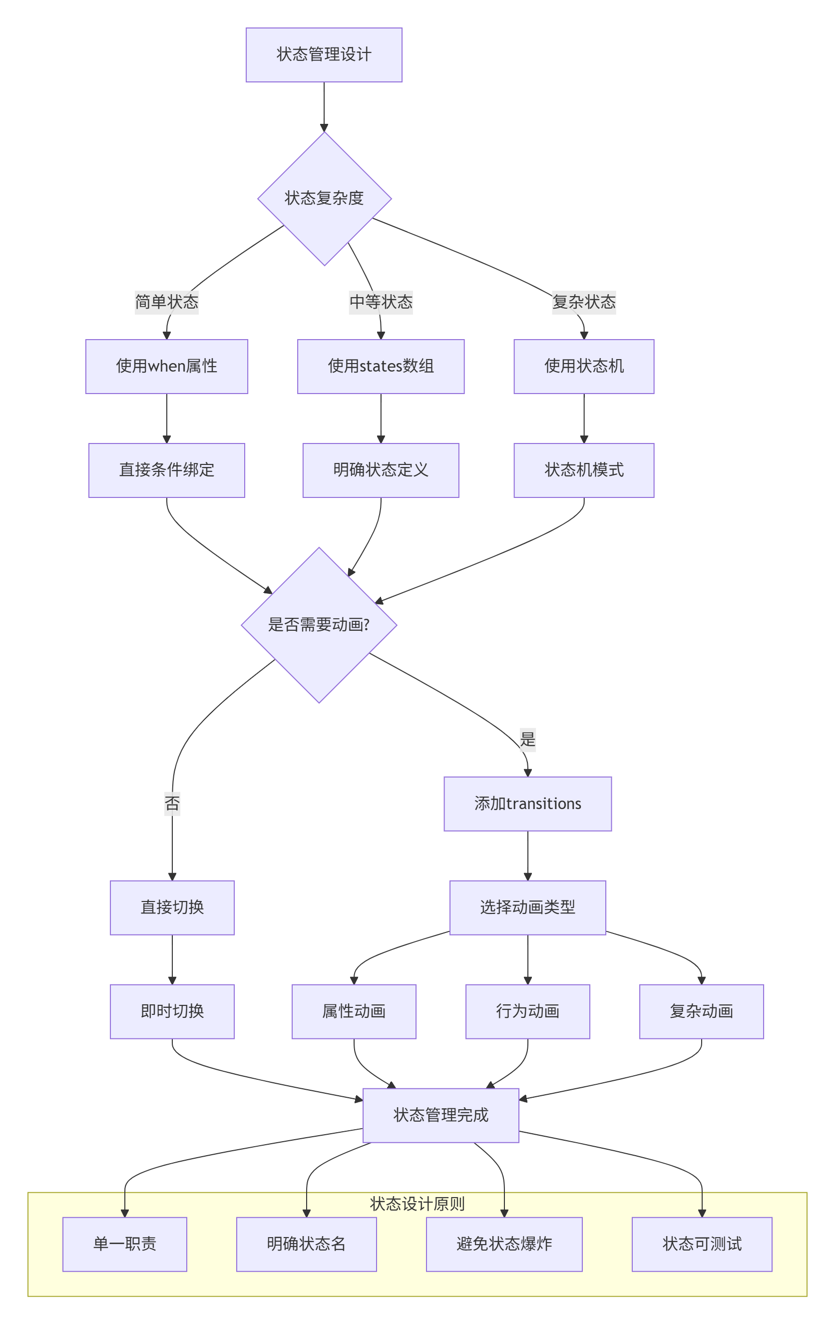
状态管理原则:
-
状态命名明确:使用描述性名称,如"active"、"disabled"、"loading"
-
状态互斥:确保同一时间只有一个状态是激活的
-
状态层次:使用子状态处理复杂状态机
-
状态持久化:重要状态应该可以保存和恢复
-
状态验证:确保状态转换是有效的
4. 组件化开发
4.1 创建自定义组件
组件化是构建可维护、可复用UI的关键。让我们学习如何创建和使用自定义组件:
javascript
// CalculatorButton.qml - 计算器按钮组件
import QtQuick 2.15
import QtQuick.Controls 2.15

Rectangle {
    id: button

    // ==================== 组件属性 ====================
    // 公共接口 - 这些属性可以被外部访问和设置

    // 1. 基本属性
    property string text: ""                 // 按钮文本
    property string buttonType: "number"     // 按钮类型: number, operator, function, equals
    property bool isPressed: false           // 按下状态

    // 2. 样式属性
    property color normalColor: getColorByType()
    property color pressedColor: Qt.darker(normalColor, 1.2)
    property color textColor: "white"
    property int fontSize: 20

    // 3. 信号
    signal clicked(string buttonText, string type)
    signal pressed()
    signal released()

    // ==================== 组件实现 ====================
    // 私有实现 - 这些是组件内部使用的

    // 计算颜色
    function getColorByType() {
        switch(buttonType) {
        case "number":
            return "#4a4a4a"
        case "operator":
            return "#f57c00"
        case "function":
            return "#616161"
        case "equals":
            return "#2196f3"
        default:
            return "#4a4a4a"
        }
    }

    // ==================== 组件样式 ====================
    width: 60
    height: 60
    radius: 5
    color: isPressed ? pressedColor : normalColor

    // 文字阴影
    layer.enabled: true
    layer.effect: DropShadow {
        color: "#20000000"
        radius: 2
        samples: 4
        verticalOffset: 1
    }

    // ==================== 组件内容 ====================
    Text {
        id: buttonText
        text: parent.text
        color: textColor
        font.pixelSize: fontSize
        font.bold: buttonType === "equals"
        anchors.centerIn: parent
    }

    // ==================== 组件交互 ====================
    MouseArea {
        id: mouseArea
        anchors.fill: parent

        // 鼠标按下
        onPressed: {
            button.isPressed = true
            button.pressed()
        }

        // 鼠标释放
        onReleased: {
            button.isPressed = false
            button.released()
        }

        // 点击
        onClicked: {
            // 播放点击动画
            clickAnimation.start()
            // 发射点击信号
            button.clicked(button.text, button.buttonType)
        }

        // 取消点击
        onCanceled: {
            button.isPressed = false
        }
    }

    // ==================== 组件动画 ====================
    // 点击动画
    SequentialAnimation {
        id: clickAnimation

        // 缩小
        NumberAnimation {
            target: button
            property: "scale"
            from: 1.0
            to: 0.9
            duration: 50
        }

        // 恢复
        NumberAnimation {
            target: button
            property: "scale"
            from: 0.9
            to: 1.0
            duration: 50
        }
    }

    // 悬停动画
    PropertyAnimation {
        id: hoverAnimation
        target: button
        property: "scale"
        to: 1.05
        duration: 150
    }

    // 启用悬停效果
    HoverHandler {
        id: hoverHandler
        onHoveredChanged: {
            if (hovered) {
                hoverAnimation.start()
            } else {
                hoverAnimation.stop()
                button.scale = 1.0
            }
        }
    }

    // ==================== 组件状态 ====================
    states: [
        State {
            name: "disabled"
            when: !mouseArea.enabled

            PropertyChanges {
                target: button
                opacity: 0.5
            }
        },

        State {
            name: "hovered"
            when: hoverHandler.hovered

            PropertyChanges {
                target: button
                layer.effect.radius: 4
                layer.effect.samples: 8
            }
        }
    ]

    // ==================== 状态转换 ====================
    transitions: [
        Transition {
            from: "*"
            to: "*"

            NumberAnimation {
                properties: "scale,opacity"
                duration: 150
            }
        }
    ]
}
4.2 使用自定义组件
现在让我们在计算器应用中使用这个组件:
javascript
// Calculator.qml - 计算器主界面
import QtQuick 2.15
import QtQuick.Controls 2.15
import QtQuick.Layouts 1.15
ApplicationWindow {
id: calculator
title: "QML计算器"
width: 320
height: 480
visible: true
color: "#2c3e50"
// 计算器逻辑
property string currentInput: "0"
property string previousInput: ""
property string currentOperator: ""
property bool shouldClearDisplay: false
// 初始化
Component.onCompleted: {
console.log("计算器应用启动")
}
// 主布局
ColumnLayout {
anchors.fill:parent
spacing: 10
anchors.margins: 15
// 显示屏区域
Rectangle {
id: displayArea
Layout.fillWidth: true
Layout.preferredHeight: 120
color: "#34495e"
radius: 8
Column {
anchors.fill: parent
anchors.margins: 10
spacing: 5
// 历史记录显示
Text {
id: historyDisplay
width: parent.width
text: previousInput + (currentOperator ? " " + currentOperator : "")
color: "#95a5a6"
font.pixelSize: 16
elide: Text.ElideRight
horizontalAlignment: Text.AlignRight
}
// 当前输入显示
Text {
id: currentDisplay
width: parent.width
text: currentInput
color: "white"
font.pixelSize: 36
font.bold: true
elide: Text.ElideRight
horizontalAlignment: Text.AlignRight
}
// 状态指示器
Row {
width: parent.width
spacing: 5
Text {
text: "内存: " + (memoryValue !== 0 ? "M" : "")
color: "#7f8c8d"
font.pixelSize: 12
}
Text {
text: "操作: " + (currentOperator || "无")
color: "#7f8c8d"
font.pixelSize: 12
}
Item { width: 10; height: 1 }
Text {
text: "长度: " + currentInput.length
color: "#7f8c8d"
font.pixelSize: 12
}
}
}
// 显示屏点击效果
MouseArea {
anchors.fill: parent
onClicked: copyToClipboard()
onPressAndHold: showDisplayMenu()
}
}
// 按钮区域
GridLayout {
id: buttonGrid
Layout.fillWidth: true
Layout.fillHeight: true
columns: 4
columnSpacing: 8
rowSpacing: 8
// 第一行:功能按钮
CalculatorButton {
text: "C"
buttonType: "function"
Layout.fillWidth: true
onClicked: clearAll()
}
CalculatorButton {
text: "±"
buttonType: "function"
Layout.fillWidth: true
onClicked: toggleSign()
}
CalculatorButton {
text: "%"
buttonType: "function"
Layout.fillWidth: true
onClicked: calculatePercentage()
}
CalculatorButton {
text: "÷"
buttonType: "operator"
Layout.fillWidth: true
onClicked: operatorClicked("/")
}
// 第二行:7 8 9 ×
CalculatorButton {
text: "7"
buttonType: "number"
Layout.fillWidth: true
onClicked: numberClicked("7")
}
CalculatorButton {
text: "8"
buttonType: "number"
Layout.fillWidth: true
onClicked: numberClicked("8")
}
CalculatorButton {
text: "9"
buttonType: "number"
Layout.fillWidth: true
onClicked: numberClicked("9")
}
CalculatorButton {
text: "×"
buttonType: "operator"
Layout.fillWidth: true
onClicked: operatorClicked("*")
}
// 第三行:4 5 6 -
CalculatorButton {
text: "4"
buttonType: "number"
Layout.fillWidth: true
onClicked: numberClicked("4")
}
CalculatorButton {
text: "5"
buttonType: "number"
Layout.fillWidth: true
onClicked: numberClicked("5")
}
CalculatorButton {
text: "6"
buttonType: "number"
Layout.fillWidth: true
onClicked: numberClicked("6")
}
CalculatorButton {
text: "-"
buttonType: "operator"
Layout.fillWidth: true
onClicked: operatorClicked("-")
}
// 第四行:1 2 3 +
CalculatorButton {
text: "1"
buttonType: "number"
Layout.fillWidth: true
onClicked: numberClicked("1")
}
CalculatorButton {
text: "2"
buttonType: "number"
Layout.fillWidth: true
onClicked: numberClicked("2")
}
CalculatorButton {
text: "3"
buttonType: "number"
Layout.fillWidth: true
onClicked: numberClicked("3")
}
CalculatorButton {
text: "+"
buttonType: "operator"
Layout.fillWidth: true
onClicked: operatorClicked("+")
}
// 第五行:0 . =
CalculatorButton {
text: "0"
buttonType: "number"
Layout.fillWidth: true
Layout.columnSpan: 2
onClicked: numberClicked("0")
}
CalculatorButton {
text: "."
buttonType: "number"
Layout.fillWidth: true
onClicked: decimalClicked()
}
CalculatorButton {
text: "="
buttonType: "equals"
Layout.fillWidth: true
onClicked: calculateResult()
}
}
}
// 计算器状态
property double memoryValue: 0
property bool isError: false
// 计算器逻辑函数
function numberClicked(number) {
if (isError) {
clearAll()
}
if (shouldClearDisplay) {
currentInput = ""
shouldClearDisplay = false
}
if (currentInput === "0" && number !== ".") {
currentInput = number
} else {
// 限制输入长度
if (currentInput.length < 15) {
currentInput += number
}
}
}
function decimalClicked() {
if (shouldClearDisplay) {
currentInput = "0"
shouldClearDisplay = false
}
if (currentInput.indexOf(".") === -1) {
currentInput += "."
}
}
function operatorClicked(op) {
if (isError) {
clearAll()
}
if (previousInput && currentOperator && !shouldClearDisplay) {
calculateResult()
}
previousInput = currentInput
currentOperator = op
shouldClearDisplay = true
}
function calculateResult() {
if (!previousInput || !currentOperator || isError) {
return
}
var prev = parseFloat(previousInput)
var current = parseFloat(currentInput)
var result = 0
try {
switch(currentOperator) {
case "+":
result = prev + current
break
case "-":
result = prev - current
break
case "×":
case "*":
result = prev * current
break
case "÷":
case "/":
if (current === 0) {
throw new Error("除数不能为零")
}
result = prev / current
break
default:
return
}
// 处理结果
if (!isFinite(result)) {
throw new Error("计算结果无限大")
}
// 格式化结果
var resultStr = result.toString()
if (resultStr.length > 15) {
// 科学计数法显示
resultStr = result.toExponential(8)
}
currentInput = resultStr
previousInput = ""
currentOperator = ""
shouldClearDisplay = true
isError = false
} catch (error) {
currentInput = "错误"
isError = true
console.error("计算错误:", error.message)
}
}
function clearAll() {
currentInput = "0"
previousInput = ""
currentOperator = ""
shouldClearDisplay = false
isError = false
}
function clearEntry() {
currentInput = "0"
shouldClearDisplay = false
}
function toggleSign() {
if (isError) return
if (currentInput !== "0") {
if (currentInput.charAt(0) === "-") {
currentInput = currentInput.substring(1)
} else {
currentInput = "-" + currentInput
}
}
}
function calculatePercentage() {
if (isError) return
var value = parseFloat(currentInput)
if (!isNaN(value)) {
currentInput = (value / 100).toString()
shouldClearDisplay = true
}
}
function copyToClipboard() {
// 复制当前显示内容到剪贴板
// 注意:实际应用中需要适当的剪贴板API
console.log("复制到剪贴板:", currentInput)
}
function showDisplayMenu() {
// 显示显示区域的上下文菜单
console.log("显示菜单")
}
// 键盘支持
Shortcut {
sequences: ["0", "Ctrl+0"]
onActivated: numberClicked("0")
}
Shortcut {
sequences: ["1", "Ctrl+1"]
onActivated: numberClicked("1")
}
Shortcut {
sequences: ["2", "Ctrl+2"]
onActivated: numberClicked("2")
}
Shortcut {
sequences: ["3", "Ctrl+3"]
onActivated: numberClicked("3")
}
Shortcut {
sequences: ["4", "Ctrl+4"]
onActivated: numberClicked("4")
}
Shortcut {
sequences: ["5", "Ctrl+5"]
onActivated: numberClicked("5")
}
Shortcut {
sequences: ["6", "Ctrl+6"]
onActivated: numberClicked("6")
}
Shortcut {
sequences: ["7", "Ctrl+7"]
onActivated: numberClicked("7")
}
Shortcut {
sequences: ["8", "Ctrl+8"]
onActivated: numberClicked("8")
}
Shortcut {
sequences: ["9", "Ctrl+9"]
onActivated: numberClicked("9")
}
Shortcut {
sequences: ["+", "Ctrl++"]
onActivated: operatorClicked("+")
}
Shortcut {
sequences: ["-", "Ctrl+-"]
onActivated: operatorClicked("-")
}
Shortcut {
sequences: ["*", "Ctrl+*"]
onActivated: operatorClicked("*")
}
Shortcut {
sequences: ["/", "Ctrl+/"]
onActivated: operatorClicked("/")
}
Shortcut {
sequences: ["=", "Enter", "Return"]
onActivated: calculateResult()
}
Shortcut {
sequence: "Escape"
onActivated: clearAll()
}
Shortcut {
sequence: "Delete"
onActivated: clearEntry()
}
// 计算器状态
states: [
State {
name: "error"
when: isError
PropertyChanges {
target: displayArea
color: "#c0392b"
}
},
State {
name: "memory"
when: memoryValue !== 0
PropertyChanges {
target: displayArea
border.color: "#f1c40f"
border.width: 2
}
}
]
// 动画
Behavior on color {
ColorAnimation { duration: 300 }
}
// 主题支持
property bool darkTheme: true
onDarkThemeChanged: {
calculator.color = darkTheme ? "#2c3e50" : "#ecf0f1"
}
}现在让我们创建一个完整的计算器应用,包含主题切换和历史记录功能:
javascript
// AdvancedCalculator.qml - 高级计算器
import QtQuick 2.15
import QtQuick.Controls 2.15
import QtQuick.Layouts 1.15
import QtQuick.Dialogs 1.3
ApplicationWindow {
id: advancedCalculator
title: "QML高级计算器"
width: 400
height: 600
minimumWidth: 350
minimumHeight: 500
visible: true
// 计算引擎
QtObject {
id: calculatorEngine
property var history: []
property var memory: 0
property var lastResult: 0
function calculate(expression) {
try {
// 安全地评估表达式
var result = evaluateExpression(expression)
addToHistory(expression + " = " + result)
lastResult = result
return result
} catch (error) {
console.error("计算错误:", error)
return "错误"
}
}
function evaluateExpression(expr) {
// 简单的表达式求值
// 注意:实际应用中应使用更安全的求值方法
expr = expr.replace(/×/g, "*").replace(/÷/g, "/")
return Function('"use strict"; return (' + expr + ')')()
}
function addToHistory(entry) {
history.unshift({
"timestamp": new Date().toLocaleTimeString(),
"entry": entry
})
if (history.length > 50) {
history.pop()
}
}
function clearHistory() {
history = []
}
function memoryStore(value) {
memory = parseFloat(value) || 0
}
function memoryRecall() {
return memory
}
function memoryClear() {
memory = 0
}
function memoryAdd(value) {
memory += parseFloat(value) || 0
}
function memorySubtract(value) {
memory -= parseFloat(value) || 0
}
}
// 主题管理
property var currentTheme: lightTheme
property var lightTheme: {
"primary": "#2196f3",
"secondary": "#f50057",
"background": "#f5f5f5",
"surface": "#ffffff",
"text": "#212121",
"textSecondary": "#757575",
"divider": "#e0e0e0"
}
property var darkTheme: {
"primary": "#2196f3",
"secondary": "#f50057",
"background": "#121212",
"surface": "#1e1e1e",
"text": "#ffffff",
"textSecondary": "#b0b0b0",
"divider": "#333333"
}
// 应用栏
header: ToolBar {
height: 56
background: Rectangle {
color: currentTheme.primary
}
RowLayout {
anchors.fill: parent
anchors.leftMargin: 16
anchors.rightMargin: 16
// 标题
Label {
text: "高级计算器"
font.pixelSize: 20
font.bold: true
color: "white"
elide: Label.ElideRight
Layout.fillWidth: true
}
// 主题切换按钮
ToolButton {
icon.source: "qrc:/icons/theme.svg"
icon.color: "white"
onClicked: toggleTheme()
ToolTip.visible: hovered
ToolTip.text: "切换主题"
}
// 历史记录按钮
ToolButton {
icon.source: "qrc:/icons/history.svg"
icon.color: "white"
onClicked: historyPopup.open()
ToolTip.visible: hovered
ToolTip.text: "历史记录"
}
// 设置按钮
ToolButton {
icon.source: "qrc:/icons/settings.svg"
icon.color: "white"
onClicked: settingsPopup.open()
ToolTip.visible: hovered
ToolTip.text: "设置"
}
}
}
// 主内容
ColumnLayout {
anchors.fill: parent
anchors.margins: 16
spacing: 16
// 显示屏
Rectangle {
Layout.fillWidth: true
Layout.preferredHeight: 120
color: currentTheme.surface
radius: 8
border.color: currentTheme.divider
border.width: 1
Column {
anchors.fill: parent
anchors.margins: 12
spacing: 4
// 表达式显示
Text {
width: parent.width
text: expressionInput.text
color: currentTheme.textSecondary
font.pixelSize: 18
elide: Text.ElideRight
horizontalAlignment: Text.AlignRight
}
// 结果显示
Text {
width: parent.width
text: resultDisplay
color: currentTheme.text
font.pixelSize: 36
font.bold: true
elide: Text.ElideRight
horizontalAlignment: Text.AlignRight
}
// 内存指示器
Row {
width: parent.width
spacing: 8
visible: calculatorEngine.memory !== 0
Text {
text: "M: " + calculatorEngine.memory
color: currentTheme.secondary
font.pixelSize: 12
}
}
}
// 复制按钮
ToolButton {
anchors.right: parent.right
anchors.bottom: parent.bottom
anchors.margins: 8
icon.source: "qrc:/icons/copy.svg"
icon.color: currentTheme.textSecondary
onClicked: copyResult()
ToolTip.visible: hovered
ToolTip.text: "复制结果"
}
}
// 表达式输入
TextField {
id: expressionInput
Layout.fillWidth: true
placeholderText: "输入表达式..."
font.pixelSize: 16
color: currentTheme.text
background: Rectangle {
color: currentTheme.surface
border.color: currentTheme.divider
radius: 4
}
onAccepted: calculate()
}
// 按钮网格
GridLayout {
Layout.fillWidth: true
Layout.fillHeight: true
columns: 4
columnSpacing: 8
rowSpacing: 8
// 第一行
CalcButton { text: "C"; onClicked: clearExpression() }
CalcButton { text: "("; onClicked: appendToExpression("(") }
CalcButton { text: ")"; onClicked: appendToExpression(")") }
CalcButton {
text: "÷";
backgroundColor: currentTheme.primary
onClicked: appendToExpression("÷")
}
// 第二行
CalcButton { text: "7"; onClicked: appendToExpression("7") }
CalcButton { text: "8"; onClicked: appendToExpression("8") }
CalcButton { text: "9"; onClicked: appendToExpression("9") }
CalcButton {
text: "×";
backgroundColor: currentTheme.primary
onClicked: appendToExpression("×")
}
// 第三行
CalcButton { text: "4"; onClicked: appendToExpression("4") }
CalcButton { text: "5"; onClicked: appendToExpression("5") }
CalcButton { text: "6"; onClicked: appendToExpression("6") }
CalcButton {
text: "-";
backgroundColor: currentTheme.primary
onClicked: appendToExpression("-")
}
// 第四行
CalcButton { text: "1"; onClicked: appendToExpression("1") }
CalcButton { text: "2"; onClicked: appendToExpression("2") }
CalcButton { text: "3"; onClicked: appendToExpression("3") }
CalcButton {
text: "+";
backgroundColor: currentTheme.primary
onClicked: appendToExpression("+")
}
// 第五行
CalcButton {
text: "0";
Layout.columnSpan: 2
onClicked: appendToExpression("0")
}
CalcButton { text: "."; onClicked: appendToExpression(".") }
CalcButton {
text: "=";
backgroundColor: currentTheme.secondary
onClicked: calculate()
}
}
// 内存功能行
RowLayout {
Layout.fillWidth: true
spacing: 8
CalcButton {
text: "MC";
Layout.fillWidth: true
onClicked: memoryClear()
}
CalcButton {
text: "MR";
Layout.fillWidth: true
onClicked: memoryRecall()
}
CalcButton {
text: "M+";
Layout.fillWidth: true
onClicked: memoryAdd()
}
CalcButton {
text: "M-";
Layout.fillWidth: true
onClicked: memorySubtract()
}
CalcButton {
text: "MS";
Layout.fillWidth: true
onClicked: memoryStore()
}
}
}
// 计算器逻辑
property string resultDisplay: "0"
function appendToExpression(text) {
expressionInput.text += text
}
function clearExpression() {
expressionInput.text = ""
resultDisplay = "0"
}
function calculate() {
if (expressionInput.text === "") return
var result = calculatorEngine.calculate(expressionInput.text)
resultDisplay = result.toString()
}
function toggleTheme() {
currentTheme = (currentTheme === lightTheme) ? darkTheme : lightTheme
advancedCalculator.color = currentTheme.background
}
function copyResult() {
// 复制结果到剪贴板
console.log("复制:", resultDisplay)
}
// 内存功能
function memoryStore() {
if (resultDisplay !== "0" && resultDisplay !== "错误") {
calculatorEngine.memoryStore(resultDisplay)
}
}
function memoryRecall() {
if (calculatorEngine.memory !== 0) {
appendToExpression(calculatorEngine.memoryRecall())
}
}
function memoryClear() {
calculatorEngine.memoryClear()
}
function memoryAdd() {
if (resultDisplay !== "0" && resultDisplay !== "错误") {
calculatorEngine.memoryAdd(resultDisplay)
}
}
function memorySubtract() {
if (resultDisplay !== "0" && resultDisplay !== "错误") {
calculatorEngine.memorySubtract(resultDisplay)
}
}
// 历史记录弹窗
Popup {
id: historyPopup
width: parent.width * 0.8
height: parent.height * 0.6
x: (parent.width - width) / 2
y: (parent.height - height) / 2
modal: true
focus: true
contentItem: Rectangle {
color: currentTheme.surface
radius: 8
ColumnLayout {
anchors.fill: parent
spacing: 0
// 标题栏
Rectangle {
Layout.fillWidth: true
Layout.preferredHeight: 56
color: currentTheme.primary
radius: 8
RowLayout {
anchors.fill: parent
anchors.leftMargin: 16
anchors.rightMargin: 16
Label {
text: "历史记录"
color: "white"
font.pixelSize: 18
font.bold: true
Layout.fillWidth: true
}
ToolButton {
icon.source: "qrc:/icons/close.svg"
icon.color: "white"
onClicked: historyPopup.close()
}
}
}
// 历史列表
ListView {
Layout.fillWidth: true
Layout.fillHeight: true
model: calculatorEngine.history
clip: true
delegate: Rectangle {
width: ListView.view.width
height: 60
color: index % 2 ? currentTheme.background : currentTheme.surface
Column {
anchors.fill: parent
anchors.margins: 12
spacing: 4
Text {
text: modelData.entry
color: currentTheme.text
font.pixelSize: 16
elide: Text.ElideRight
}
Text {
text: modelData.timestamp
color: currentTheme.textSecondary
font.pixelSize: 12
}
}
MouseArea {
anchors.fill: parent
onClicked: {
expressionInput.text = modelData.entry.split(" = ")[0]
historyPopup.close()
}
}
}
ScrollBar.vertical: ScrollBar {
policy: ScrollBar.AlwaysOn
}
}
// 底部操作栏
RowLayout {
Layout.fillWidth: true
Layout.preferredHeight: 48
Button {
text: "清空历史"
Layout.fillWidth: true
onClicked: {
calculatorEngine.clearHistory()
historyPopup.close()
}
}
}
}
}
}
// 设置弹窗
Popup {
id: settingsPopup
width: parent.width * 0.8
height: 300
x: (parent.width - width) / 2
y: (parent.height - height) / 2
modal: true
focus: true
contentItem: Rectangle {
color: currentTheme.surface
radius: 8
ColumnLayout {
anchors.fill: parent
anchors.margins: 16
spacing: 16
Label {
text: "设置"
font.pixelSize: 20
font.bold: true
color: currentTheme.text
}
Column {
spacing: 12
Row {
spacing: 12
CheckBox {
id: soundCheckbox
text: "启用音效"
checked: true
}
CheckBox {
id: vibrationCheckbox
text: "启用震动"
checked: false
}
}
Column {
spacing: 8
Label {
text: "精度设置"
color: currentTheme.text
}
ComboBox {
model: ["自动", "2位小数", "4位小数", "8位小数", "完整精度"]
width: 200
}
}
}
Item { Layout.fillHeight: true }
RowLayout {
Layout.fillWidth: true
Button {
text: "取消"
Layout.fillWidth: true
onClicked: settingsPopup.close()
}
Button {
text: "保存"
Layout.fillWidth: true
highlighted: true
onClicked: {
// 保存设置
settingsPopup.close()
}
}
}
}
}
}
// 自定义按钮组件
component CalcButton: Button {
property color backgroundColor: currentTheme.surface
text: ""
font.pixelSize: 18
font.bold: true
background: Rectangle {
radius: 4
color: parent.pressed ? Qt.darker(parent.backgroundColor, 1.2) :
parent.hovered ? Qt.lighter(parent.backgroundColor, 1.1) :
parent.backgroundColor
border.color: currentTheme.divider
border.width: 1
}
contentItem: Text {
text: parent.text
color: parent.highlighted ? "white" : currentTheme.text
horizontalAlignment: Text.AlignHCenter
verticalAlignment: Text.AlignVCenter
font: parent.font
}
}
// 键盘快捷键
Shortcut {
sequences: ["Ctrl+L", "Ctrl+Shift+L"]
onActivated: clearExpression()
}
Shortcut {
sequence: "Ctrl+H"
onActivated: historyPopup.open()
}
Shortcut {
sequence: "Ctrl+T"
onActivated: toggleTheme()
}
// 初始化
Component.onCompleted: {
advancedCalculator.color = currentTheme.background
}
}现在让我们创建一个完整的项目结构,将所有这些组件组织在一起:
bash
calculator_project/
├── main.py                      # Python主入口
├── requirements.txt             # 依赖文件
├── README.md                    # 项目说明
├── qml/                         # QML文件目录
│   ├── main.qml                # 主QML文件
│   ├── Calculator.qml          # 基础计算器
│   ├── AdvancedCalculator.qml  # 高级计算器
│   ├── components/             # 组件目录
│   │   ├── CalculatorButton.qml
│   │   ├── Display.qml
│   │   └── ThemeManager.qml
│   └── resources/             # 资源文件
│       └── icons/
├── python/                     # Python后端
│   ├── calculator_logic.py     # 计算器逻辑
│   ├── history_manager.py      # 历史记录管理
│   └── settings.py            # 设置管理
└── assets/                    # 静态资源
    ├── fonts/
    └── images/
下面是Python后端代码,用于启动计算器应用:
javascript
// main.qml - 应用主入口
import QtQuick 2.15
import QtQuick.Controls 2.15
import QtQuick.Window 2.15

ApplicationWindow {
    id: mainWindow
    width: 400
    height: 600
    visible: true
    title: qsTr("QML计算器")

    // 启动界面
    Rectangle {
        anchors.fill: parent
        color: "#2196f3"

        Column {
            anchors.centerIn: parent
            spacing: 20

            Text {
                text: "QML计算器"
                color: "white"
                font.pixelSize: 32
                font.bold: true
            }

            Text {
                text: "选择计算器类型"
                color: "white"
                font.pixelSize: 16
            }

            Column {
                spacing: 10
                width: 200

                Button {
                    text: "基础计算器"
                    width: parent.width
                    highlighted: true
                    onClicked: {
                        loader.source = "Calculator.qml"
                        stackView.push(loader.item)
                    }
                }

                Button {
                    text: "高级计算器"
                    width: parent.width
                    onClicked: {
                        loader.source = "AdvancedCalculator.qml"
                        stackView.push(loader.item)
                    }
                }
            }
        }
    }

    // 主内容区域
    StackView {
        id: stackView
        anchors.fill: parent
        initialItem: mainWindow.contentItem

        pushEnter: Transition {
            PropertyAnimation {
                property: "opacity"
                from: 0
                to: 1
                duration: 200
            }
        }

        pushExit: Transition {
            PropertyAnimation {
                property: "opacity"
                from: 1
                to: 0
                duration: 200
            }
        }

        popEnter: Transition {
            PropertyAnimation {
                property: "opacity"
                from: 0
                to: 1
                duration: 200
            }
        }

        popExit: Transition {
            PropertyAnimation {
                property: "opacity"
                from: 1
                to: 0
                duration: 200
            }
        }
    }

    // 动态加载器
    Loader {
        id: loader
        visible: false
    }

    // 返回按钮
    Button {
        id: backButton
        text: "返回"
        visible: stackView.depth > 1
        anchors.left: parent.left
        anchors.top: parent.top
        anchors.margins: 10
        z: 100

        onClicked: stackView.pop()
    }
}
5. JavaScript在QML中的高级用法
5.1 JavaScript集成方式
QML内置了JavaScript引擎,支持多种方式集成JavaScript代码:
javascript
import QtQuick 2.15

Rectangle {
    id: jsExample
    width: 600
    height: 400
    color: "#f5f5f5"

    // 标题
    Text {
        text: "JavaScript在QML中的集成"
        font.pixelSize: 24
        font.bold: true
        color: "#1a237e"
        anchors.horizontalCenter: parent.horizontalCenter
        y: 20
    }

    TabBar {
        id: jsTabs
        width: parent.width - 40
        anchors.horizontalCenter: parent.horizontalCenter
        y: 70

        TabButton { text: "内联JS" }
        TabButton { text: "外部JS" }
        TabButton { text: "模块化" }
        TabButton { text: "异步" }
    }

    StackLayout {
        width: parent.width - 40
        height: 300
        anchors.horizontalCenter: parent.horizontalCenter
        y: 120
        currentIndex: jsTabs.currentIndex

        // ==================== 1. 内联JavaScript ====================
        Column {
            spacing: 20

            Text {
                text: "1. 内联JavaScript"
                font.bold: true
                color: "#0d47a1"
            }

            Rectangle {
                width: 500
                height: 200
                color: "white"
                border.color: "#ddd"
                radius: 5

                Column {
                    anchors.centerIn: parent
                    spacing: 10

                    // 内联函数定义
                    property string result: ""

                    // 内联函数调用
                    Button {
                        text: "执行内联函数"
                        onClicked: {
                            // 直接在onClicked中写JavaScript
                            var a = 10
                            var b = 20
                            var sum = a + b
                            parent.result = "计算结果: " + sum
                            console.log("内联计算完成:", sum)
                        }
                    }

                    Text {
                        text: parent.result
                        color: "#2196f3"
                    }

                    // 复杂的条件逻辑
                    Button {
                        text: "复杂逻辑示例"
                        onClicked: {
                            // 复杂的JavaScript逻辑
                            var numbers = [1, 2, 3, 4, 5]
                            var evenNumbers = numbers.filter(function(n) {
                                return n % 2 === 0
                            })
                            var sum = evenNumbers.reduce(function(a, b) {
                                return a + b
                            }, 0)

                            parent.result = "偶数之和: " + sum
                        }
                    }
                }
            }
        }

        // ==================== 2. 外部JavaScript文件 ====================
        Column {
            spacing: 20

            Text {
                text: "2. 外部JavaScript文件"
                font.bold: true
                color: "#004d40"
            }

            Rectangle {
                width: 500
                height: 200
                color: "white"
                border.color: "#ddd"
                radius: 5

                // 导入外部JavaScript文件
                // 假设有一个mathUtils.js文件
                // import "mathUtils.js" as MathUtils

                Column {
                    anchors.centerIn: parent
                    spacing: 10

                    property var utils: ({
                        add: function(a, b) { return a + b },
                        multiply: function(a, b) { return a * b },
                        factorial: function(n) {
                            if (n <= 1) return 1
                            return n * this.factorial(n - 1)
                        }
                    })

                    Button {
                        text: "调用外部函数"
                        onClicked: {
                            // 模拟调用外部函数
                            var result = parent.utils.factorial(5)
                            console.log("5! =", result)
                        }
                    }

                    Text {
                        text: "查看控制台输出"
                        color: "#666"
                    }
                }
            }
        }

        // ==================== 3. 模块化JavaScript ====================
        Column {
            spacing: 20

            Text {
                text: "3. 模块化JavaScript"
                font.bold: true
                color: "#bf360c"
            }

            Rectangle {
                width: 500
                height: 200
                color: "white"
                border.color: "#ddd"
                radius: 5

                // 模拟模块
                QtObject {
                    id: mathModule

                    function calculateCircleArea(radius) {
                        return Math.PI * radius * radius
                    }

                    function calculateHypotenuse(a, b) {
                        return Math.sqrt(a * a + b * b)
                    }

                    function generateRandom(min, max) {
                        return Math.floor(Math.random() * (max - min + 1)) + min
                    }
                }

                Column {
                    anchors.centerIn: parent
                    spacing: 10

                    Button {
                        text: "计算圆面积 (r=5)"
                        onClicked: {
                            var area = mathModule.calculateCircleArea(5)
                            console.log("圆面积:", area.toFixed(2))
                        }
                    }

                    Button {
                        text: "计算斜边 (3,4)"
                        onClicked: {
                            var hypotenuse = mathModule.calculateHypotenuse(3, 4)
                            console.log("斜边长度:", hypotenuse)
                        }
                    }

                    Button {
                        text: "生成随机数 (1-100)"
                        onClicked: {
                            var random = mathModule.generateRandom(1, 100)
                            console.log("随机数:", random)
                        }
                    }
                }
            }
        }

        // ==================== 4. 异步JavaScript ====================
        Column {
            spacing: 20

            Text {
                text: "4. 异步JavaScript"
                font.bold: true
                color: "#4a148c"
            }

            Rectangle {
                width: 500
                height: 200
                color: "white"
                border.color: "#ddd"
                radius: 5

                Column {
                    anchors.centerIn: parent
                    spacing: 10

                    property bool isProcessing: false

                    // 模拟异步操作
                    function asyncOperation(duration) {
                        return new Promise(function(resolve) {
                            setTimeout(function() {
                                resolve("操作完成,耗时 " + duration + "ms")
                            }, duration)
                        })
                    }

                    Button {
                        text: "开始异步操作"
                        enabled: !parent.isProcessing

                        onClicked: {
                            parent.isProcessing = true

                            // 使用Promise处理异步
                            parent.asyncOperation(2000).then(function(result) {
                                console.log("异步结果:", result)
                                parent.isProcessing = false
                            })
                        }
                    }

                    Text {
                        text: parent.isProcessing ? "处理中..." : "就绪"
                        color: parent.isProcessing ? "#f57c00" : "#4caf50"
                    }

                    // 使用Timer模拟异步
                    Timer {
                        id: asyncTimer
                        interval: 1000
                        running: false
                        repeat: true

                        onTriggered: {
                            console.log("定时器触发:", new Date().toLocaleTimeString())
                        }
                    }

                    Button {
                        text: asyncTimer.running ? "停止定时器" : "启动定时器"
                        onClicked: asyncTimer.running = !asyncTimer.running
                    }
                }
            }
        }
    }
}
5.2 JavaScript最佳实践
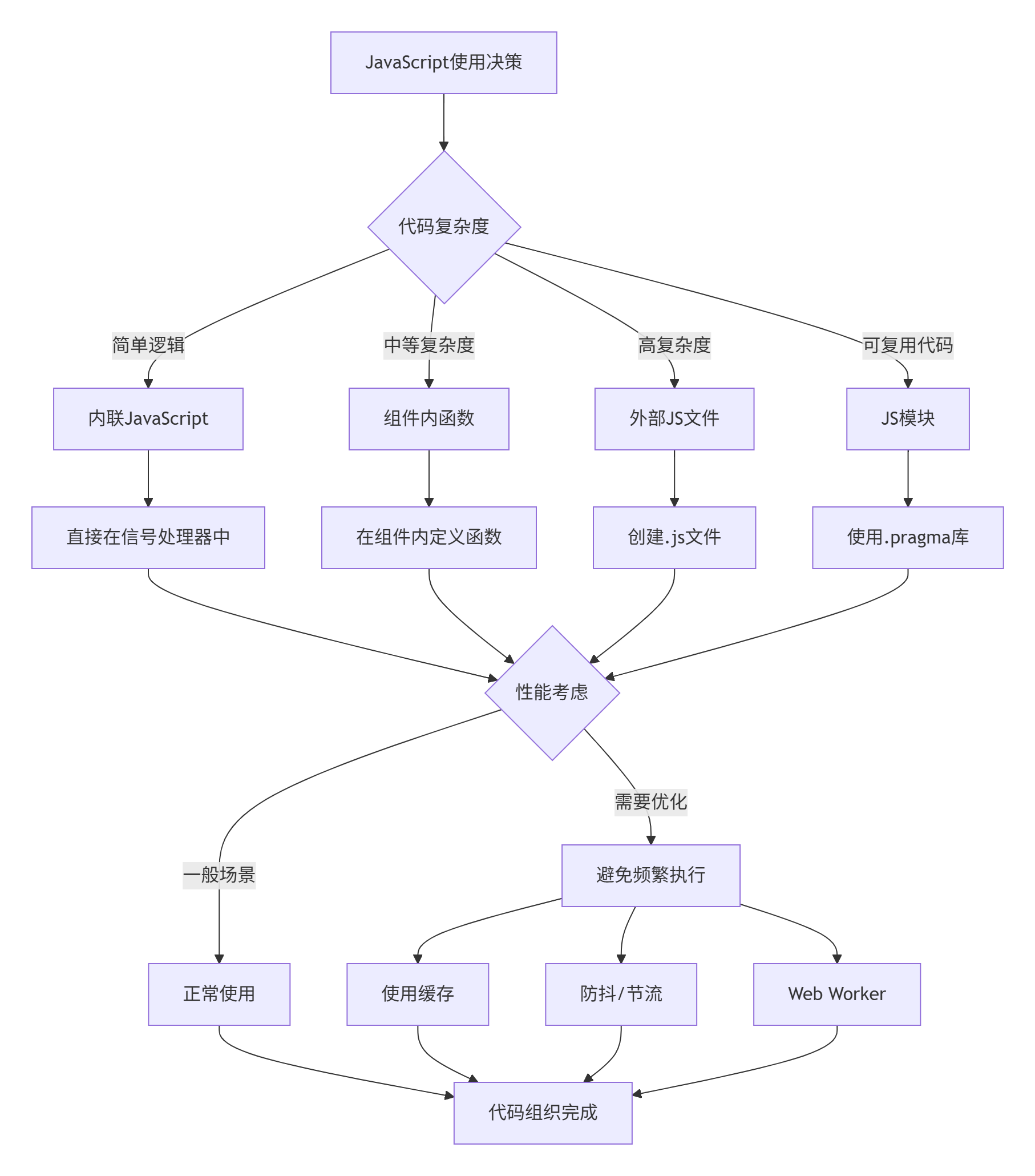
JavaScript使用指南:
-
简单逻辑用内联:一两行的简单操作可以直接写在信号处理器中
-
复杂逻辑用函数:超过3行的逻辑应该提取为函数
-
可复用代码用模块:多个组件共享的逻辑应该放在模块中
-
避免阻塞UI:长时间运行的操作应该使用异步或Worker
-
错误处理:重要的JavaScript代码应该有try-catch块
6. 总结与提高
6.1 本篇核心要点回顾
通过本篇的学习,我们深入掌握了QML语法的核心要素:
-
对象模型:理解了QML的对象树结构和属性系统
-
信号槽机制:掌握了多种信号处理方式
-
布局系统:熟练使用各种布局容器
-
状态管理:学会了创建动态交互界面
-
组件化:掌握了创建和使用自定义组件
-
JavaScript集成:了解了在QML中使用JavaScript的最佳实践
6.2 性能优化建议
-
属性绑定优化
-
避免深层属性绑定链
-
使用缓存减少重复计算
-
对频繁变化的属性使用节流
-
-
渲染优化
-
使用
visible属性控制显示,而不是opacity: 0 -
复杂组件使用
Loader延迟加载 -
列表项使用
cacheBuffer提高滚动性能
-
-
内存管理
-
及时销毁不需要的组件
-
使用
weak引用避免内存泄漏 -
监控JavaScript对象生命周期
-
6.3 常见问题解答
Q1: 什么时候使用属性绑定,什么时候使用赋值?
A1: 需要响应式更新时用绑定,设置固定值时用赋值。注意赋值会破坏已有绑定。
Q2: 如何调试QML代码?
A2: 可以使用Qt Creator的QML调试器,或者在代码中使用console.log()、console.debug()等。
Q3: 如何优化QML应用的启动速度?
A3: 延迟加载非关键组件,预编译QML文件,减少初始加载的JavaScript代码。
Q4: QML和JavaScript的性能关系?
A4: 复杂的JavaScript计算会影响UI响应,应该将耗时操作放在Web Worker中。
6.4 练习与挑战
基础练习
-
修改计算器按钮样式,添加按下效果
-
为计算器添加键盘快捷键支持
-
实现计算器的撤销/重做功能
-
添加计算结果的复制功能
进阶挑战
-
实现科学计算器功能(三角函数、对数等)
-
添加计算历史记录的保存和加载
-
实现多语言支持
-
创建计算器插件系统
项目扩展
-
将计算器打包为桌面应用
-
添加云端同步功能
-
实现计算器小工具模式
-
添加语音输入支持
6.5 下一步学习建议
在下一篇《响应式UI艺术------状态、转换与动画》中,我们将深入学习:
-
高级动画技术:关键帧动画、路径动画、粒子系统
-
状态机设计:复杂状态管理和状态转换
-
视觉效果:阴影、模糊、着色器效果
-
性能优化:GPU加速、内存管理、渲染优化
-
实战项目:创建一个音乐播放器UI
📚 扩展阅读
官方文档
-
QML语言基础
-
Qt Quick布局
-
JavaScript环境
学习资源
-
QML最佳实践
-
性能优化指南
-
调试技巧
工具推荐
-
QML Scene Graph Viewer:查看QML场景图
-
GammaRay:Qt应用调试工具
-
HotQML:QML热重载工具
社区资源
-
Qt官方论坛
-
Stack Overflow QML标签
-
GitHub优秀QML项目
🎉 结语
恭喜你完成了第二篇的学习!通过构建一个功能完整的计算器应用,你已经掌握了QML语法的核心要素。从简单的属性绑定到复杂的组件化架构,你现在具备了构建真实QML应用的能力。
记住,掌握语法只是第一步。真正的艺术在于如何将这些语法元素组合成优雅、高效、可维护的代码。在接下来的篇章中,我们将学习如何让界面"活"起来------通过动画、状态转换和视觉效果,创建令人惊艳的用户体验。