前言
关于亚马逊订单数据的探索!
次项目大家就仅当作学习使用好了
导入库
import pandas as pd
from pyecharts.charts import \*
from pyecharts import options as opts
from pyecharts.commons.utils import JsCode
Python从零基础入门到实战系统教程、源码、视频,想要数据集的同学也可以点这里
数据处理
-
对时间字段进行处理,转为datetime;
-
对配送州字段进行处理,原始数据中既有州缩写也有全称,统一为全称呼;
df_c = pd.read_excel('C:/Users/Administrator/Desktop/市场占有率.xls')
df = pd.read_excel('C:/Users/Administrator/Desktop/亚马逊入驻商订单报表.xls', header=1)
df'支付时间' = pd.to_datetime(df'支付时间', utc=False)# .dt.strftime('%Y-%m-%d %H:%M:%S')
df'下单时间' = pd.to_datetime(df'下单时间', utc=False)# .dt.strftime('%Y-%m-%d %H:%M:%S')
df'最早配送时间' = pd.to_datetime(df'最早配送时间', utc=False)
df'最晚配送时间' = pd.to_datetime(df'最晚配送时间', utc=False)
df'最早送达时间' = pd.to_datetime(df'最早送达时间', utc=False)
df'最晚送达时间' = pd.to_datetime(df'最晚送达时间', utc=False)
c_map = dict()
for idx, row in df_c.iterrows():
c_maprow\['州名简写'] = row'美国州名英文'.replace(u'\xa0', u' ')c_map'SD' = 'South Dakota'
c_map'NM' = 'New Mexico'
c_map'SC' = 'South Carolina'
c_map'NH' = 'New Hampshire'
c_map'NJ' = 'New Jersey'def format_state(state):
try:
c = state.upper().replace('.', '')
if c in c_map.keys():
return c_mapc
elif c in x.upper() for x in c\_map.values():
return list(c_map.values())\[x.upper() for x in c\_map.values().index(c)]
else:
return None
except AttributeError:
return Nonedf'配送州' = df'配送州'.map(format_state)
df.head()
各时间段订单量
早上的订单最多,好像和国内用户习惯不太一样呢~
data = df.groupby(\[df\['下单时间'\].dt.hour\])\['订单ID'\].count().reset\_index()
data\_x \= \['{}点'.format(int(i)) for i in data\['下单时间'\]\]
data\_y \= data\['订单ID'\].tolist()

area\_color\_js \= """
    new echarts.graphic.LinearGradient(
    0, 0, 0, 1,
    \[{offset: 0, color: 'rgba(128, 255, 165)'},
    {offset: 1, color: 'rgba(1, 191, 236)'}\],
    false)
"""

bg\_color\_js \= """
    new echarts.graphic.LinearGradient(
    0, 0, 0, 1,
    \[{offset: 0, color: 'rgba(128, 255, 165, 0.2)'},
    {offset: 1, color: 'rgba(1, 191, 236, 0.2)'}\],
    false)
"""

line \= Line(init\_opts=opts.InitOpts(theme='white', width='1000px', height='500px', bg\_color=JsCode(bg\_color\_js)))
line.add\_xaxis(data\_x)
line.add\_yaxis(
    '',
    data\_y,
    is\_smooth\=True,
    symbol\="circle",
    is\_symbol\_show\=False,
    linestyle\_opts\=opts.LineStyleOpts(color="#fff"),
    areastyle\_opts\=opts.AreaStyleOpts(color=JsCode(area\_color\_js), opacity=1),
)

line.set\_series\_opts(opts.LabelOpts(is\_show\=False))
line.set\_global\_opts(xaxis\_opts\=opts.AxisOpts(boundary\_gap=False),
                     yaxis\_opts\=opts.AxisOpts(axisline\_opts=opts.AxisLineOpts(is\_show=False),
                                              axistick\_opts\=opts.AxisTickOpts(
                                                  is\_show\=False),
                                              splitline\_opts\=opts.SplitLineOpts(is\_show=True,
                                                                                linestyle\_opts\=opts.LineStyleOpts(color='#E0E6F1'))
                                              ),
                     tooltip\_opts\=opts.TooltipOpts(
    is\_show\=True, trigger='axis', axis\_pointer\_type='cross'),
    title\_opts\=opts.TitleOpts(title="全天各时间段订单数", pos\_left='center')
)
line.render\_notebook()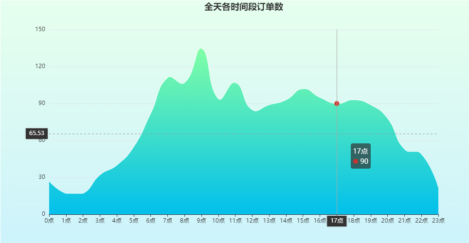
周内订单量分布
data = df.groupby(\[df\['下单时间'\].dt.weekday\_name\])\['订单ID'\].count().reset\_index()
cat\_day\_of\_week \= pd.api.types.CategoricalDtype(
    \['Monday', 'Tuesday', 'Wednesday', 'Thursday', 'Friday', 'Saturday', 'Sunday'\],
    ordered\=True
)
data\['下单时间'\] = data\['下单时间'\].astype(cat\_day\_of\_week)
data \= data.sort\_values(\['下单时间'\])
data\_x \= data\['下单时间'\].tolist()
data\_y \= data\['订单ID'\].tolist()

area\_color\_js \= """
    new echarts.graphic.LinearGradient(
    0, 0, 0, 1,
    \[{offset: 0, color: 'rgba(128, 255, 165)'},
    {offset: 1, color: 'rgba(1, 191, 236)'}\],
    false)
"""

bg\_color\_js \= """
    new echarts.graphic.LinearGradient(
    0, 0, 0, 1,
    \[{offset: 0, color: 'rgba(128, 255, 165, 0.2)'},
    {offset: 1, color: 'rgba(1, 191, 236, 0.2)'}\],
    false)
"""

line \= Line(
    init\_opts\=opts.InitOpts(
        theme\='white',
        width\='1000px',
        height\='500px',
        bg\_color\=JsCode(bg\_color\_js)))
line.add\_xaxis(data\_x)
line.add\_yaxis(
    '',
    data\_y,
    is\_smooth\=True,
    symbol\="circle",
    is\_symbol\_show\=False,
    linestyle\_opts\=opts.LineStyleOpts(color="#fff"),
    areastyle\_opts\=opts.AreaStyleOpts(color=JsCode(area\_color\_js), opacity=1),
)

line.set\_series\_opts(opts.LabelOpts(is\_show\=False))
line.set\_global\_opts(xaxis\_opts\=opts.AxisOpts(boundary\_gap=False),
                     yaxis\_opts\=opts.AxisOpts(
                         is\_scale\=True,
                         axisline\_opts\=opts.AxisLineOpts(is\_show=False),
    axistick\_opts\=opts.AxisTickOpts(
                             is\_show\=False),
    splitline\_opts\=opts.SplitLineOpts(is\_show=True,
                                      linestyle\_opts\=opts.LineStyleOpts(color='#E0E6F1'))
),
    tooltip\_opts\=opts.TooltipOpts(
    is\_show\=True, trigger='axis', axis\_pointer\_type='cross'),
    title\_opts\=opts.TitleOpts(title="一周内各天订单数", pos\_left='center')
)
line.render\_notebook()
美国各州订单
下载美国地图
import requests

GEO\_data \= requests.get(url="https://echarts.apache.org/examples/data/asset/geo/USA.json").json()

area\_move \= """{
        Alaska: {              // 把阿拉斯加移到美国主大陆左下方
            left: -128,
            top: 25,
            width: 15
        },
        Hawaii: {
            left: -110,        // 夏威夷
            top: 25,
            width: 5
        },
        'Puerto Rico': {       // 波多黎各
            left: -76,
            top: 26,
            width: 2
        }
    }"""

data \= df.groupby(\['配送州'\])\['订单ID'\].count().reset\_index()
data\_pair \= \[\]
for idx, row in data.iterrows():
    data\_pair.append((row\['配送州'\], row\['订单ID'\]))
map\_chart \= Map(init\_opts=opts.InitOpts(width='1000px', height='600px'))
map\_chart.add\_js\_funcs(
    """echarts.registerMap('USA', {}, {});""".format(
        GEO\_data, area\_move))
map\_chart.add('订单数',
              data\_pair\=data\_pair,
              maptype\='USA',
              is\_roam\=False,
              # 关闭symbol的显示
              is\_map\_symbol\_show=False,
              zoom\=1.1,
              label\_opts\=opts.LabelOpts(is\_show=False),
              )

map\_chart.set\_global\_opts(
    legend\_opts\=opts.LegendOpts(is\_show=False),
    title\_opts\=opts.TitleOpts(title="美国各州订单数分布", pos\_left='center'),
    visualmap\_opts\=opts.VisualMapOpts(is\_show=True,
                                      is\_piecewise\=True,
                                      orient\='vertical',
                                      pos\_left\='2%',
                                      pos\_top\='65%',
                                      range\_text\=\['订单数', ''\],
                                      pieces\=\[{'min': 100},
                                              {'min': 60,
                                               'max': 100},
                                              {'min': 30,
                                               'max': 60},
                                              {'min': 10,
                                               'max': 30},
                                              {'min': 1,
                                               'max': 10}
                                               \],
                                      range\_color\=\["#CCD3D9", "#E6B6C2", "#D4587A", "#DC364C"\]
                                      )
)
map\_chart.render\_notebook()
商品属性
根据商品名称关键词来判断,93%的商品都是女款
f, m = 0, 0
for i in df\['产品名称'\]:
    try:
        if i.upper().\_\_contains\_\_('WOMEN') or i.upper().\_\_contains\_\_('GIRL'):
            f+=1
        elif i.upper().\_\_contains\_\_('MEN'):
            m+=1
        else:
            pass
    except AttributeError:
        pass

f\_p \= round(f/(f+m)\*100)
m\_p \= round(m/(f+m)\*100)
symbols \= \[
    'path://M18.2629891,11.7131596 L6.8091608,11.7131596 C1.6685112,11.7131596 0,13.032145 0,18.6237673 L0,34.9928467 C0,38.1719847 4.28388932,38.1719847 4.28388932,34.9928467 L4.65591984,20.0216948 L5.74941883,20.0216948 L5.74941883,61.000787 C5.74941883,65.2508314 11.5891201,65.1268798 11.5891201,61.000787 L11.9611506,37.2137775 L13.1110872,37.2137775 L13.4831177,61.000787 C13.4831177,65.1268798 19.3114787,65.2508314 19.3114787,61.000787 L19.3114787,20.0216948 L20.4162301,20.0216948 L20.7882606,34.9928467 C20.7882606,38.1719847 25.0721499,38.1719847 25.0721499,34.9928467 L25.0721499,18.6237673 C25.0721499,13.032145 23.4038145,11.7131596 18.2629891,11.7131596 M12.5361629,1.11022302e-13 C15.4784742,1.11022302e-13 17.8684539,2.38997966 17.8684539,5.33237894 C17.8684539,8.27469031 15.4784742,10.66467 12.5361629,10.66467 C9.59376358,10.66467 7.20378392,8.27469031 7.20378392,5.33237894 C7.20378392,2.38997966 9.59376358,1.11022302e-13 12.5361629,1.11022302e-13',
    'path://M28.9624207,31.5315864 L24.4142575,16.4793596 C23.5227152,13.8063773 20.8817445,11.7111088 17.0107398,11.7111088 L12.112691,11.7111088 C8.24168636,11.7111088 5.60080331,13.8064652 4.70917331,16.4793596 L0.149791395,31.5315864 C-0.786976655,34.7595013 2.9373074,35.9147532 3.9192135,32.890727 L8.72689855,19.1296485 L9.2799493,19.1296485 C9.2799493,19.1296485 2.95992025,43.7750224 2.70031069,44.6924335 C2.56498417,45.1567684 2.74553639,45.4852068 3.24205501,45.4852068 L8.704461,45.4852068 L8.704461,61.6700801 C8.704461,64.9659872 13.625035,64.9659872 13.625035,61.6700801 L13.625035,45.360657 L15.5097899,45.360657 L15.4984835,61.6700801 C15.4984835,64.9659872 20.4191451,64.9659872 20.4191451,61.6700801 L20.4191451,45.4852068 L25.8814635,45.4852068 C26.3667633,45.4852068 26.5586219,45.1567684 26.4345142,44.6924335 C26.1636859,43.7750224 19.8436568,19.1296485 19.8436568,19.1296485 L20.3966199,19.1296485 L25.2043926,32.890727 C26.1862111,35.9147532 29.9105828,34.7595013 28.9625083,31.5315864 L28.9624207,31.5315864 Z M14.5617154,0 C17.4960397,0 19.8773132,2.3898427 19.8773132,5.33453001 C19.8773132,8.27930527 17.4960397,10.66906 14.5617154,10.66906 C11.6274788,10.66906 9.24611767,8.27930527 9.24611767,5.33453001 C9.24611767,2.3898427 11.6274788,0 14.5617154,0 L14.5617154,0 Z',
\]

area\_color\_js \= """
    new echarts.graphic.LinearGradient(
    0, 1, 0, 1,
    \[{offset: 0, color: 'rgba(128, 255, 165)'},
    {offset: 1, color: 'rgba(1, 191, 236)'}\],
    false)
"""

p \= PictorialBar(
    init\_opts\=opts.InitOpts(
        theme\='white',
        width\='1000px',
        height\='800px',
        bg\_color\=JsCode(bg\_color\_js)))

p.add\_xaxis(\[0, 1\])

# 此部分数据为要显示的数值
p.add\_yaxis(
    "",
    \[{
        "value": m\_p,
        "symbol": symbols\[0\],
        'symbolBoundingData': 100,
        "itemStyle": {
            "normal": {
                "color": 'rgba(105,204,230)'  # 单独控制颜色
            }
        },
    },
        {
        "value": f\_p,
        "symbol": symbols\[1\],
        'symbolBoundingData': 100,
        "itemStyle": {
            "normal": {
                "color": 'rgba(255,130,130)'  # 单独控制颜色
            }
        },
    }
    \],
    label\_opts\=opts.LabelOpts(
        is\_show\=True,
        position\='inside',
        font\_family\='Arial',
        font\_weight\='bolder',
        font\_size\=40,
        formatter\='{c}%'),
    symbol\_repeat\=False,
    is\_symbol\_clip\=True
)

# 此部分数据用于背景,设置为100
p.add\_yaxis(
    "",
    \[{
        "value": 100,
        "symbol": symbols\[0\],
        'symbolBoundingData': 100,
        "itemStyle": {
            "normal": {
                "color": 'rgba(105,204,230,0.40)'  # 单独控制颜色
            }
        },
    },
        {
        "value": 100,
        "symbol": symbols\[1\],
        'symbolBoundingData': 100,
        "itemStyle": {
            "normal": {
                "color": 'rgba(255,130,130,0.40)'  # 单独控制颜色
            }
        },
    }
    \],
    category\_gap\='30%',
    label\_opts\=opts.LabelOpts(is\_show=False),
    is\_symbol\_clip\=True,
    symbol\_repeat\=False
)


p.set\_global\_opts(
    title\_opts\=opts.TitleOpts(
        title\="男款商品 VS 女款商品",
        subtitle\='依据订单商品名称中的关键词判断, 如"women","girl"等。',
        pos\_left\='center'),
    tooltip\_opts\=opts.TooltipOpts(is\_show=False),
    legend\_opts\=opts.LegendOpts(is\_show=False),
    xaxis\_opts\=opts.AxisOpts(is\_show=False),
    yaxis\_opts\=opts.AxisOpts(is\_show=False, max\_=100),
)

p.render\_notebook()
商品属性
-
哪个尺码的衣服买的更多?
-
那个颜色更受欢迎?
pie = Pie(
init_opts=opts.InitOpts(
theme='white',
width='1000px',
height='500px',
bg_color='#F5F5F5',
)
)
pie.add(
"",
c.most_common(10),
radius="30%", "50%",
center="25%", "50%",
# rosetype="area",
label_opts=opts.LabelOpts(is_show=True, formatter='{b}:{d}%'),
itemstyle_opts={
'normal': {
'shadowColor': 'rgba(0, 0, 0, .5)', # 阴影颜色
'shadowBlur': 5, # 阴影大小
'shadowOffsetY': 5, # Y轴方向阴影偏移
'shadowOffsetX': 5, # x轴方向阴影偏移
'opacity': '0.7',
}
}
)pie.add(
"",
cl.most_common(10),
radius="30%", "50%",
center="75%", "50%",
# rosetype="area",
label_opts=opts.LabelOpts(is_show=True, formatter='{b}:{d}%'),
itemstyle_opts={
'normal': {
'shadowColor': 'rgba(0, 0, 0, .5)', # 阴影颜色
'shadowBlur': 5, # 阴影大小
'shadowOffsetY': 5, # Y轴方向阴影偏移
'shadowOffsetX': 5, # x轴方向阴影偏移
# 'opacity': '0.7',
}
}
)
pie.set_global_opts(
title_opts= dict( text\='商品属性', left\='center', top\='5%', textStyle\=dict( color\='#282828', fontSize\=20)), dict( text\='SIZE', left\='23%', top\='48%', textStyle\=dict( color\='#282828', fontSize\=17)), dict( text\='COLOR', left\='72%', top\='48%', textStyle\=dict( color\='#282828', fontSize\=17)) ,
tooltip_opts=opts.TooltipOpts(is_show=False),
legend_opts=opts.LegendOpts(is_show=False),
visualmap_opts=opts.VisualMapOpts(
is_show=False,
max_=300,
range_color='rgb(1, 191, 236)', 'rgb(128, 255, 165)'
)
)
pie.render_notebook()

词云图
from stylecloud import gen\_stylecloud
from IPython.display import Image

gen\_stylecloud(' '.join(word\_list),
              size\=1000,
              max\_words\=1000,
              # palette='palettable.tableau.TableauMedium\_10',
              icon\_name='fab fa-amazon',
              output\_name\='comment.png',
              )

Image(filename\='comment.png')