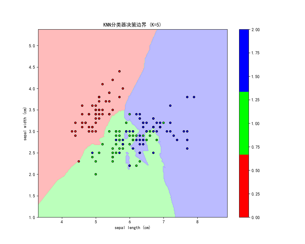
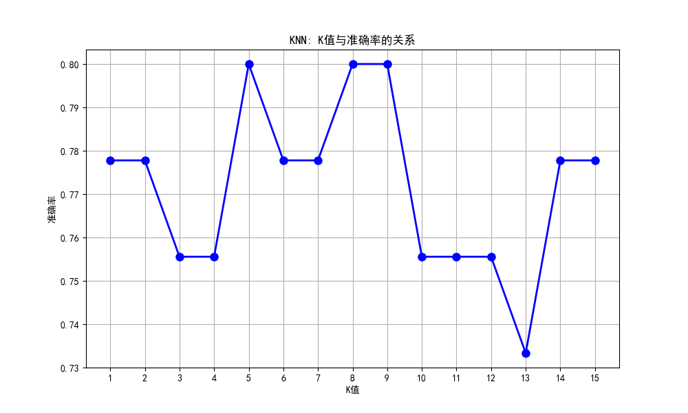
本文使用K近邻算法对鸢尾花数据集进行分类,测试了K值从1到15对模型性能的影响。结果显示最佳K值为6,准确率达0.82。通过绘制K值-准确率曲线和决策边界可视化,直观展示了不同K值对分类效果的影响。实验采用前两个特征进行二维可视化,并使用不同颜色标记分类区域和样本点,清晰呈现了KNN分类器的决策边界形成过程。
import numpy as np
import matplotlib.pyplot as plt
from sklearn.neighbors import KNeighborsClassifier
from sklearn.datasets import load_iris
from sklearn.model_selection import train_test_split
from sklearn.metrics import accuracy_score
from matplotlib.colors import ListedColormap
plt.rcParams['font.sans-serif'] = ['SimHei', 'Microsoft YaHei']
plt.rcParams['axes.unicode_minus'] = False
# 加载鸢尾花数据集
iris = load_iris()
X = iris.data[:, :2]  # 只使用前两个特征以便可视化
y = iris.target

# 划分数据集
X_train, X_test, y_train, y_test = train_test_split(X, y, test_size=0.3, random_state=42)

# 测试不同的K值
k_values = range(1, 16)
accuracies = []

for k in k_values:
    model = KNeighborsClassifier(n_neighbors=k)
    model.fit(X_train, y_train)
    y_pred = model.predict(X_test)
    accuracy = accuracy_score(y_test, y_pred)
    accuracies.append(accuracy)

# 找到最佳K值
best_k = k_values[np.argmax(accuracies)]
best_accuracy = max(accuracies)

print(f"最佳K值: {best_k}")
print(f"最佳准确率: {best_accuracy:.2f}")

# 绘制K值与准确率的关系
plt.figure(figsize=(10, 6))
plt.plot(k_values, accuracies, 'bo-', linewidth=2, markersize=8)
plt.xlabel('K值')
plt.ylabel('准确率')
plt.title('KNN: K值与准确率的关系')
plt.grid(True)
plt.xticks(k_values)
plt.show()

# 使用最佳K值训练模型并可视化决策边界
best_model = KNeighborsClassifier(n_neighbors=best_k)
best_model.fit(X_train, y_train)

# 创建网格点
h = 0.02
x_min, x_max = X[:, 0].min() - 1, X[:, 0].max() + 1
y_min, y_max = X[:, 1].min() - 1, X[:, 1].max() + 1
xx, yy = np.meshgrid(np.arange(x_min, x_max, h),
                     np.arange(y_min, y_max, h))

# 预测每个网格点
Z = best_model.predict(np.c_[xx.ravel(), yy.ravel()])
Z = Z.reshape(xx.shape)

# 绘制决策边界
plt.figure(figsize=(10, 8))
cmap_light = ListedColormap(['#FFAAAA', '#AAFFAA', '#AAAAFF'])
cmap_bold = ListedColormap(['#FF0000', '#00FF00', '#0000FF'])

plt.contourf(xx, yy, Z, cmap=cmap_light, alpha=0.8)
scatter = plt.scatter(X[:, 0], X[:, 1], c=y, cmap=cmap_bold, edgecolor='black', s=20)
plt.xlabel(iris.feature_names[0])
plt.ylabel(iris.feature_names[1])
plt.title(f'KNN分类器决策边界 (K={best_k})')
plt.colorbar(scatter)
plt.show()