数据集来自kaggle文章,代码较为简单。
import numpy as np # linear algebra
import pandas as pd # data processing, CSV file I/O (e.g. pd.read_csv)


# Input data files are available in the read-only "../input/" directory
# For example, running this (by clicking run or pressing Shift+Enter) will list all files under the input directory


import os
for dirname, _, filenames in os.walk('/kaggle/input'):
    for filename in filenames:
        print(os.path.join(dirname, filename))
Neural Network Model with TensorFlow and Keras for Classification
import tensorflow as tf
from tensorflow.keras import models,layers
import matplotlib.pyplot as plt


BATCH_SIZE=32
IMAGE_SIZE=224
CHANNELS=3
EPOCHS=50
Loading Image Dataset for Training
dataset=tf.keras.preprocessing.image_dataset_from_directory(
    "/kaggle/input/potato-dataset/PlantVillage",
    shuffle=True,
    image_size=(IMAGE_SIZE,IMAGE_SIZE),
    batch_size=BATCH_SIZE
)
Retrieving Class Names from the Dataset
class_names=dataset.class_names
class_names
Data Visualization
import os


Potato___Early_blight_dir = '/kaggle/input/potato-dataset/PlantVillage/Potato___Early_blight'
Potato___Late_blight_dir = '/kaggle/input/potato-dataset/PlantVillage/Potato___Late_blight'
Potato___healthy_dir = '/kaggle/input/potato-dataset/PlantVillage/Potato___healthy'
import matplotlib.pyplot as plt


# Define the categories and corresponding counts
categories = ['Early Leaf Blight','Late Leaf Blight','Healthy']
counts = [len(os.listdir(Potato___Early_blight_dir)), len(os.listdir(Potato___Late_blight_dir)), len(os.listdir(Potato___healthy_dir))]


# Create a bar plot to visualize the distribution of images
plt.figure(figsize=(12, 6))
plt.bar(categories, counts, color='skyblue')
plt.xlabel('Categories')
plt.ylabel('Number of Images')
plt.title('Distribution of Images in Different Categories')
plt.show()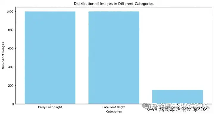
Visualizing Sample Images from the Dataset
plt.figure(figsize=(10,10))
for image_batch, labels_batch in dataset.take(1):
    print(image_batch.shape)
    print(labels_batch.numpy())
    for i in range(12):
        ax=plt.subplot(3,4,i+1)
        plt.imshow(image_batch[i].numpy().astype("uint8"))
        plt.title(class_names[labels_batch[i]])
        plt.axis("off")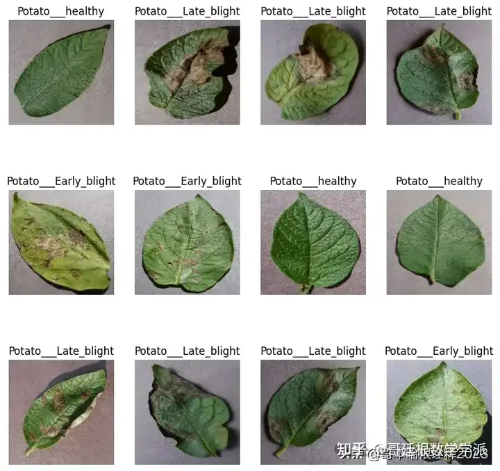
Function to Split Dataset into Training and Validation Set
def get_dataset_partitions_tf(ds, train_split=0.8, val_split=0.2, shuffle=True, shuffle_size=10000):
    assert(train_split+val_split)==1


    ds_size=len(ds)


    if shuffle:
        ds=ds.shuffle(shuffle_size, seed=12)


    train_size=int(train_split*ds_size)
    val_size=int(val_split*ds_size)


    train_ds=ds.take(train_size)
    val_ds=ds.skip(train_size).take(val_size)


    return train_ds, val_ds
train_ds, val_ds =get_dataset_partitions_tf(dataset)
Data Augmentation
train_ds= train_ds.cache().shuffle(1000).prefetch(buffer_size=tf.data.AUTOTUNE)
val_ds= val_ds.cache().shuffle(1000).prefetch(buffer_size=tf.data.AUTOTUNE)
for image_batch, labels_batch in dataset.take(1):
    print(image_batch[0].numpy()/255)
pip install preprocessing
resize_and_rescale = tf.keras.Sequential([
    layers.Resizing(IMAGE_SIZE, IMAGE_SIZE),
    layers.Rescaling(1./255),
])
data_augmentation=tf.keras.Sequential([
    layers.RandomFlip("horizontal_and_vertical"),
    layers.RandomRotation(0.2),
])
n_classes=3
Our own Convolutional Neural Network (CNN) for Image Classification
input_shape=(BATCH_SIZE, IMAGE_SIZE,IMAGE_SIZE,CHANNELS)
n_classes=3


model_1= models.Sequential([
    resize_and_rescale,
    data_augmentation,
    layers.Conv2D(32, kernel_size=(3,3), activation='relu', input_shape=input_shape),
    layers.MaxPooling2D((2,2)),
    layers.Conv2D(64, kernel_size=(3,3), activation='relu'),
    layers.MaxPooling2D((2,2)),
    layers.Conv2D(64, kernel_size=(3,3), activation='relu'),
    layers.MaxPooling2D((2,2)),
    layers.Conv2D(64, (3,3), activation='relu'),
    layers.MaxPooling2D((2,2)),
    layers.Conv2D(64, (3,3), activation='relu'),
    layers.MaxPooling2D((2,2)),
    layers.Conv2D(128, (3,3), activation='relu'),
    layers.MaxPooling2D((2,2)),
    layers.Flatten(),
    layers.Dense(256,activation='relu'),
    layers.Dense(n_classes, activation='softmax'),
])
model_1.build(input_shape=input_shape)
model_1.summary()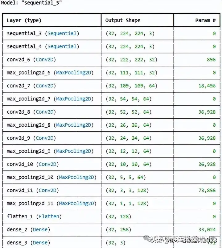
model_1.compile(
    optimizer='adam',
    loss=tf.keras.losses.SparseCategoricalCrossentropy(from_logits=False),
    metrics=['accuracy']
)
history=model_1.fit(
    train_ds,
    batch_size=BATCH_SIZE,
    validation_data=val_ds,
    verbose=1,
    epochs=50
)
scores=model_1.evaluate(val_ds)
Training History Metrics Extraction
acc=history.history['accuracy']
val_acc=history.history['val_accuracy']


loss=history.history['loss']
val_loss=history.history['val_loss']
history.history['accuracy']
Training History Visualization
EPOCHS=50
plt.figure(figsize=(20,8))
plt.subplot(1,2,1)
plt.plot(range(EPOCHS), acc, label='Training Accuracy')
plt.plot(range(EPOCHS), val_acc, label='Validation Accuracy')
plt.legend(loc='lower right')
plt.title('Training and Validation Accuracy')


plt.subplot(1, 2, 2)
plt.plot(range(EPOCHS), loss, label='Training Loss')
plt.plot(range(EPOCHS), val_loss, label='Validation Loss')
plt.legend(loc='upper right')
plt.title('Training and Validation Loss')
plt.show()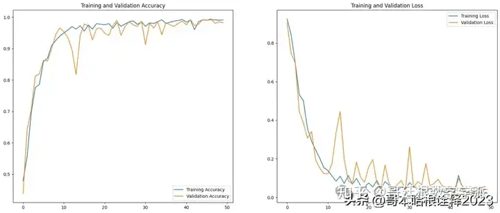
Prediction of Image Labels from Validation Dataset
import numpy as np
for images_batch, labels_batch in val_ds.take(1):
  first_image=images_batch[0].numpy().astype("uint8")
  print("First image to predict")
  plt.imshow(first_image)
  print("Actual Label:",class_names[labels_batch[0].numpy()])


  batch_prediction = model_1.predict(images_batch)
  print("Predicted Label:",class_names[np.argmax(batch_prediction[0])])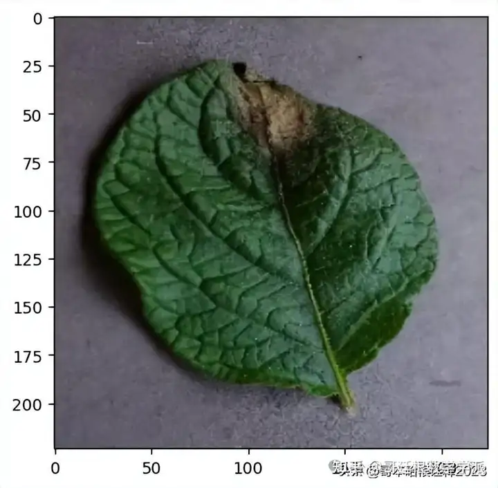
def predict(model, img):
  img_array=tf.keras.preprocessing.image.img_to_array(images[i].numpy())
  img_array=tf.expand_dims(img_array,0) #create a batch


  predictions=model.predict(img_array)


  predicted_class=class_names[np.argmax(predictions[0])]
  confidence=round(100*(np.max(predictions[0])),2)
  return predicted_class, confidence
plt.figure(figsize=(15,15))
for images, labels in val_ds.take(1):
  for i in range(1):
    ax=plt.subplot(3,3,i+1)
    plt.imshow(images[i].numpy().astype("uint8"))
    predicted_class, confidence=predict(model_1, images[i].numpy())


    actual_class=class_names[labels[i]]
    plt.title(f"Actual: {actual_class}, \n Predicted: {predicted_class}. \n Confidence: {confidence}%")
    plt.axis("off")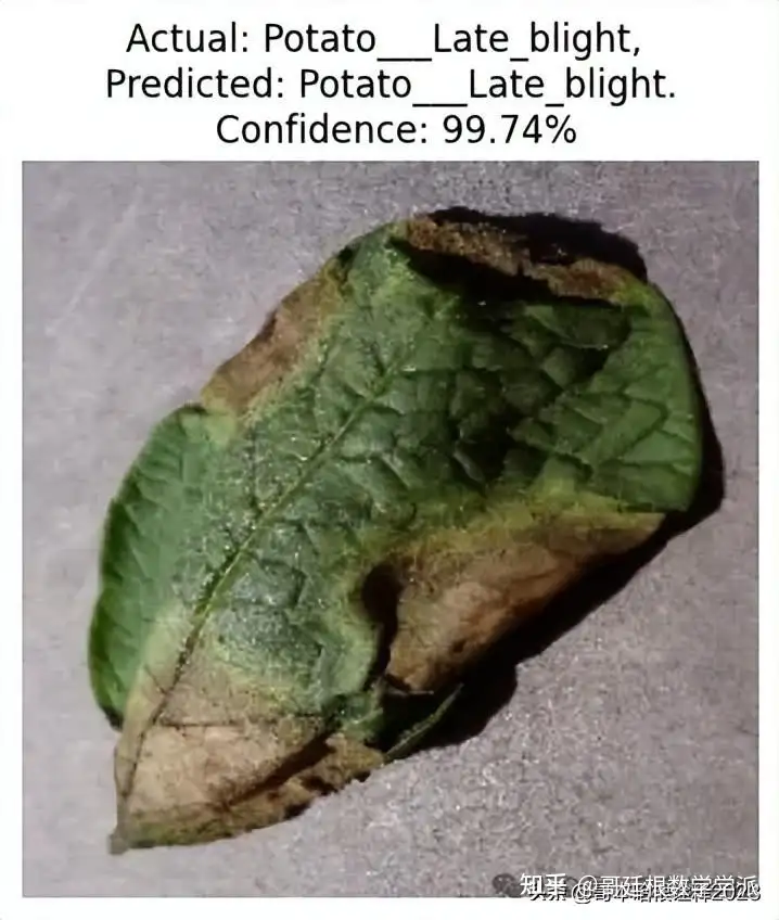
plt.figure(figsize=(15,15))
for images, labels in val_ds.take(1):
  for i in range(9):
    ax=plt.subplot(3,3,i+1)
    plt.imshow(images[i].numpy().astype("uint8"))
    predicted_class, confidence=predict(model_1, images[i].numpy())


    actual_class=class_names[labels[i]]
    plt.title(f"Actual: {actual_class}, \n Predicted: {predicted_class}. \n Confidence: {confidence}%")
    plt.axis("off")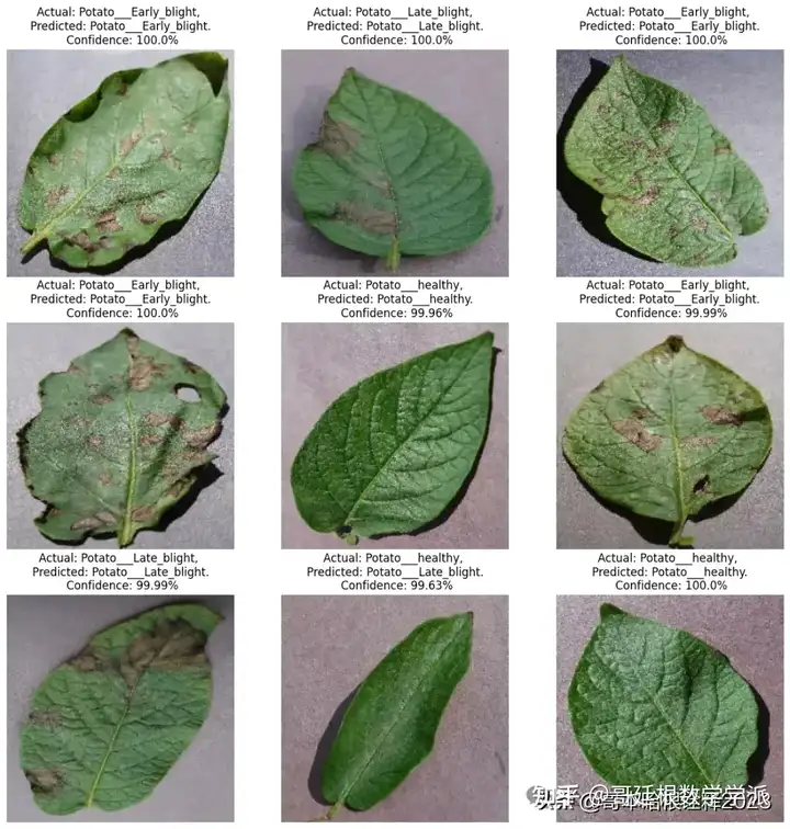
Saving the TensorFlow Model
from tensorflow.keras.models import save_model


# Save the TensorFlow model in .h5 format


# With this line
model_1.save('/kaggle/working/model_potato_50epochs_99%acc.keras')
Evaluating Model Predictions on Validation Dataset
# Initialize lists to store the results
y_true = []
y_pred = []


# Iterate over the validation dataset
for images, labels in val_ds:
    # Get the model's predictions
    predictions = model_1.predict(images)


    # Get the indices of the maximum values along an axis using argmax
    pred_labels = np.argmax(predictions, axis=1)


    # Extend the 'y_true' and 'y_pred' lists
    y_true.extend(labels.numpy())
    y_pred.extend(pred_labels)


# Convert lists to numpy arrays
y_true = np.array(y_true)
y_pred = np.array(y_pred)
Evaluation Metrics Calculation
from sklearn.metrics import accuracy_score, precision_score, recall_score, f1_score


# Calculate metrics
accuracy = accuracy_score(y_true, y_pred)
precision = precision_score(y_true, y_pred, average='weighted')
recall = recall_score(y_true, y_pred, average='weighted')
f1 = f1_score(y_true, y_pred, average='weighted')


print(f'Accuracy: {accuracy}')  # (accuracy = (TP+TN)/(TP+FP+TN+FN))
print(f'Precision: {precision}')  # (precision = TP/(TP+FP))
print(f'Recall: {recall}')  # (recall = TP/(TP+FN))
print(f'F1 Score: {f1}')  # (f1 score = 2/((1/Precision)+(1/Recall)))
Visualization of Confusion Matrix
import seaborn as sns
from sklearn.metrics import confusion_matrix
import matplotlib.pyplot as plt


# Assuming y_true and y_pred are defined
cm = confusion_matrix(y_true, y_pred)
plt.figure(figsize=(10, 10))
sns.heatmap(cm, annot=True, fmt='d', cmap='Blues')
plt.xlabel('Predicted labels')
plt.ylabel('True labels')
plt.title('Confusion Matrix')
plt.show()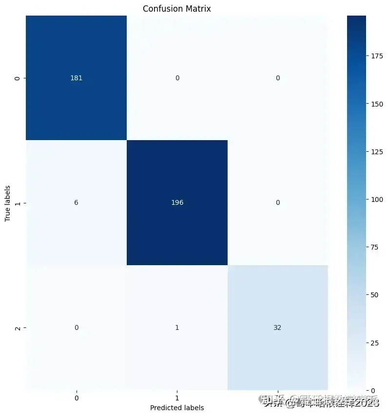
ROC Curve
from sklearn.metrics import roc_curve, auc
from sklearn.preprocessing import LabelBinarizer
import matplotlib.pyplot as plt


# Binarize the output
lb = LabelBinarizer()
lb.fit(y_true)
y_test = lb.transform(y_true)
y_pred = lb.transform(y_pred)


n_classes = y_test.shape[1]


# Compute ROC curve and ROC area for each class
fpr = dict()
tpr = dict()
roc_auc = dict()
for i in range(n_classes):
    fpr[i], tpr[i], _ = roc_curve(y_test[:, i], y_pred[:, i])
    roc_auc[i] = auc(fpr[i], tpr[i])


# Plot all ROC curves
plt.figure()
for i in range(n_classes):
    plt.plot(fpr[i], tpr[i],
             label='ROC curve of class {0} (area = {1:0.2f})'
             ''.format(i, roc_auc[i]))


plt.plot([0, 1], [0, 1], 'k--')
plt.xlim([0.0, 1.0])
plt.ylim([0.0, 1.05])
plt.xlabel('False Positive Rate')
plt.ylabel('True Positive Rate')
plt.title('Receiver Operating Characteristic to Multi-Class')
plt.legend(loc="lower right")
plt.show()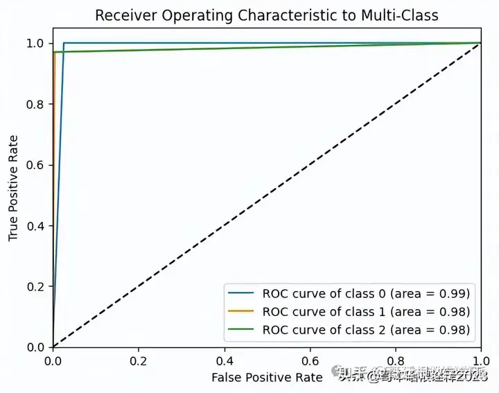
AUC Score
from sklearn.metrics import roc_auc_score


# Assuming y_true and y_pred are defined
# 'ovo' stands for One-vs-One
# 'macro' calculates metrics for each label, and finds their unweighted mean
auc = roc_auc_score(y_true, y_pred, multi_class='ovo', average='macro')


print(f'AUC Score: {auc}')  # (AUC Score = Area Under the ROC Curve)
Saving the TensorFlow Model
from tensorflow.keras.models import save_model


# Save the TensorFlow model in .h5 format


# With this line
model_1.save('/kaggle/working/model_potato_50epochs_99%acc1.keras')
CNN Architecture Specification of the Base Research Paper
#Proposed Model in Research Paper
# activation units=64,128,256,512,512,4096,4096,1000
# kernel= 3,3
# max pooling =2,2
input_shape=(224,224,3)
Paper-Based CNN Model Architecture
from tensorflow.keras import Input


model_paper = models.Sequential([
    Input(shape=input_shape),
    resize_and_rescale,
    data_augmentation,
    # conv1
    layers.Conv2D(64, kernel_size=(3,3), activation='relu'),
    layers.MaxPooling2D((2,2)),


    #conv2
    layers.Conv2D(128, kernel_size=(3,3), activation='relu'),
    layers.MaxPooling2D((2,2)),


    #conv3
    layers.Conv2D(256, kernel_size=(3,3), activation='relu'),
    layers.MaxPooling2D((2,2)),


    #conv4
    layers.Conv2D(512, (3,3), activation='relu'),
    layers.MaxPooling2D((2,2)),


    #conv5
    layers.Conv2D(512, (3,3), activation='relu'),
    layers.MaxPooling2D((2,2)),


    layers.Flatten(),
    layers.Dense(4096, activation='relu'),
    layers.Dense(4096, activation='relu'),
    layers.Dense(1000, activation='relu'),
    layers.Dense(n_classes, activation='softmax'),
])
model_paper.summary()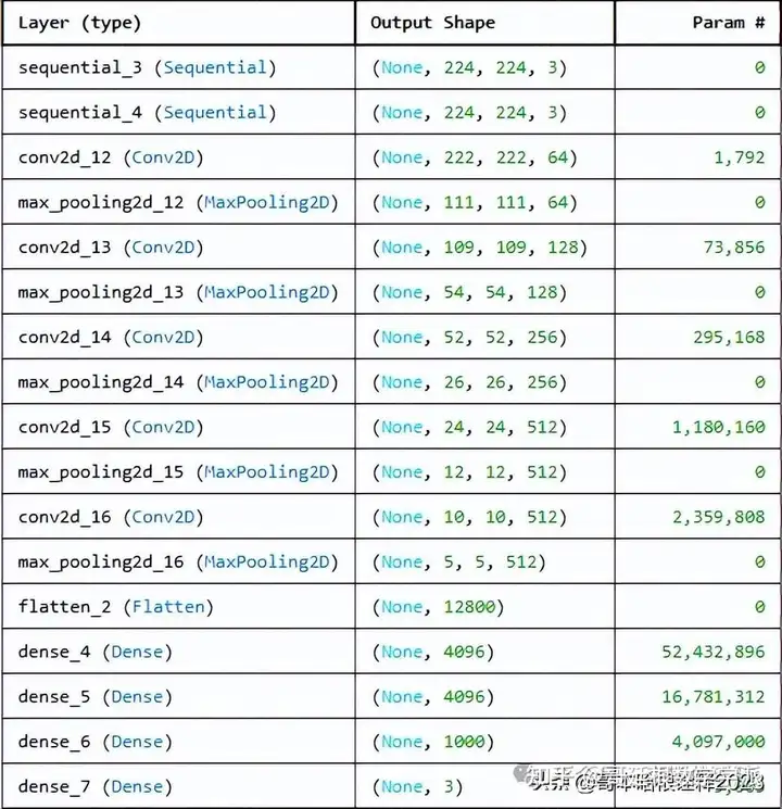
Compilation of the Paper-Based CNN Model
model_paper.compile(
    optimizer='adam',
    loss=tf.keras.losses.SparseCategoricalCrossentropy(from_logits=False),
    metrics=['accuracy']
)
Training the Paper-Based CNN Model
history_paper=model_paper.fit(
    train_ds,
    batch_size=BATCH_SIZE,
    validation_data=val_ds,
    verbose=1,
    epochs=50
)
scores_paper=model_paper.evaluate(val_ds)
acc=history_paper.history['accuracy']
val_acc=history_paper.history['val_accuracy']


loss=history_paper.history['loss']
val_loss=history_paper.history['val_loss']
history_paper.history['accuracy']
Visualization of Training and Validation Metrics of Base Paper Model
EPOCHS=50
plt.figure(figsize=(20,8))
plt.subplot(1,2,1)
plt.plot(range(EPOCHS), acc, label='Training Accuracy')
plt.plot(range(EPOCHS), val_acc, label='Validation Accuracy')
plt.legend(loc='lower right')
plt.title('Training and Validation Accuracy')


plt.subplot(1, 2, 2)
plt.plot(range(EPOCHS), loss, label='Training Loss')
plt.plot(range(EPOCHS), val_loss, label='Validation Loss')
plt.legend(loc='upper right')
plt.title('Training and Validation Loss')
plt.show()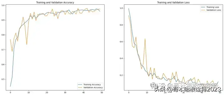
Prediction of Image Label from Validation Dataset
import numpy as np
for images_batch, labels_batch in val_ds.take(1):
  first_image=images_batch[0].numpy().astype("uint8")
  print("First image to predict")
  plt.imshow(first_image)
  print("Actual Label:",class_names[labels_batch[0].numpy()])


  batch_prediction = model_paper.predict(images_batch)
  print("Predicted Label:",class_names[np.argmax(batch_prediction[0])])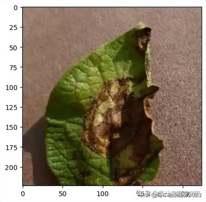
def predict(model, img):
  img_array=tf.keras.preprocessing.image.img_to_array(images[i].numpy())
  img_array=tf.expand_dims(img_array,0) #create a batch


  predictions=model.predict(img_array)


  predicted_class=class_names[np.argmax(predictions[0])]
  confidence=round(100*(np.max(predictions[0])),2)
  return predicted_class, confidence
plt.figure(figsize=(15,15))
for images, labels in val_ds.take(1):
  for i in range(1):
    ax=plt.subplot(3,3,i+1)
    plt.imshow(images[i].numpy().astype("uint8"))
    predicted_class, confidence=predict(model_paper, images[i].numpy())


    actual_class=class_names[labels[i]]
    plt.title(f"Actual: {actual_class}, \n Predicted: {predicted_class}. \n Confidence: {confidence}%")
    plt.axis("off")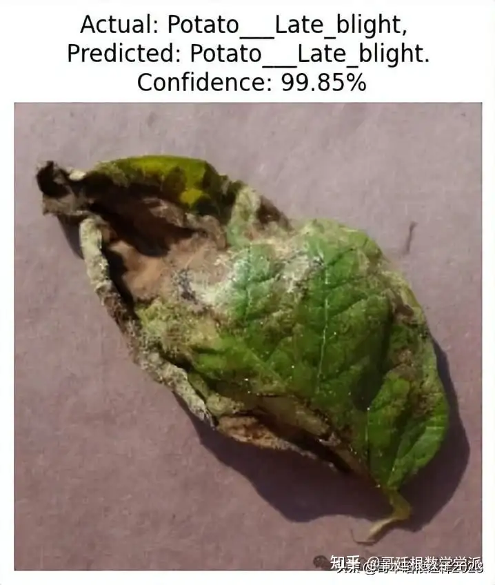
plt.figure(figsize=(15,15))
for images, labels in val_ds.take(1):
  for i in range(9):
    ax=plt.subplot(3,3,i+1)
    plt.imshow(images[i].numpy().astype("uint8"))
    predicted_class, confidence=predict(model_paper, images[i].numpy())


    actual_class=class_names[labels[i]]
    plt.title(f"Actual: {actual_class}, \n Predicted: {predicted_class}. \n Confidence: {confidence}%")
    plt.axis("off")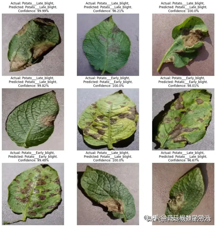
Saving the Tensorflow model of the base paper
from tensorflow.keras.models import save_model


# Save the TensorFlow model in .h5 format


# With this line
model_paper.save('/kaggle/working/model_potato_basepaper.keras')
# Initialize lists to store the results
y_true = []
y_pred = []


# Iterate over the validation dataset
for images, labels in val_ds:
    # Get the model's predictions
    predictions = model_paper.predict(images)


    # Get the indices of the maximum values along an axis using argmax
    pred_labels = np.argmax(predictions, axis=1)


    # Extend the 'y_true' and 'y_pred' lists
    y_true.extend(labels.numpy())
    y_pred.extend(pred_labels)


# Convert lists to numpy arrays
y_true = np.array(y_true)
y_pred = np.array(y_pred)
Calculating Classification Metrics
from sklearn.metrics import accuracy_score, precision_score, recall_score, f1_score


# Calculate metrics
accuracy = accuracy_score(y_true, y_pred)
precision = precision_score(y_true, y_pred, average='weighted')
recall = recall_score(y_true, y_pred, average='weighted')
f1 = f1_score(y_true, y_pred, average='weighted')


print(f'Accuracy: {accuracy}')
print(f'Precision: {precision}')
print(f'Recall: {recall}')
print(f'F1 Score: {f1}')
The provided code segment visualizes the confusion matrix using Seaborn's heatmap function
import seaborn as sns
from sklearn.metrics import confusion_matrix
import matplotlib.pyplot as plt


# Assuming y_true and y_pred are defined
cm = confusion_matrix(y_true, y_pred)
plt.figure(figsize=(10, 10))
sns.heatmap(cm, annot=True, fmt='d', cmap='Blues')
plt.xlabel('Predicted labels')
plt.ylabel('True labels')
plt.title('Confusion Matrix')
plt.show()
from sklearn.metrics import roc_curve, auc
from sklearn.preprocessing import LabelBinarizer
import matplotlib.pyplot as plt


# Binarize the output
lb = LabelBinarizer()
lb.fit(y_true)
y_test = lb.transform(y_true)
y_pred = lb.transform(y_pred)


n_classes = y_test.shape[1]


# Compute ROC curve and ROC area for each class
fpr = dict()
tpr = dict()
roc_auc = dict()
for i in range(n_classes):
    fpr[i], tpr[i], _ = roc_curve(y_test[:, i], y_pred[:, i])
    roc_auc[i] = auc(fpr[i], tpr[i])


# Plot all ROC curves
plt.figure()
for i in range(n_classes):
    plt.plot(fpr[i], tpr[i],
             label='ROC curve of class {0} (area = {1:0.2f})'
             ''.format(i, roc_auc[i]))


plt.plot([0, 1], [0, 1], 'k--')
plt.xlim([0.0, 1.0])
plt.ylim([0.0, 1.05])
plt.xlabel('False Positive Rate')
plt.ylabel('True Positive Rate')
plt.title('Receiver Operating Characteristic to Multi-Class')
plt.legend(loc="lower right")
plt.show()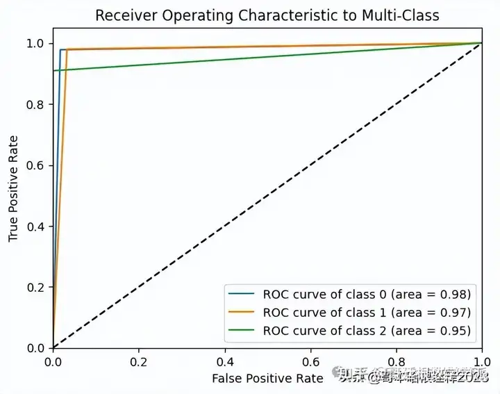
from sklearn.metrics import roc_auc_score
# Assuming y_true and y_pred are defined
# 'ovo' stands for One-vs-One
# 'macro' calculates metrics for each label, and finds their unweighted mean
auc = roc_auc_score(y_true, y_pred, multi_class='ovo', average='macro')
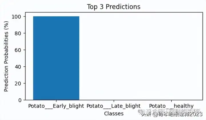
print(f'AUC Score: {auc}') # (AUC Score = Area Under the ROC Curve)Using Explainable AI to explain the predictions of our own CNN model,Taking an image and predicting it's class using our own CNN Model
import numpy as np
import matplotlib.pyplot as plt


for images_batch, labels_batch in val_ds.take(1):
  first_image = images_batch[0].numpy().astype("uint8")
  print("First image to predict")
  plt.imshow(first_image)
  print("Actual Label:", class_names[labels_batch[0].numpy()])


  batch_prediction = model_1.predict(images_batch)
  top_3_pred_indices = np.argsort(batch_prediction[0])[-3:][::-1]
  top_3_pred_labels = [class_names[index] for index in top_3_pred_indices]
  top_3_pred_values = [batch_prediction[0][index] for index in top_3_pred_indices]
  top_3_pred_percentages = [value * 100 for value in top_3_pred_values]
  print("Top 3 Predicted Labels:", top_3_pred_labels)
  print("Top 3 Predicted Probabilities (%):", top_3_pred_percentages)


  # Plotting the top 3 predictions
  plt.figure(figsize=(6, 3))
  plt.bar(top_3_pred_labels, top_3_pred_percentages)
  plt.title('Top 3 Predictions')
  plt.xlabel('Classes')
  plt.ylabel('Prediction Probabilities (%)')
  plt.show()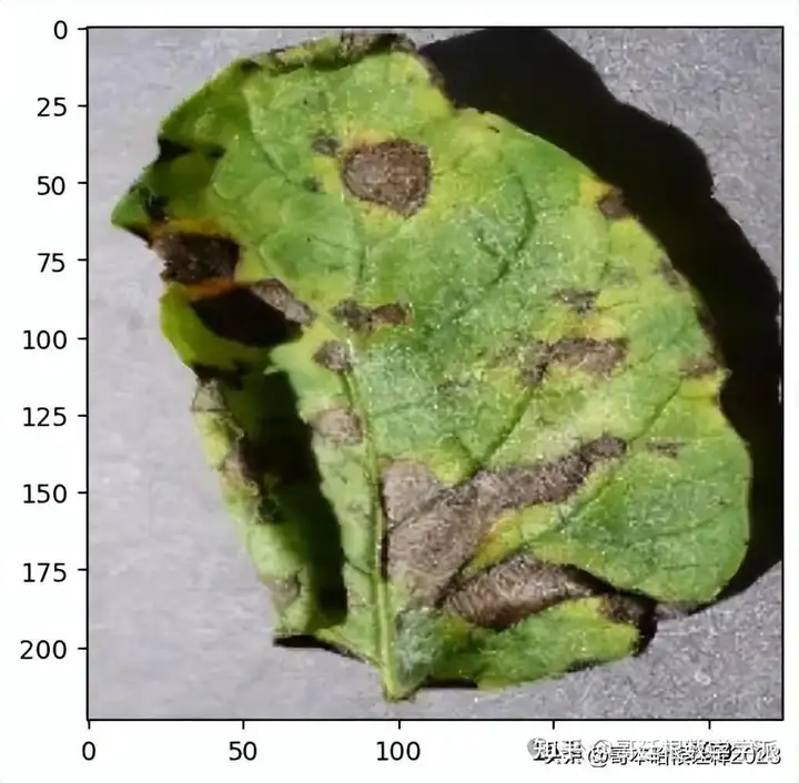
Model Explainability with LIME (Local Interpretable Model-Agnostic Explanations)
pip install limeSetting up Lime for Image Explanation
%load_ext autoreload
%autoreload 2
import os,sys
try:
    import lime
except:
    sys.path.append(os.path.join('..', '..')) # add the current directory
    import lime
from lime import lime_image
explainer = lime_image.LimeImageExplainer()
%%time
# Hide color is the color for a superpixel turned OFF. Alternatively, if it is NONE, the superpixel will be replaced by the average of its pixels
explanation = explainer.explain_instance(images_batch[0].numpy().astype('double'), model_1.predict, top_labels=3, hide_color=0, num_samples=1000)
from skimage.segmentation import mark_boundaries
Superpixel for the top most Prediction
#here hide_rest is True
temp, mask = explanation.get_image_and_mask(explanation.top_labels[0], positive_only=True, num_features=3, hide_rest=True)
plt.imshow(mark_boundaries(temp / 2 + 0.5, mask))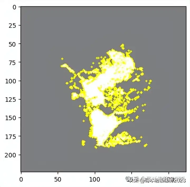
#here hide_rest is False
temp, mask = explanation.get_image_and_mask(explanation.top_labels[0], positive_only=True, num_features=10, hide_rest=False)
plt.imshow(mark_boundaries(temp / 2 + 0.5, mask))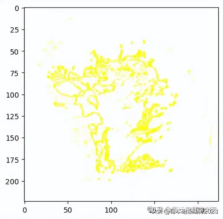
Visualizing 'pros and cons'
temp, mask = explanation.get_image_and_mask(explanation.top_labels[0], positive_only=False, num_features=10, hide_rest=False)
plt.imshow(mark_boundaries(temp / 2 + 0.5, mask))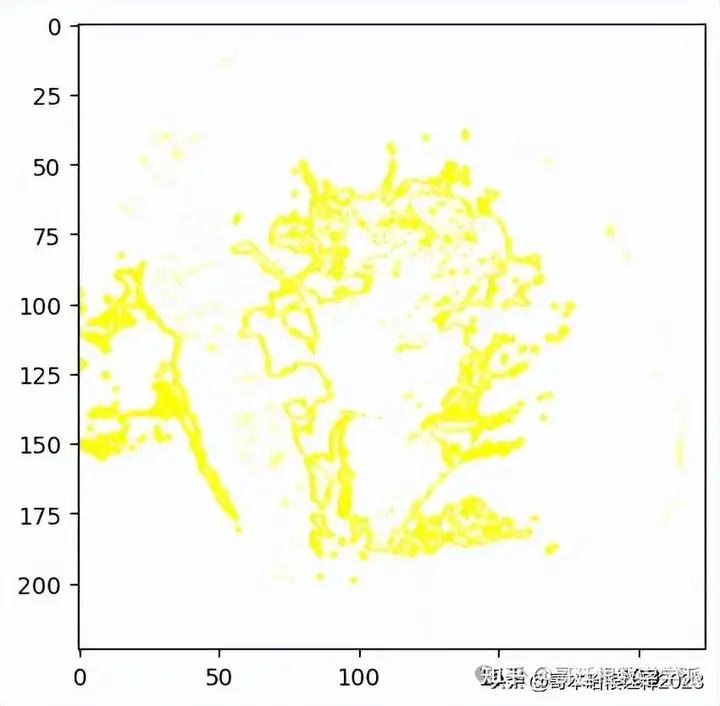
temp, mask = explanation.get_image_and_mask(explanation.top_labels[0], positive_only=False, num_features=1000, hide_rest=False, min_weight=0.1)
plt.imshow(mark_boundaries(temp / 2 + 0.5, mask))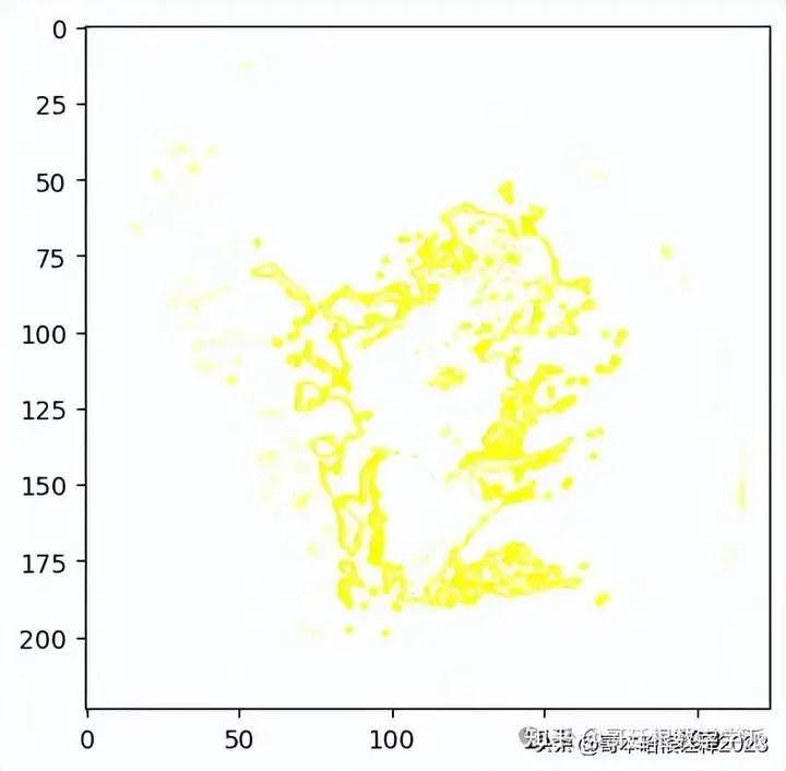
Explaination Heatmap plot with weights
#Select the same class explained on the figures above.
ind =  explanation.top_labels[0]


#Map each explanation weight to the corresponding superpixel
dict_heatmap = dict(explanation.local_exp[ind])
heatmap = np.vectorize(dict_heatmap.get)(explanation.segments)


#Plot. The visualization makes more sense if a symmetrical colorbar is used.
plt.imshow(heatmap, cmap = 'RdBu', vmin  = -heatmap.max(), vmax = heatmap.max())
plt.colorbar()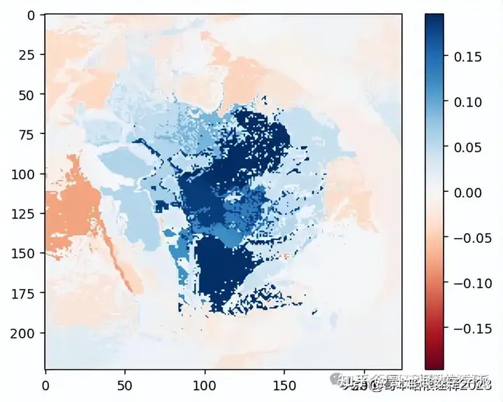
Second Prediction in the List
temp, mask = explanation.get_image_and_mask(explanation.top_labels[1], positive_only=True, num_features=5, hide_rest=True)
plt.imshow(mark_boundaries(temp / 2 + 0.5, mask))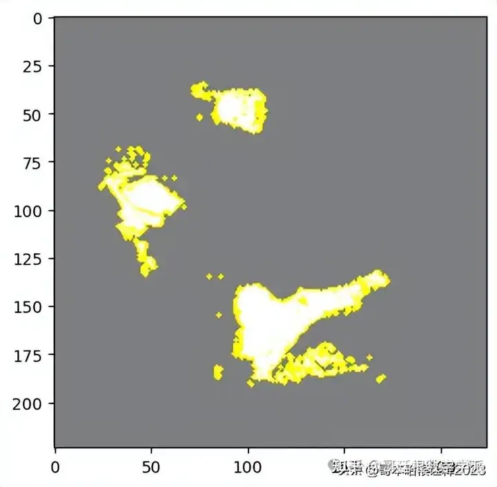
Rest of the image from the second prediction i.e. top_labels1
temp, mask = explanation.get_image_and_mask(explanation.top_labels[1], positive_only=True, num_features=5, hide_rest=False)
plt.imshow(mark_boundaries(temp / 2 + 0.5, mask))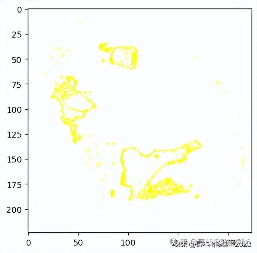
Visualizing 'pros and cons'
temp, mask = explanation.get_image_and_mask(explanation.top_labels[1], positive_only=False, num_features=10, hide_rest=False)
plt.imshow(mark_boundaries(temp / 2 + 0.5, mask))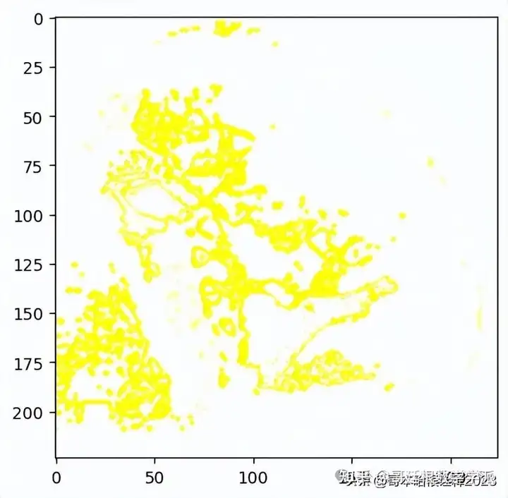
temp, mask = explanation.get_image_and_mask(explanation.top_labels[1], positive_only=False, num_features=1000, hide_rest=False, min_weight=0.1)
plt.imshow(mark_boundaries(temp / 2 + 0.5, mask))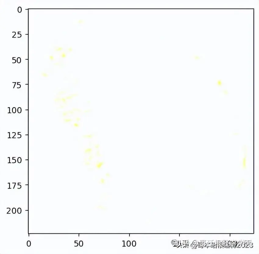
#Select the same class explained on the figures above.
ind =  explanation.top_labels[1]


#Map each explanation weight to the corresponding superpixel
dict_heatmap = dict(explanation.local_exp[ind])
heatmap = np.vectorize(dict_heatmap.get)(explanation.segments)


#Plot. The visualization makes more sense if a symmetrical colorbar is used.
plt.imshow(heatmap, cmap = 'RdBu', vmin  = -heatmap.max(), vmax = heatmap.max())
plt.colorbar()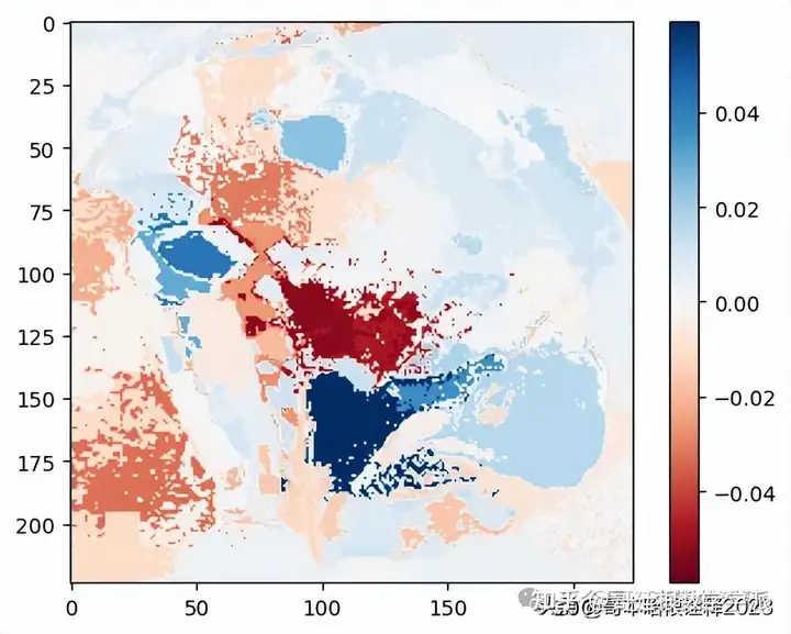
from lime import lime_image
explainer = lime_image.LimeImageExplainer()
explanation = explainer.explain_instance(images_batch[0].numpy().astype('double'), model_1.predict,top_labels=3, hide_color=0, num_samples=1000)
from skimage.segmentation import mark_boundaries


temp_1, mask_1 = explanation.get_image_and_mask(explanation.top_labels[0], positive_only=True, num_features=5, hide_rest=True)
temp_2, mask_2 = explanation.get_image_and_mask(explanation.top_labels[0], positive_only=False, num_features=10, hide_rest=False)


fig, (ax1, ax2) = plt.subplots(1, 2, figsize=(15,15))
ax1.imshow(mark_boundaries(temp_1, mask_1))
ax2.imshow(mark_boundaries(temp_2, mask_2))
ax1.axis('off')
ax2.axis('off')


plt.savefig('mask_default.png')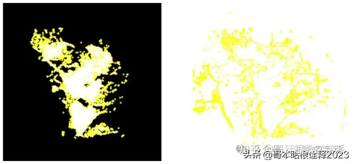
工学博士,担任《Mechanical System and Signal Processing》《中国电机工程学报》《控制与决策》等期刊审稿专家,擅长领域:现代信号处理,机器学习,深度学习,数字孪生,时间序列分析,设备缺陷检测、设备异常检测、设备智能故障诊断与健康管理PHM等。